Berlin
Below you’ll find a list of articles broken down by sub topics that cover each and every aspect of your theme. We regularly maintain our documentation in collaboration with our support staff.
General Settings
Settings that are used in almost all sections
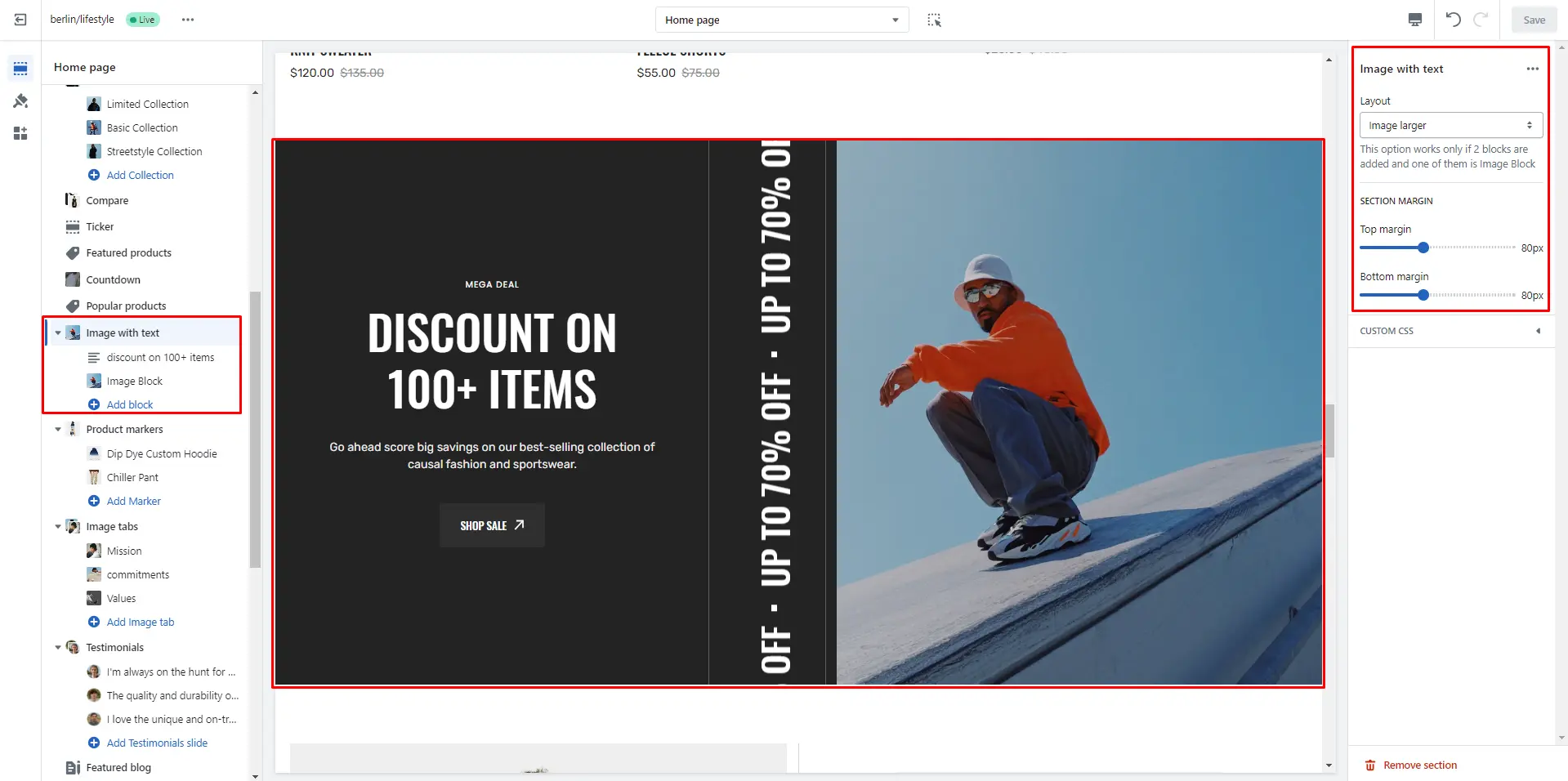
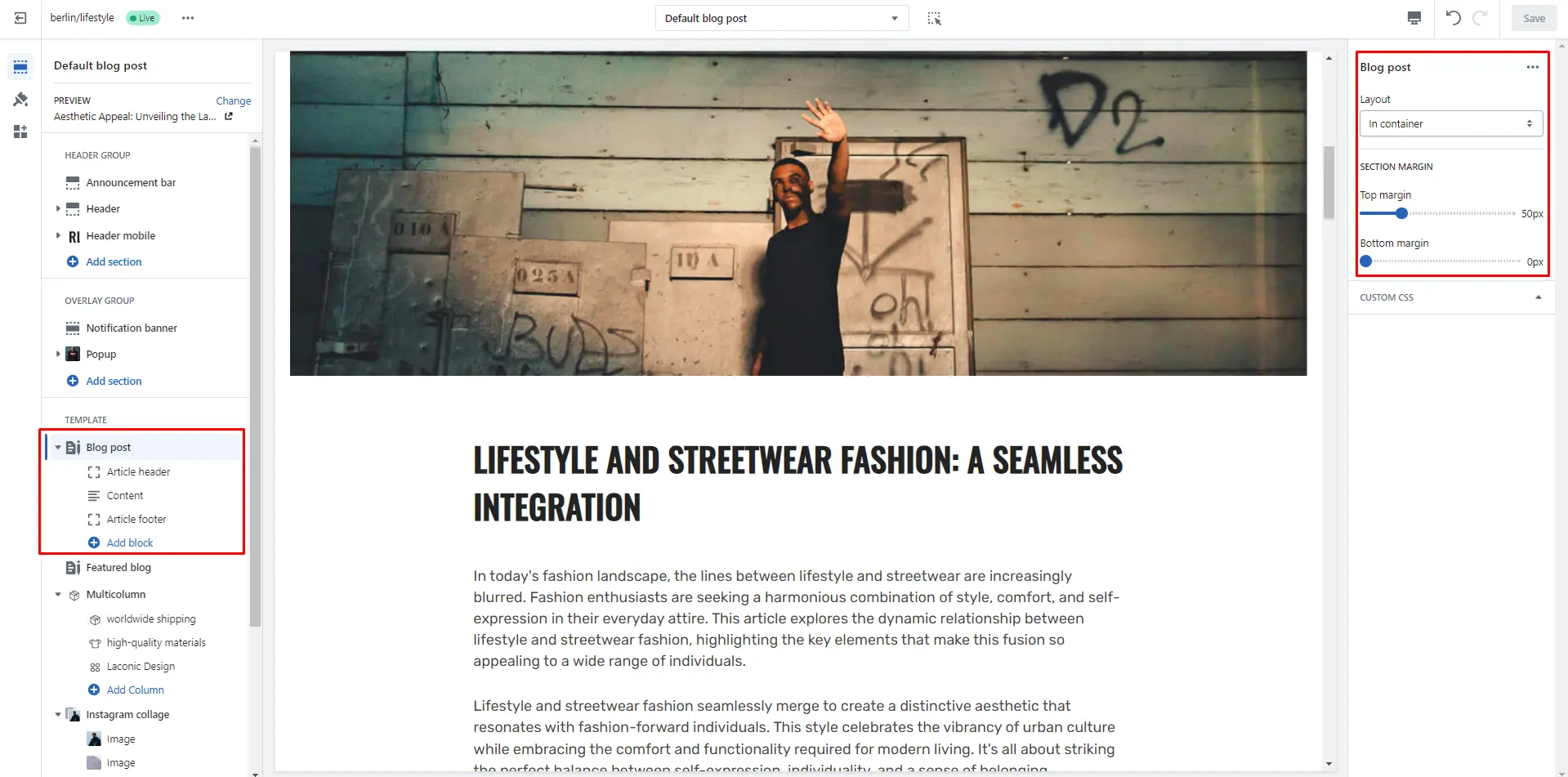
Section margin
Allows you to change the top and bottom margin in the section
- Top margin slider allows you to change the top margin in the section.
- Bottom margin slider allows you to change the bottom margin in the section.
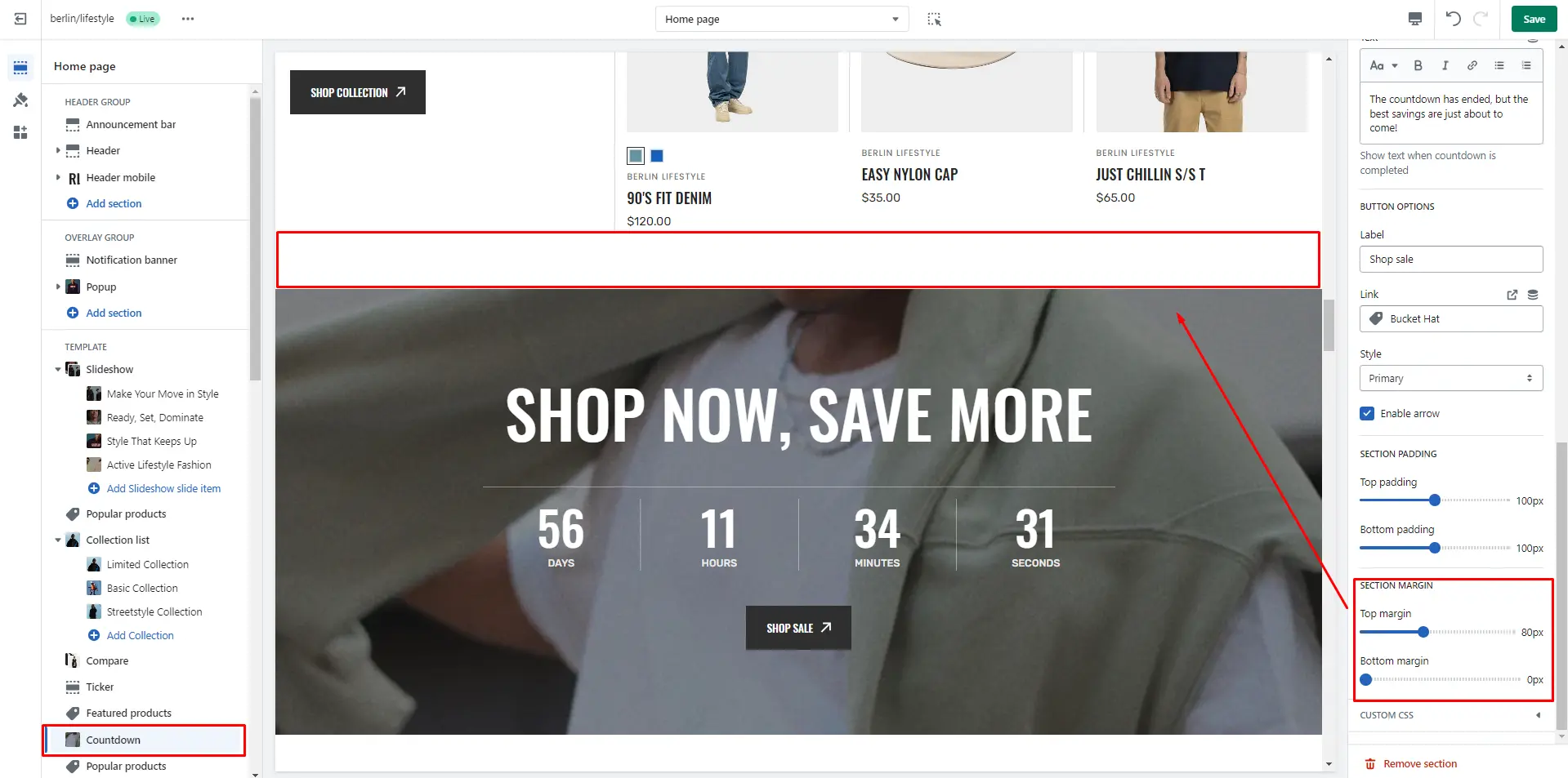
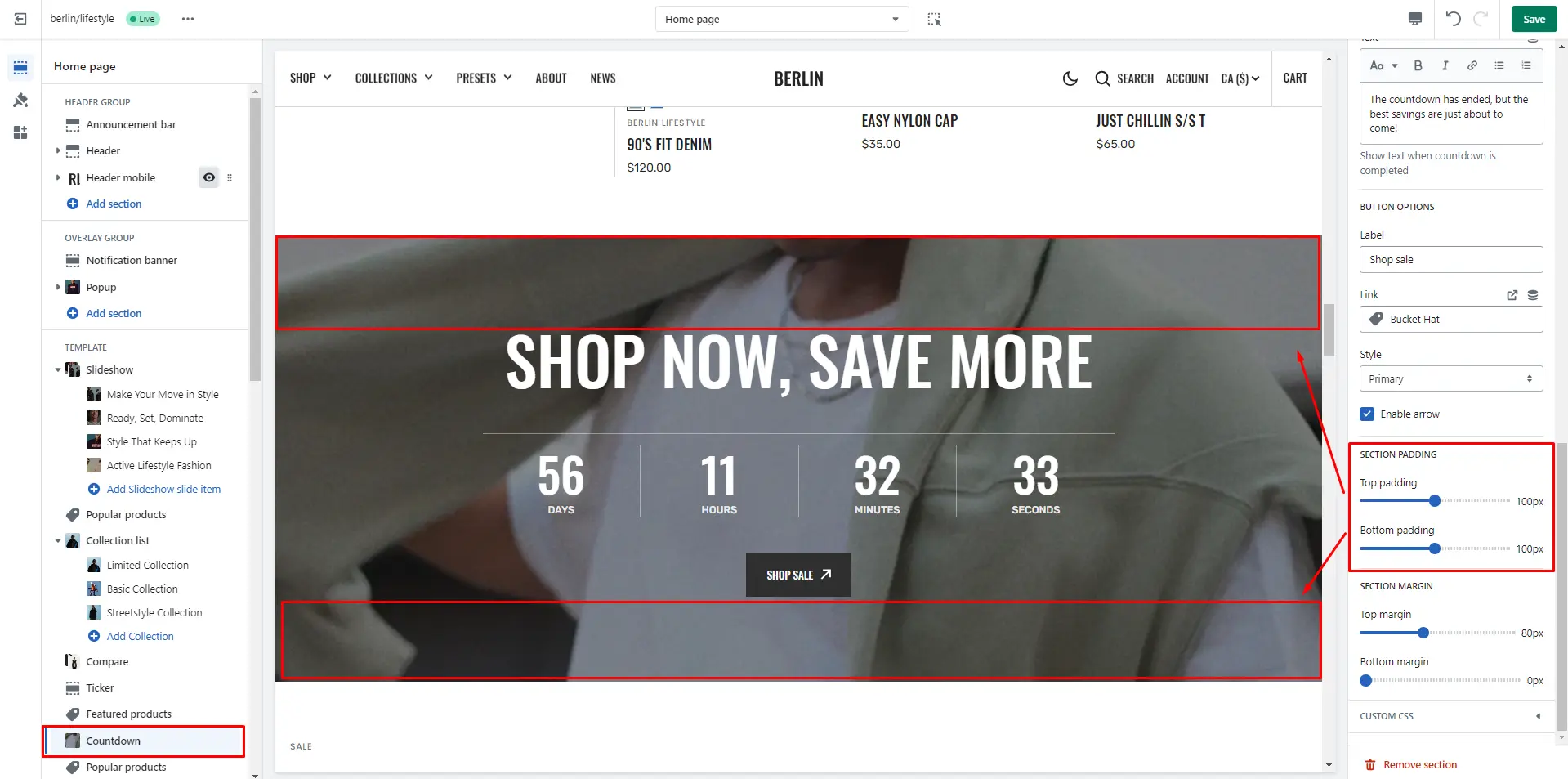
Section padding
Allows you to change the top and bottom padding in the section
- Top padding slider allows you to change the top padding in the section.
- Bottom padding slider allows you to change the bottom padding in the section.
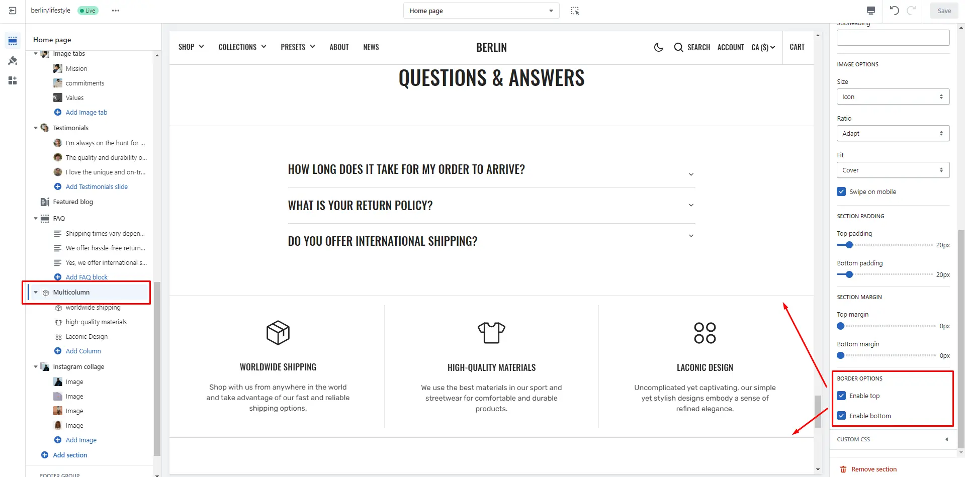
Section borders
To enable top and bottom borders in the section
- Enable top field enables a line above the section.
- Enable bottom field enables a line below the section.
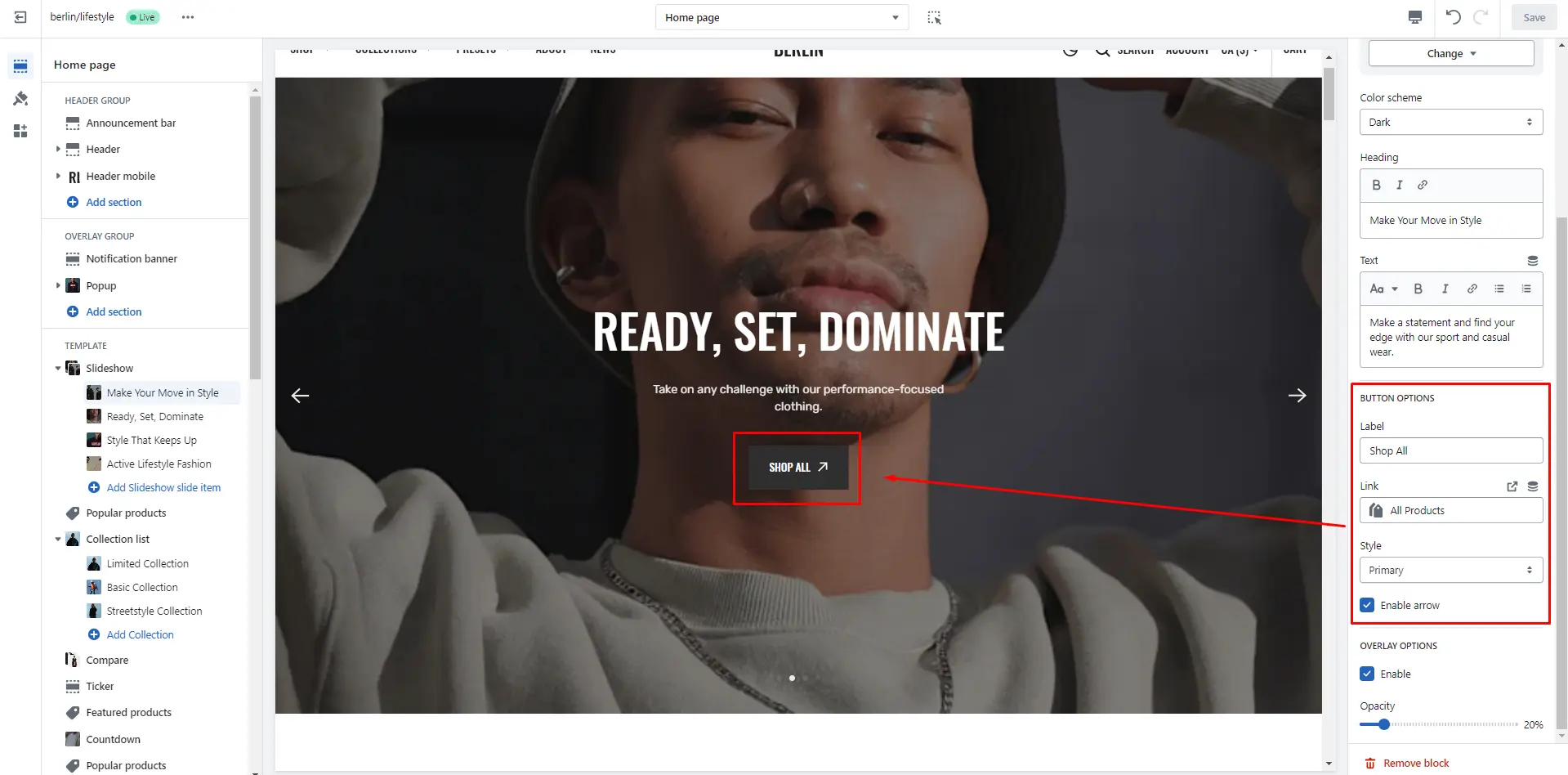
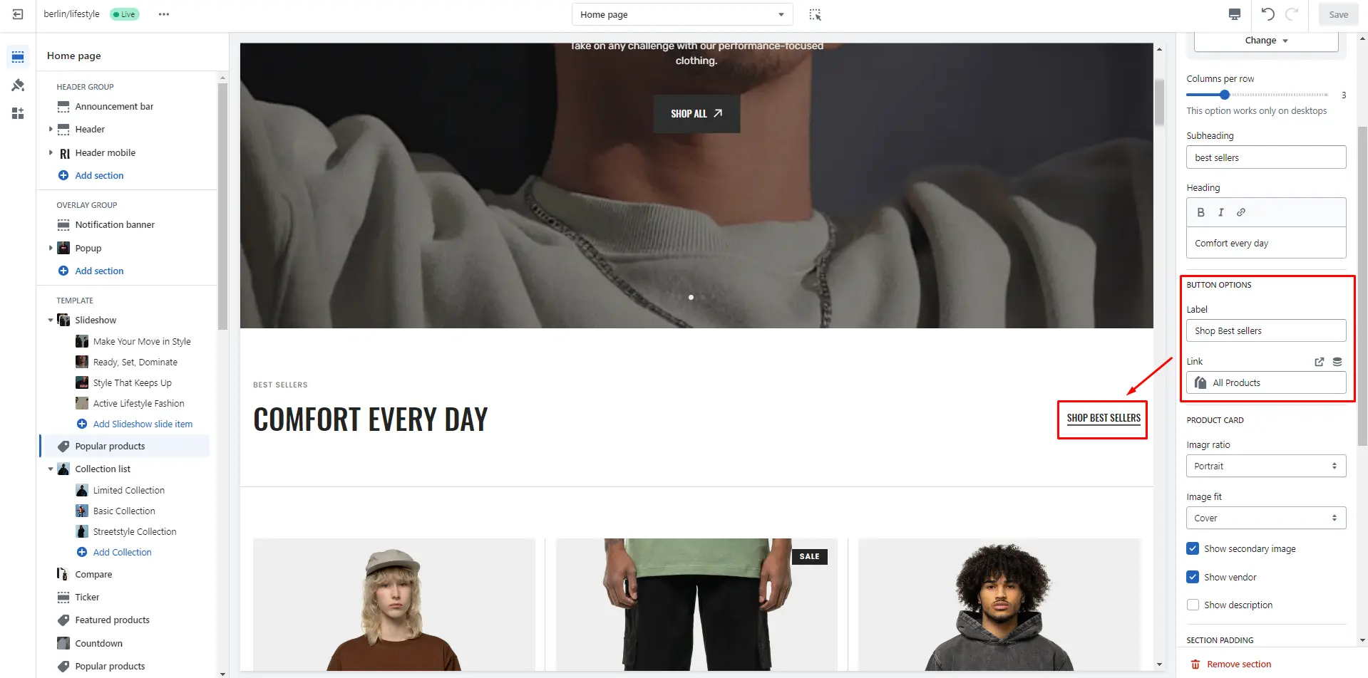
Buttons
Allows you to change button options
- Button label field sets the button's label.
- Button link field allows you to add a link to any source.
- Button style selector to change the button style.
- Enable arrow field enables an arrow in the button.
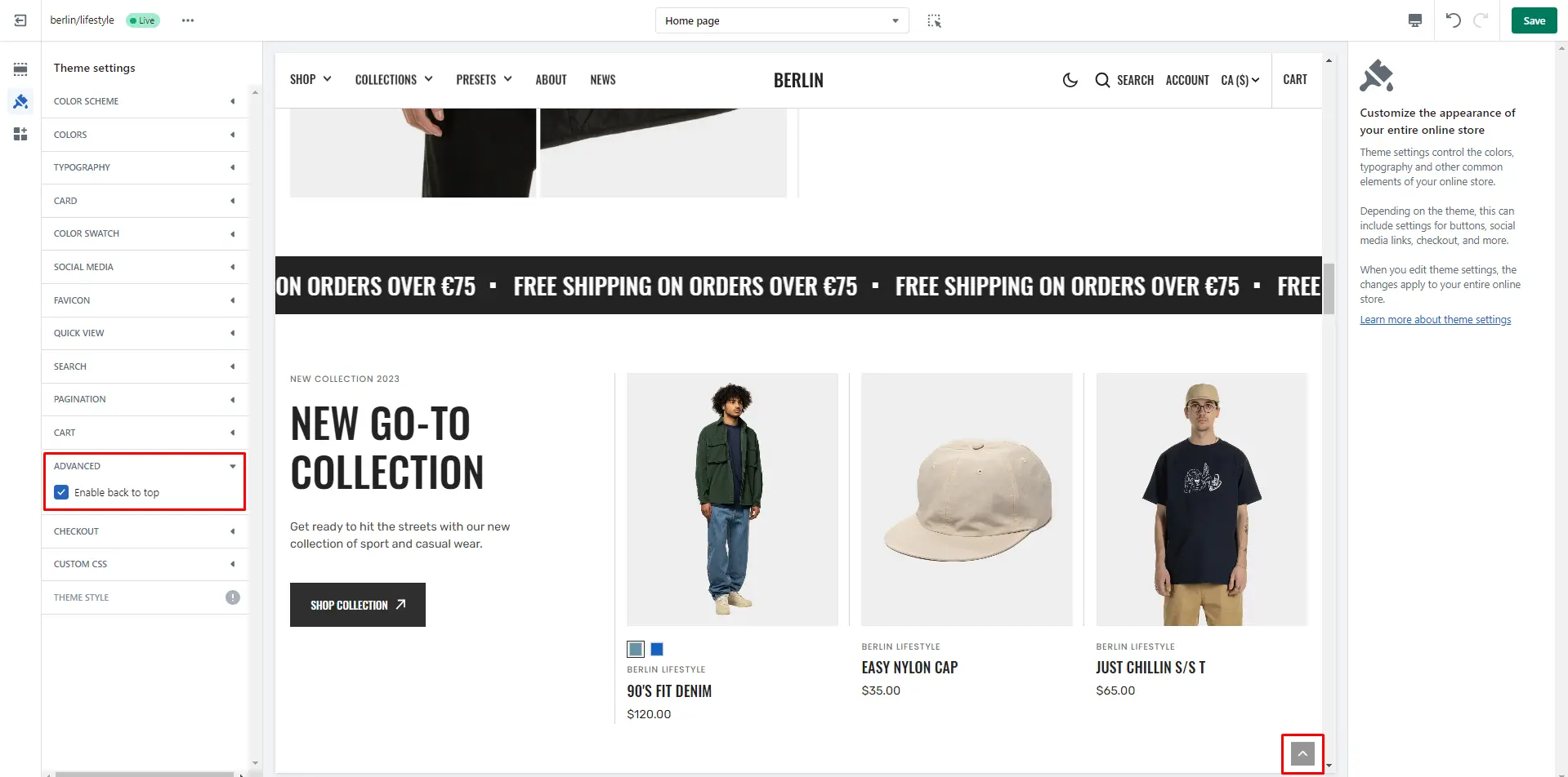
Back to Top
To enable Back to Top button, navigate to Theme settings > Advanced.
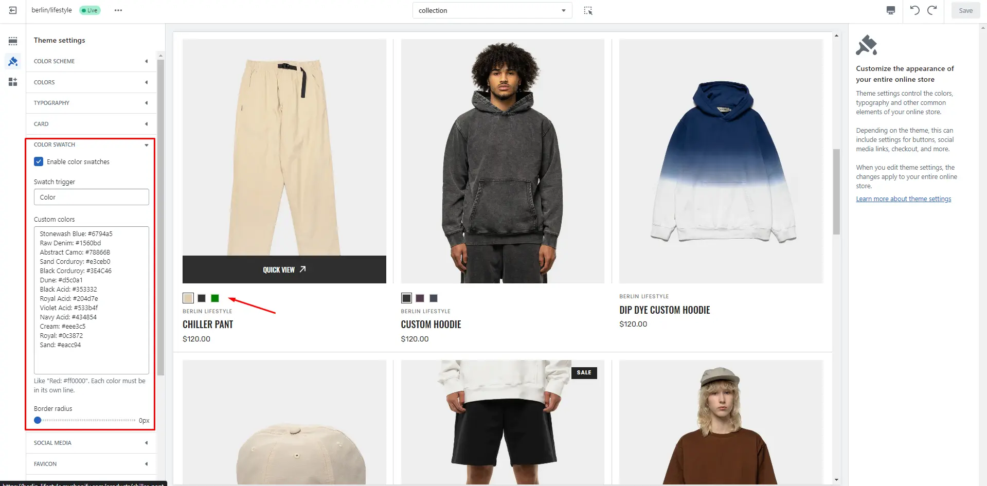
Color swatches
To enable and edit Color swatches, navigate to Theme settings > Color swatches. Swatch trigger should be the same as the option in Product variants. You can also add custom colors by adding their name and color in HEX format.
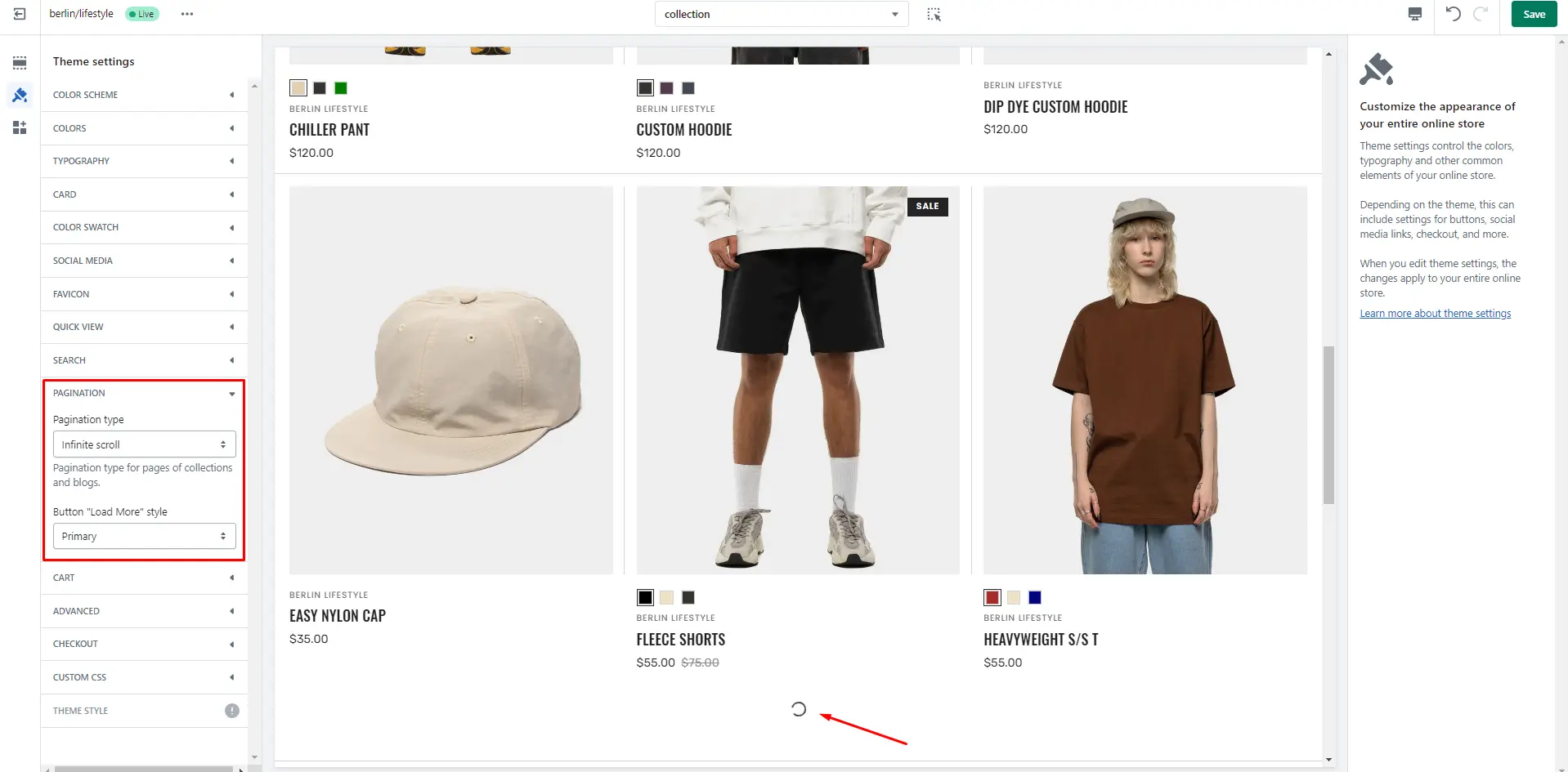
Infinite scroll
To enable and edit Infinite scroll, navigate to Theme settings > Pagination > Pagination type.
Header Group
Sections that are used on all pages by default
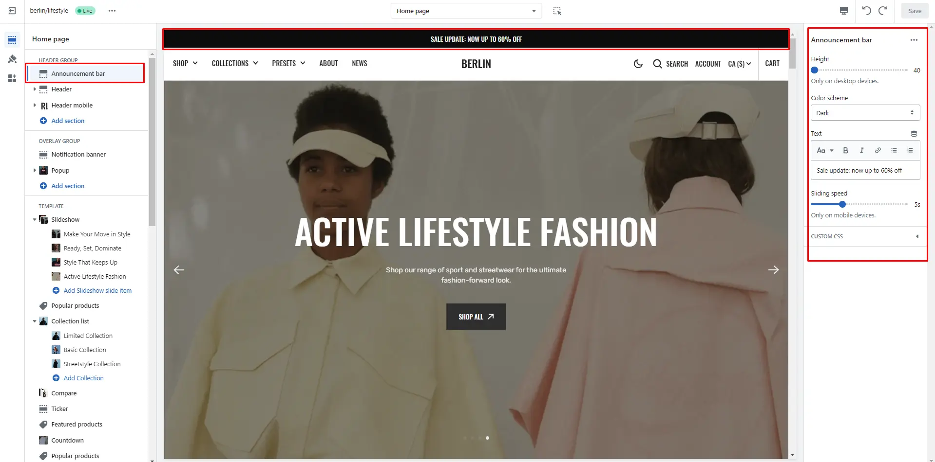
Announcement bar
The announcement bar appears at the top of every page and includes custom messages with optional links. It's good to use for promoting sales or need-to-know updates.
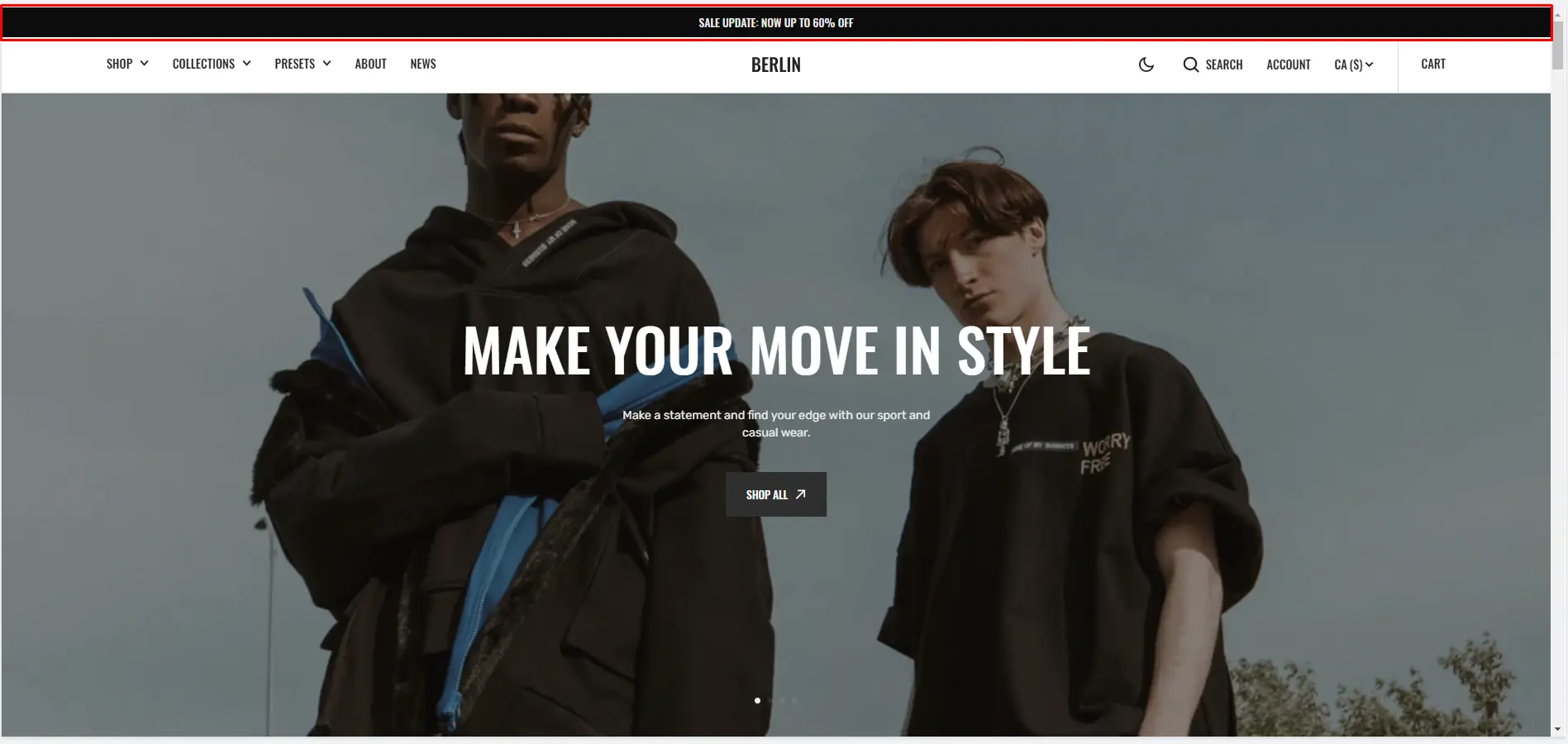
- Use the Add announcement button to add an announcement.
- Height slider allows you to change the announcement height only on desktop devices.
- Color scheme selector allows you to change the color scheme. (You can change the background color in the Theme settings.
- Text field allows you to add and edit text.
- Speed allows you to change speed for the ticker only on mobile devices.
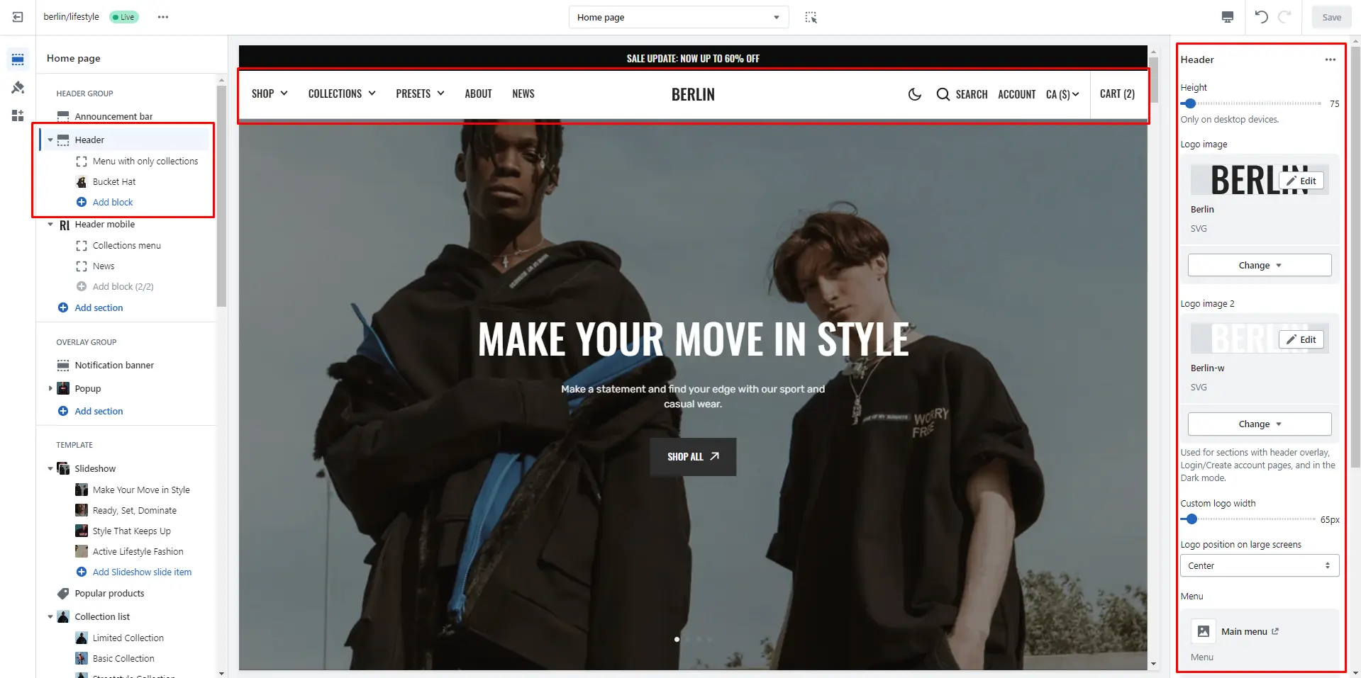
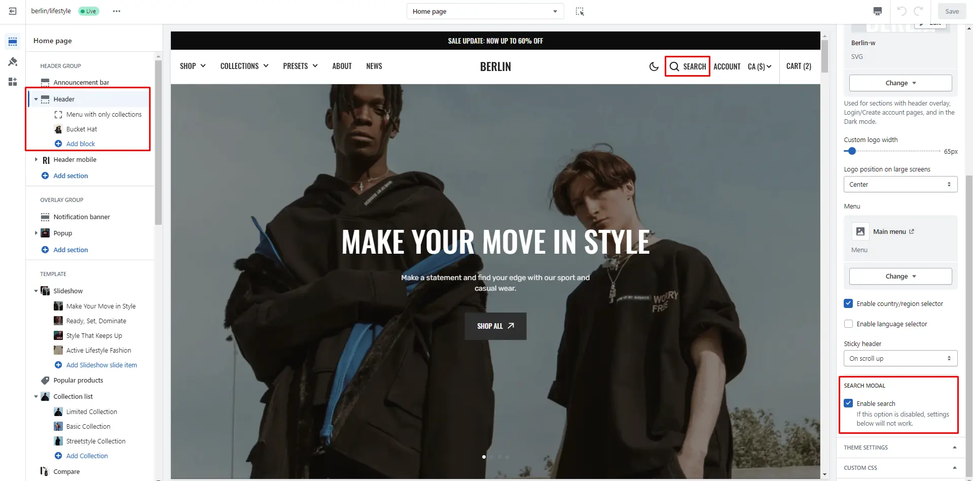
Header
There are several types of the header in this theme. You can choose a variant.
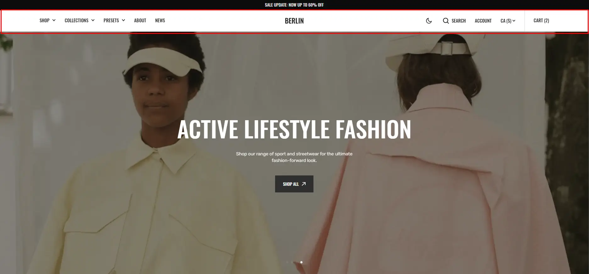
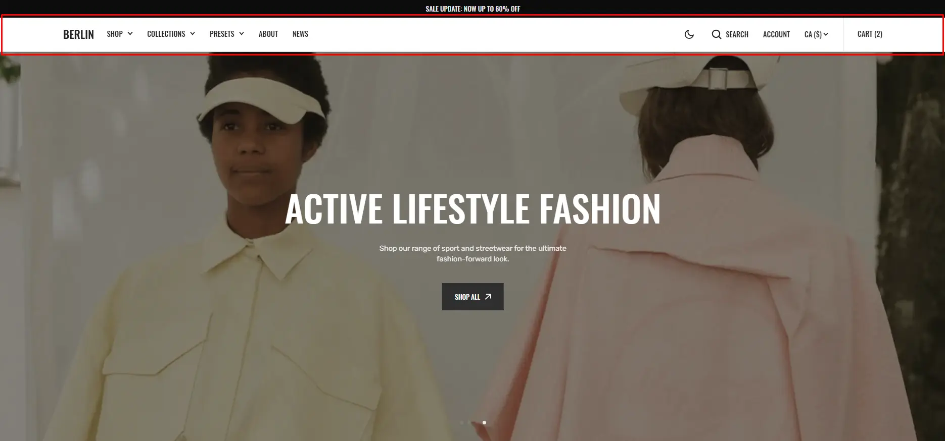
- Height slider allows you to change the header's height only on desktop devices.
- Use the Logo image file selector allows you to select or upload your logo file.
- Use the Logo image 2 file selector to select or upload your logo, which can be seen in Dark mode.
- (Optional.) If you add a logo, you can use the Custom logo width slider to change the logo size.
- Choose a Menu to be displayed in the header.
- Sticky header field allows the display of a header on the screen as the user scrolls up.
- Enable country/region selector field enables the display of country/region.
- Enable language selector field enables the display of language.
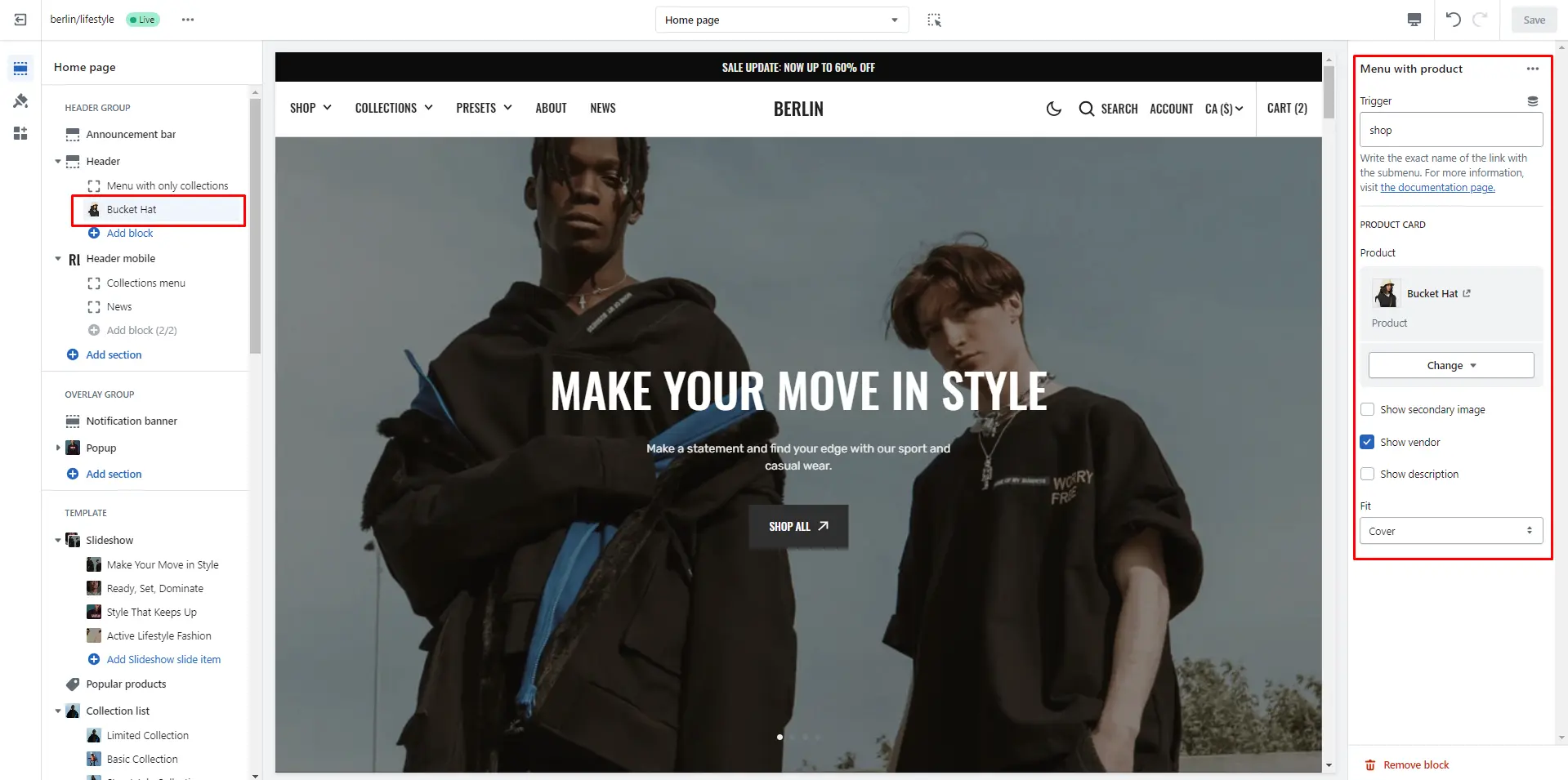
Mega menu
To add a Mega menu, make sure that the main menu link has sublinks, and then follow these steps:
- Add the Mega menu to the Header.
- Type the exact name of the link in the Trigger field.
- Product card options allow you to add products and customize product cards.
- Collection field enables the display of collection links in the Mega menu.
Search
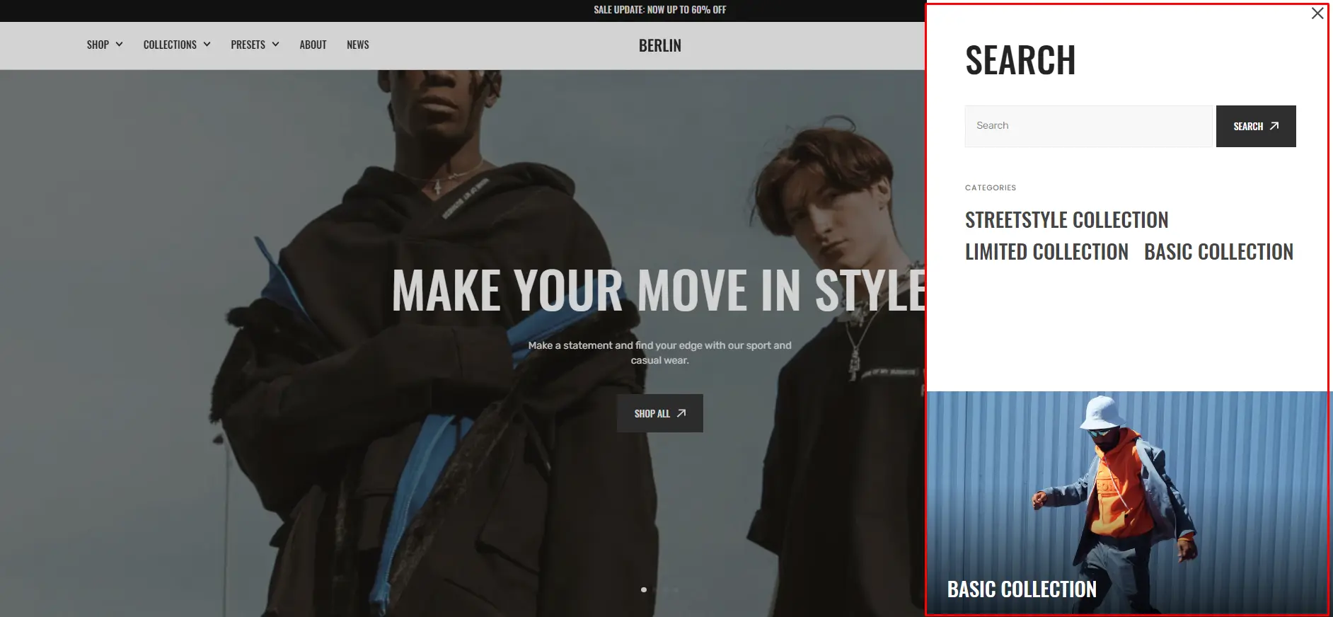
In this theme, you can use a predictive search. It is enabled by default, but you can disable it in the Theme settings > Search.
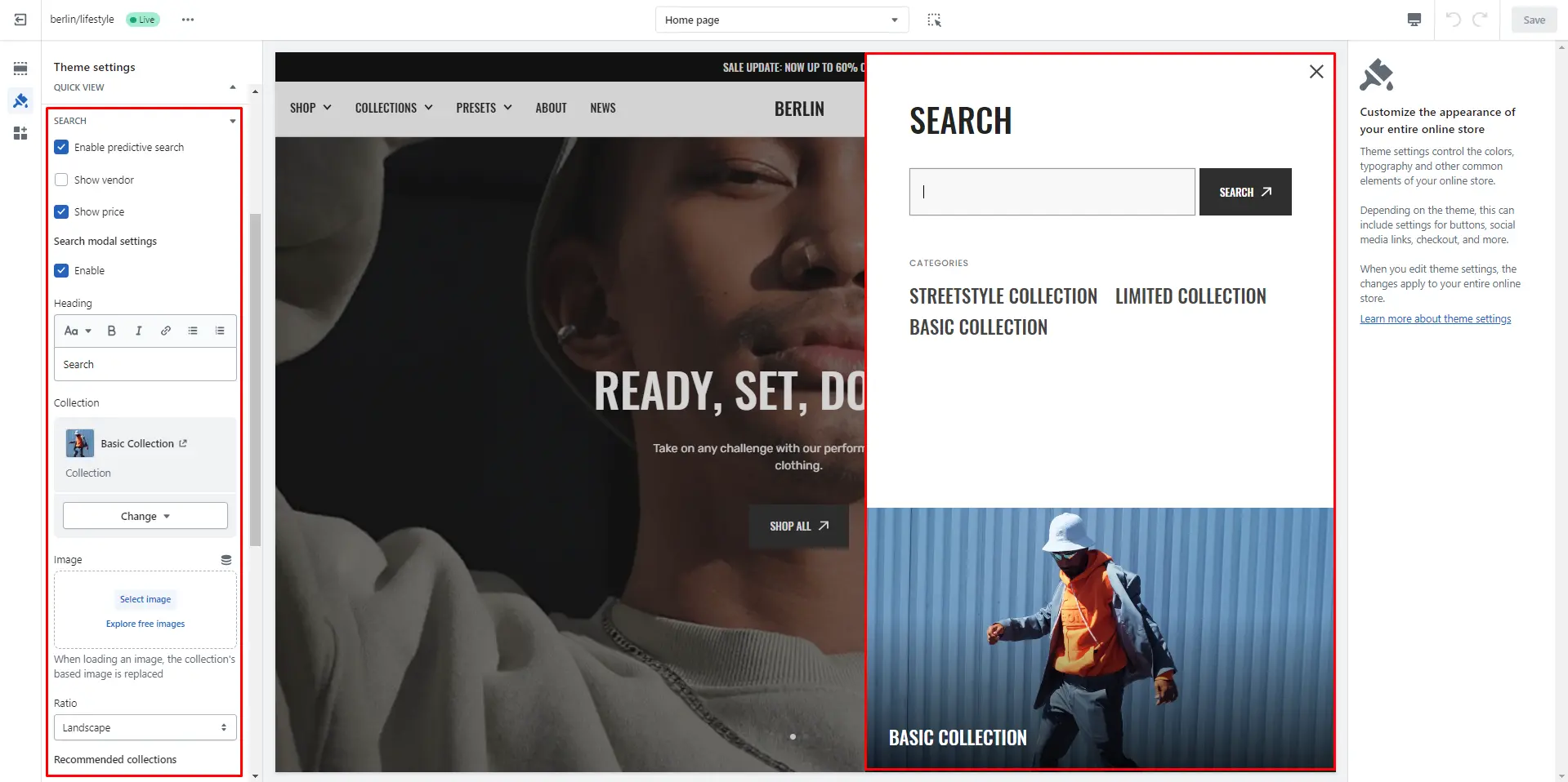
You can also enable the Enable search in the Header settings.
Overlay Group
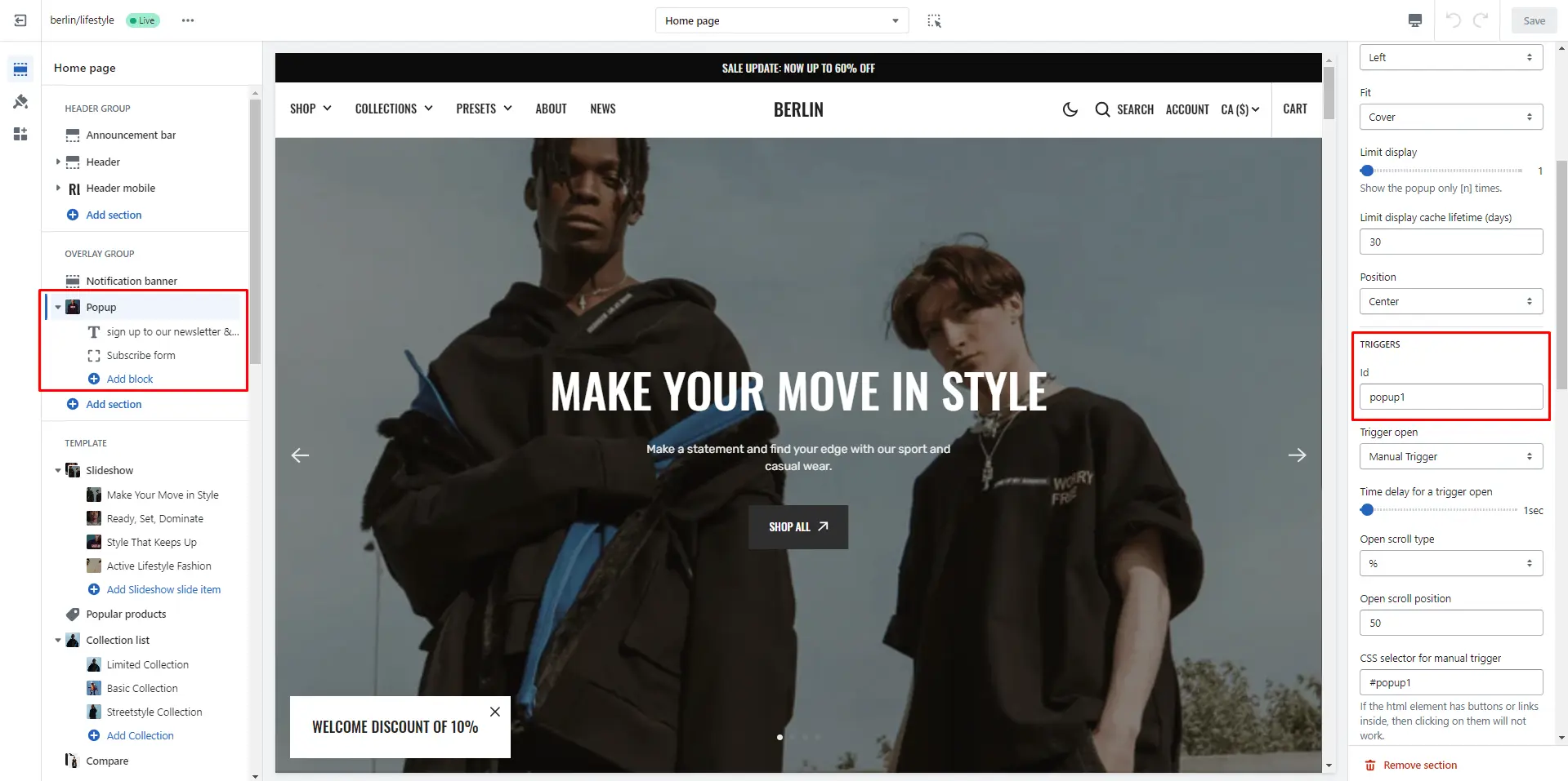
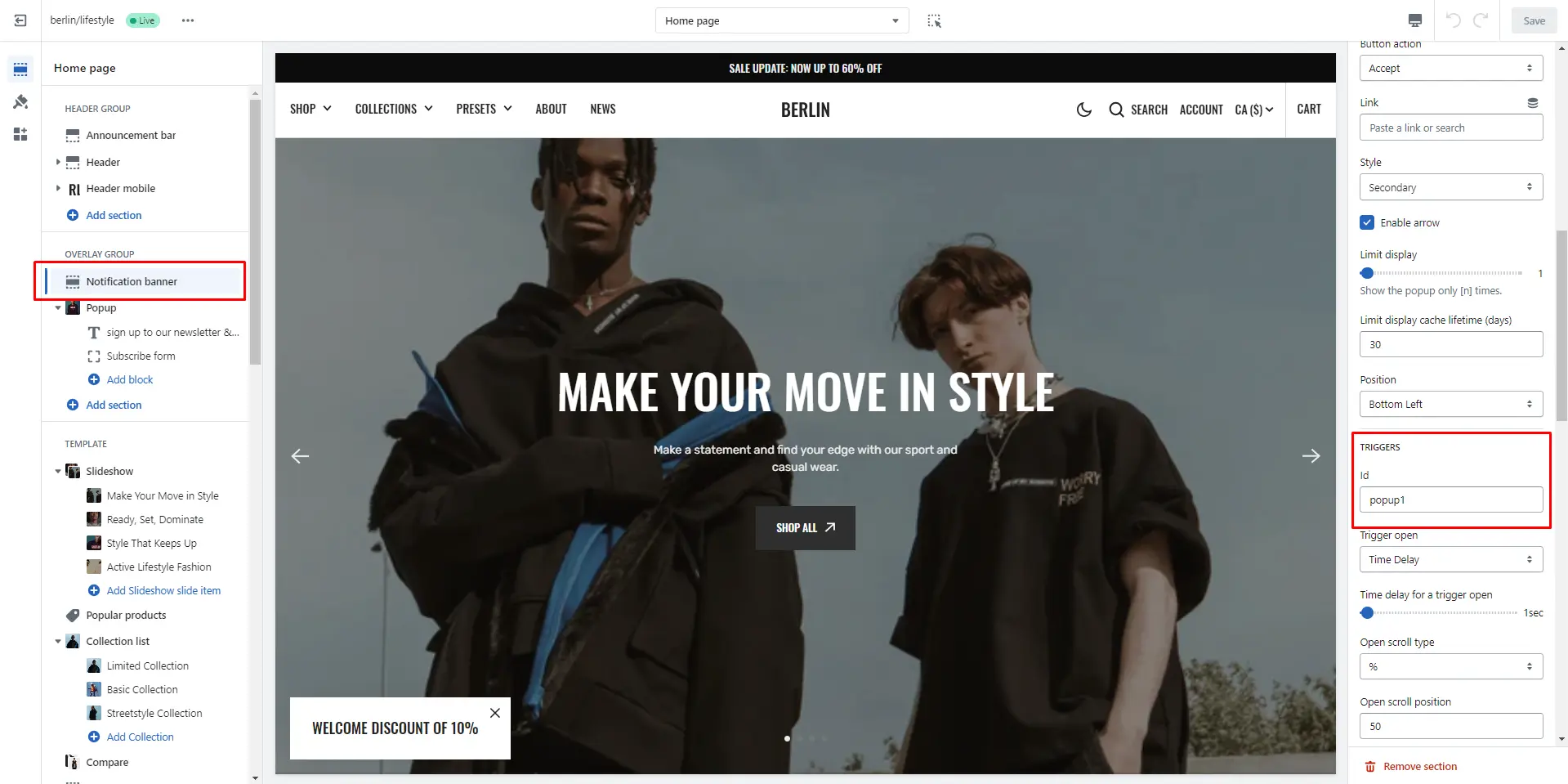
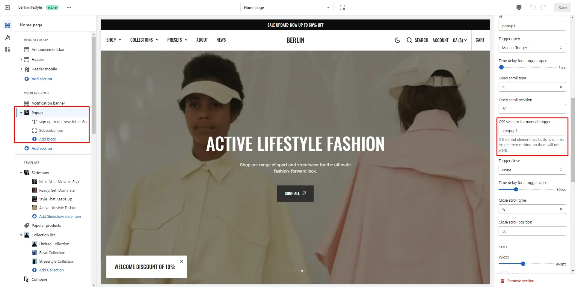
Popup
In the Popup settings, you can change layout, add image, subscribe form, edit position, change open and exit animations and options.
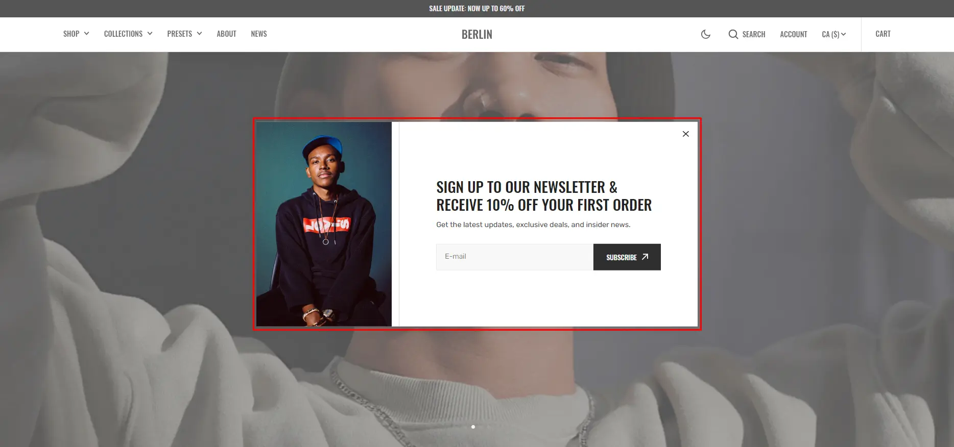
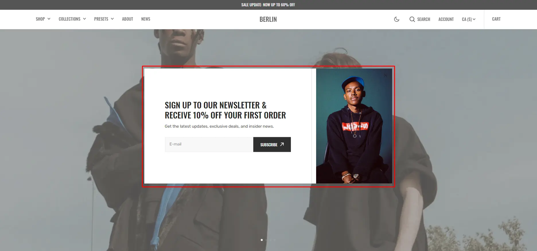
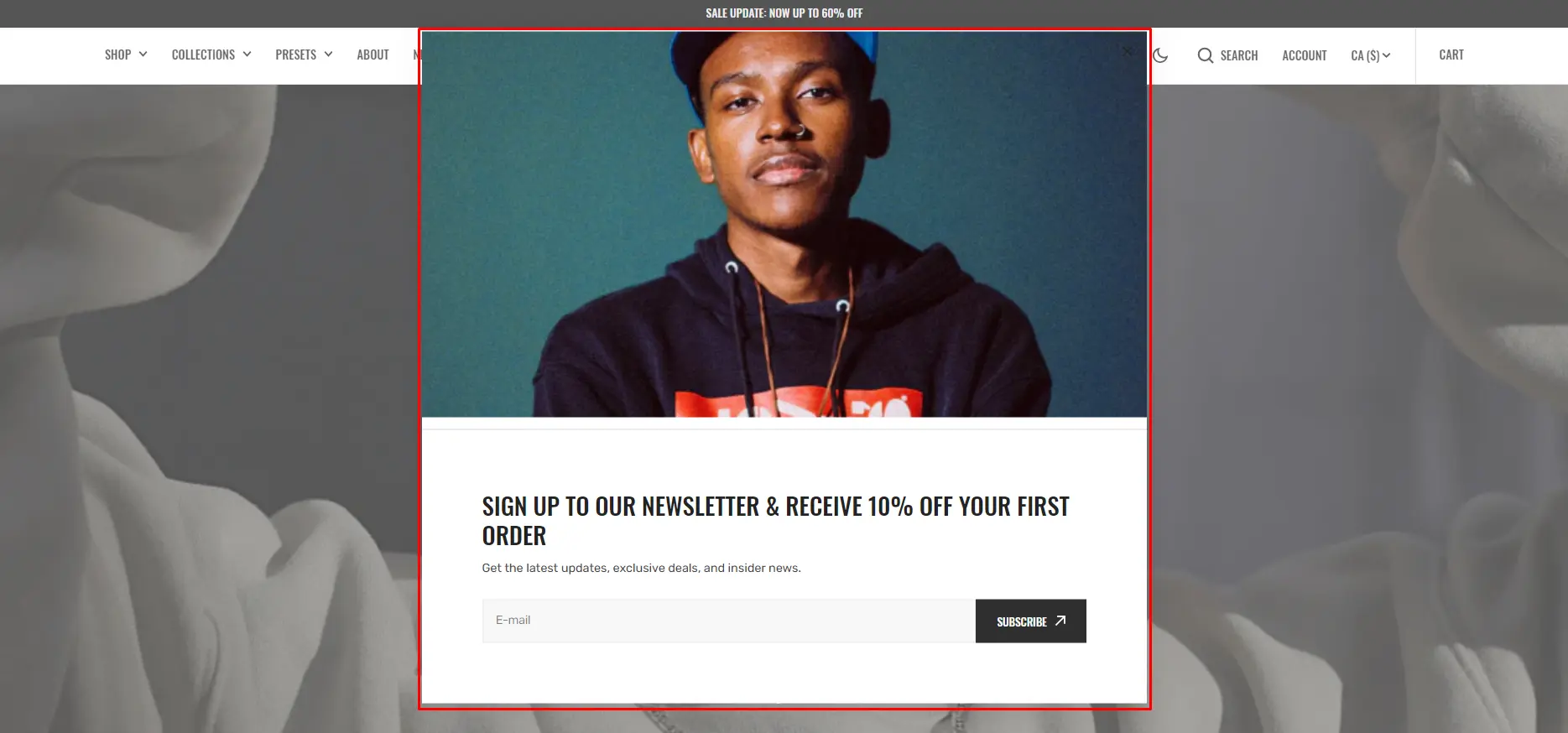
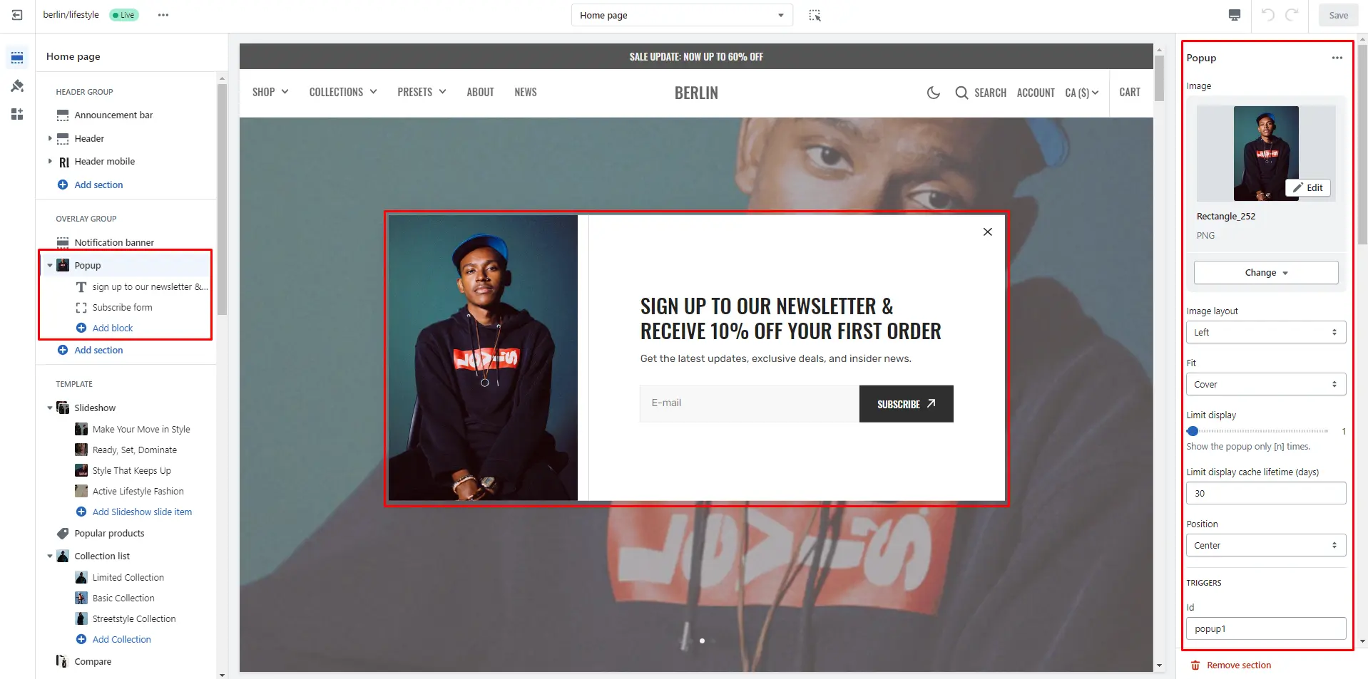
You can also use this popup as a button-trigger for opening another popup or notification bar by following these steps:
- Add the id of the popup/notification bar you chose to open to the Id field in the Triggers section (e.g. "popup").
- Navigate to the popup/notification bar settings and add the Id with "#" in the beginning to the "CSS selector for manual trigger" field.
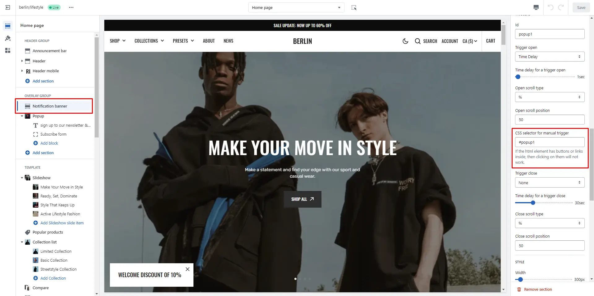
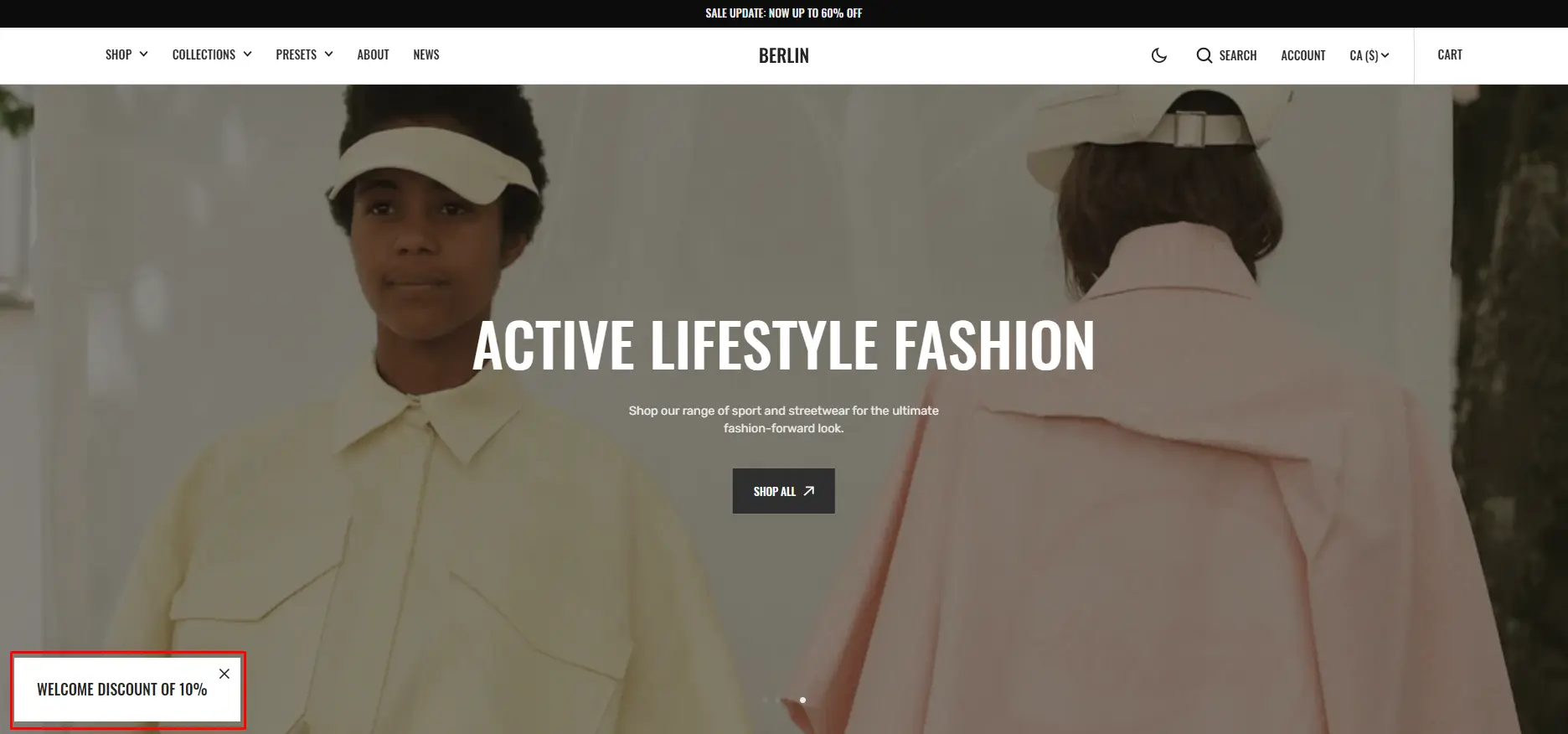
Notification Banner
In the Notification Banner settings, you can change layout, add image, texts, edit banner position, change open and exit animations and options.
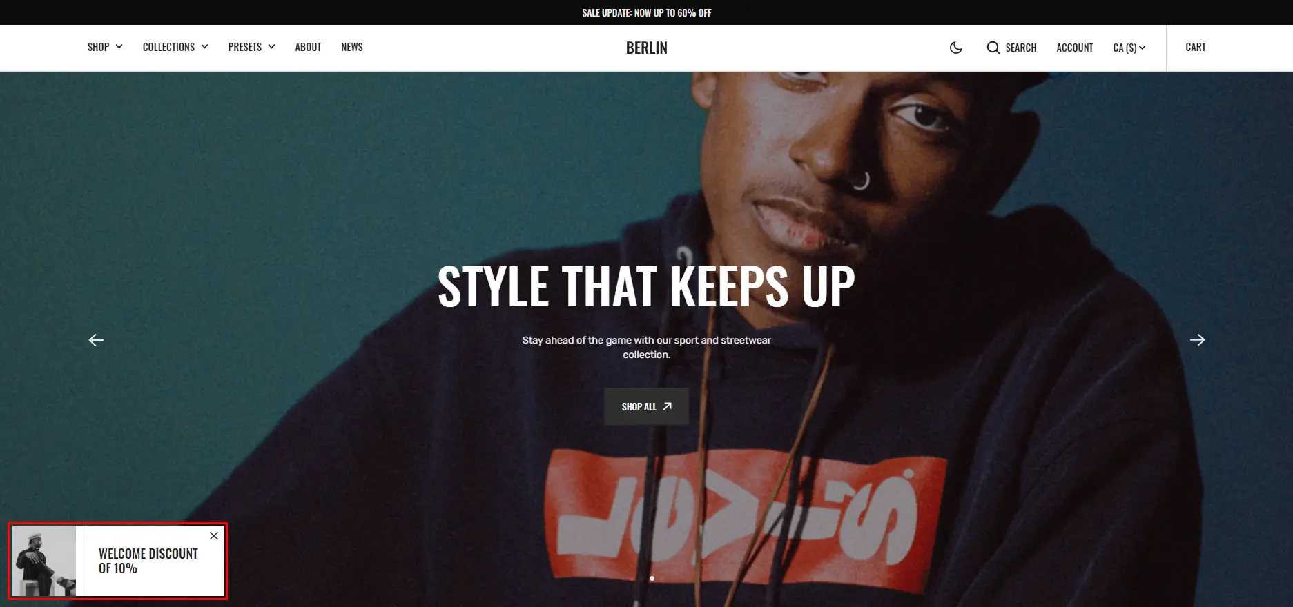
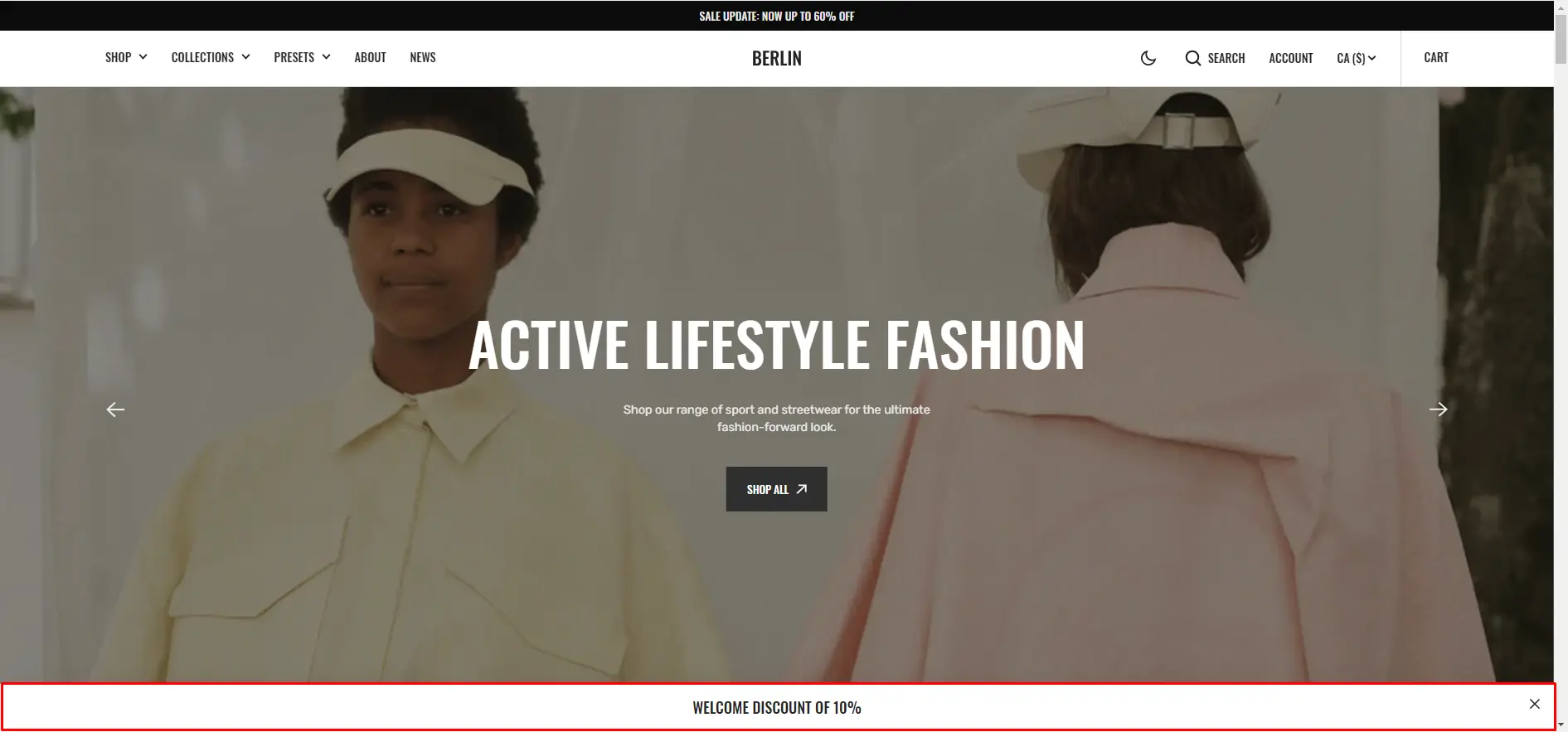
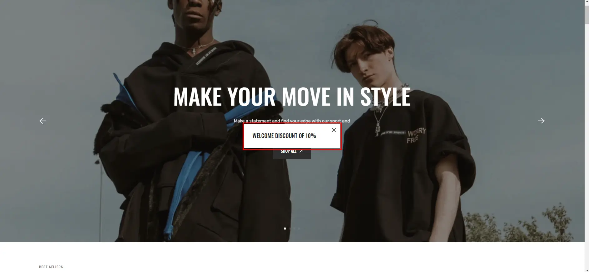
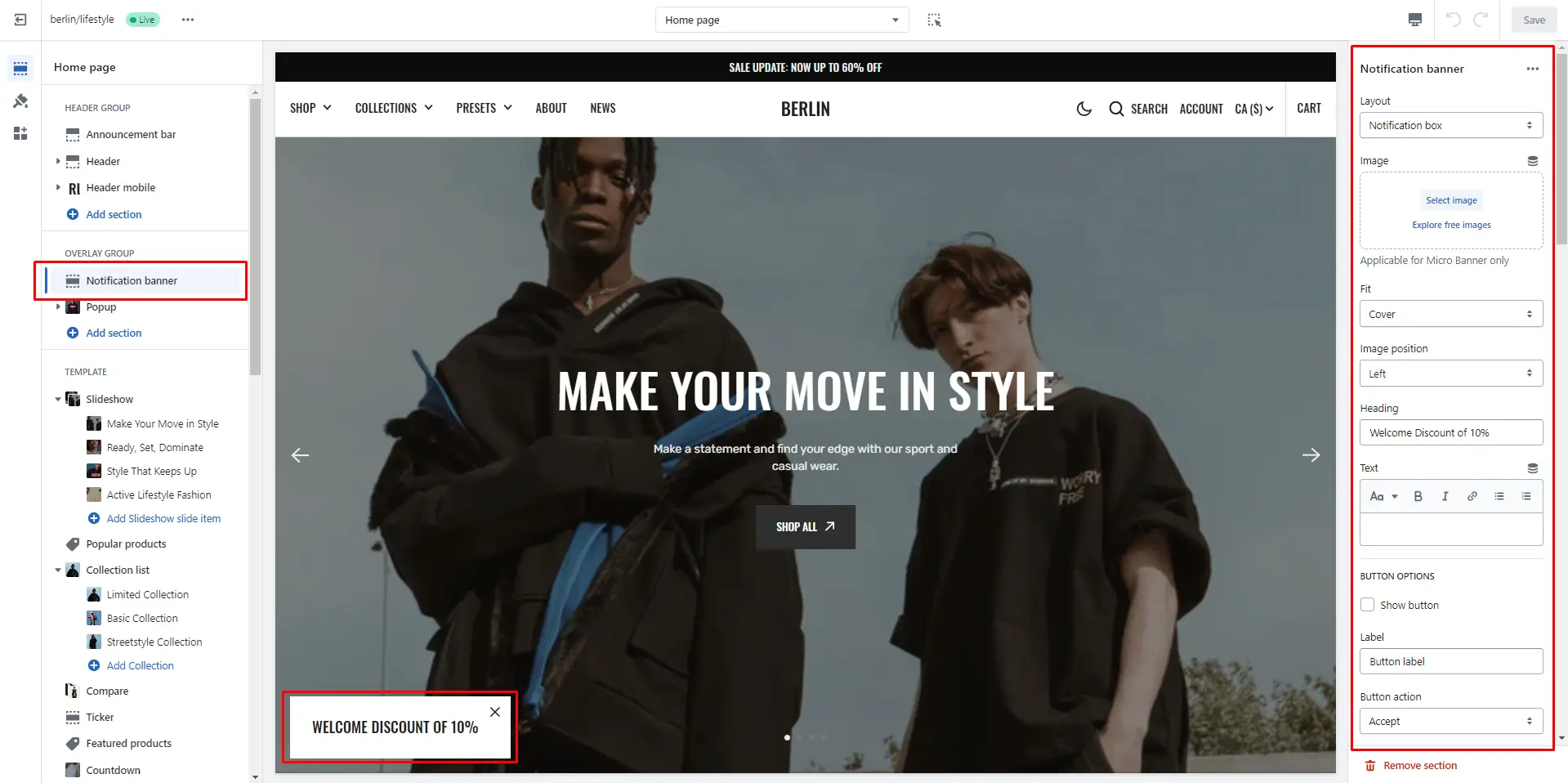
You can also use this banner as a button-trigger for opening another notification bar or a popup by following these steps:
- Add the id of the popup/notification bar you chose to open to the Id field in the Triggers section (e.g. "popup").
- Navigate to the popup/notification bar settings and add the Id with "#" in the beginning to the "CSS selector for manual trigger" field.
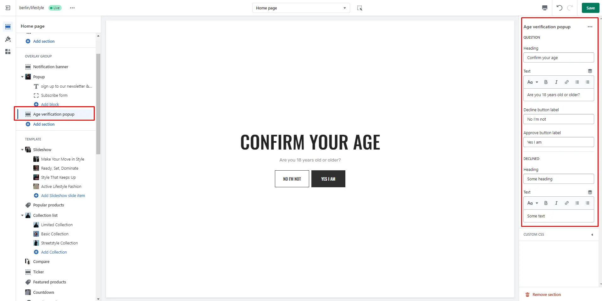
Age verification popup
An Age verification popup is a prompt that appears on a website to confirm the user's age before accessing restricted content. In the Age verification popup settings, you can change customize text and buttons. .
Footer Group
Sections is used on all pages by default
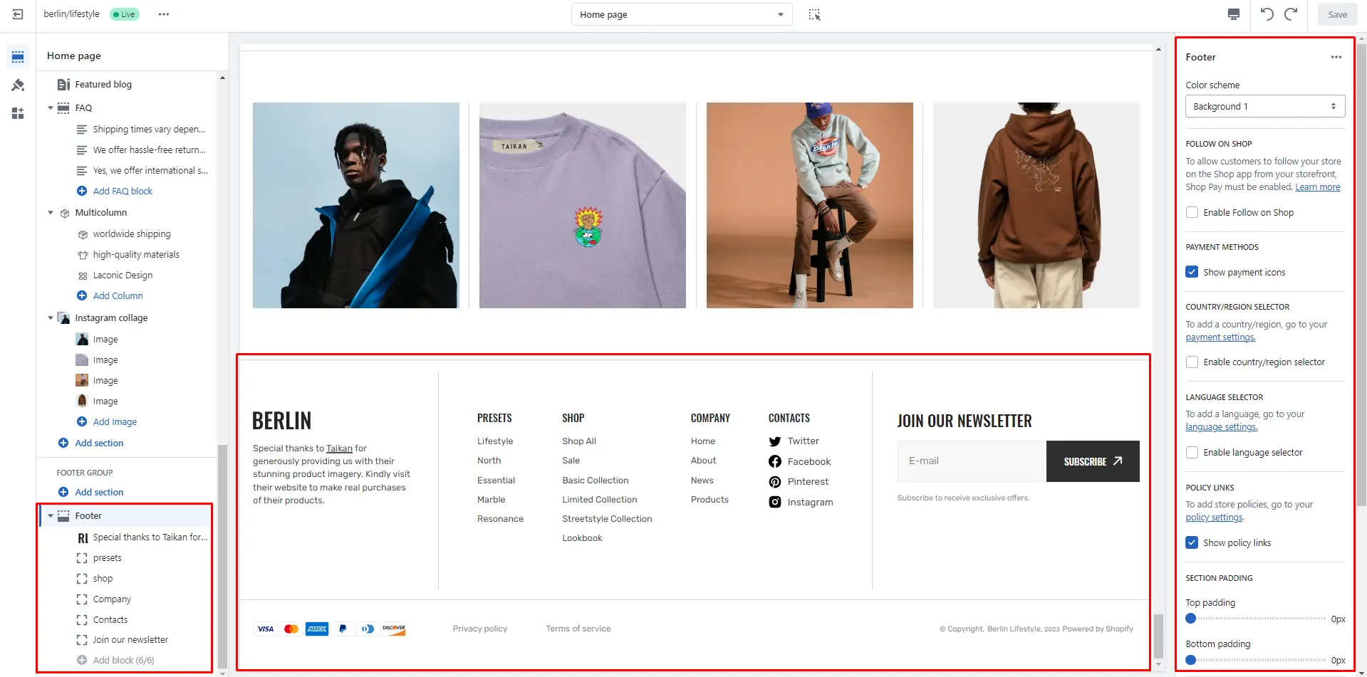
Footer
Footer appears at the bottom of every page. You can customize it to fit your brand and product offerings.
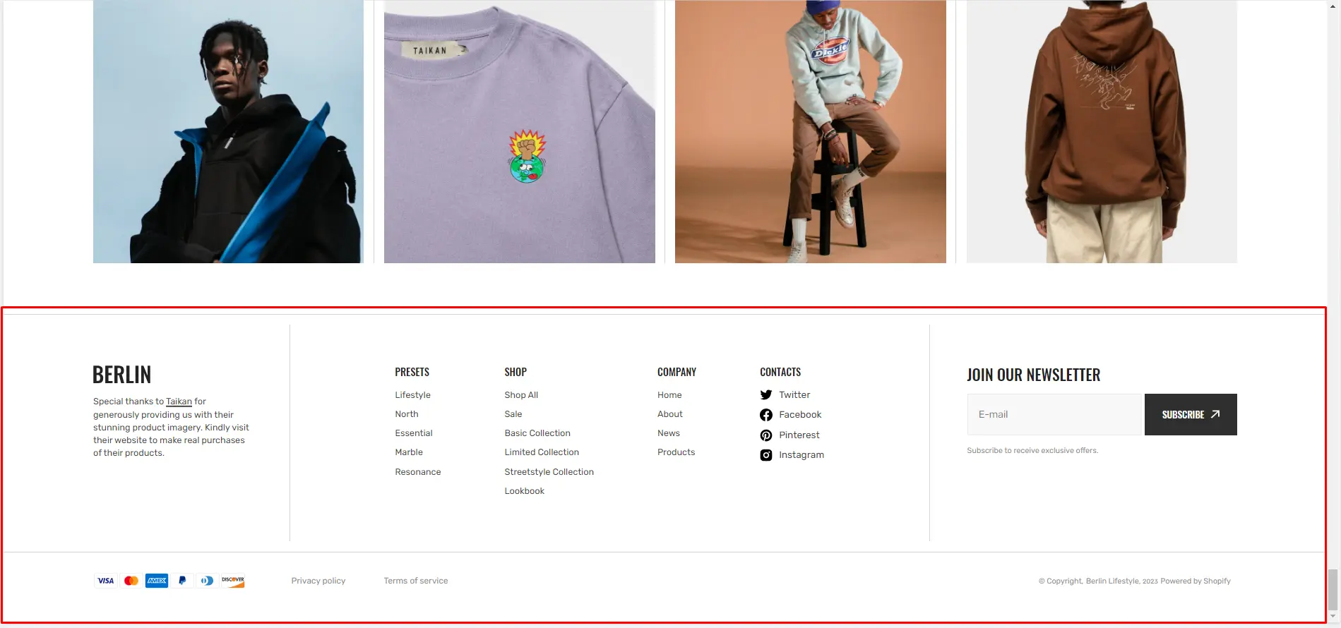
- Use Color scheme selector to change the color scheme.
- SIGNUP FORM allows you to add and customize subscribe form.
- FOLLOW ON SHOP the field allows you to enable the option to subscribe to the store.
- PAYMENT METHODS field enables the display of payment methods in the bottom line of the footer.
- COUNTRY/REGION SELECTOR field enables the display of the region selector in the footer.
- LANGUAGE SELECTOR field enables the display of the language selector in the footer.
- POLICY LINKS field enables the display of the policy links in the footer.
- Block Logo info options Image file selector allows you to select or upload your logo file.
- Block Logo info options Image 2 file selector to select or upload your logo, which can be seen in Dark mode.
- Block Logo info options custom logo width . (Optional.) If you add a logo, you can use the Custom logo width slider to change the logo size.
- Block Menu allows you to select menus, which will be displayed on the top line of the footer.
- Block Social allows you to add social links, which will be displayed on the top line of the footer.
All sections
The theme contains several customizable sections that you can add to your page in any order.
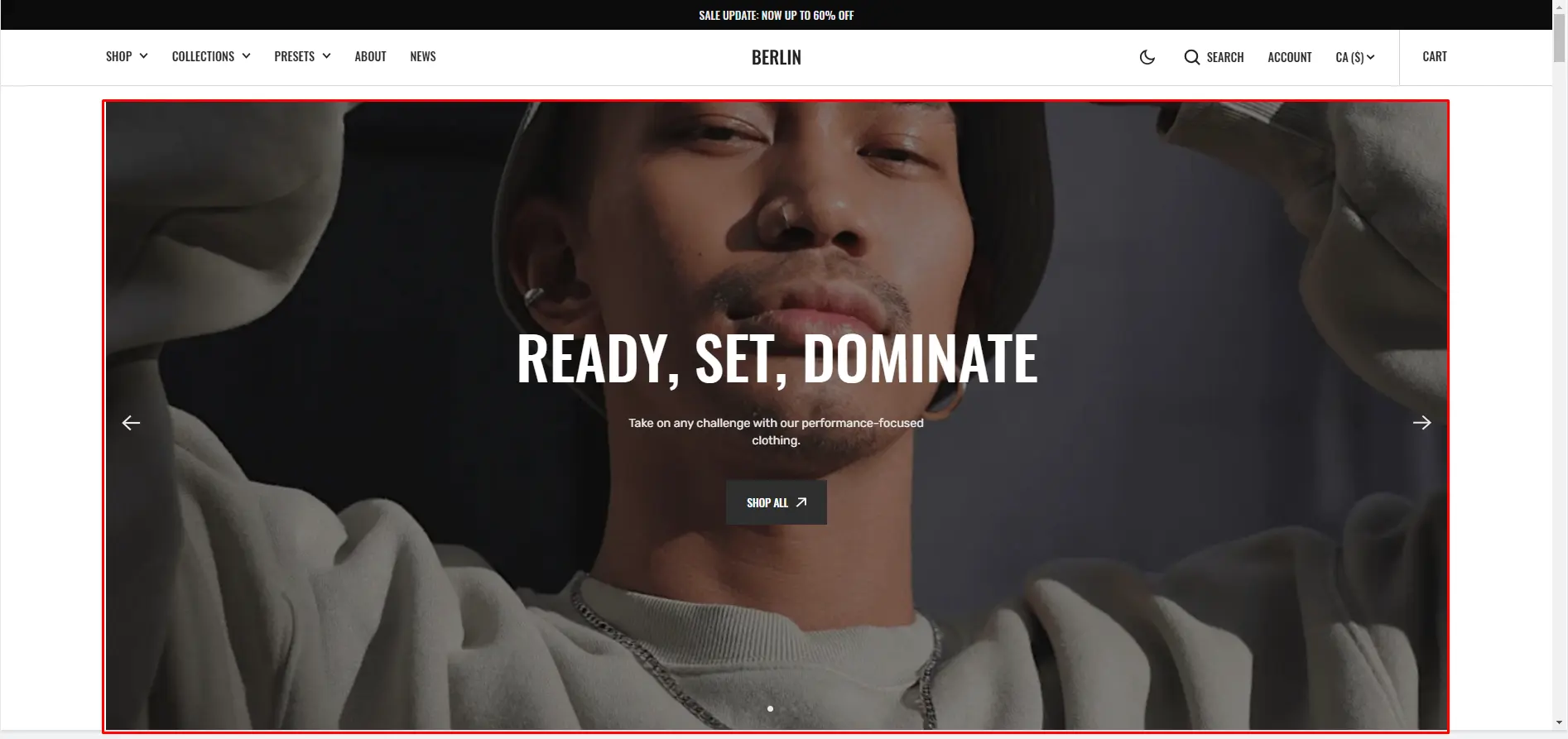
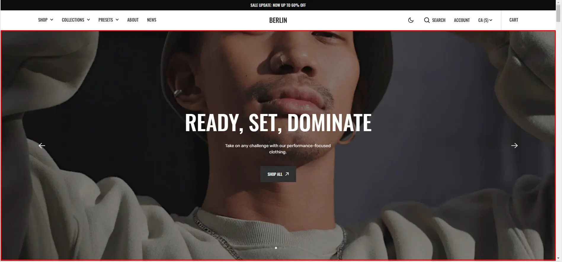
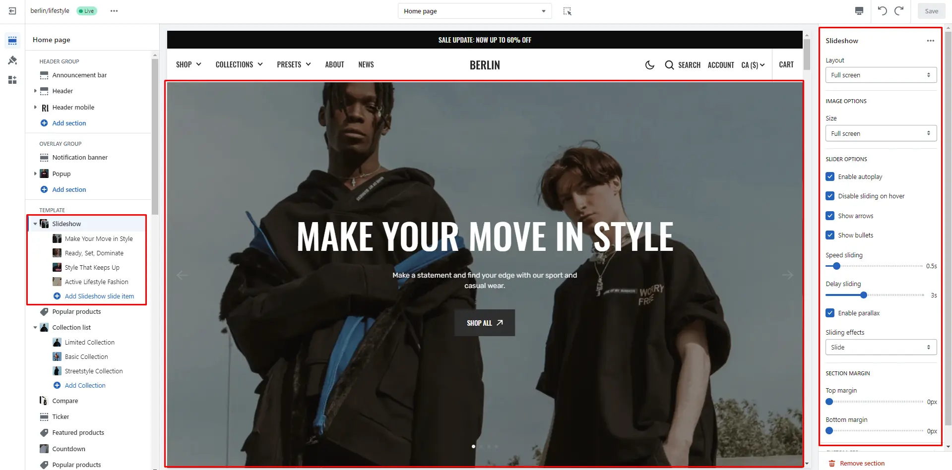
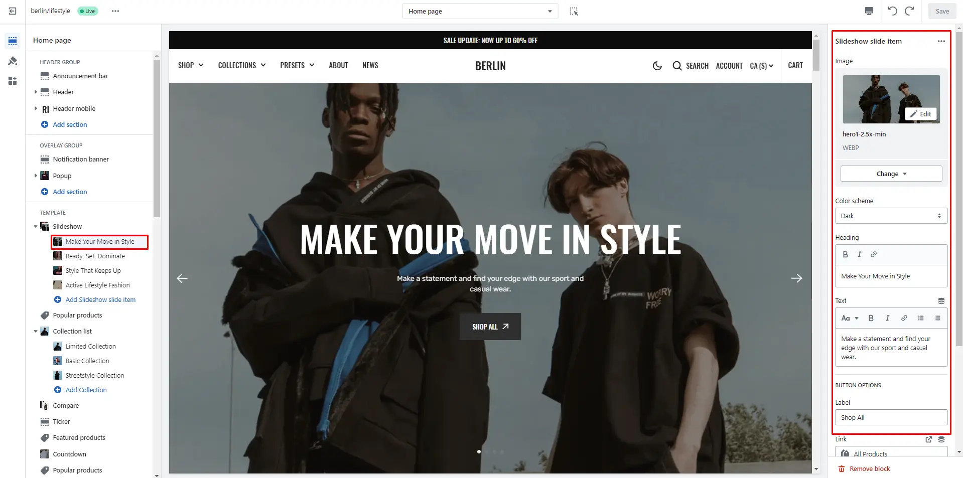
Slideshow
The section allows you to add slides with image and heading
-
Layout selector allows you to enable this section with full
screen or make it in container.
- Image size selector allows you to change the height of this section.
- Enable autoplay checkbox field allows you to enable autoplay for slider.
- Stopping on hover checkbox field allows you to stop slider autoplay while hovering.
- Show arrows checkbox field enables the display arrows.
- Show bullets checkbox field enables the display bullets.
- Speed slider allows you to change speed of transition between items.
- Delay slider allows you to change delay after each slide.
- Enable parallax checkbox field allows you to enable the parallax effect for sliding.
- Sliding effects selector allows you to choose a few sliding effects.
- Block Slideshow slide item options Image allows you to set an image for the block.
- Block Slideshow slide item options Color scheme selector to change the color scheme for the block.
- Block Slideshow slide item options Heading allows you to set a heading for the block.
- Block Slideshow slide item options text allows you to set a text for the block.
- Block Slideshow slide item options Overlay opacity slider allows you to change the opacity of the overlay.
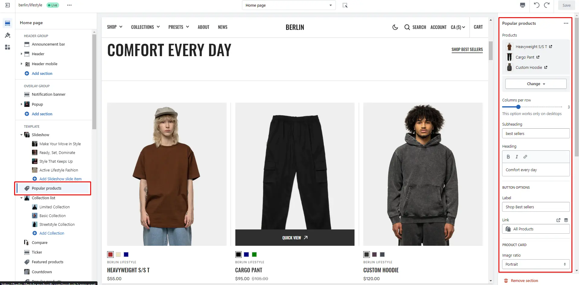
Popular products
The section allows you to select products and customize their display.
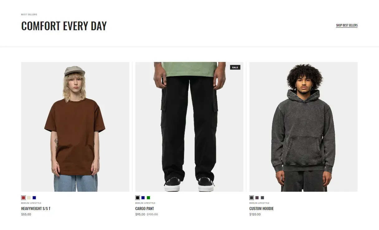
- Products select products to be added to the section.
- Columns per row slider allows you to change the number of products per line only on desktop devices.
- Subheading allows you to set a subheading for the section.
- Heading allows you to set a heading for the section.
- Product card options allow you to customize product cards in the section.
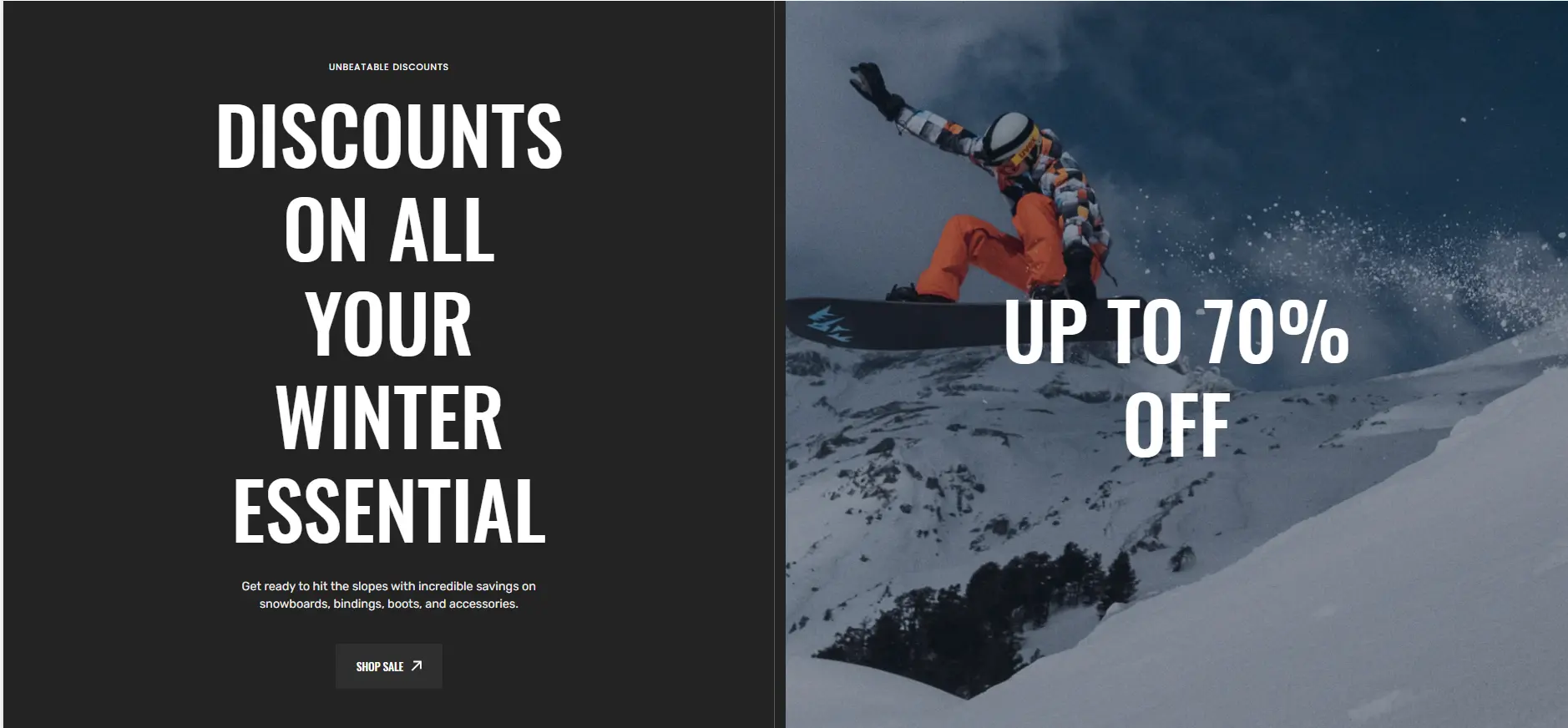
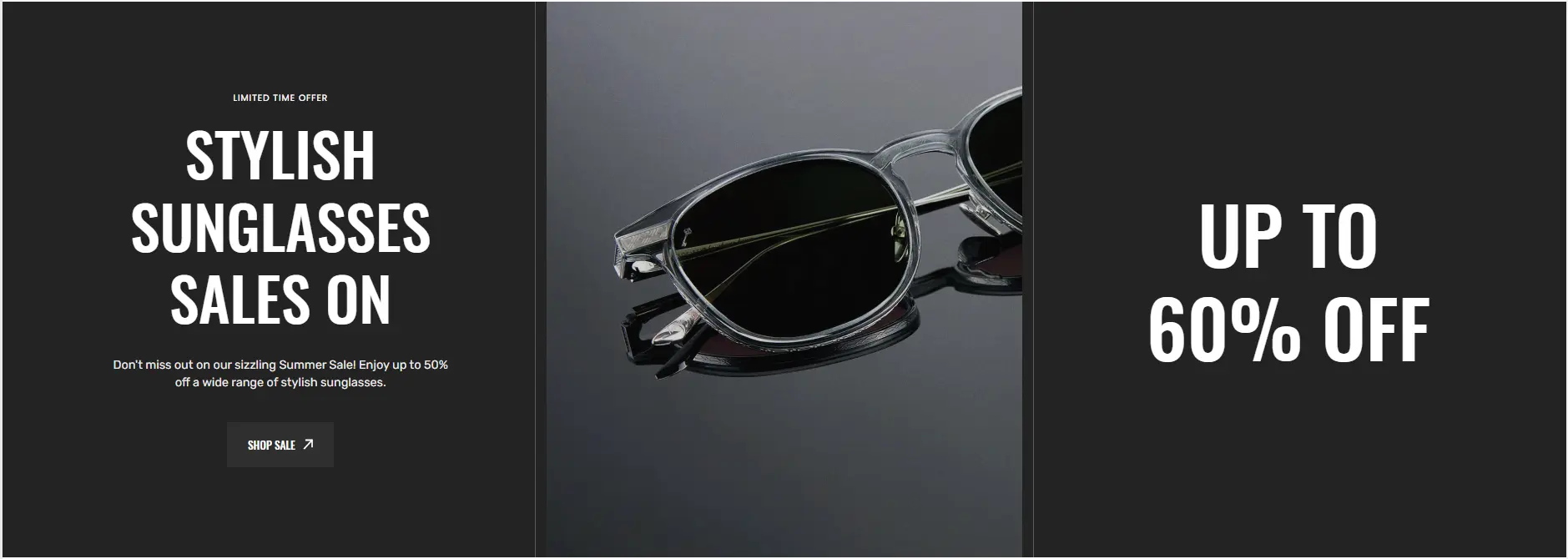
Split screen slideshow
The section allows you to add slides with image and heading.
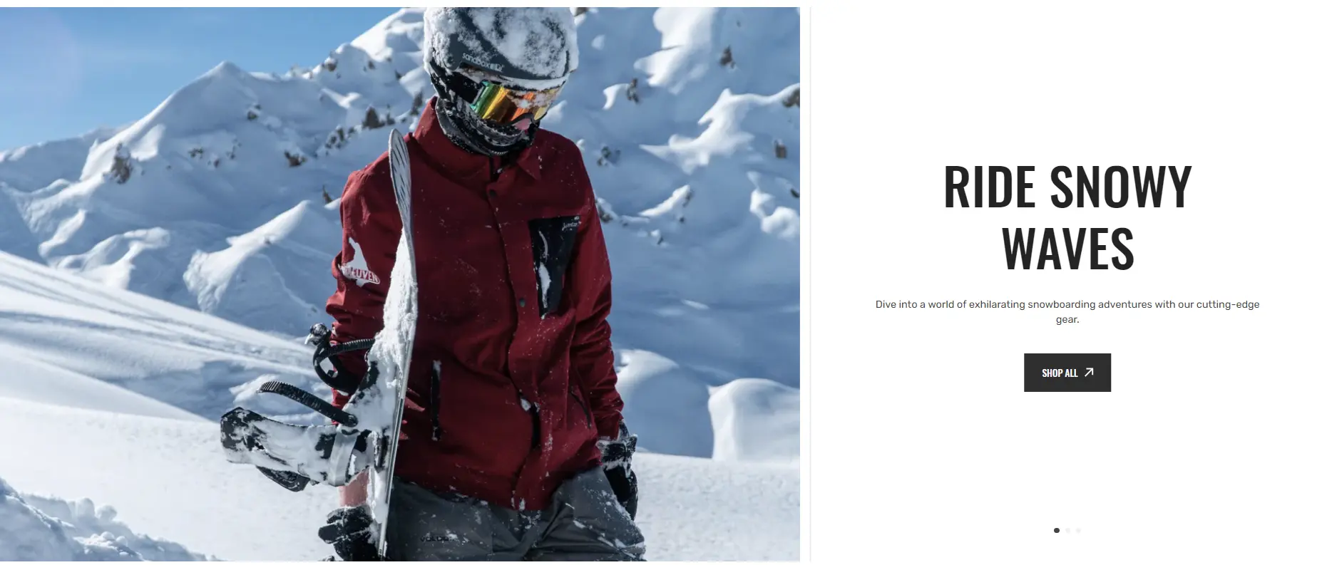
- Layout selector allows you to enable this section with full screen or make it in container.
- Image size selector allows you to change the height of this section.
- Enable autoplay checkbox field allows you to enable autoplay for slider.
- Stopping on hover checkbox field allows you to stop slider autoplay while hovering.
- Show arrows checkbox field enables the display arrows.
- Show bullets checkbox field enables the display bullets.
- Speed slider allows you to change speed of transition between items.
- Delay slider allows you to change delay after each slide.
- Enable parallax checkbox field allows you to enable the parallax effect for sliding.
- Sliding effects selector allows you to choose a few sliding effects.
- Block Item options Color scheme selector to change the color scheme.
- Block Item options Heading allows you to set a heading for the block.
- Block Item options Text allows you to set a text for the block.
- Block Item options Image allows you to set an image for the block.
- Block Item options Overlay opacity slider allows you to change the opacity of the overlay.
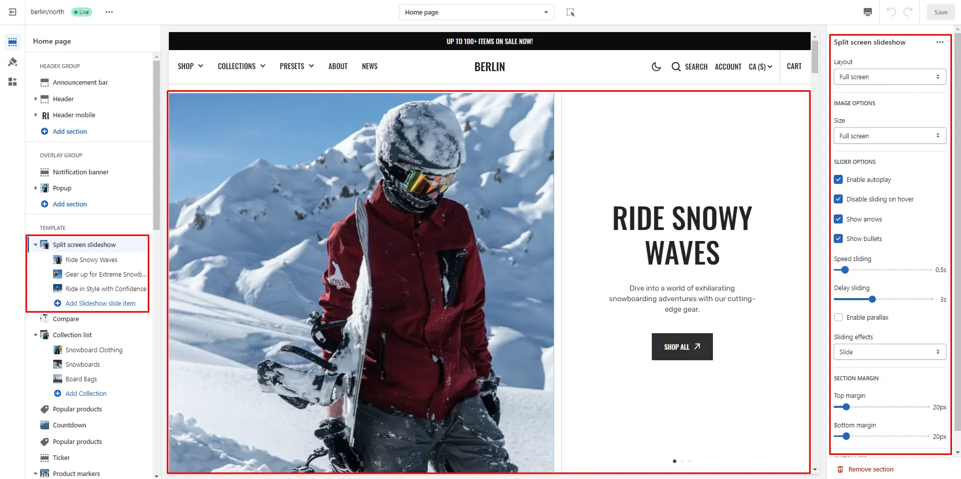
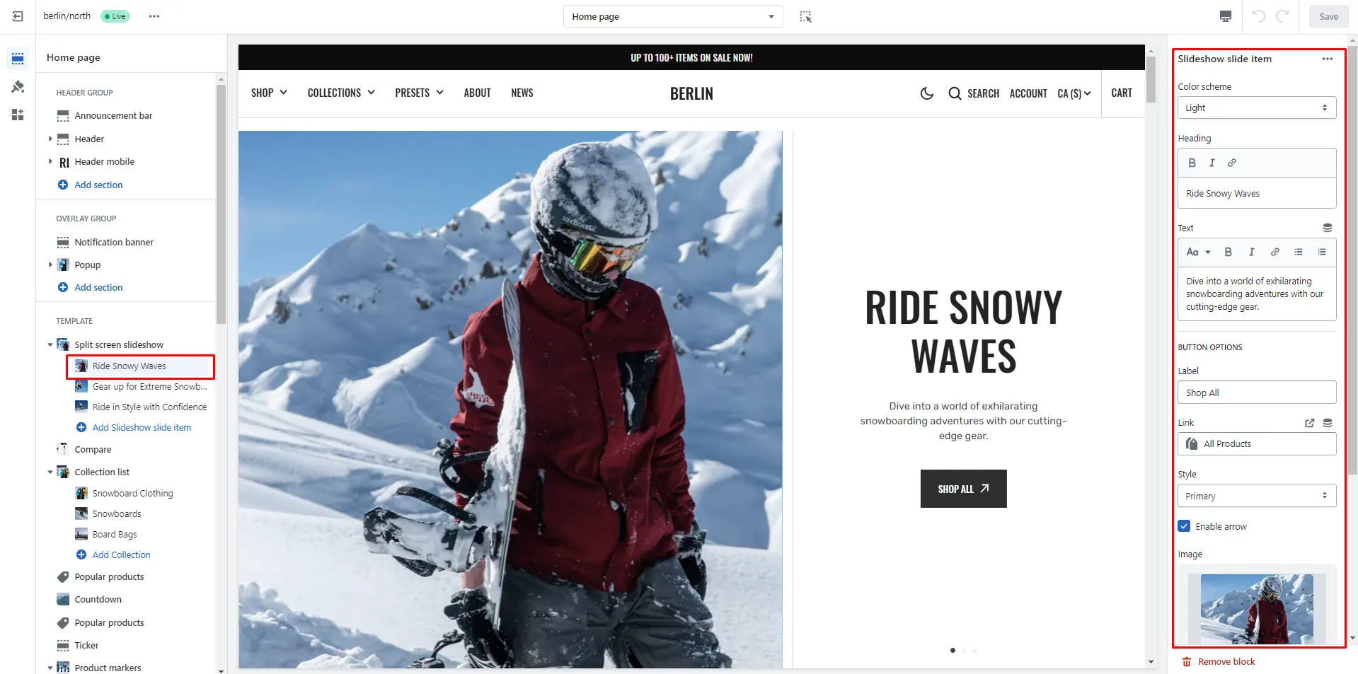
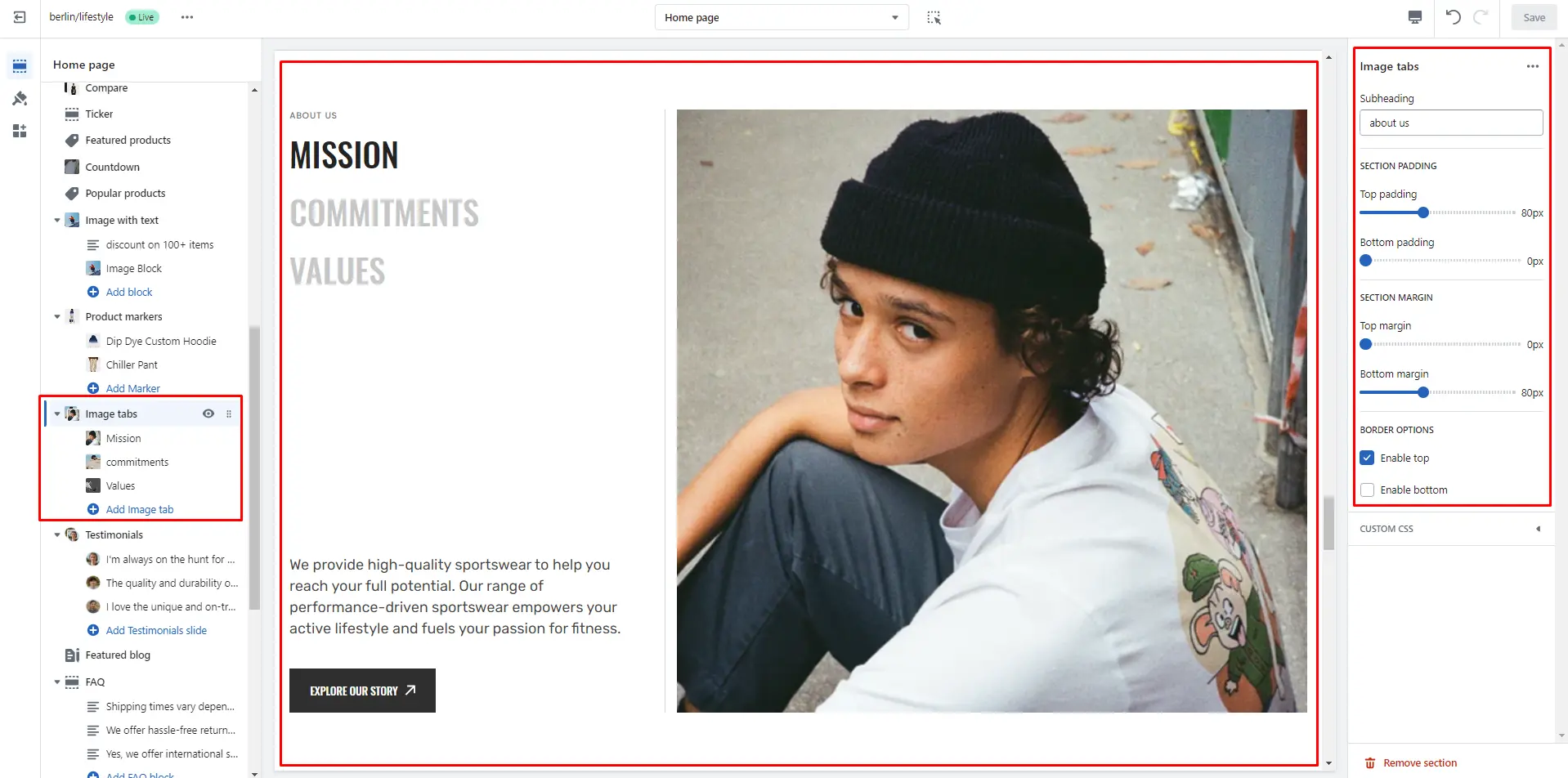
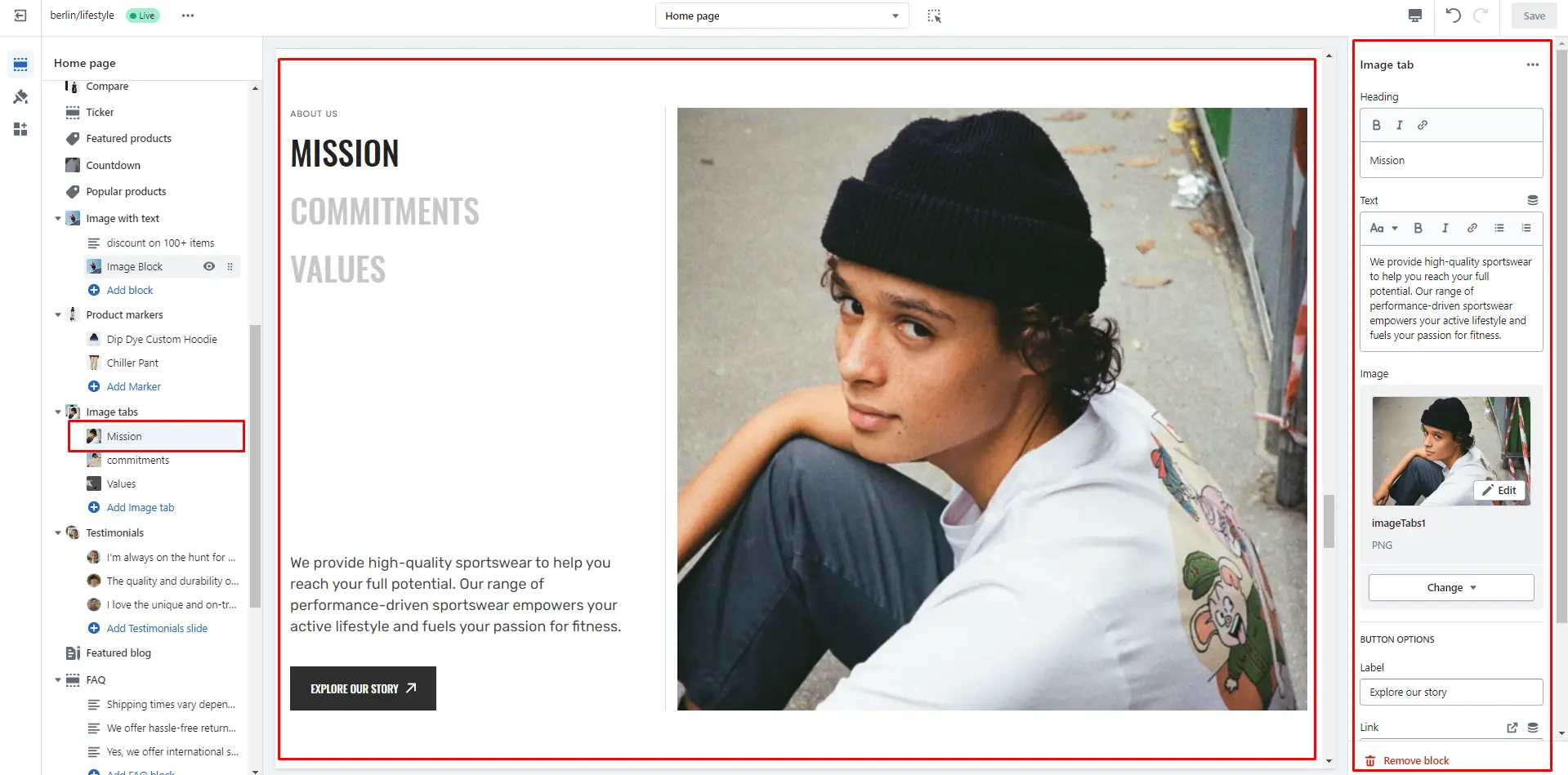
Image tabs
Section displaying several tabs with images and descriptions.
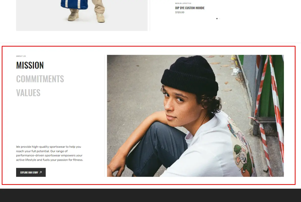
- Subheading allows you to set a subheading for the section.
- Block Tabs options Heading allows you to set a heading for the block.
- Block Tabs options Text allows you to set a text for the block.
- Block Tabs options Image allows you to set an image for the block.
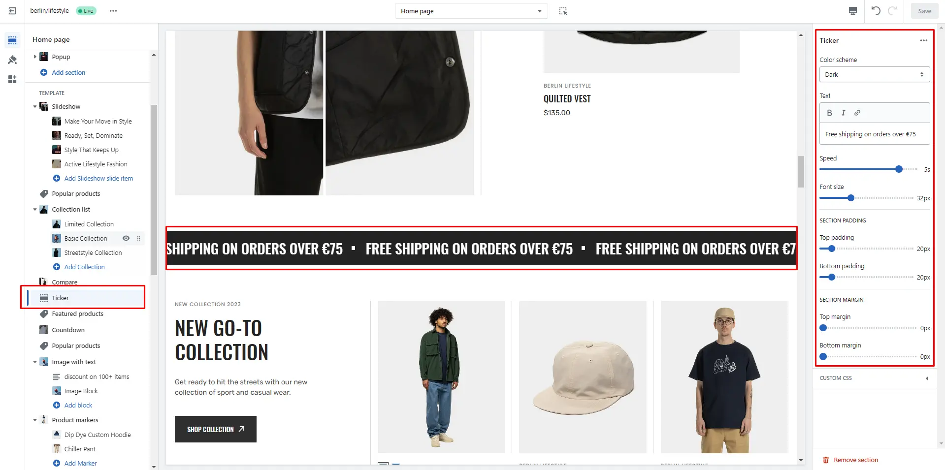
Ticker
The section allows you to add scrolling ticker
- Color scheme selector to change the color scheme.
- Text allows you to set a text for the ticker.
- Speed allows you to change speed for the ticker.
- Font Size allows you to change font size for the ticker text.
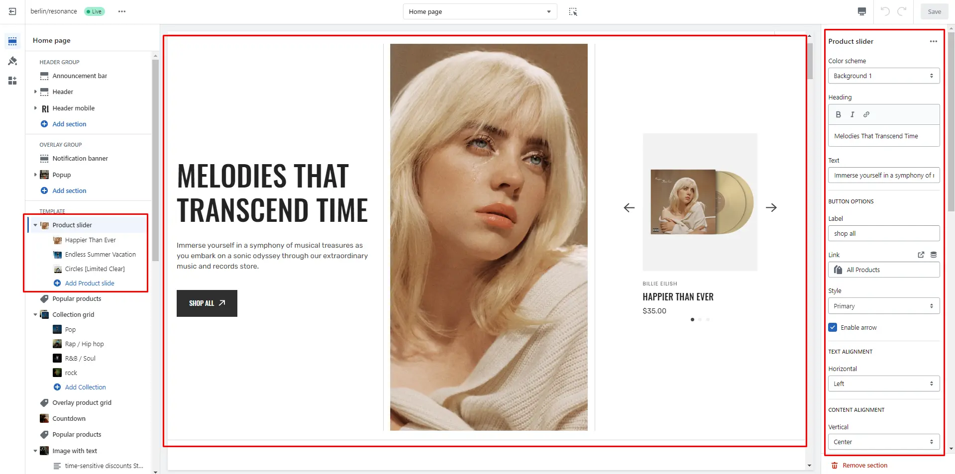
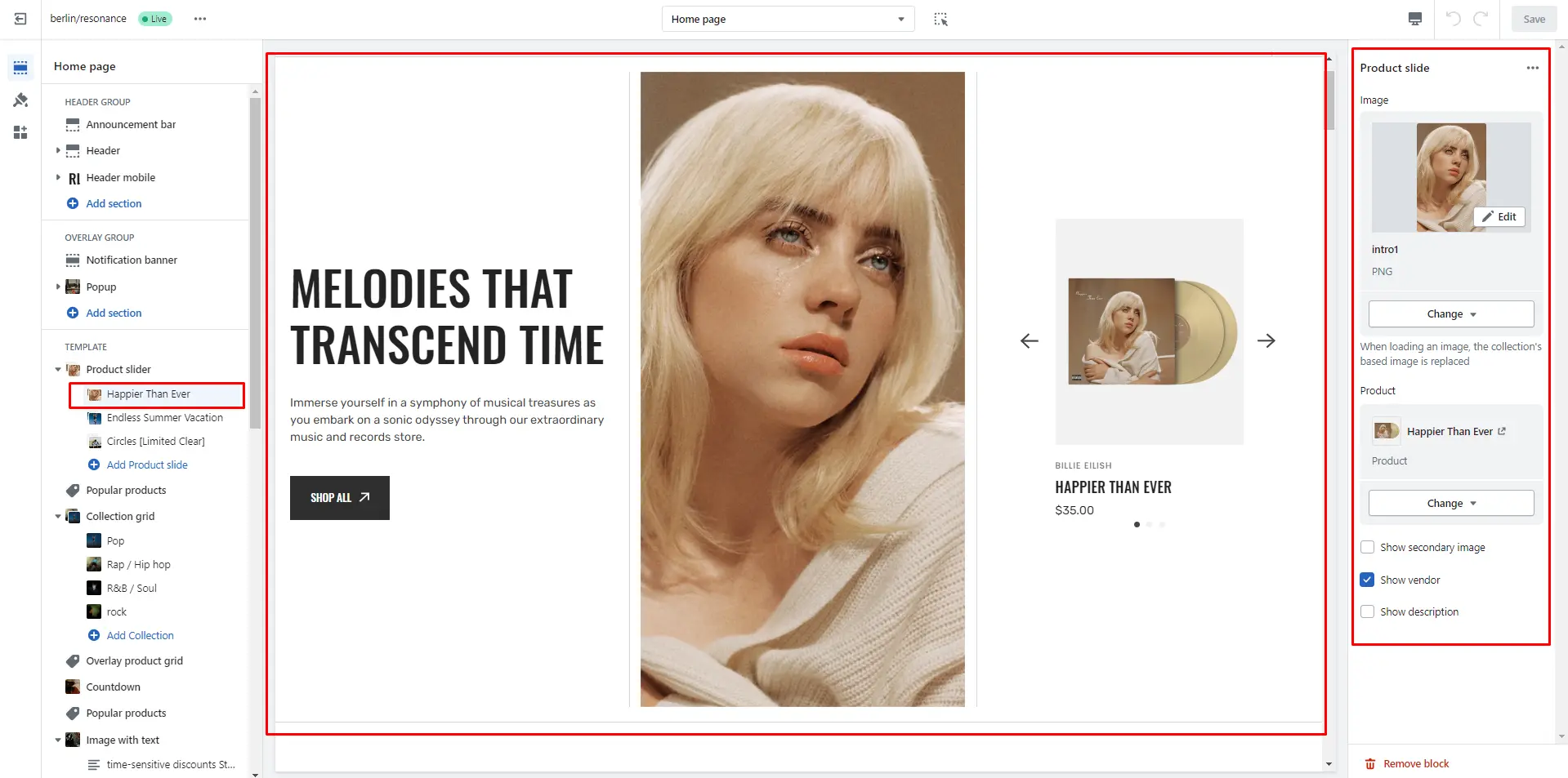
Product slider
The section allows you to add slides, select products, and customize their display.
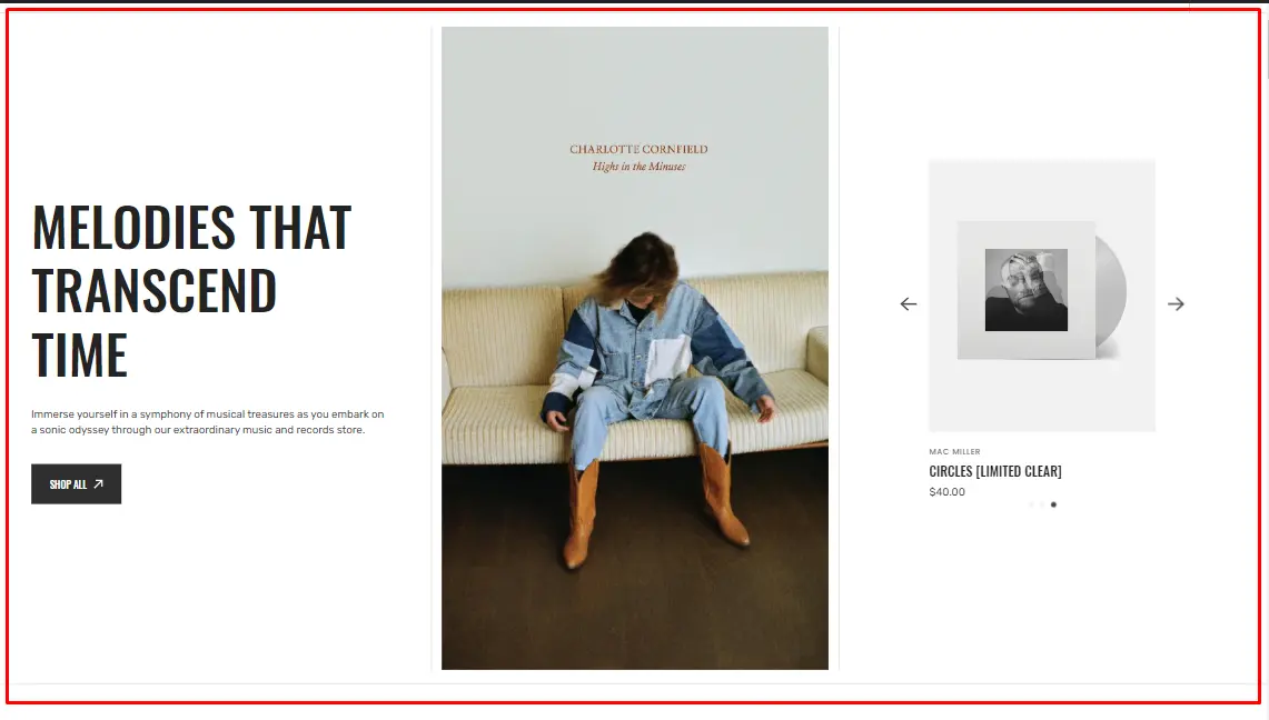
- Use Color scheme selector to change the color scheme.
- Heading allows you to set a heading for the section.
- Text allows you to set a text for the section.
- Image allows you to set an image for the section.
- Use Text horizontal alignment selector to change the position of the text horizontally.
- Use Content vertical alignment selector to change the position of the content vertically.
- Image size selector allows you to change the height of this section.
- Enable autoplay checkbox field allows you to enable autoplay for slider.
- Stopping on hover checkbox field allows you to stop slider autoplay while hovering.
- Show arrows checkbox field enables the display arrows.
- Show bullets checkbox field enables the display bullets.
- Speed slider allows you to change speed of transition between items.
- Delay slider allows you to change delay after each slide.
- Sliding effects selector allows you to choose a few sliding effects.
- Product card options allow you to customize product cards in the section.
- Block Product slide options Image allows you to set an image for the block.
- Block Product slide options Product select product that will be displayed and customize the product card in the block.
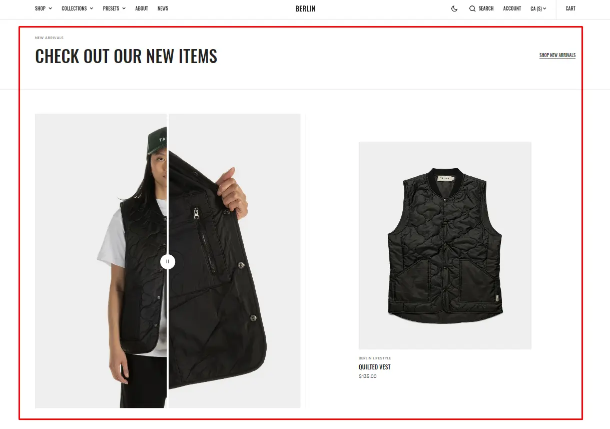
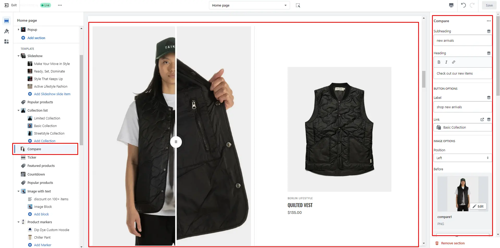
Compare
The section allows you to compare products results.
- Subheading allows you to set a subheading for the section.
- Heading allows you to set a heading for the section.
- Use Position selector to change the position.
- Image before allows you to set a first comparison image.
- Image after allows you to set a second comparison image.
- Product card options allow you to add a product and customize the product card in the section.
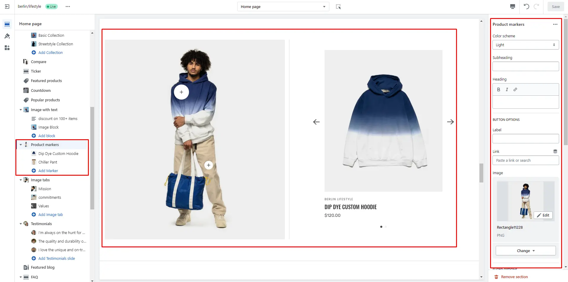
Product markers
The section allows you to mark products in the image and choose display position
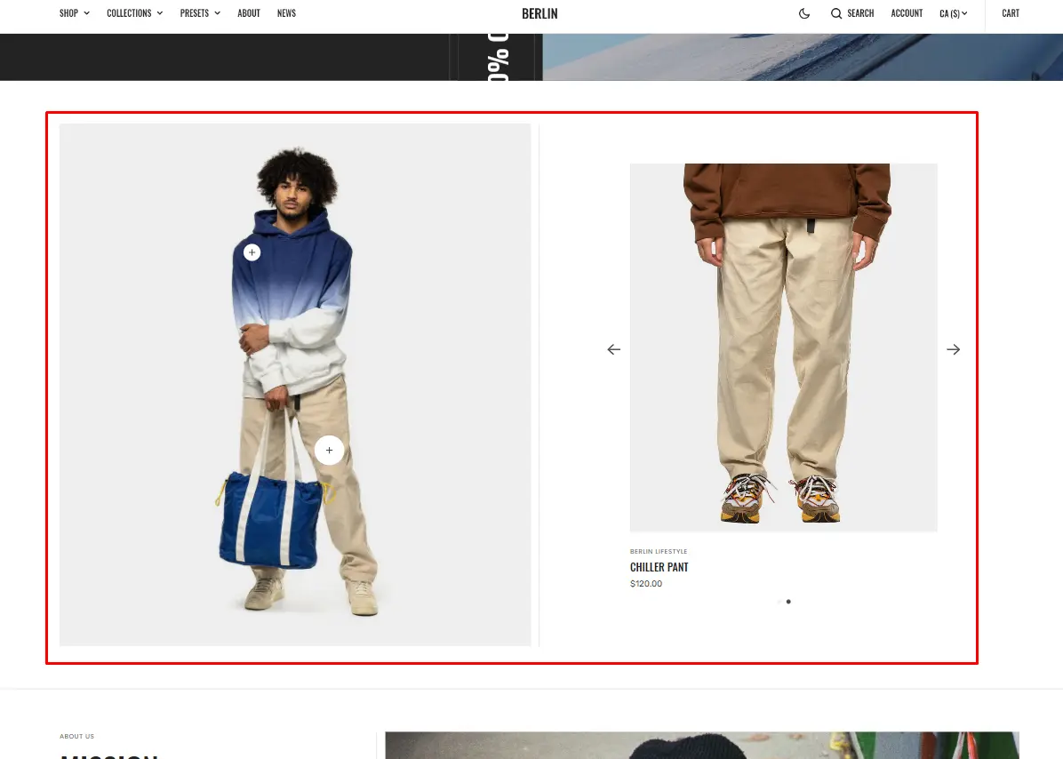
- Use Color scheme selector to change the color scheme.
- Subheading allows you to set a subheading for the section.
- Heading allows you to set a heading for the section.
- Image allows you to set an image for the section.
- Enable autoplay checkbox field allows you to enable autoplay for slider.
- Stopping on hover checkbox field allows you to stop slider autoplay while hovering.
- Show arrows checkbox field enables the display arrows.
- Show bullets checkbox field enables the display bullets.
- Speed slider allows you to change speed of transition between items.
- Delay slider allows you to change delay after each slide.
- Sliding effects selector allows you to choose a few sliding effects.
- Product card options allow you to customize product cards in the section
- Block Marker options Marker options allow you to choose display position for the marker.
- Block Marker options Product select product that will be displayed and customize the product card in the block.
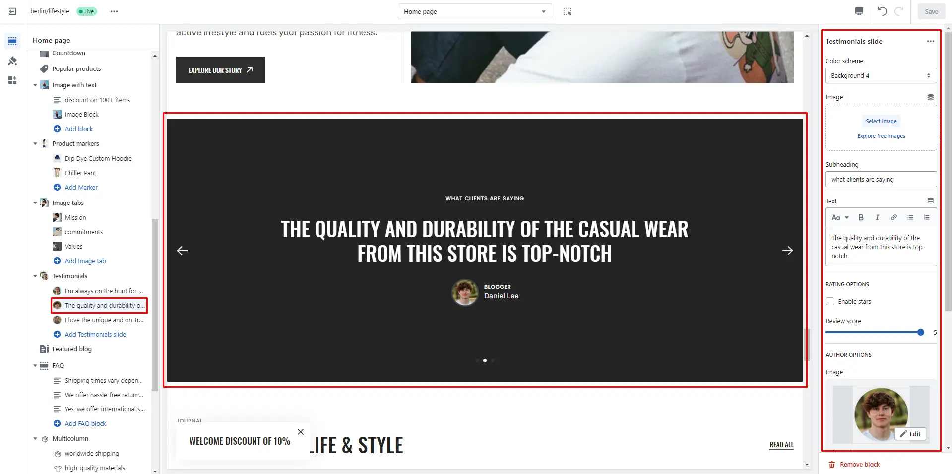
Testimonials
This section enables to add sliding product testimonials customer review.
- Size selector allows you to change the height of this section.
- Enable autoplay checkbox field allows you to enable autoplay for slider.
- Stopping on hover checkbox field allows you to stop slider autoplay while hovering.
- Show arrows checkbox field enables the display arrows.
- Show bullets checkbox field enables the display bullets.
- Speed slider allows you to change speed of transition between items.
- Delay slider allows you to change delay after each slide.
- Enable parallax checkbox field allows you to enable the parallax effect for sliding.
- Sliding effects selector allows you to choose a few sliding effects.
- Block Testimonials slide options Color scheme selector to change the color scheme.
- Block Testimonials slide options Image allows you to set an image for the section background.
- Block Testimonials slide options Subheading allows you to set a subheading for the block.
- Block Testimonials slide options Text allows you to set a text for the block.
- Block Testimonials slide options RATING OPTIONS allows you to add a rating from 0 to 5.
- Block Testimonials slide options AUTHOR OPTIONS allows you to customize Author.
- Block Testimonials slide options Overlay opacity slider allows you to change the opacity of the overlay.
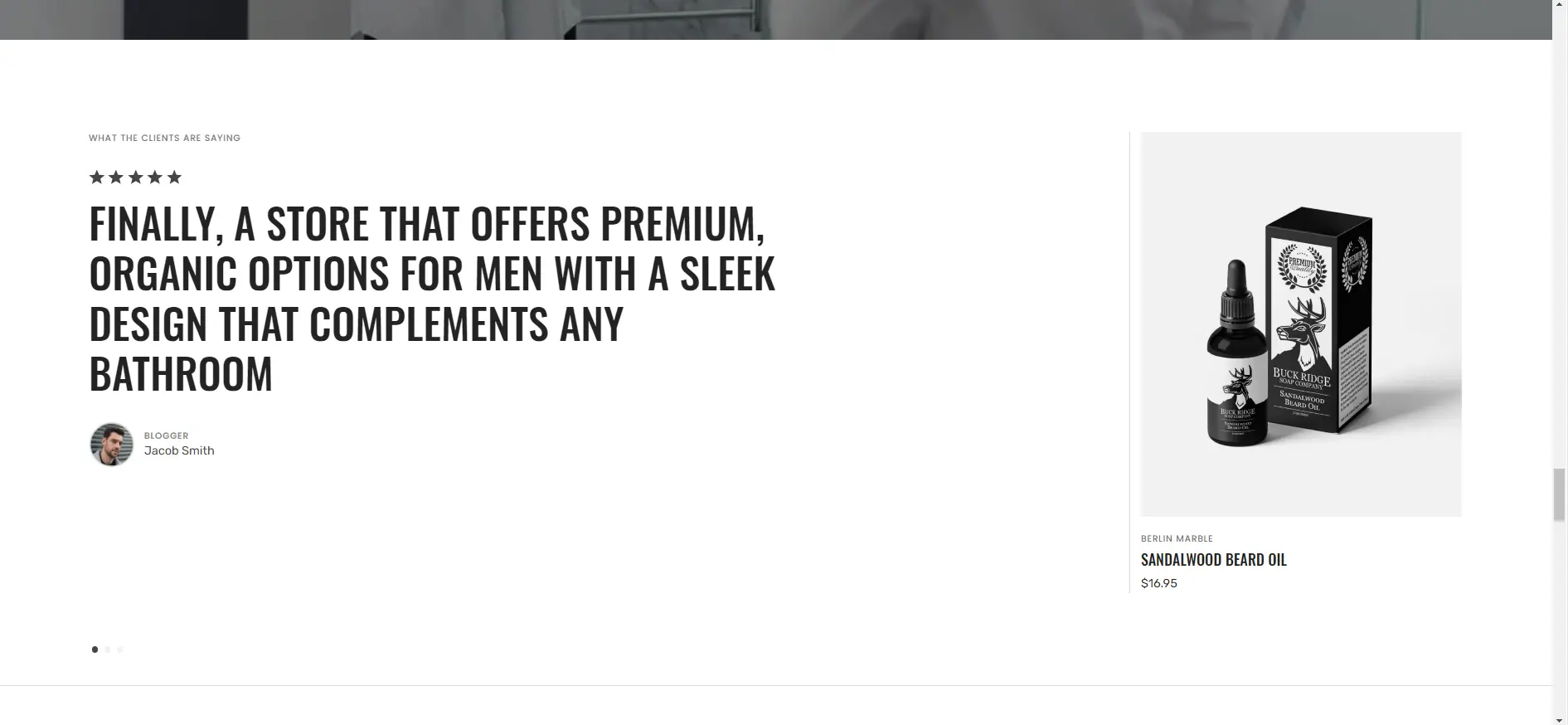
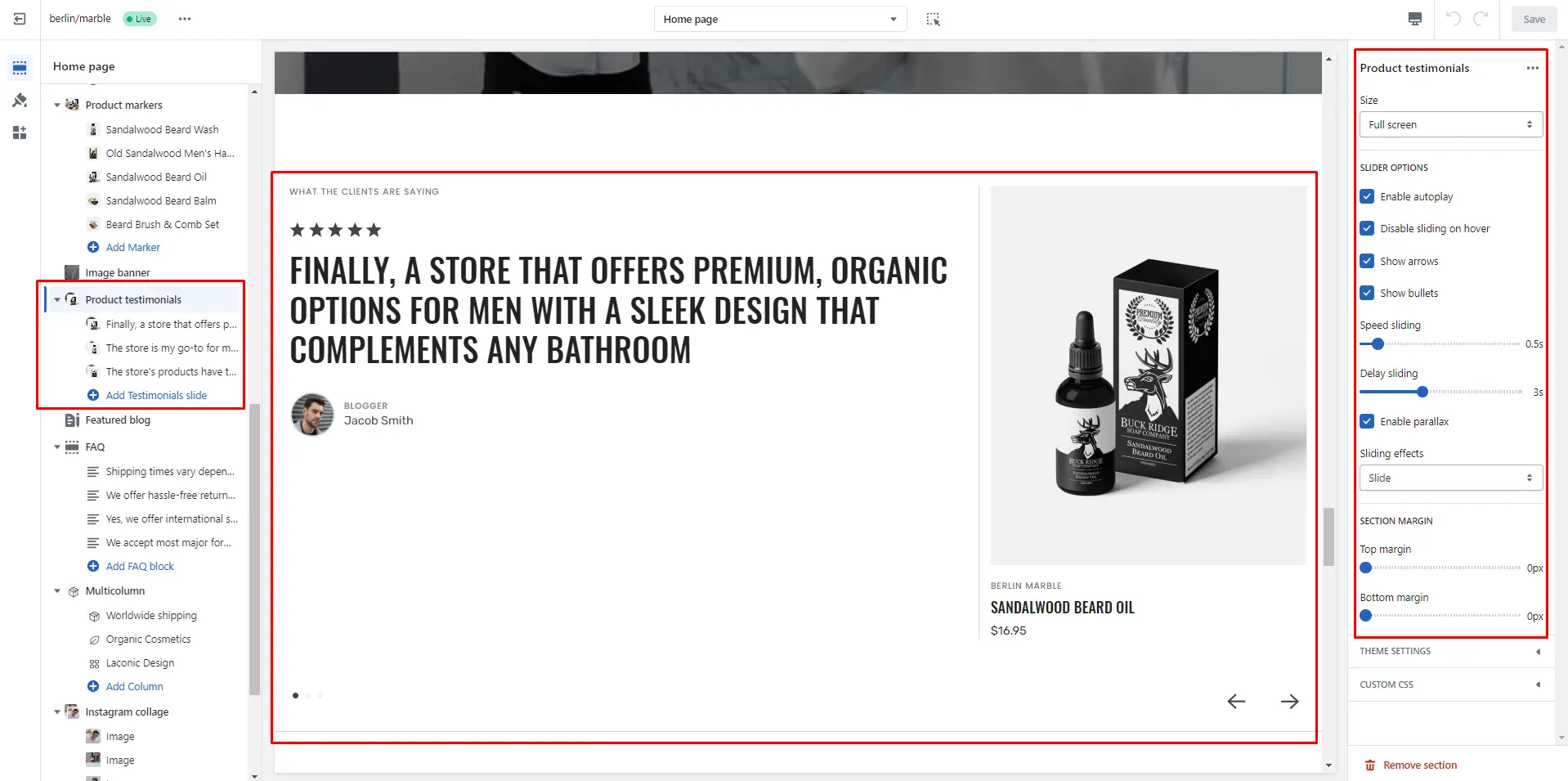
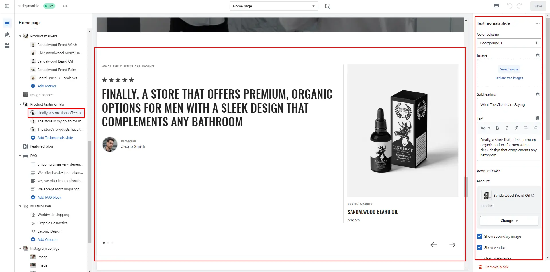
Product testimonials
This section enables to add sliding product testimonials with product and customer review.
- Size selector allows you to change the height of this section.
- Enable autoplay checkbox field allows you to enable autoplay for slider.
- Stopping on hover checkbox field allows you to stop slider autoplay while hovering.
- Show arrows checkbox field enables the display arrows.
- Show bullets checkbox field enables the display bullets.
- Speed slider allows you to change speed of transition between items.
- Delay slider allows you to change delay after each slide.
- Enable parallax checkbox field allows you to enable the parallax effect for sliding.
- Sliding effects selector allows you to choose a few sliding effects.
- Block Testimonials slide options Color scheme selector to change the color scheme.
- Block Testimonials slide options Image allows you to set an image for the section background.
- Block Testimonials slide options Subheading allows you to set a subheading for the block.
- Block Testimonials slide options Text allows you to set a text for the block.
- Block Testimonials slide options Product select product that will be displayed.
- Block Testimonials slide options RATING OPTIONS allows you to add a rating from 0 to 5.
- Block Testimonials slide options AUTHOR OPTIONS allows you to customize Author.
- Block Testimonials slide options Overlay opacity slider allows you to change the opacity of the overlay.
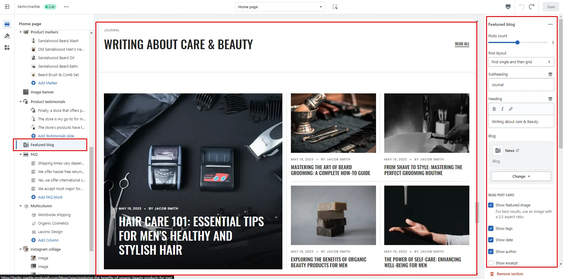
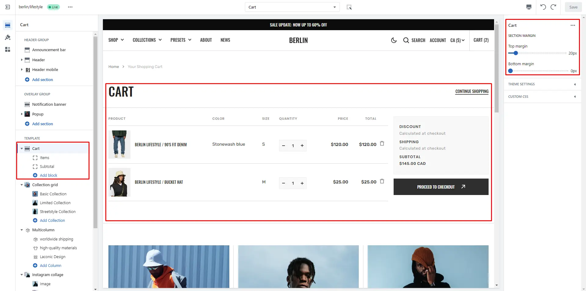
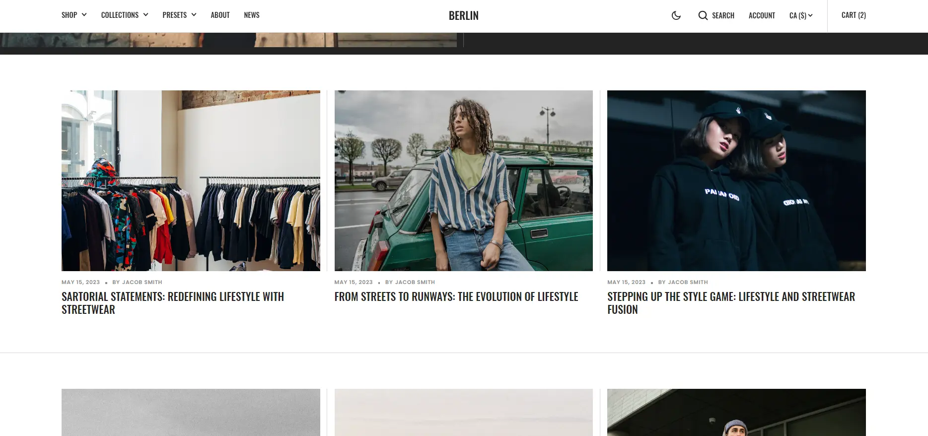
Featured Blog
The section allows you to select a blog and customize it.
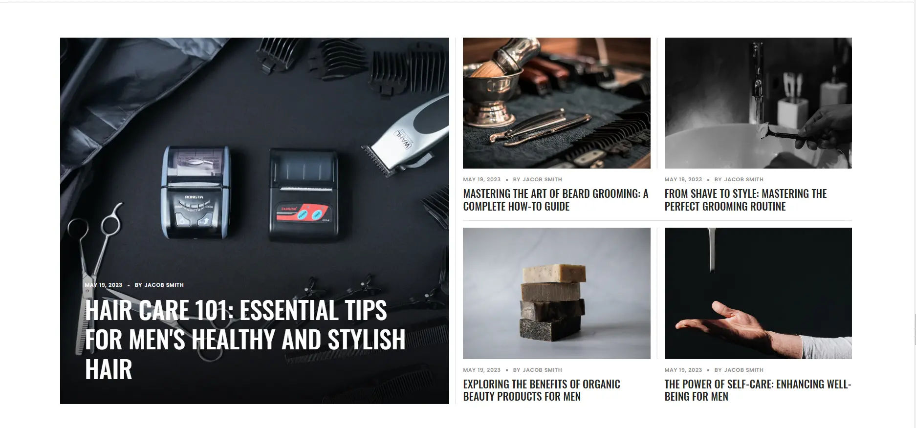
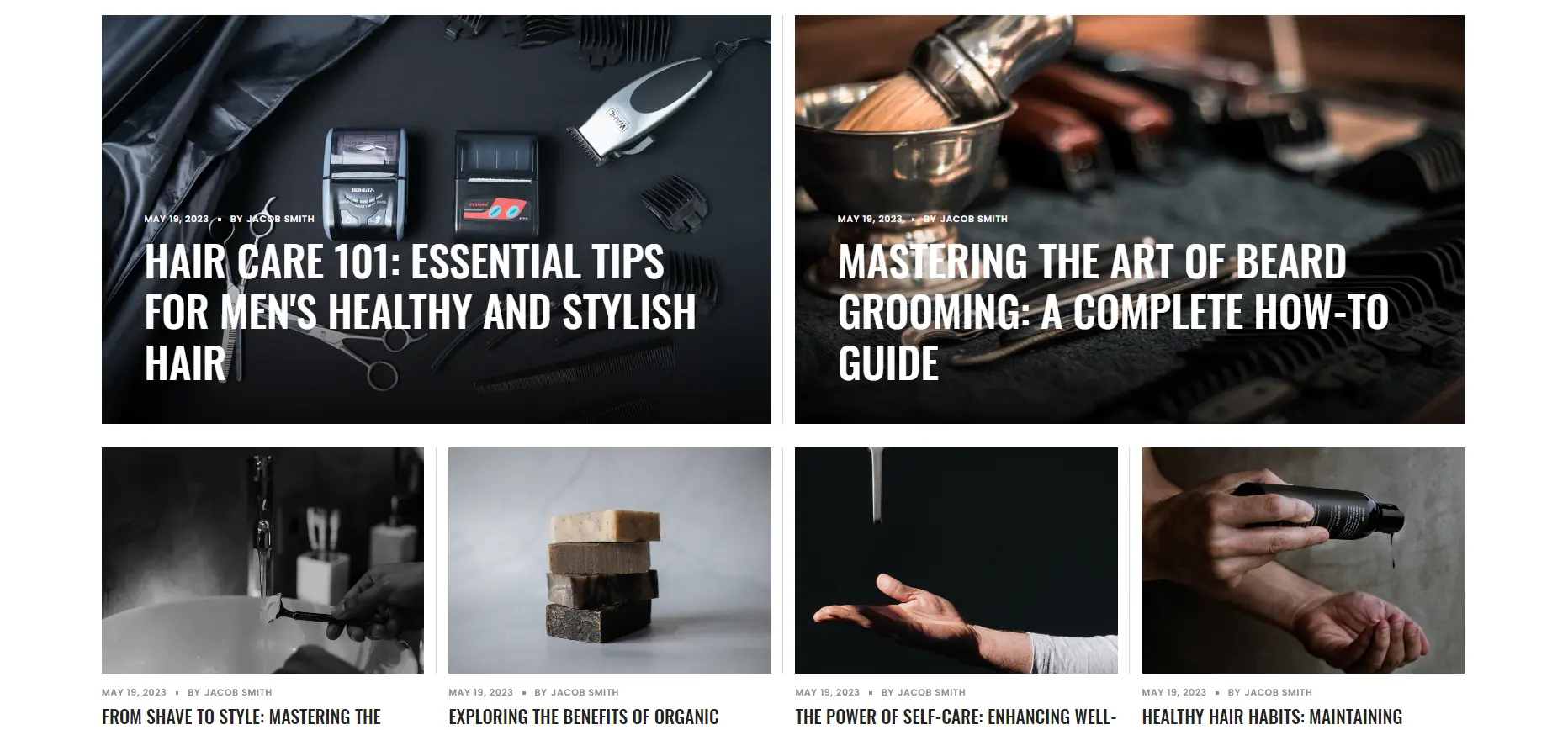
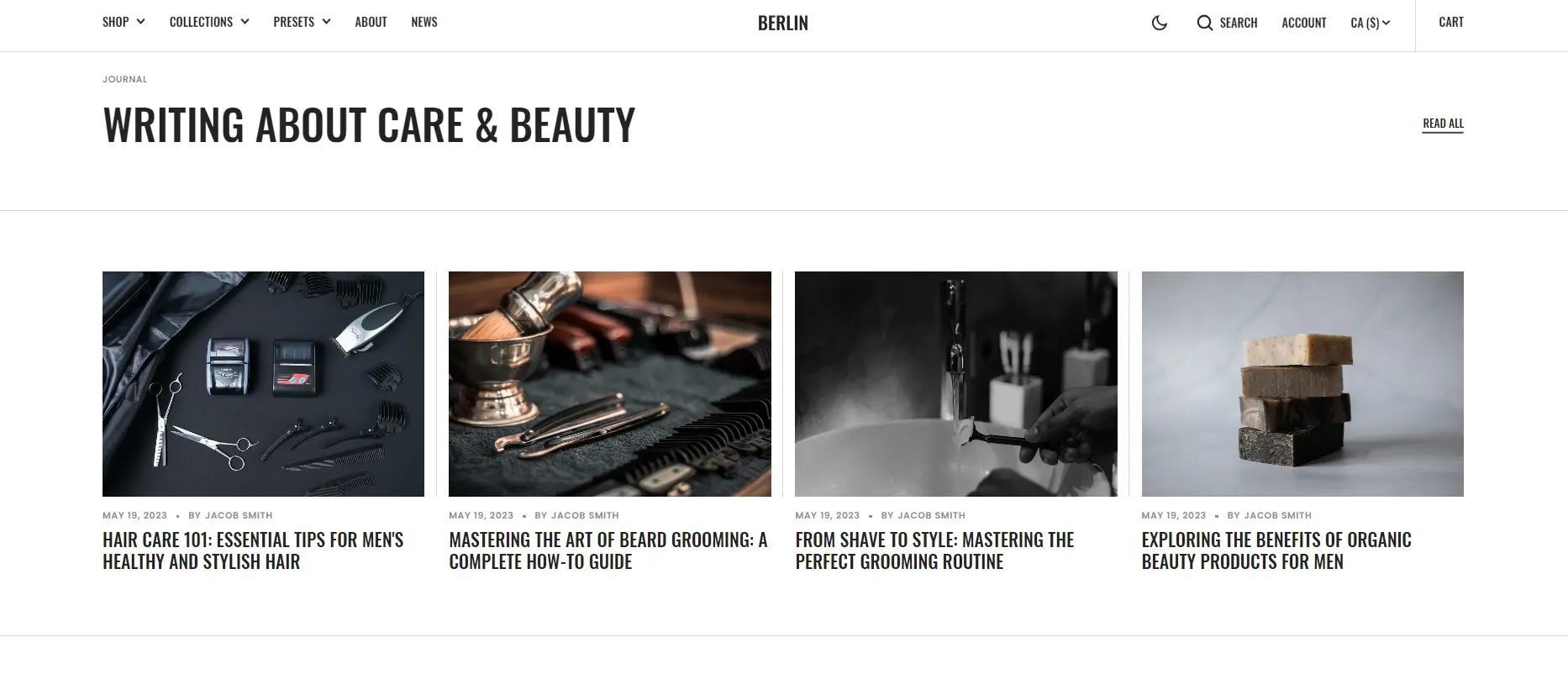
- Posts count slider allows you to change the posts display limit.
- Post layout field allows you to select layout type.
- Subheading allows you to set a subheading for the section.
- Heading allows you to set a heading for the section.
- Blog field allows you to choose a blog.
- Show featured image field enables the display of an image for the blog post.
- Show tags field enables the display of tags for the blog post.
- Show date field enables the display of the date for the blog post.
- Show author field enables the display of the author for the blog post.
- Show excerpt field enables the display of the excerpt for the blog post
- IMAGE OPTIONS allows you to customize the image and their dimensions.
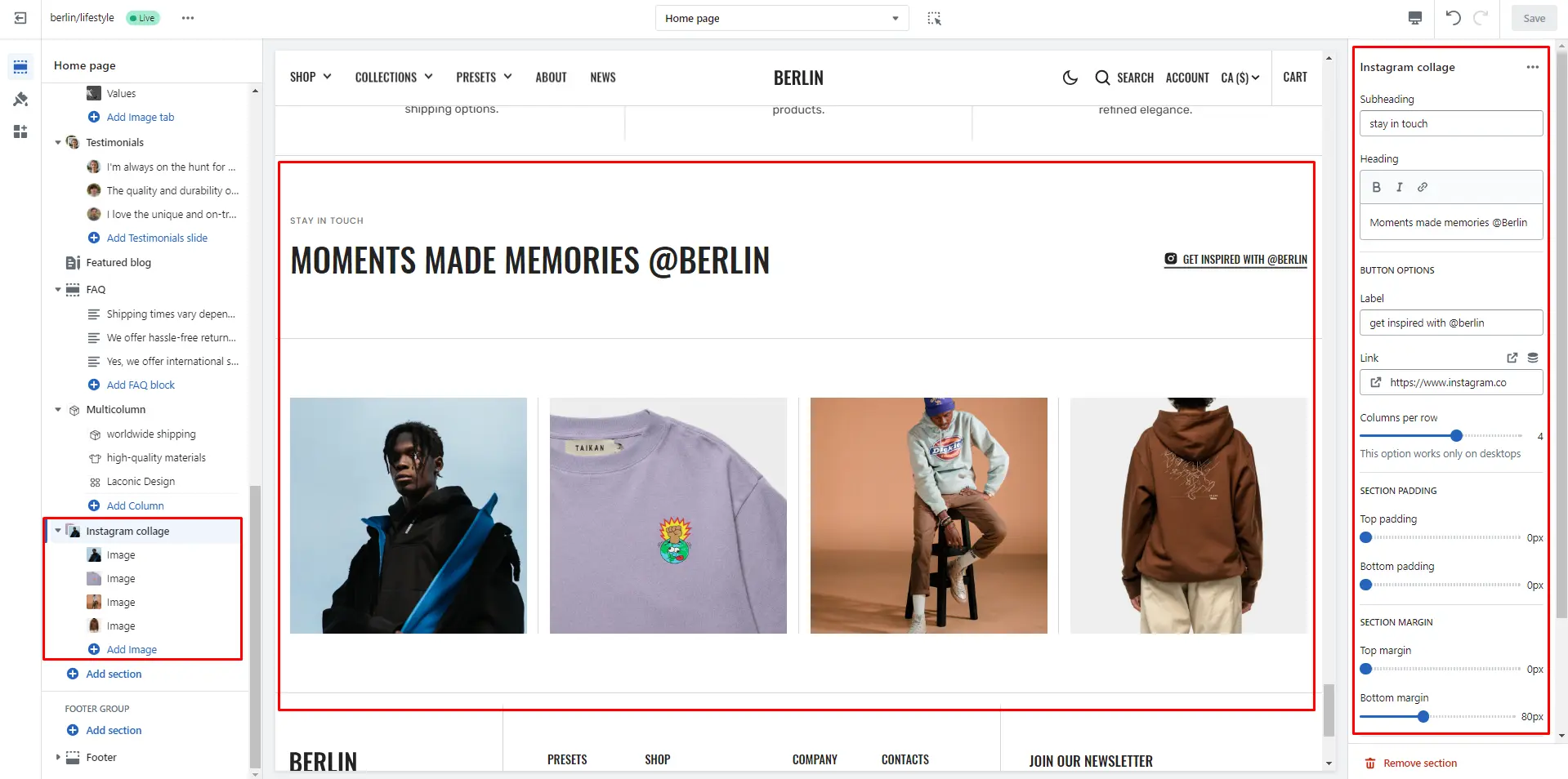
Instagram collage
This section allows to add image collage and link to any source.
- Subheading allows you to set a subheading for the section.
- Heading allows you to set a heading for the section.
- Columns per row slider allows you to change the number of blocks per line only on desktop devices.
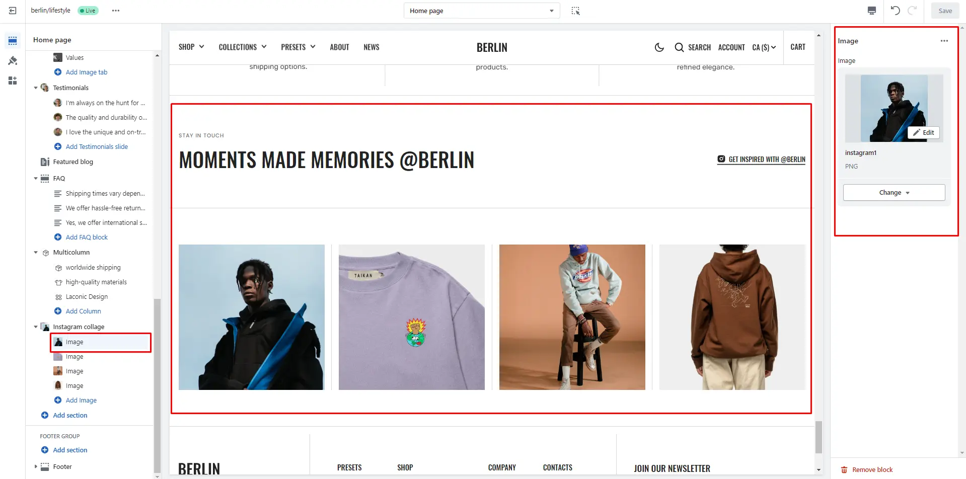
- Block options Image allows you to set an image for the block.
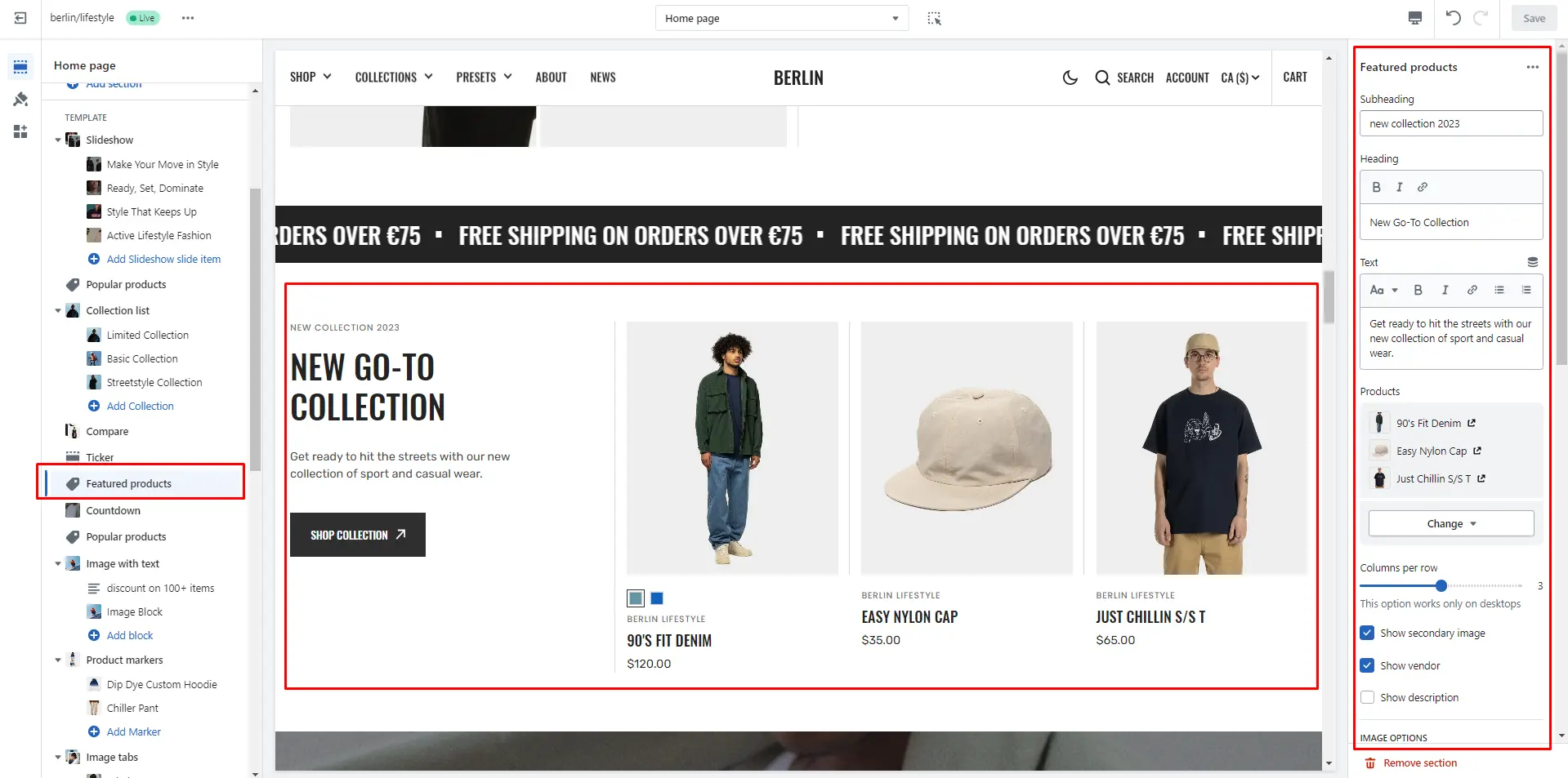
Featured products
The section allows you to select products and customize their display.
- Subheading allows you to set a subheading for the section.
- Heading allows you to set a heading for the section.
- Text allows you to set a text for the section.
- Product card select the products to be displayed and set up the product card.
- Columns per row slider allows you to change the number of products per line only on desktop devices.
- IMAGE OPTIONS allows you to customize the image and their dimensions.
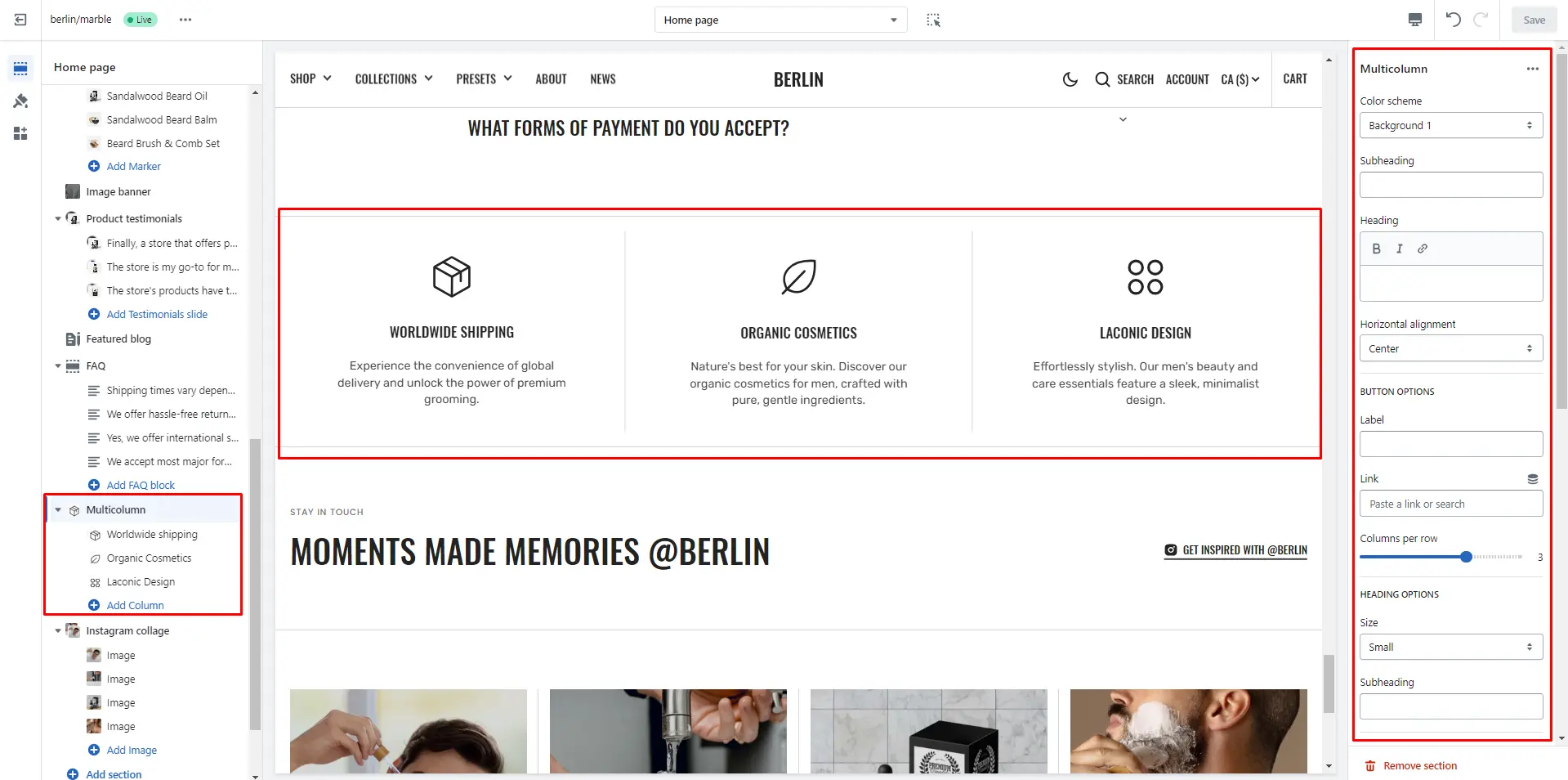
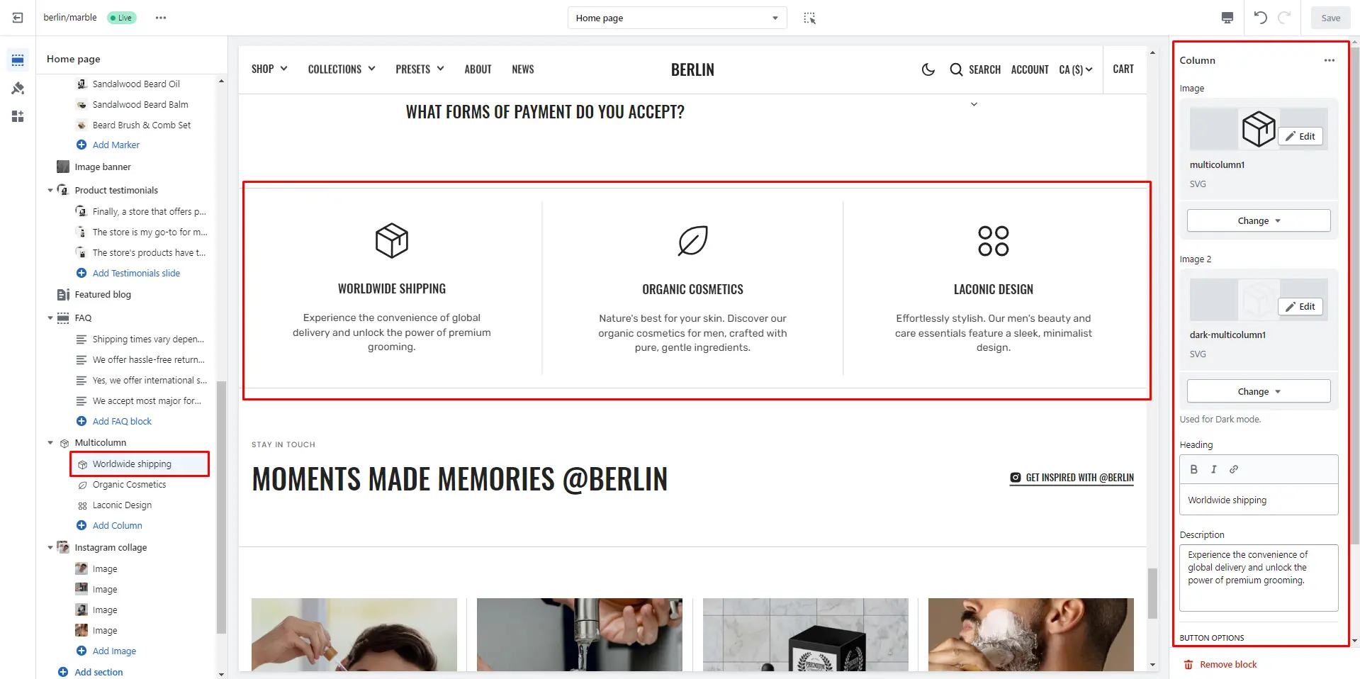
Multicolumn
Allows you to add blocks and customize them.
- Use Color scheme selector to change the color scheme.
- Heading allows you to set a heading for the section.
- Subheading allows you to set a subheading for the section.
- Use Text horizontal alignment selector to change the position of the text horizontally.
- Columns per row slider allows you to change the number of blocks per line only on desktop devices.
- Heading size selector field allows you to change the size of the block header.
- IMAGE OPTIONS allows you to customize the image and their dimensions.
- Swipe on mobile checkbox field allows you to enable the slider on mobile devices.
- Block Column options Image file selector allows you to select or upload your image file.
- Block Column options Image 2 file selector to select or upload your image, which can be seen in Dark mode.
- Block Column options Heading allows you to set a heading for the block.
- Block Column options Description allows you to set a description for the block.
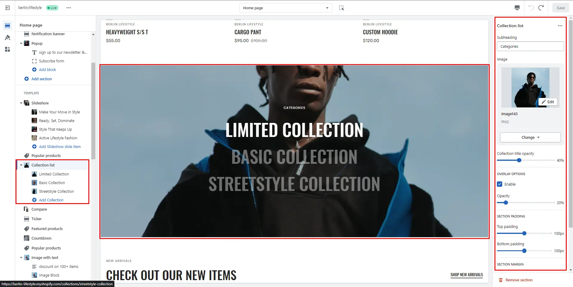
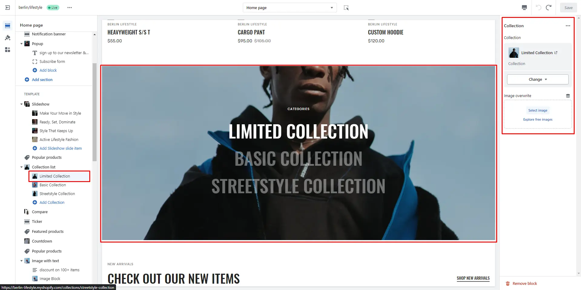
Collection list
Allows you to add collections.
- Subheading allows you to set a subheading for the section.
- Image allows you to set an image for the section background.
- Title opacity slider allows you to change the opacity of the title.
- Overlay opacity slider allows you to change the opacity of the overlay.
- Block Collection options Collection allows you to set a collection for the block.
- Block Collection options Image allows you to set an image for the block.
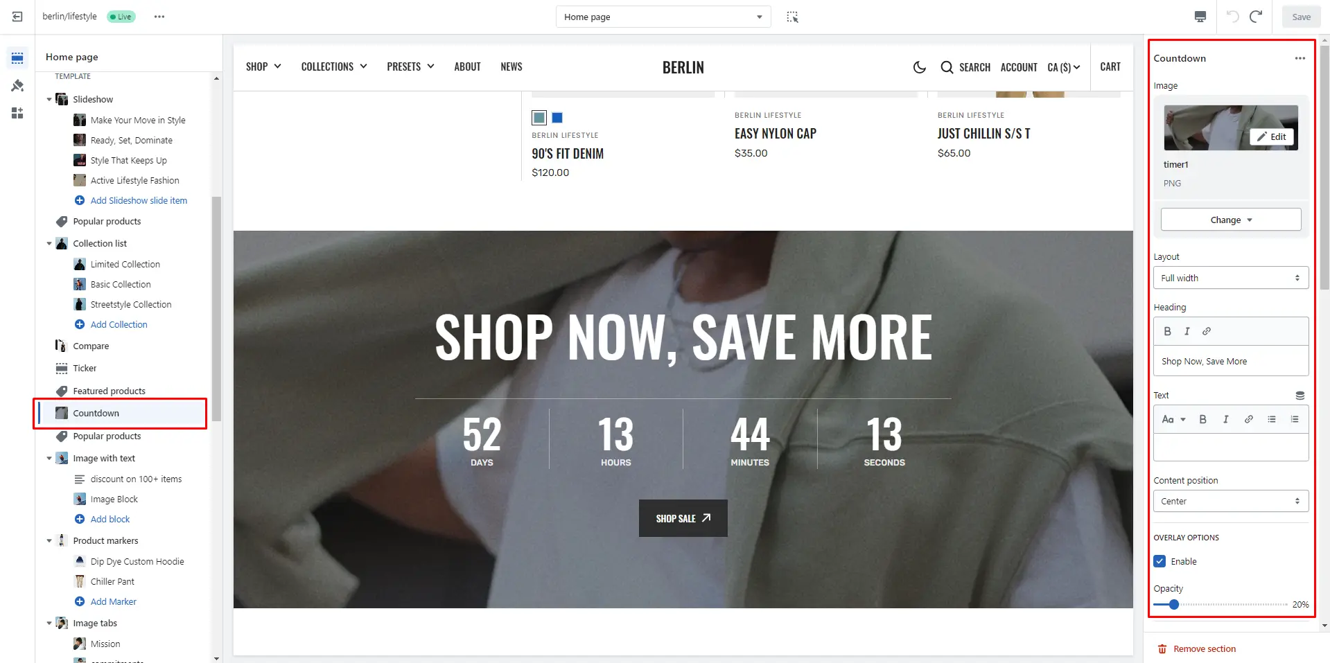
Countdown
You can add and customize a countdown timer.
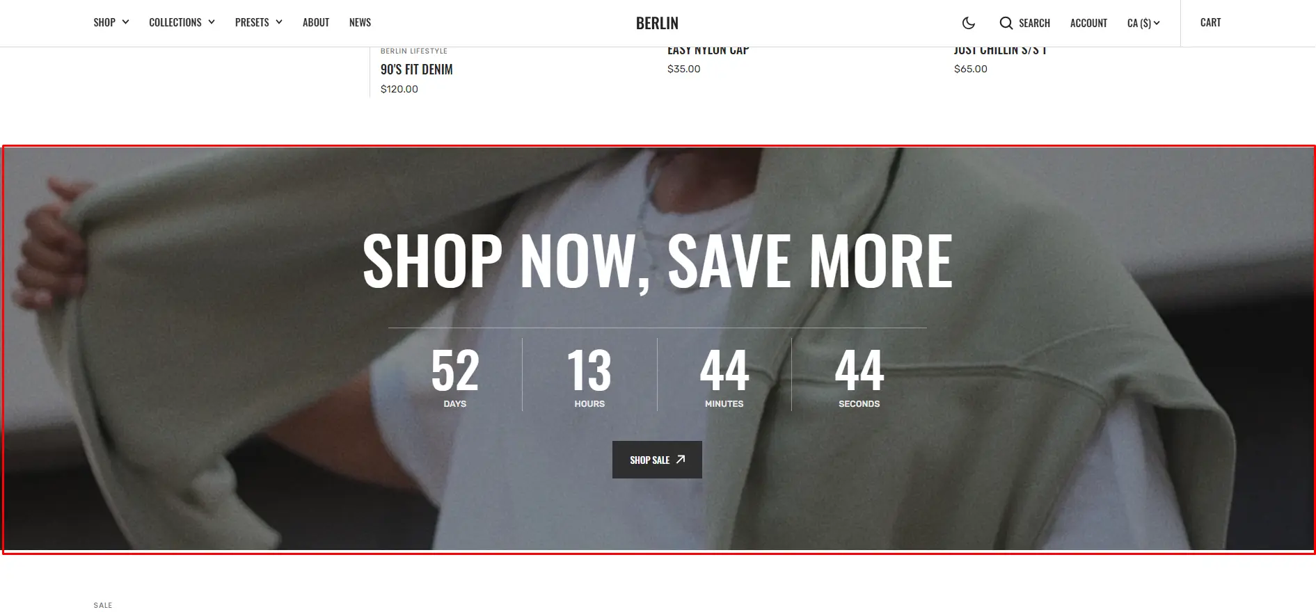
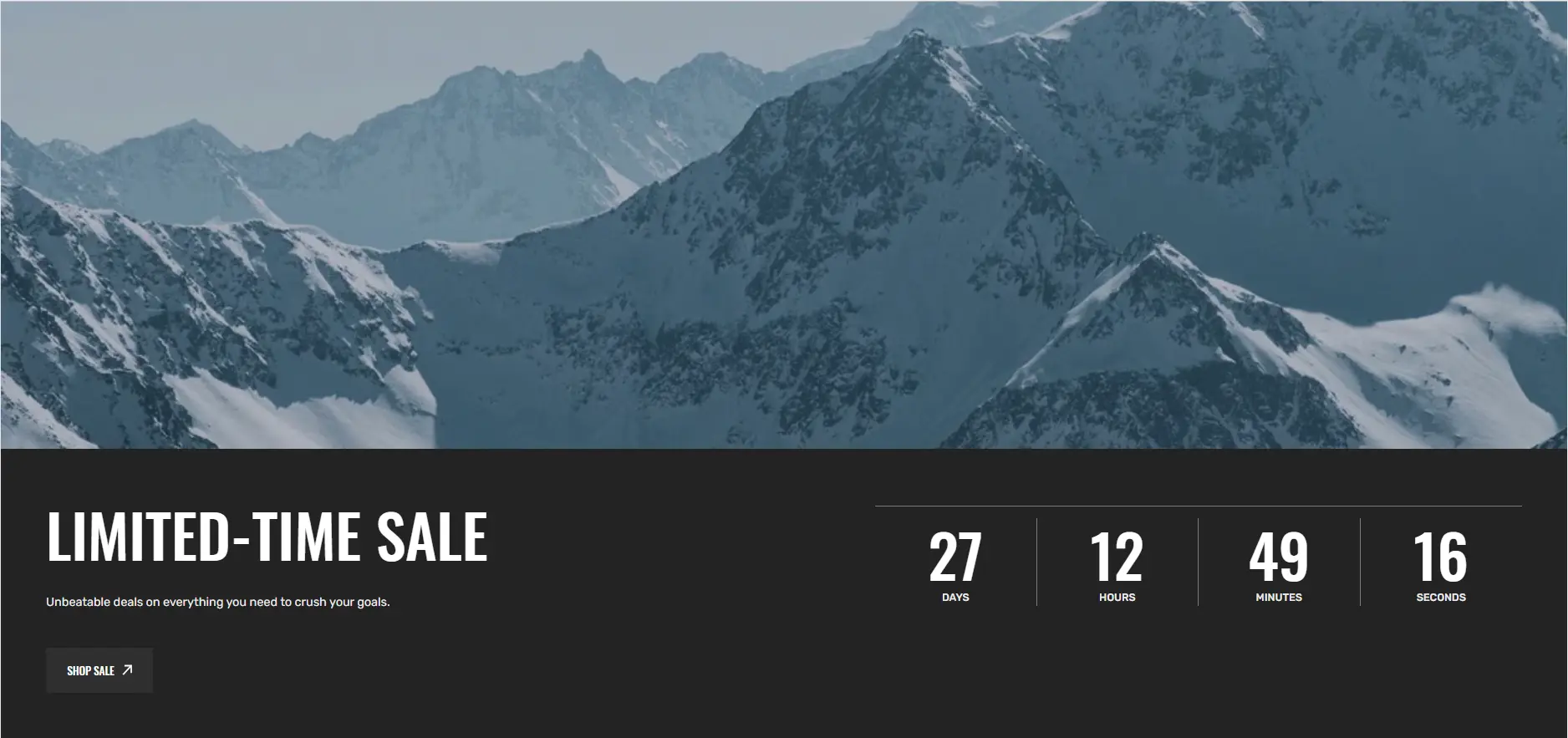
- Image allows you to set an image for the section background.
- Layout field allows you to select layout type.
- Heading allows you to set a heading for the section.
- Text allows you to set a text for the section.
- Use Content position selector to change the position of the content horizontally.
- Overlay opacity slider allows you to change the opacity of the overlay.
- COUNTDOWN OPTIONS allows you to set the time and action after the end of the time.
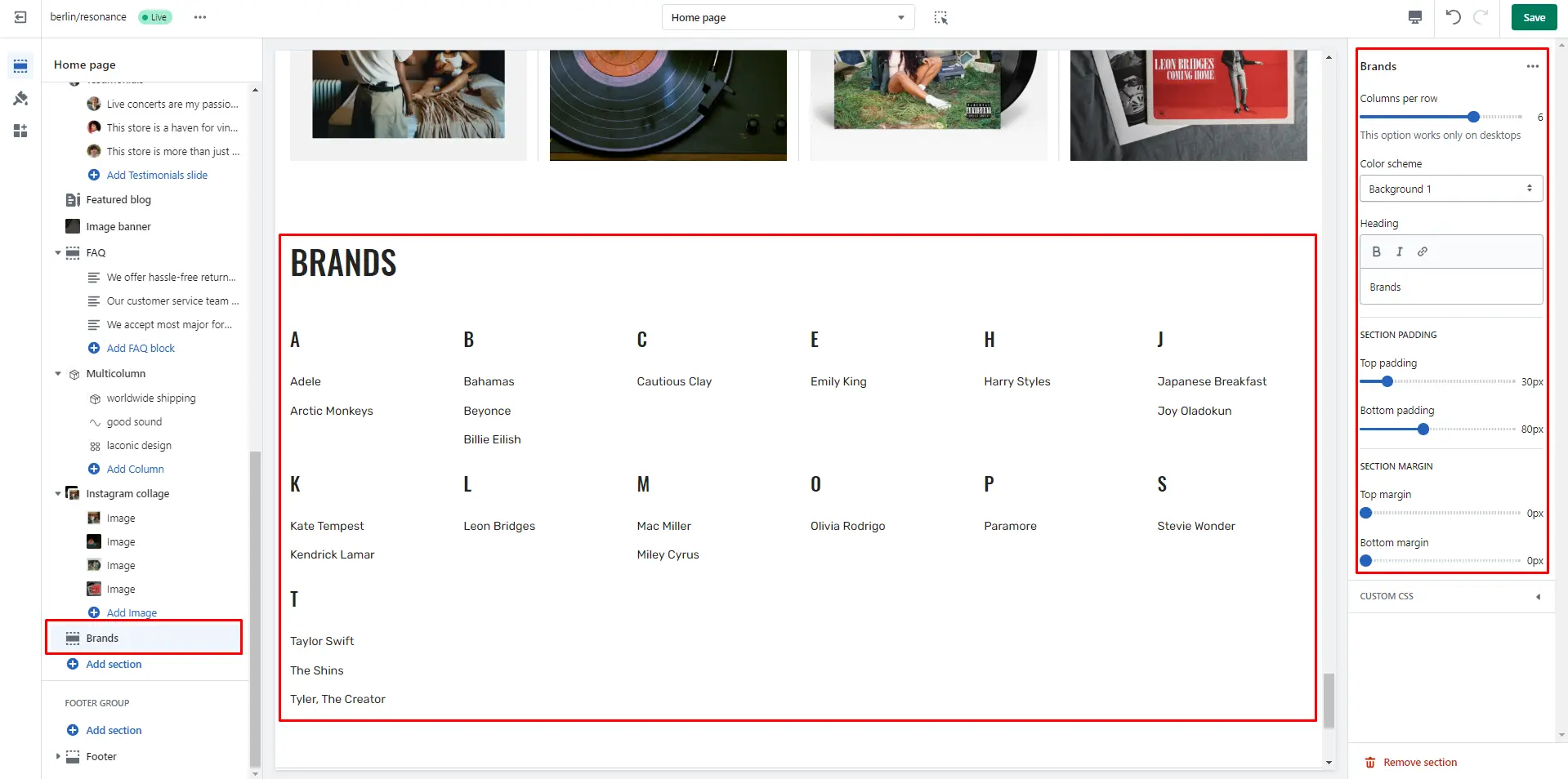
Brands
Section allows you to add all the brands of your store.
- Columns per row slider allows you to change the number of brands per line only on desktop devices.
- Use Color scheme selector to change the color scheme.
- Heading allows you to set a heading for the section.
Blockqoute
Section allows you to add image and blockqoute.
- Image allows you to set an image for the section.
- Position selector to change the image position.
- Heading allows you to set a heading for the section.
- AUTHOR OPTIONS allows you to set a position and name author.
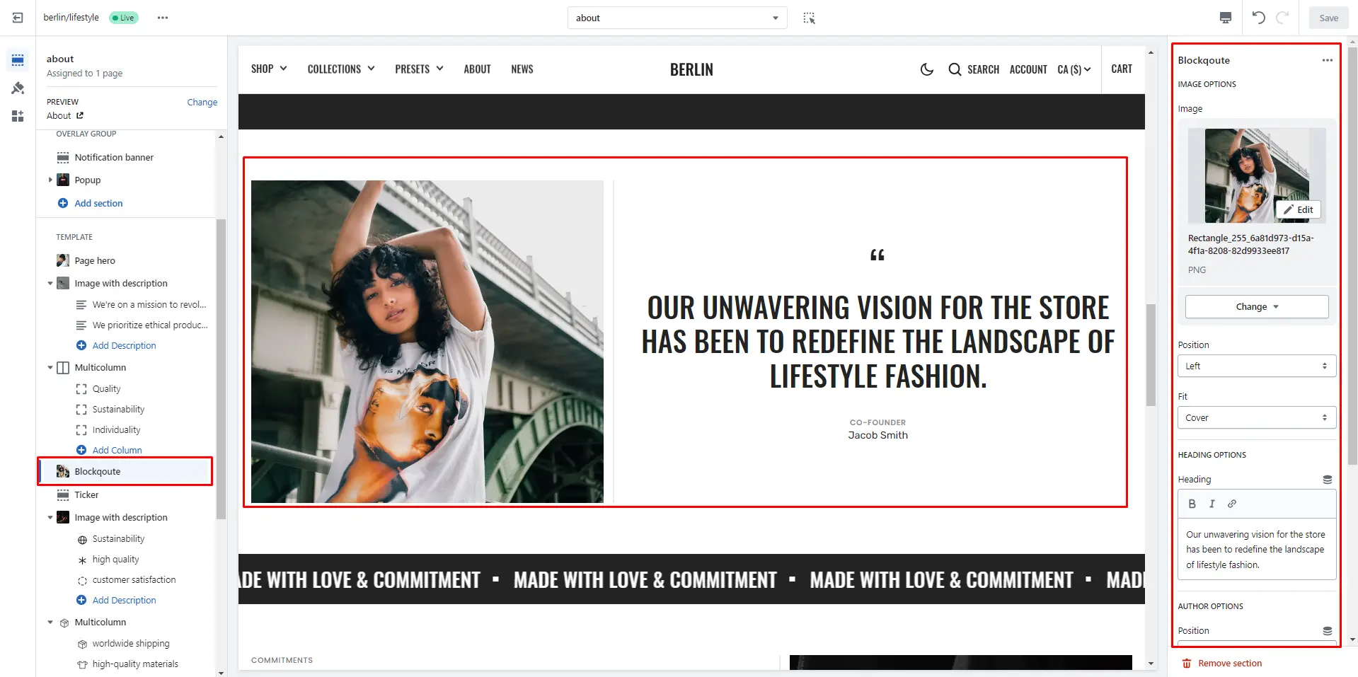
Image Banner
Section allows you to add content with background image.
- Image allows you to set an image for the section background.
- Size allows you to change section height.
- Overlay opacity slider allows you to change the opacity of the overlay.
- Subheading allows you to set a subheading for the section.
- Heading allows you to set a heading for the section.
- Text allows you to set a text for the section.
- AUTHOR OPTIONS allows you to set a position and name author.
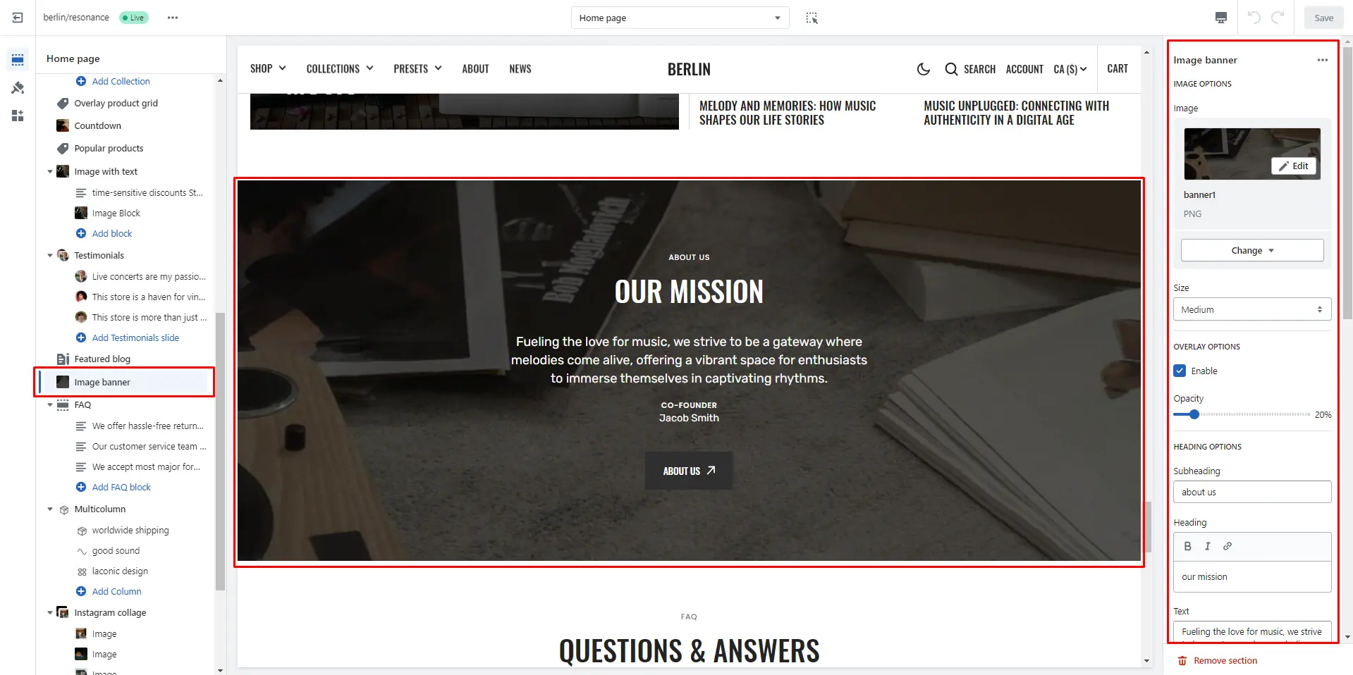
Image with description
Allows you to add image and description blocks.
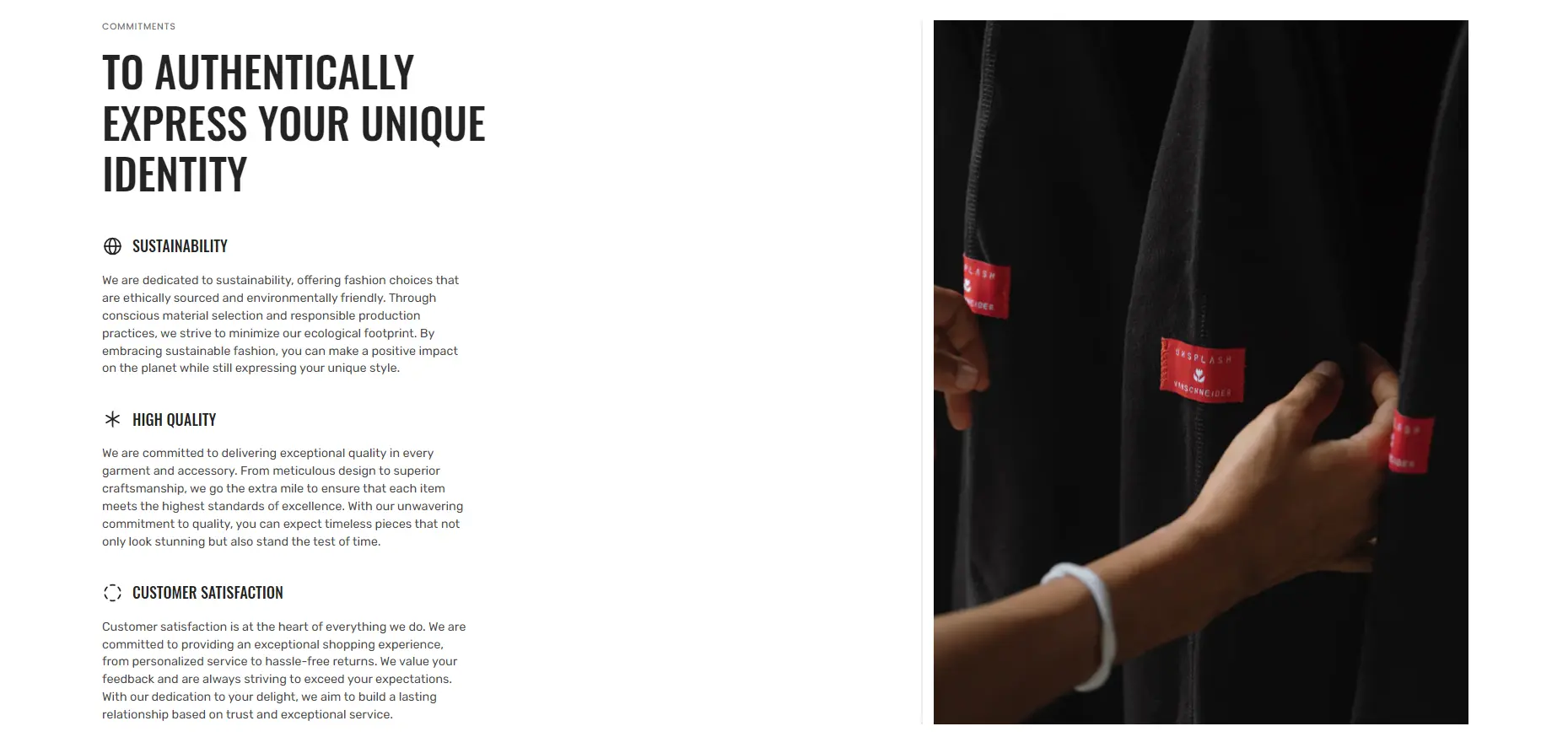
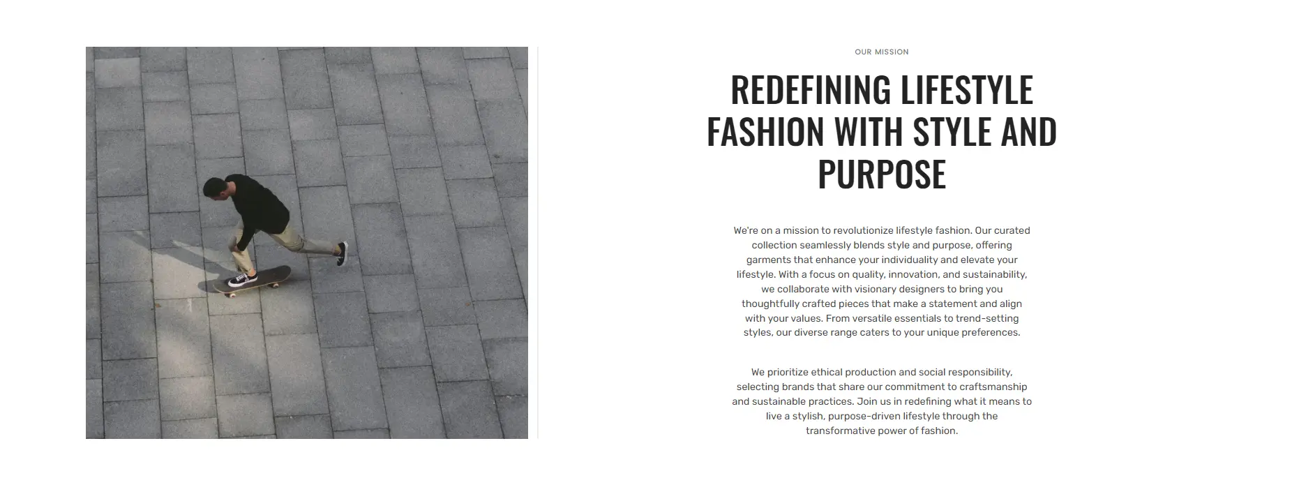
- Image allows you to set an image for the section.
- Position selector to change the image position.
- Subheading allows you to set a subheading for the section.
- Heading allows you to set a heading for the section.
- Text alignment allows you to change the position of the text horizontally and vertically.
- Block Description option Image file selector allows you to select or upload your image file.
- Block Description option Image 2 file selector to select or upload your image, which can be seen in Dark mode.
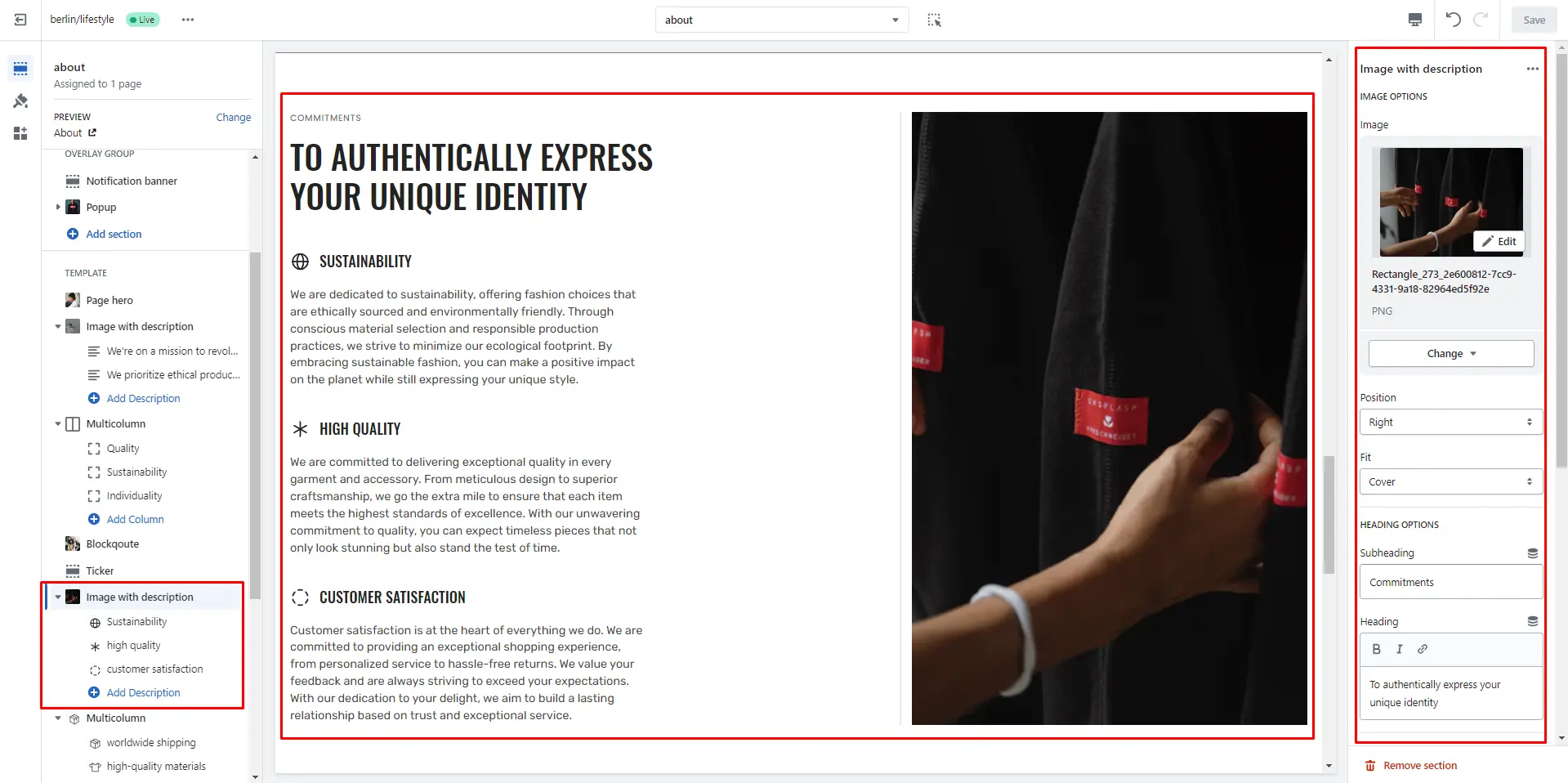
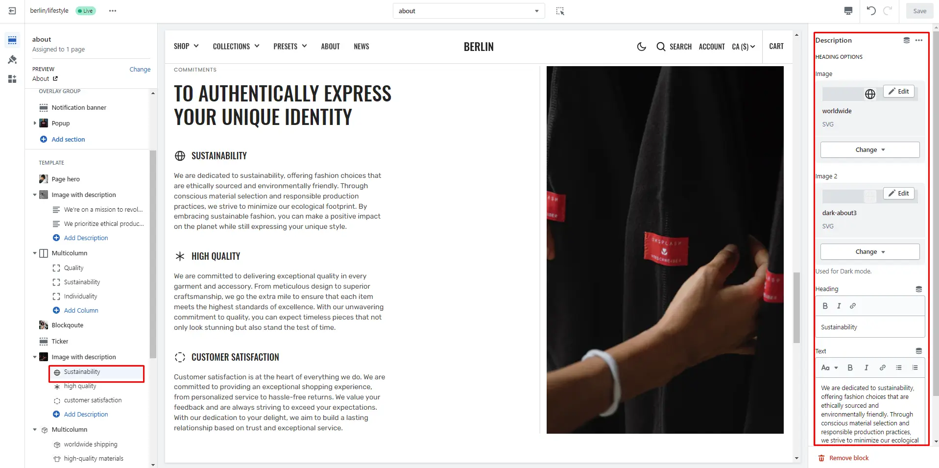
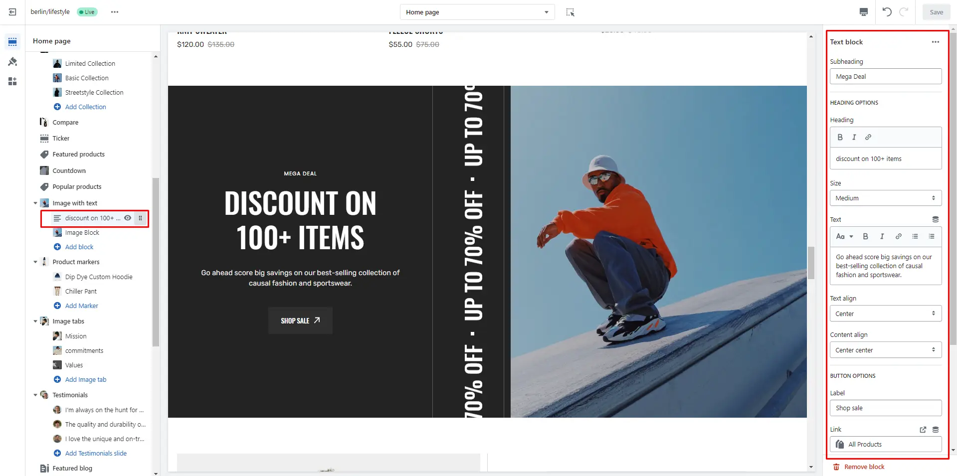
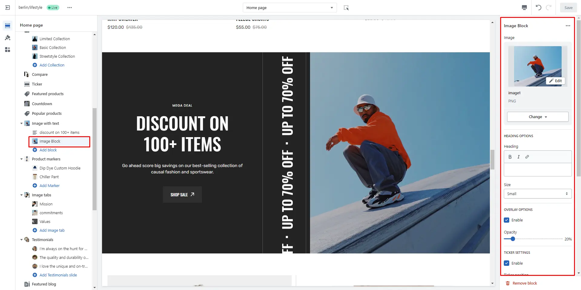
Image with text
Allows you to add image block, text block and ticker.

- Layout field allows you to select layout type.
- Block Text option Subheading allows you to set a subheading for the block.
- Block Text option Heading allows you to set a heading for the block.
- Block Text option Size allows you to change heading size for the block.
- Block Text option Text allows you to set a text for the block.
- Block Text option Text align selector to change the position of the text horizontally.
- Block Text option Content align selector to change the position of the content.
- Block Image option Image allows you to set an image for the block.
- Block Image option Overlay opacity slider allows you to change the opacity of the overlay.
- Block Image option Ticker enable checkbox field allows you to enable the ticker.
- Block Image option Ticker position selector to change the ticker position.
- Block Image option Ticker text allows you to set a text for the ticker.
- Block Image option Ticker speed slider allows you to change the speed of the ticker.
- Block Image option Ticker font size slider allows you to change the font size of the ticker text.
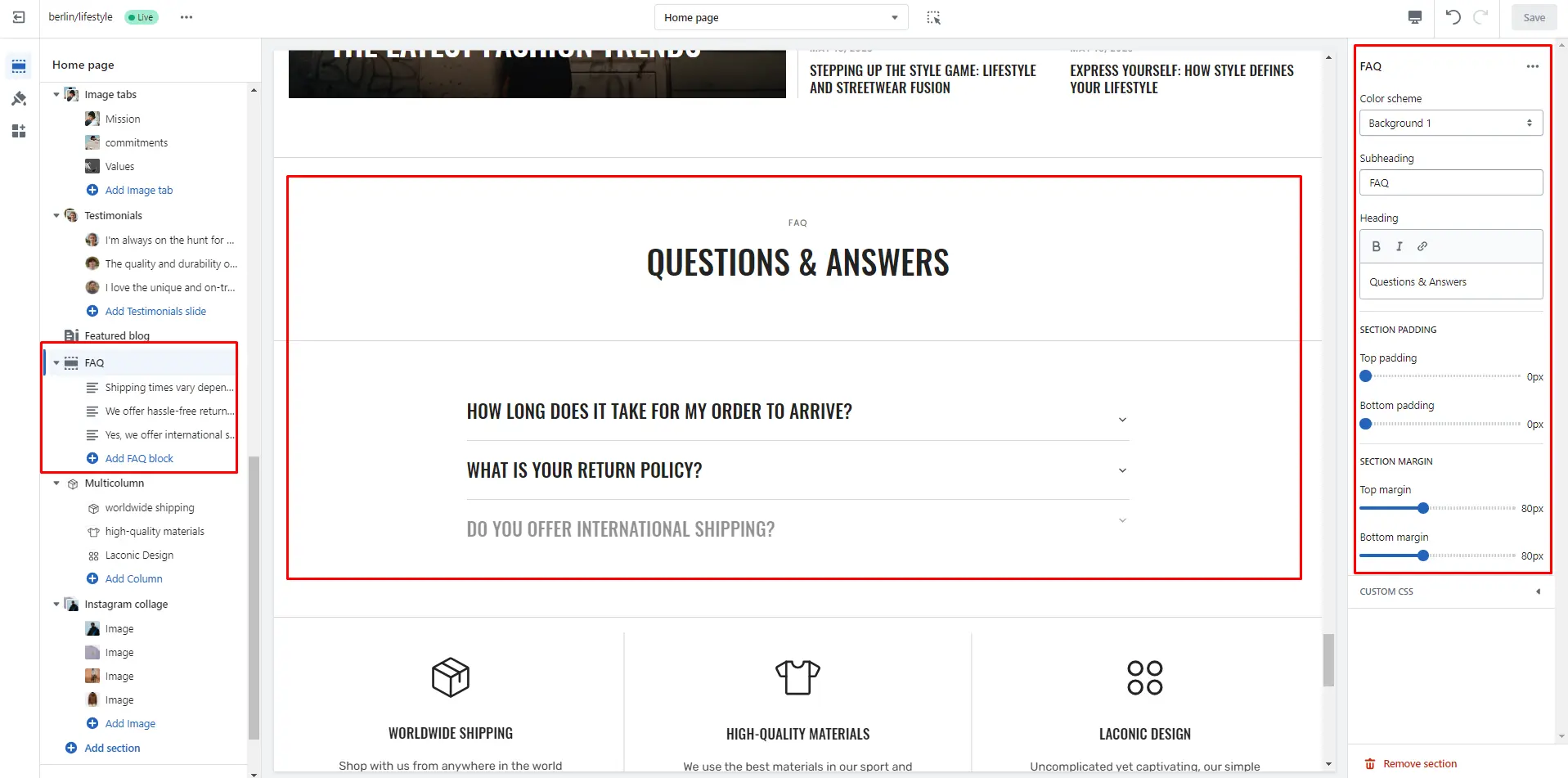
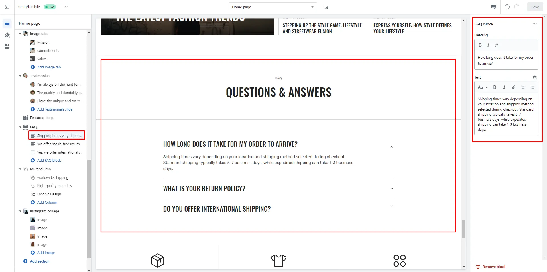
FAQ
You can add and customize a collapsible content section, such as using it for FAQs.
- Use Color scheme selector to change the color scheme.
- Subheading allows you to set a subheading for the section.
- Heading allows you to set a heading for the section.
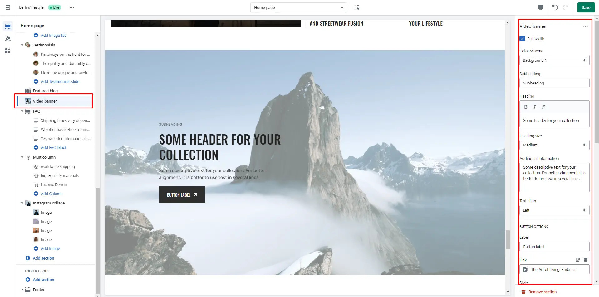
Video Banner
In this section, you can add and customize an autoplay video.
Page
Information on topic pages
Product page
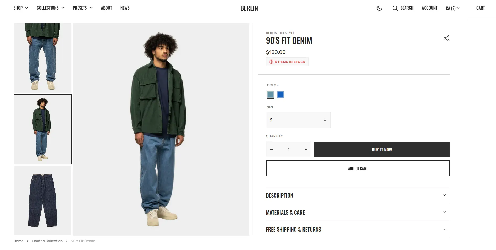
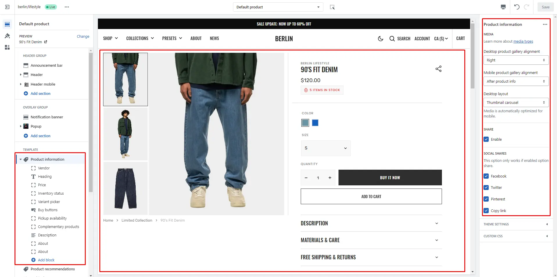
Product information
- Desktop product gallery alignment selector allows you to choose alignment type on desktop devices.
- Mobile product gallery alignment selector allows you to choose alignment type on mobile devices.
- Desktop layout field allows you to select layout the type of layout on desktop devices, it is automatically optimized for mobile devices.
- Share enable checkbox field allows you to enable the share icon.
- Social shares checkbox allows you to include a social network icon with links.
- Block Vendor allows you to enable vendor.
- Block Inventory status allows you to enable inventory status.
- Block Pop-up allows you to enable and customize pop-up modals.
- Block Buy buttons option Show dynamic checkout buttons using the payment methods available on your store, customers see their preferred option, like PayPal or Apple Pay.
- Block Complementary products allows you to add a complementary products and adjust the quantity per line.
- Block Additional description option Heading field sets a header block.
- Block Description option Heading field sets a header block .
- Block About option Heading field sets a heading block.
- Block About option Text field sets a content block.
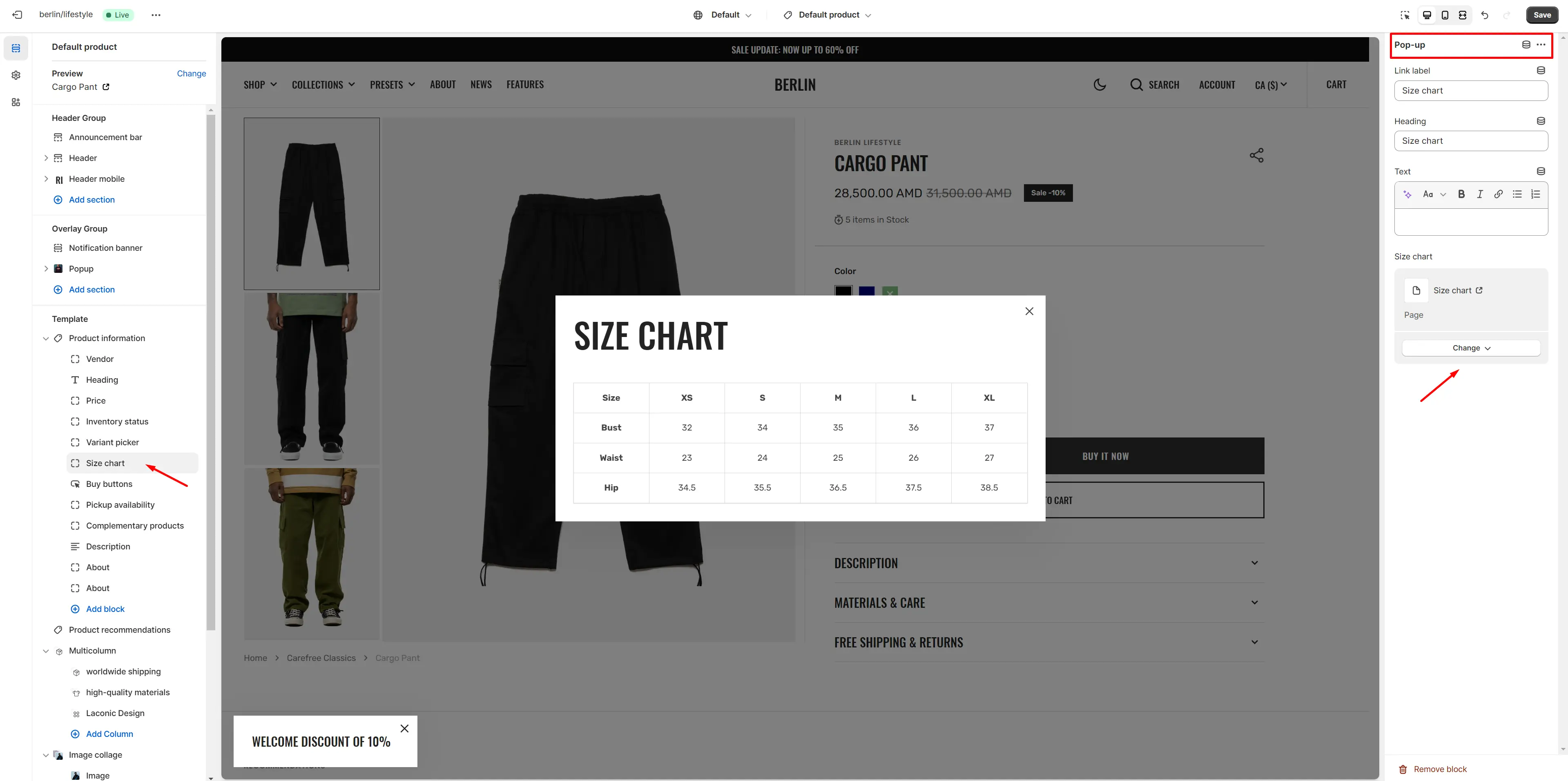
Size chart
To add a size chart, follow these steps:
-
Create new page with a table.
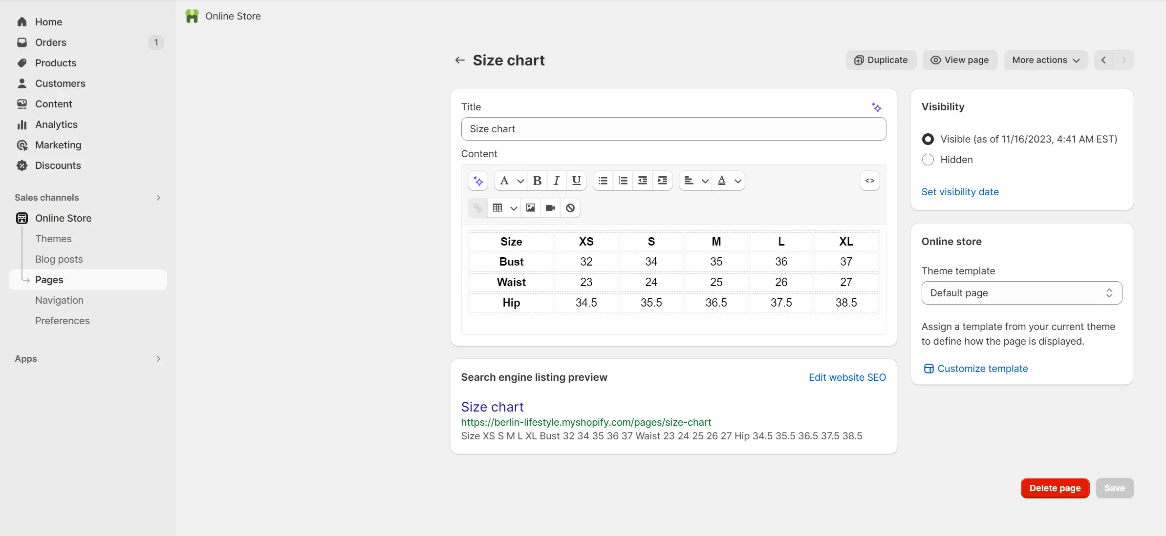
- Add a "Pop-up" block to the product page.
-
Select "Size chart" page.
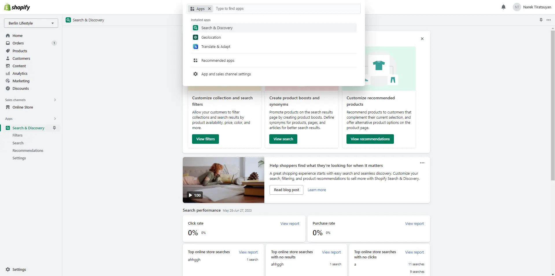
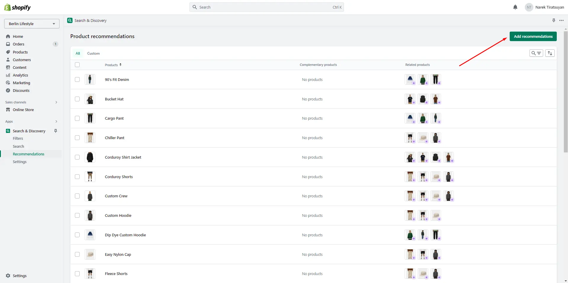
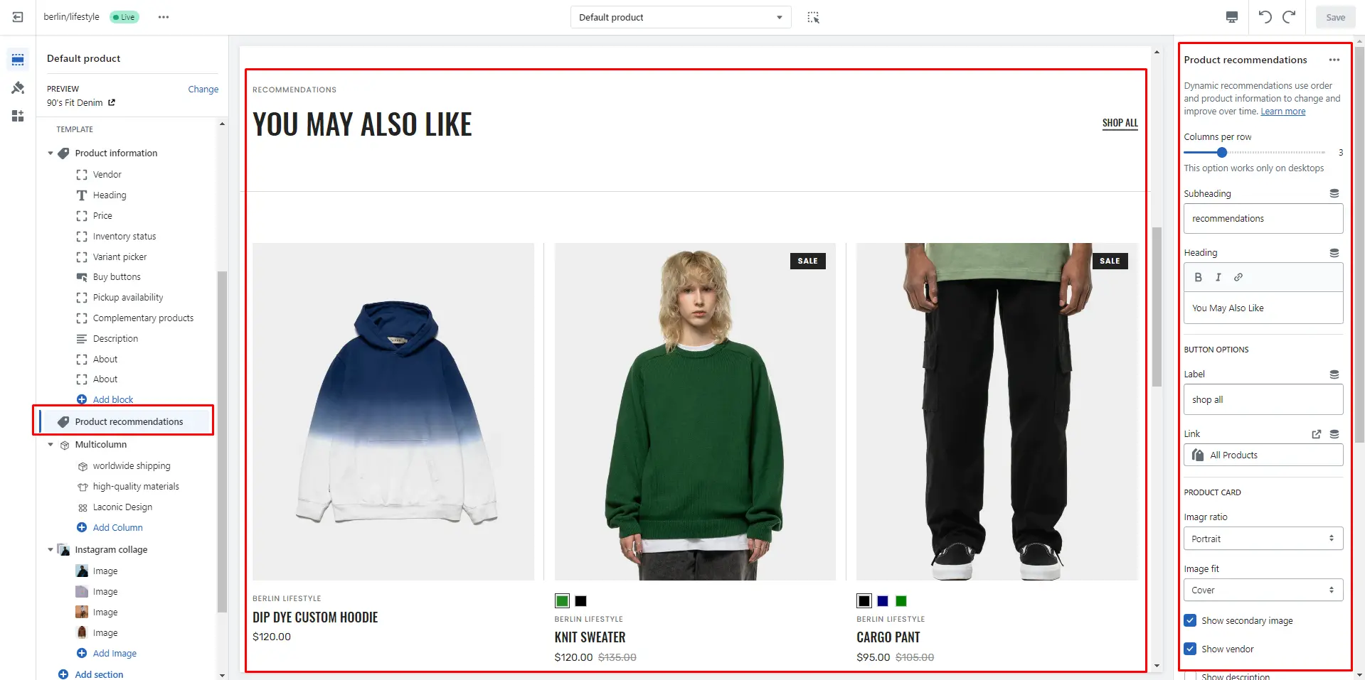
Product recommendations
Dynamic recommendations use order and product information to change and improve over time.
To add and edit product recommendations, follow these steps:
-
Install the Search & Discovery app by Shopify from the Apps page in
the Admin panel.
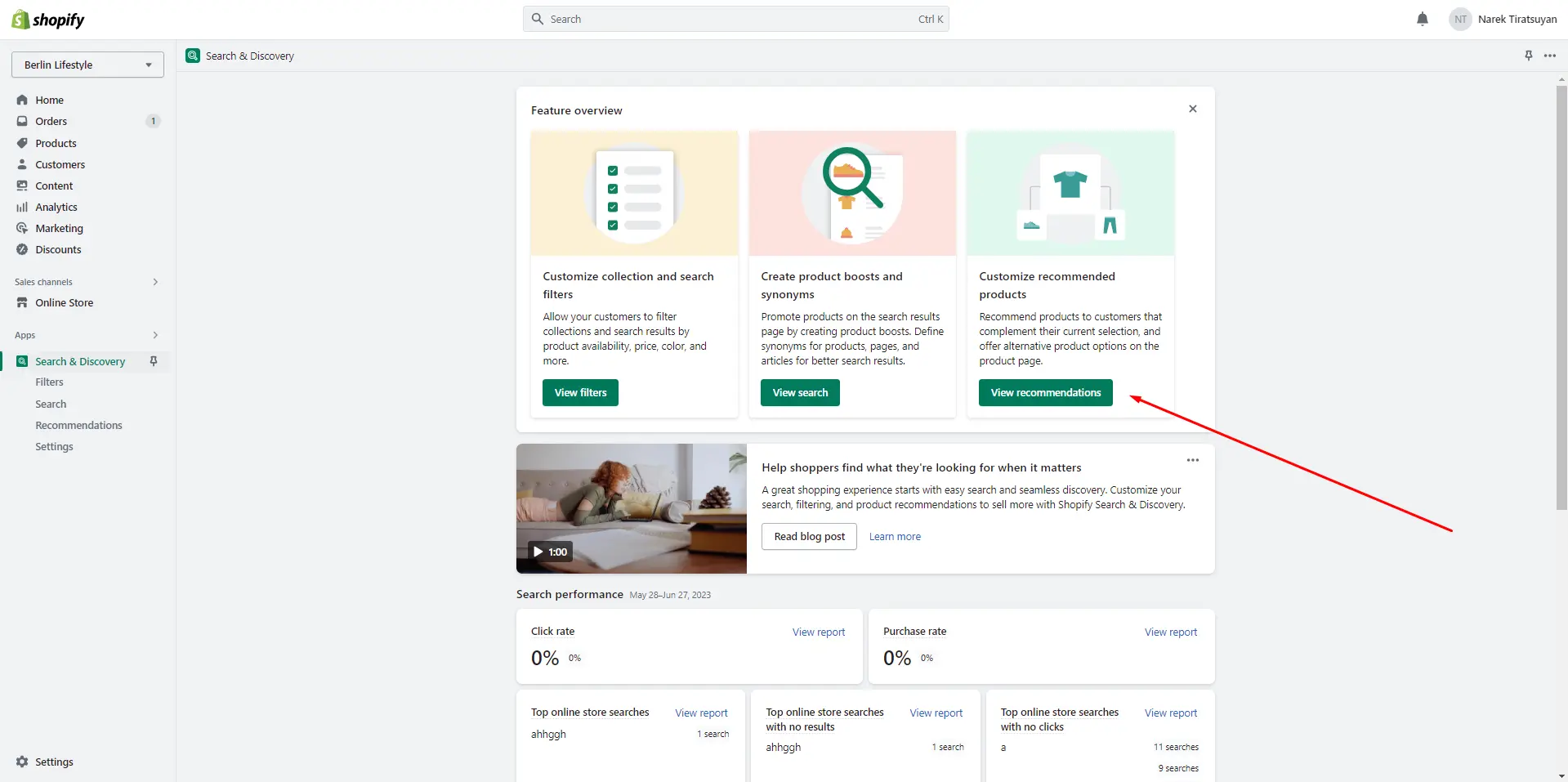
-
Once installed, open the app and follow the 'View recommendations'
link in the Feature overview section to add recommendations to your
products.
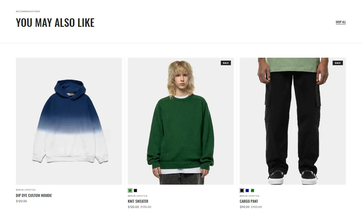
- Columns per row slider allows you to change the number of products per line only on desktop devices.
- Subheading allows you to set a subheading for the section.
- Heading allows you to set a heading for the section.
- Product card options allow you to customize product cards in the section.
Collections page
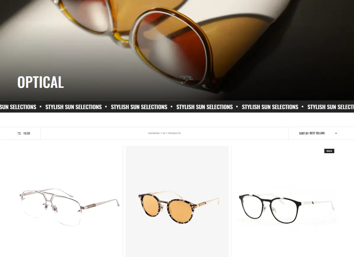
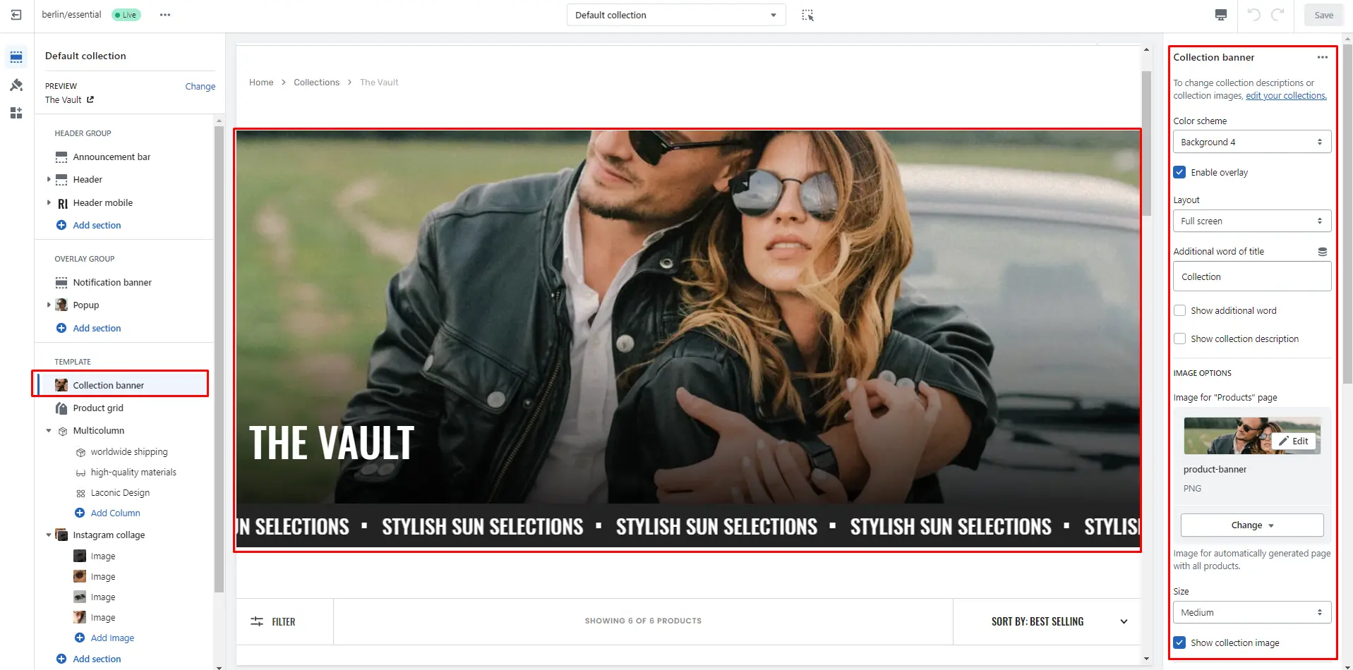
Collection banner
- Use Color scheme selector to change the color scheme.
- Layout field allows you to select layout type.
- Additional word field allows you to add additional word of title.
- Show additional word field turn on additional word display.
- Show collection description field turn on description display.
- IMAGE OPTIONS allows you to add image and customize the image and their dimensions.
- Show collection image field turn on image display.
- TICKER SETTINGS allows you to add ticker and customize.
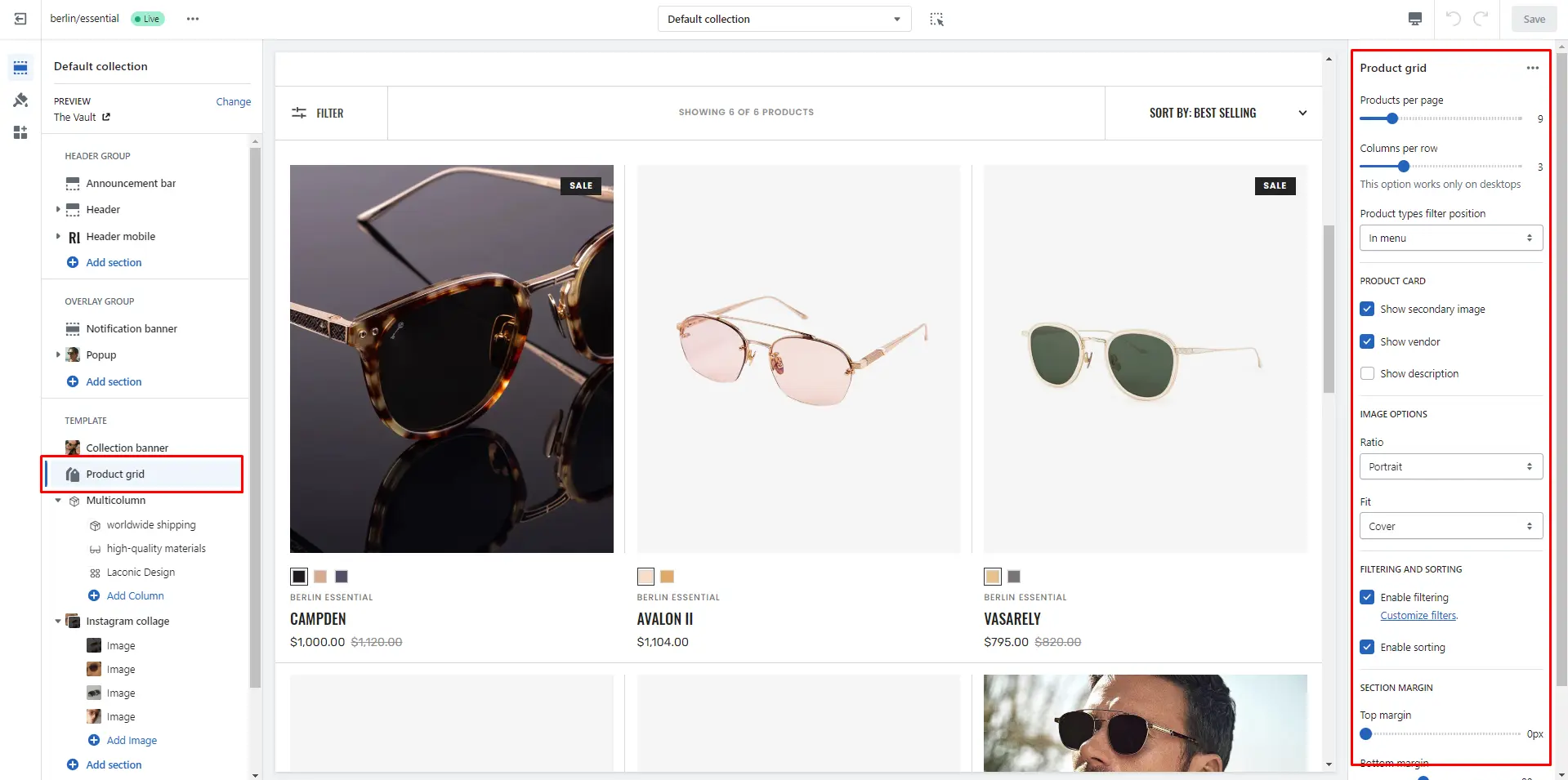
Product grid
- Products per page field sets the number of displayed cards.
- Columns per row slider allows you to change the number of products per line only on desktop devices.
- Filter position field allows you to select filter type.
- Product card options allow you to customize product cards in the section.
- IMAGE OPTIONS allows you to customize the image and their dimensions.
- Enable filtering field turn filtering.
- Enable sorting field turn sorting.
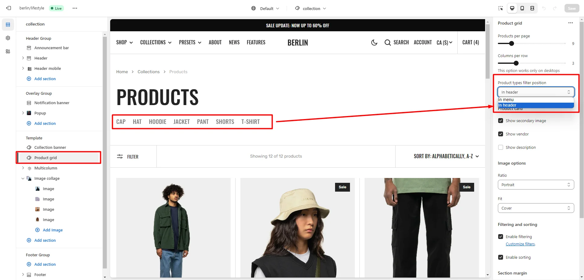
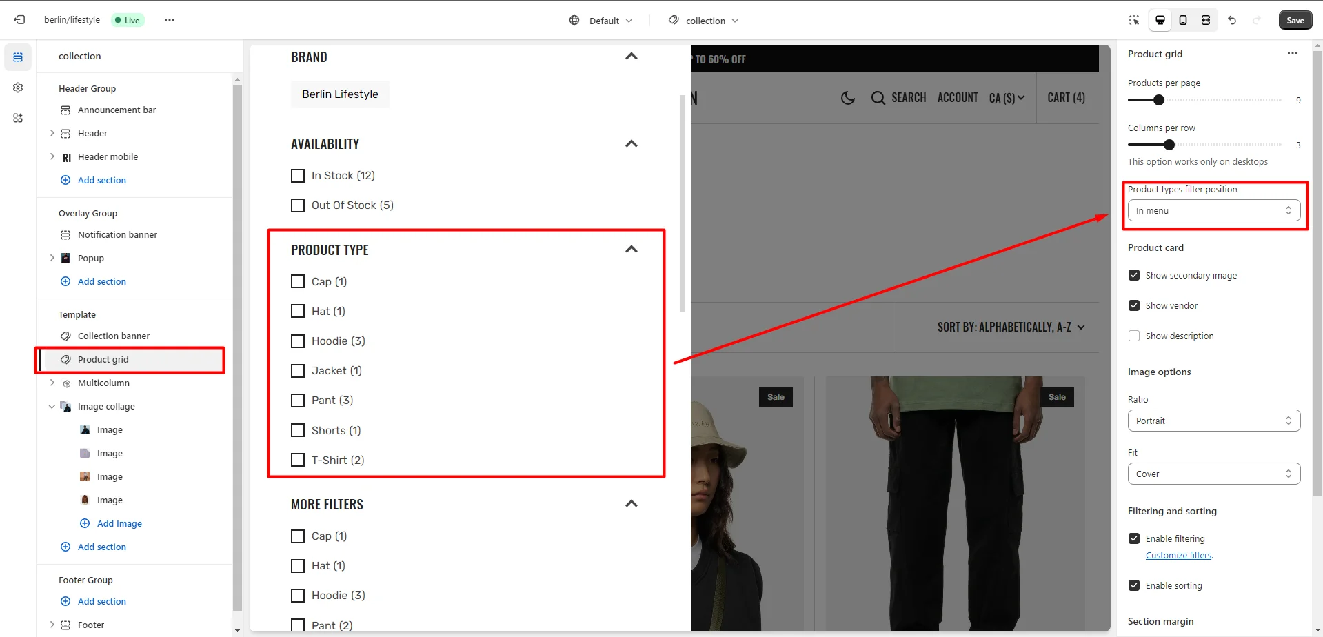
Product type filters
There are 2 options for displaying the product type filter in the menu and in the header.
-
Filter in header
-
Filter in menu
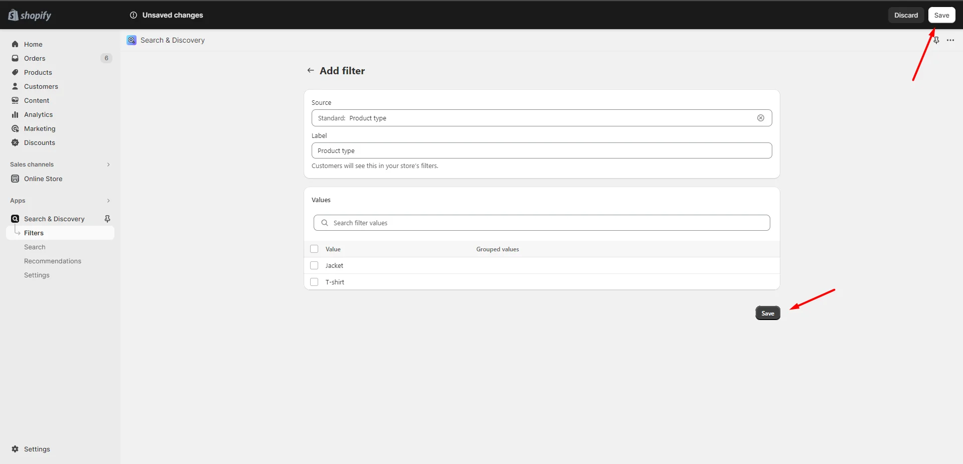
To enable the filter by product type, you need to go to the app "Search & Discovery >> Filters >> Add filter".
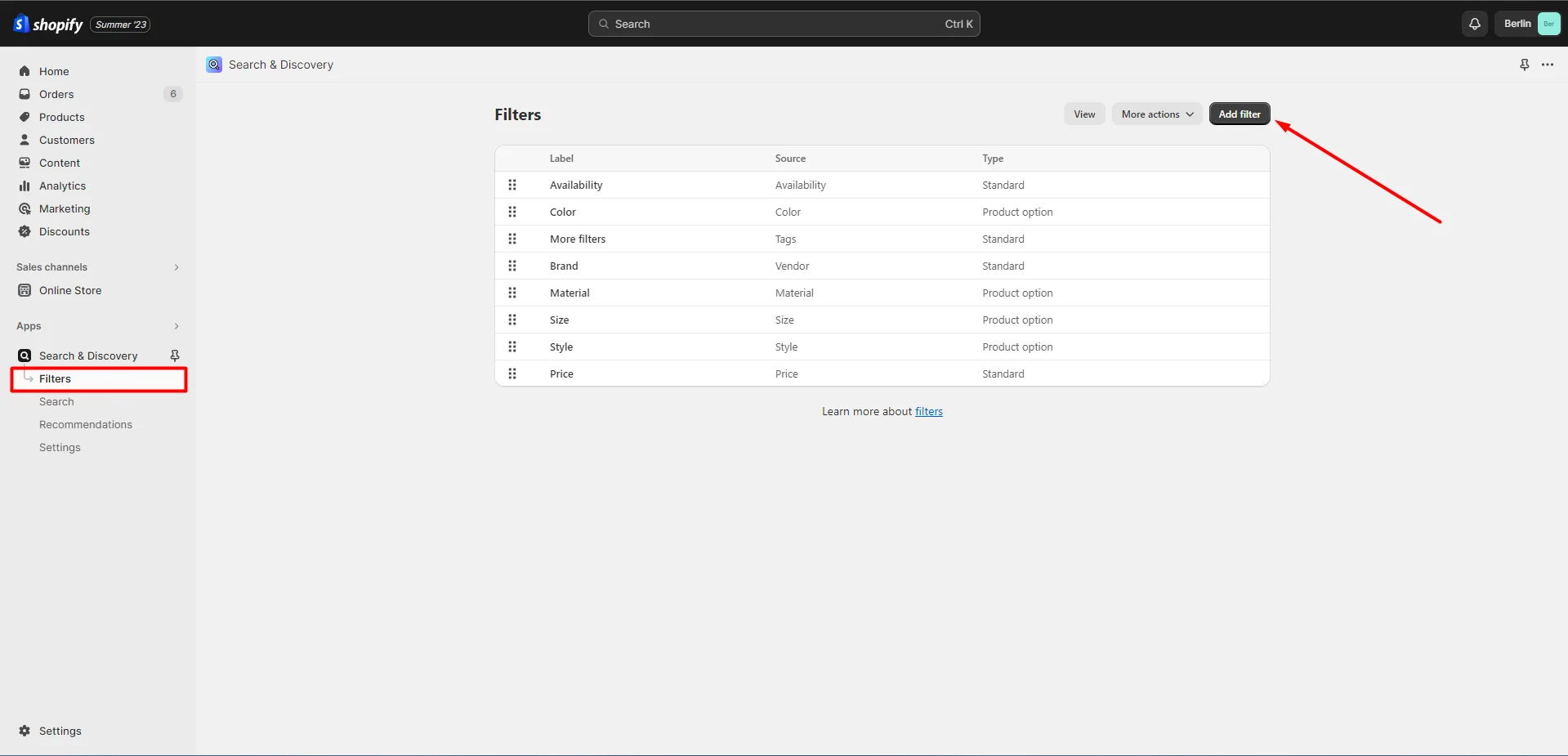
Select filter by product type.
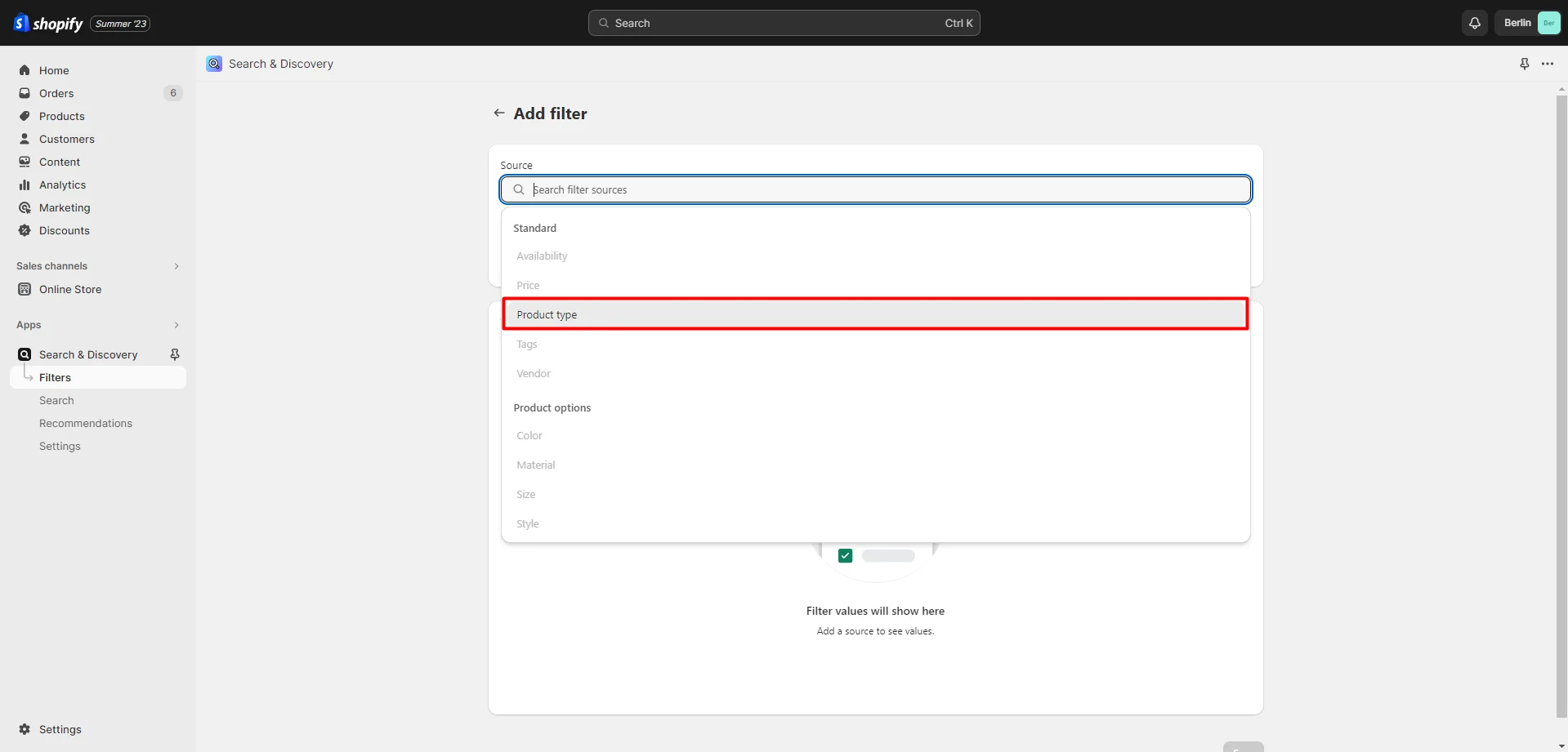
Click "Save" to save changes.
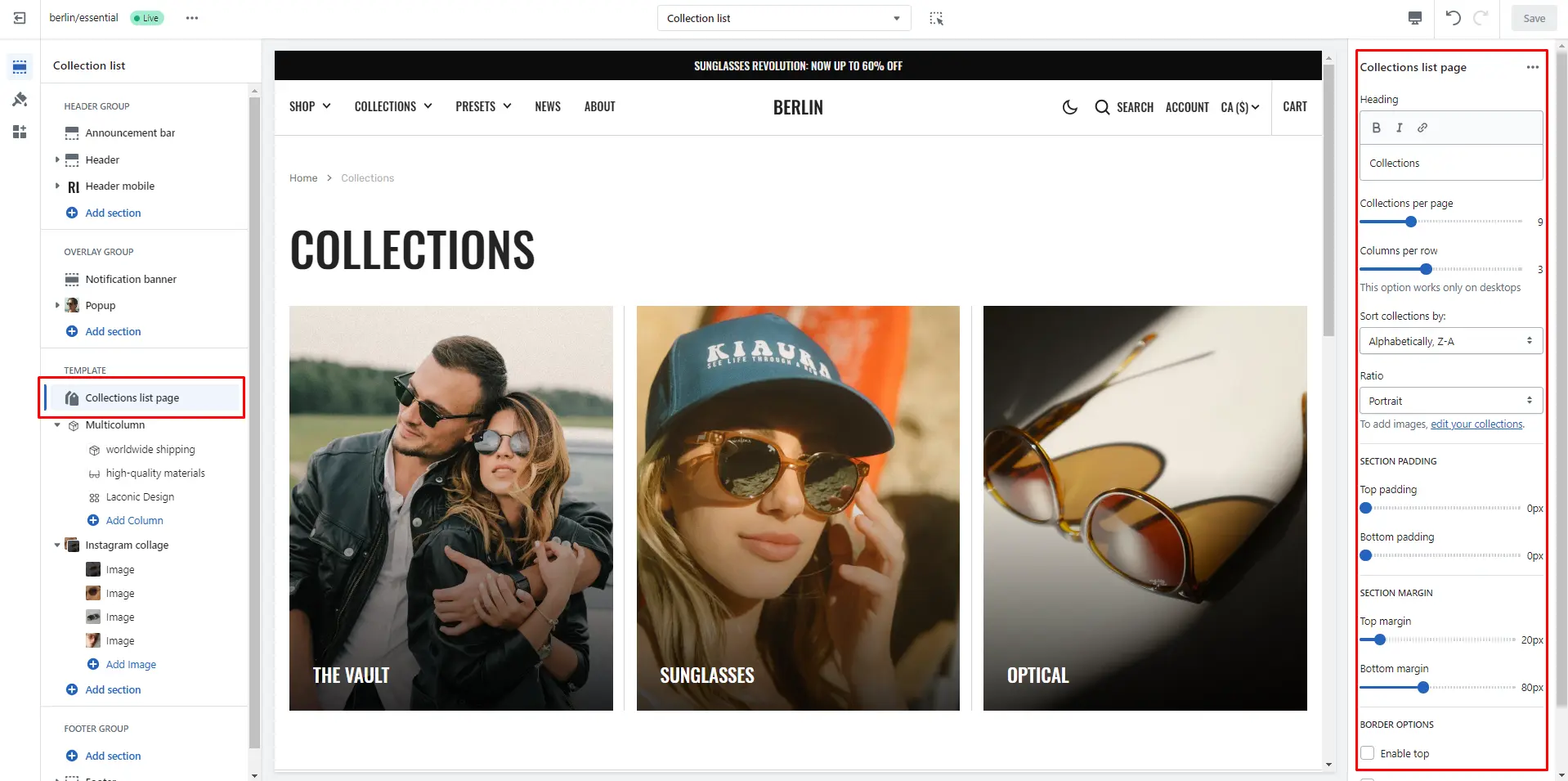
Collections list
Displays a list of all collections
- Heading field sets a header section.
- Collections per page field sets the number of displayed cards.
- Columns per row slider allows you to change the number of collections per line only on desktop devices.
- Sort collections by field filters the collection by the specified parameters.
- Image ratio selector allows you to change the height of the collection of cards in this section.
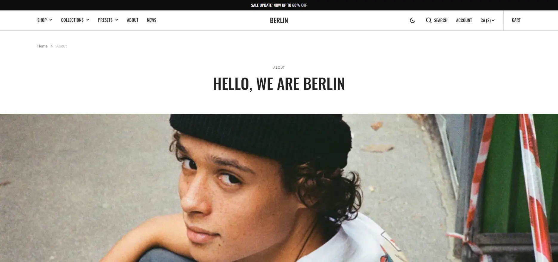
About
Allows you to add sections describing the store.
Cart
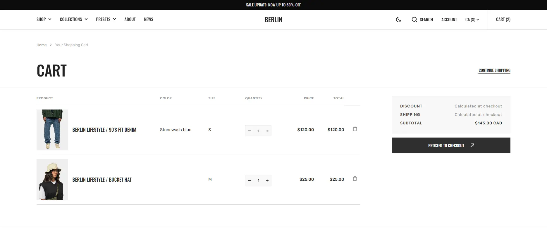
- Block Items option IMAGE OPTIONS allows you to customize the image and their dimensions.
- Block Subtotal option Enable cart note field sets note.
Blog
- Posts per page field sets the number of displayed posts.
- Columns per row slider allows you to change the number of posts per line only on desktop devices.
- Show featured image field enables the display of an image for the blog post.
- Show tags field enables the display of tags for the blog post.
- Show date field enables the display of the date for the blog post.
- Show author field enables the display of the author for the blog post.
- Show excerpt field enables the display of the excerpt for the blog post.
- IMAGE OPTIONS allows you to customize the image and their dimensions.
Blog post

- Layout allows you to select the location of the image.
- Block Article header option Show featured image field enables the display of an image for the blog post.
- Block Article header option Show tags field enables the display of tags for the blog post.
- Block Article header option Show date field enables the display of the date for the blog post.
- Block Article header option Show author field enables the display of the author for the blog post.
- Block Article header option Show excerpt field enables the display of the excerpt for the blog post.
- Block Article header option Share allows enable links from the list.
- Block Article footer option Show date field enable date for blog post.
- Block Article footer option Show author field enable author for blog post.
- Block Article footer option Share allows enable links from the list.
Importing our demos
You can also copy the structure of any of our 5 demos in a few steps.
- Download the settings file to copy the demo settings from there.
-
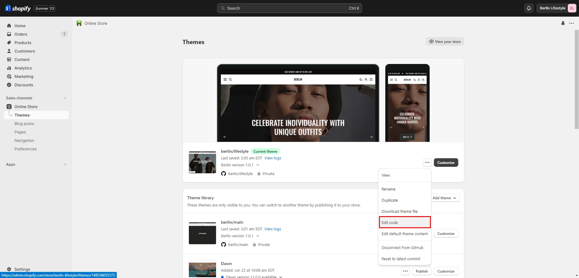
Go to section "Online Store >> Themes" your store. Click on the three dots button of your theme.
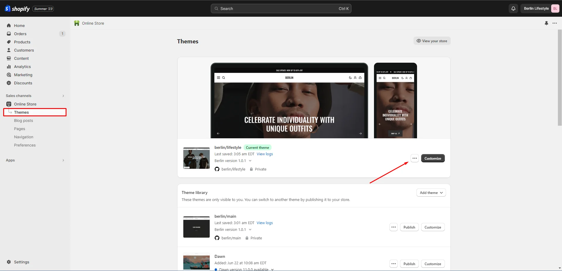
-
Go to the code editor by clicking the edit code button.
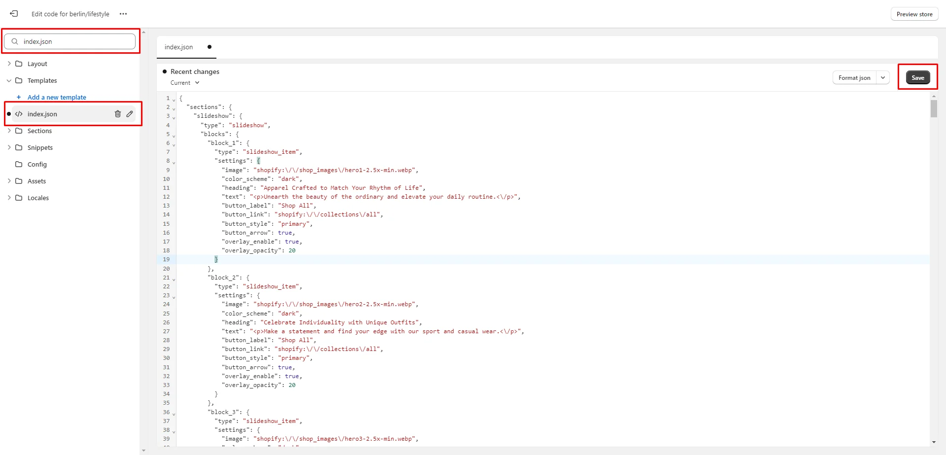
-
In the code editor, search for the file "index.json" and change the code to the demo code you want to transfer. Click "save" to save your changes.
Demos structure
Click on the demo name to download the file with the appropriate structure.
Support
You can ask any questions about the theme and our support agent will help you within 24 hours on business days.
Visit Help Center View Terms & Conditions
