Zenith
Below you’ll find a list of articles broken down by sub topics that cover each and every aspect of your theme. We regularly maintain our documentation in collaboration with our support staff.
General settings
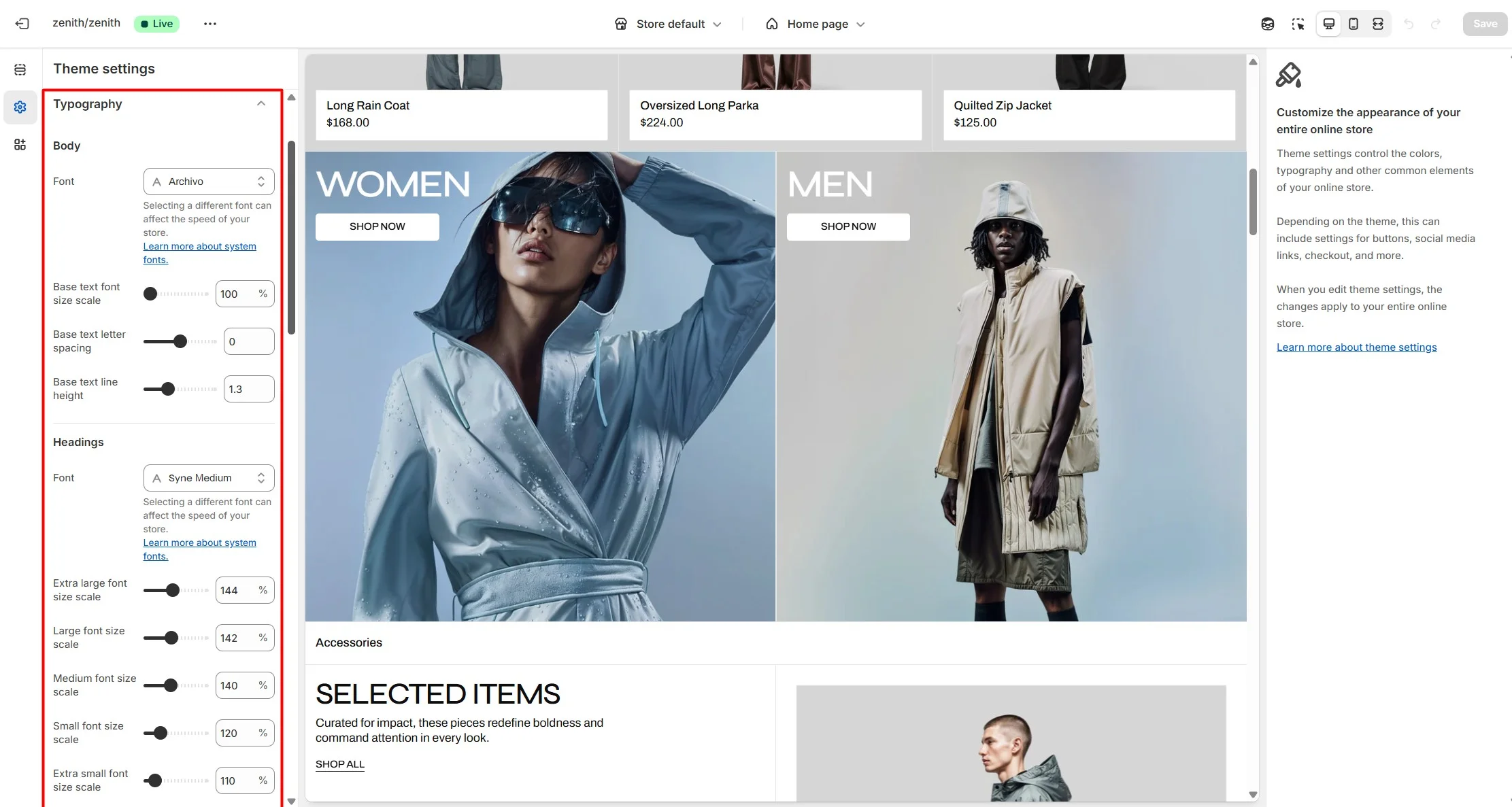
Typography
You can adjust the font family, size, and weight for all theme elements. To customize typography, go to Theme settings > Typography.
Fonts are grouped into:
- Body font – main text across the theme, used in page content and descriptions. Some sections also allow selecting Body as font type.
- Headings font – all theme headings. You can set global sizes (Extra large, Large, Medium, Small, Extra small) applied site-wide. In sections, you can choose heading sizes.
- Product card heading font – product titles on cards.
- Button font – text on all buttons.
- Menu header font – top-level menu items and header text-type buttons.
- Labels font – tags, modal titles, product vendor names, and other UI labels. Some sections also support selecting Label as font type.
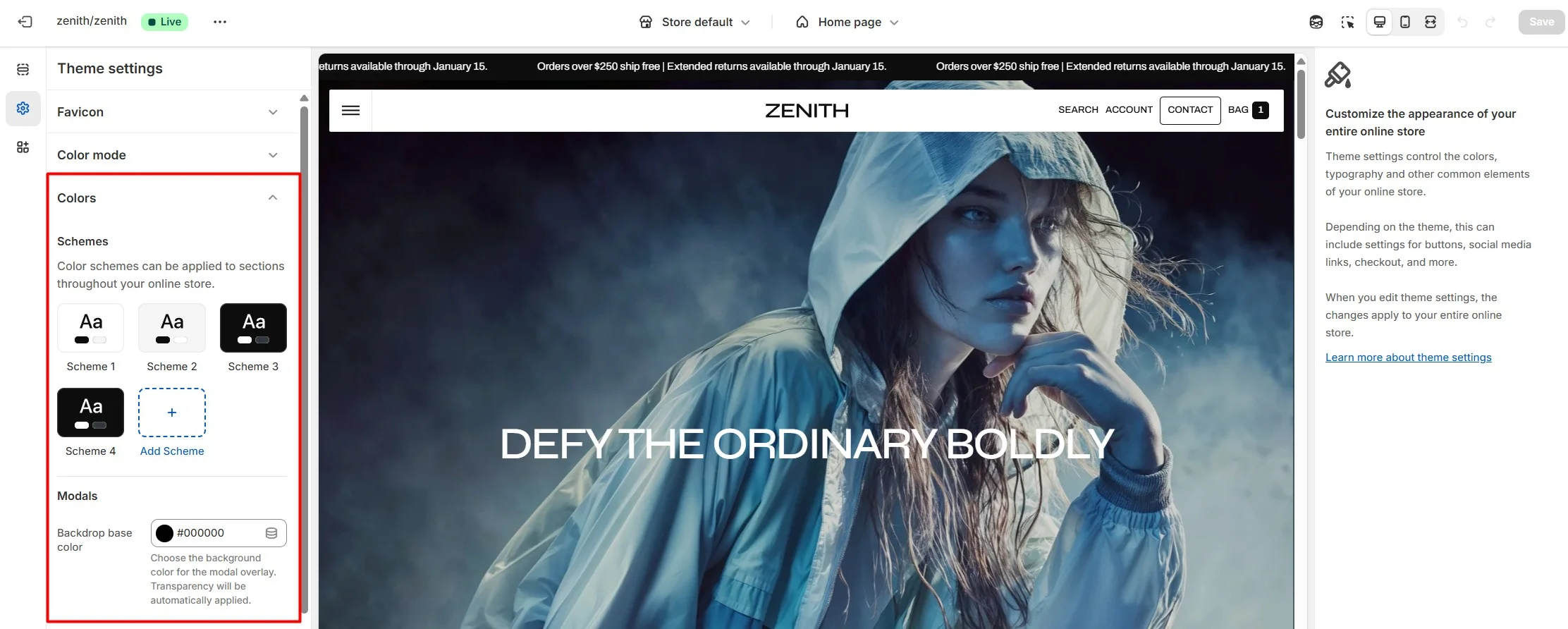
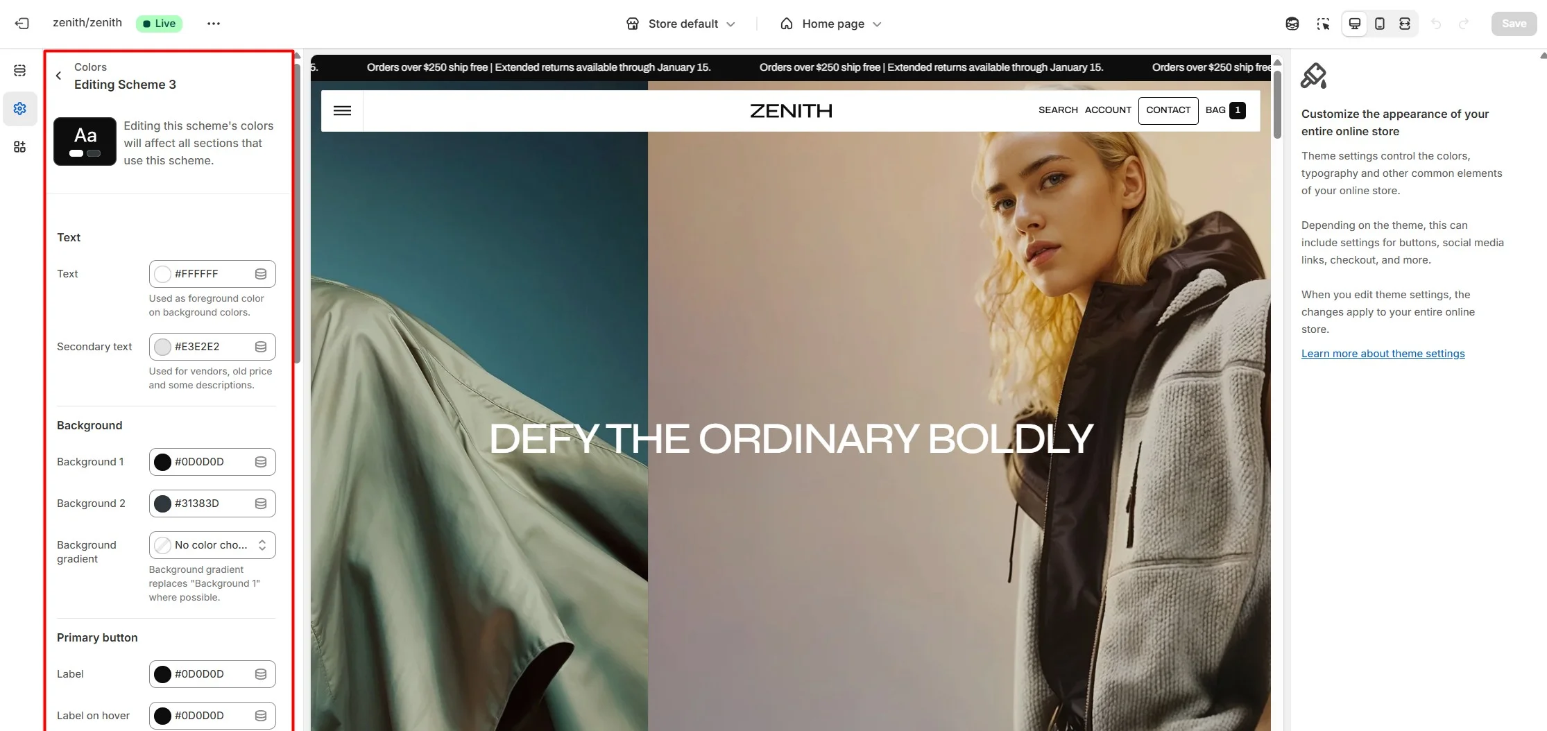
Colors
You can customize colors for most theme elements and create multiple color schemes. Each section can use its own scheme.
Within a color scheme, you can define:
- Primary and secondary text colors.
- Primary and secondary background colors.
- Button text, background, and hover states.
- Badge colors.
- Price colors.
- Other UI elements.
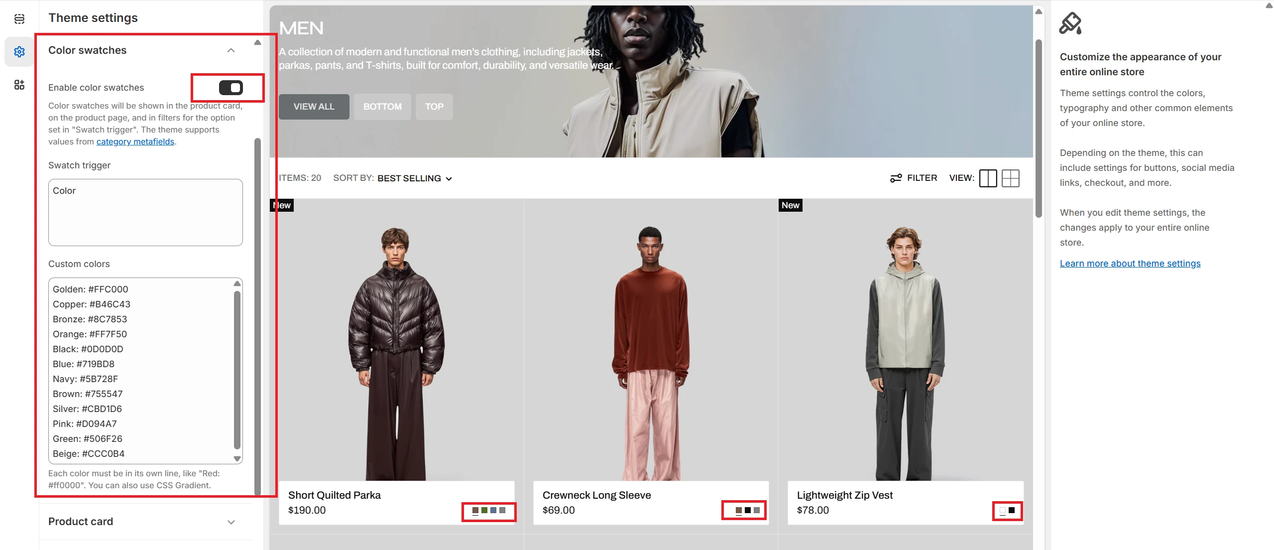
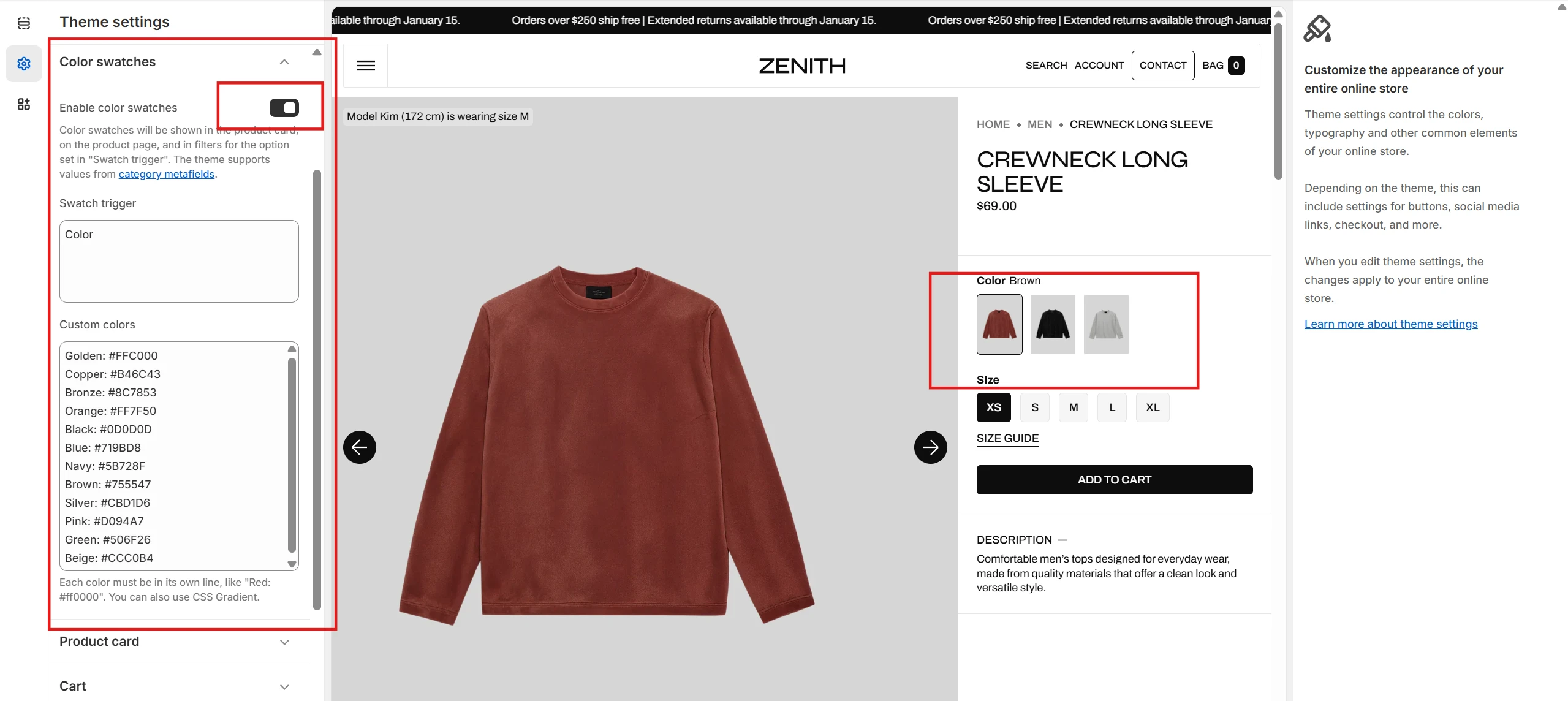
Color swatches
To enable and edit Color swatches, navigate to Theme settings > Color swatches.
If product color options are added via category metafields, they will automatically appear in the following locations:
- On the product page
- In the featured product section
- On the collection page in filters. Customize filters with the Search and Discovery app.
If the product color option is added as a custom option, the Swatch trigger field must be filled in to display color swatches. You can also add custom colors by adding their name and color in HEX format.
To display color swatches on the product card, the Swatch trigger field must also be filled in.
Multilanguage color swatches
In this section, we will show how to create multilingual color swatches using the Shopify Translate & Adapt app as an example.
After translating the store with the Translate & Adapt app, the values of the Swatch trigger and Custom colors fields in Theme settings > Color swatch will also be translated.
For color swatches to work correctly, make sure that the translation of the option in Swatch trigger in the Translate & Adapt > Theme > Theme settings > Color swatch matches the option name in the product. Additionally, if you fill in the Custom colors field, make sure that the translations of the color names match the translations of the colors within the option.
Important: On the product page and in filters, color swatches will work automatically and are not dependent on the Swatch trigger field if the product option is linked to a Category metafield.
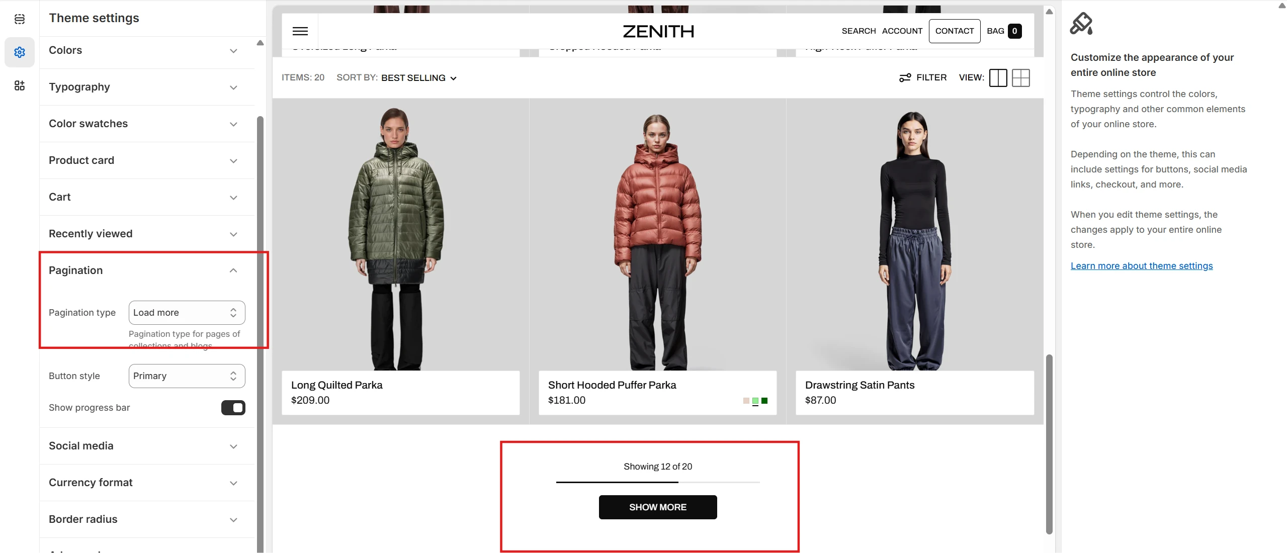
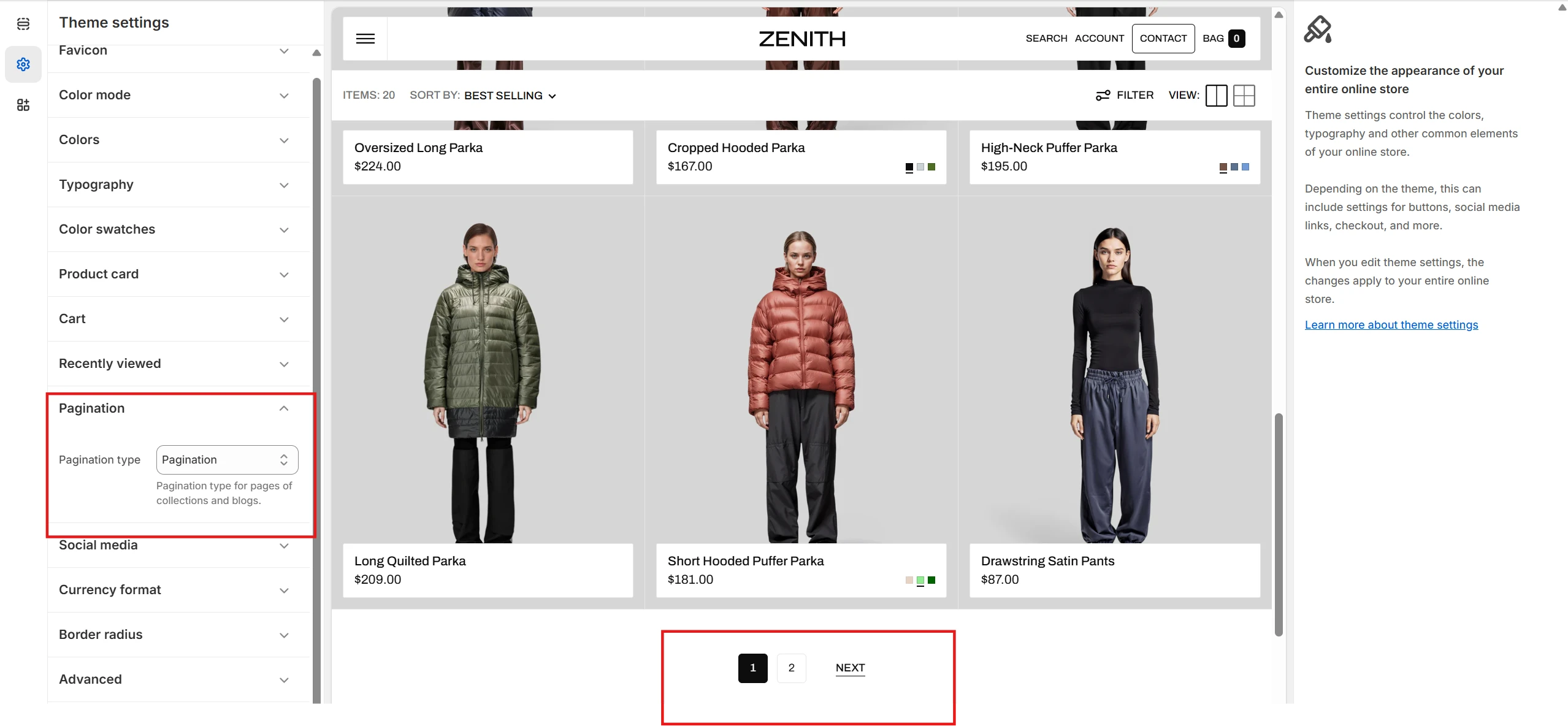
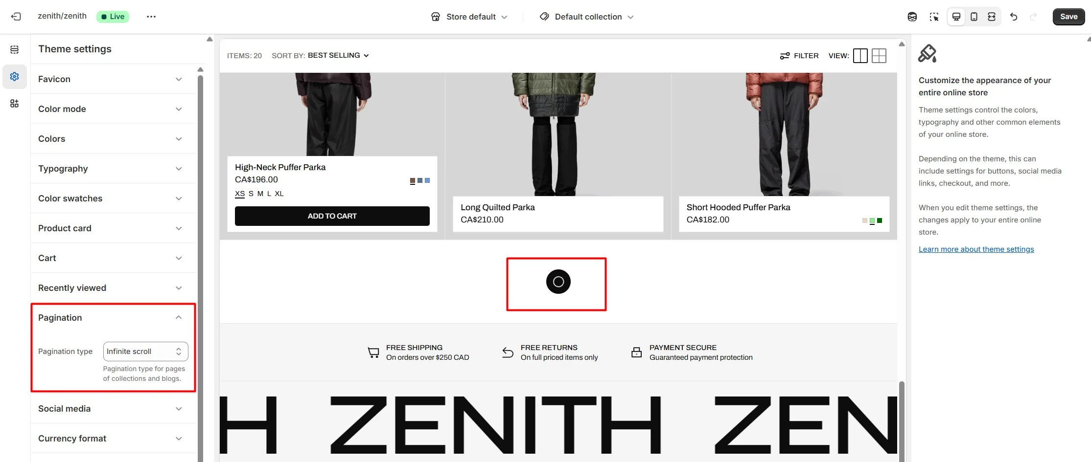
Customizable pagination
For collection list pages, product list pages, the blog page and the search page, you can configure the pagination type. To select pagination type, navigate to Theme settings > Pagination > Pagination type.
-
Load more type
-
Classic pagination type
-
Infinite scroll type
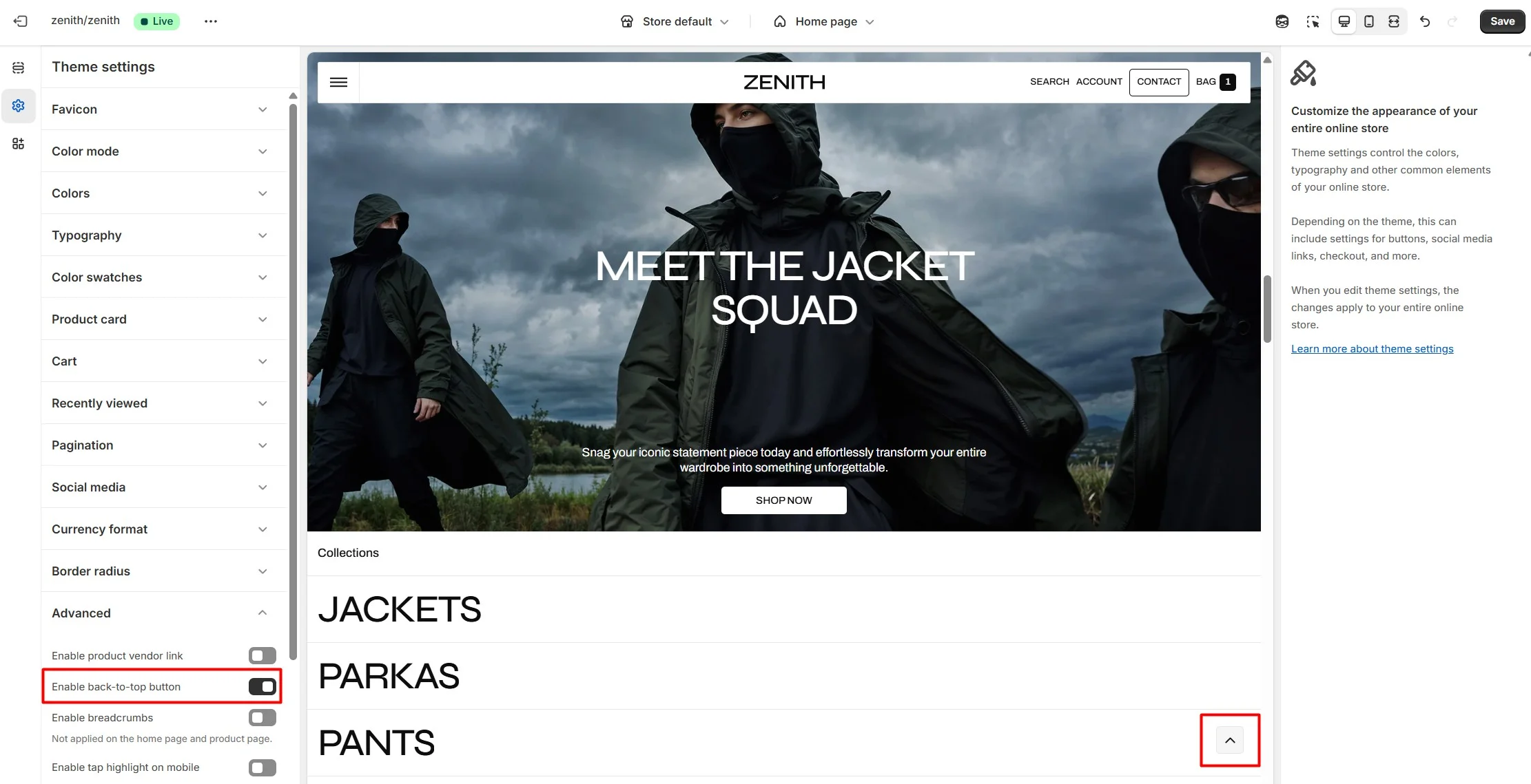
Back to top
To enable Back to top button, navigate to Theme settings > Advanced.
Product card
The theme provides global settings for product cards:
- Image ratio lets you set the aspect ratio for all product cards.
- Image hover effect allows configuring the hover effect on product images.
- Variant price display controls how prices appear when a product has multiple variants (From $X, $X–$Y, or Up to $Y).
- Badges lets you globally configure discount, sold-out, and custom badges for all product cards.
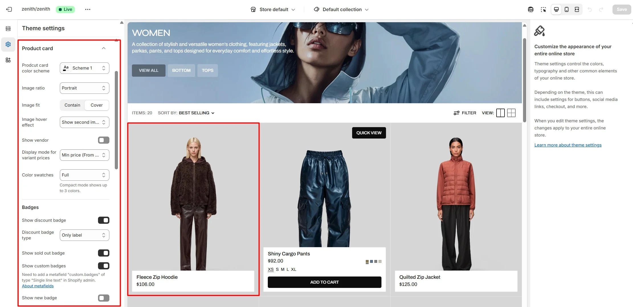
Sections using product cards also include section-level settings for desktop behavior. You can hide the info panel by default and show it on hover, or hide only the lower part and reveal it on hover.
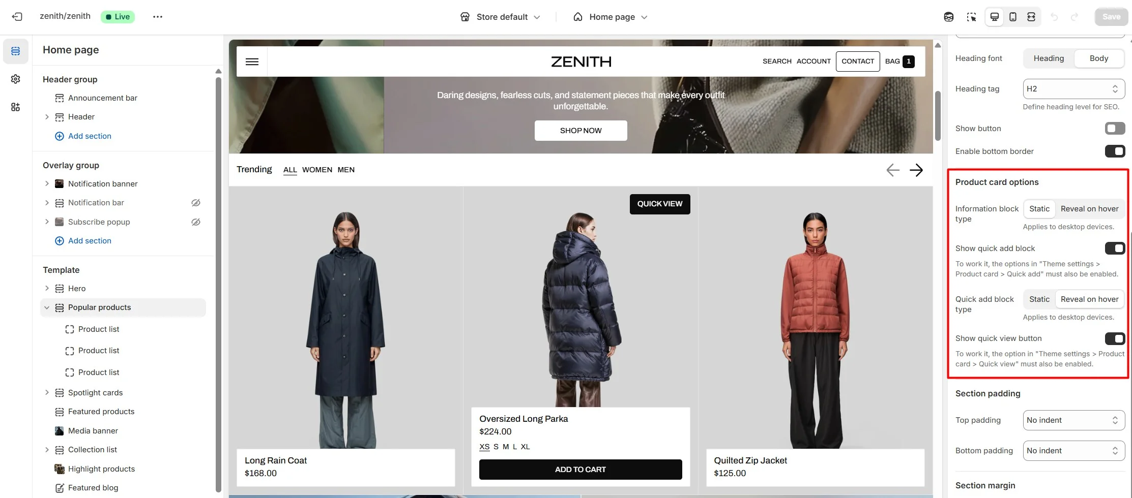
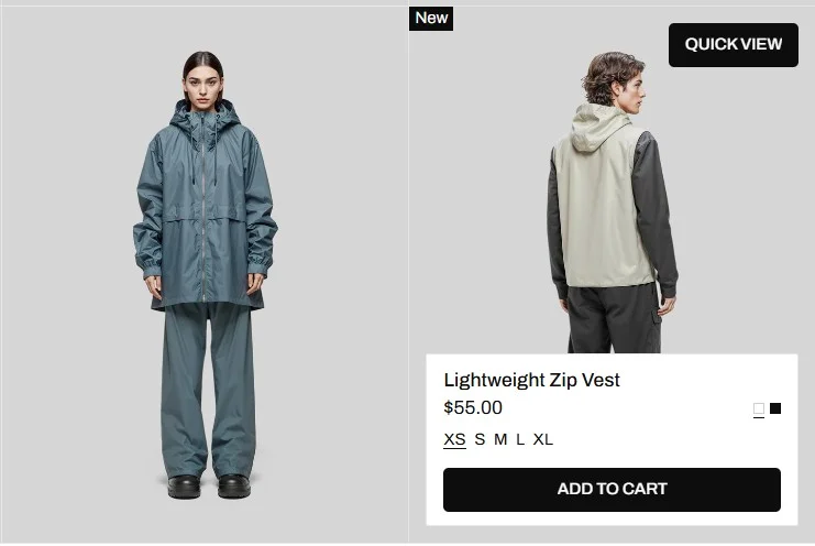
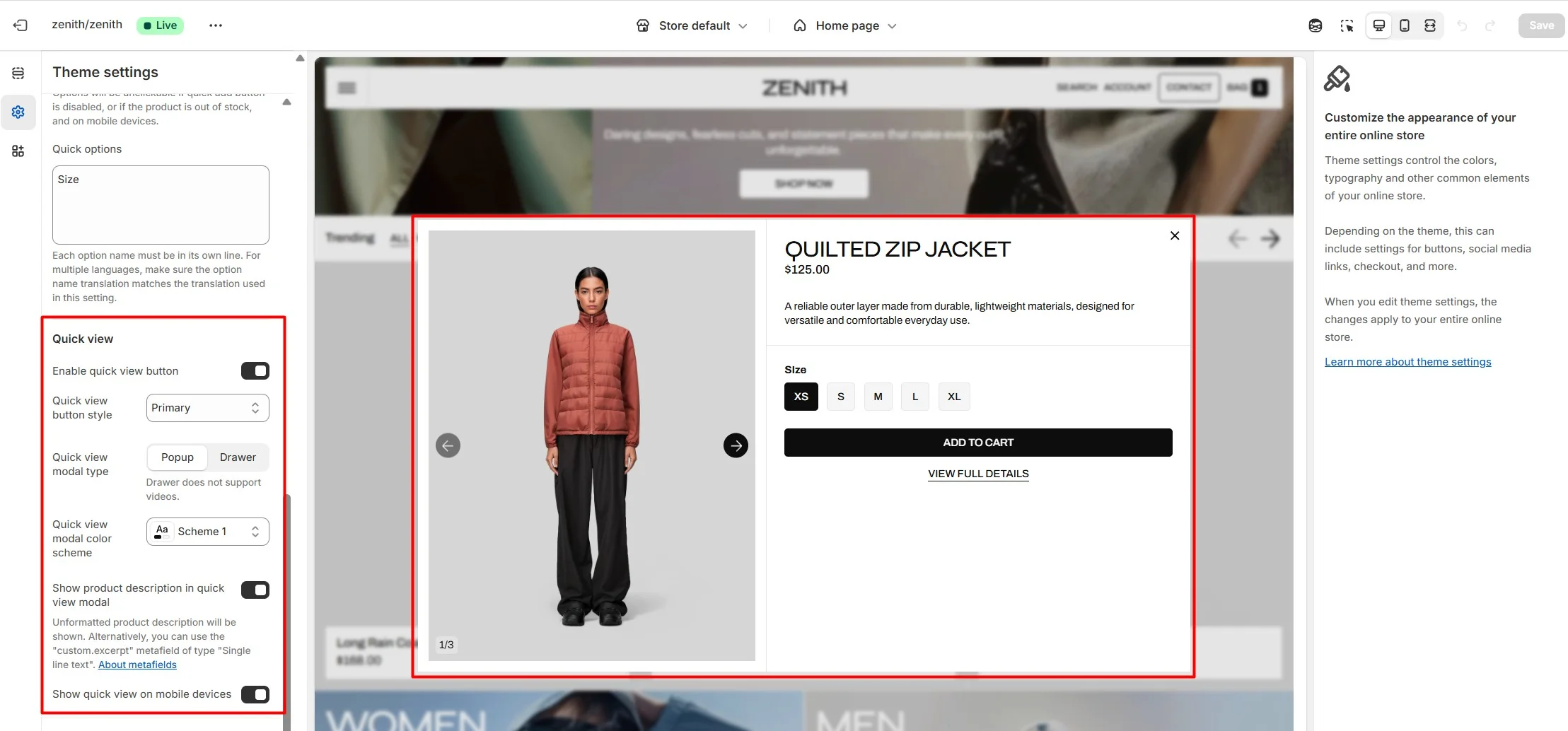
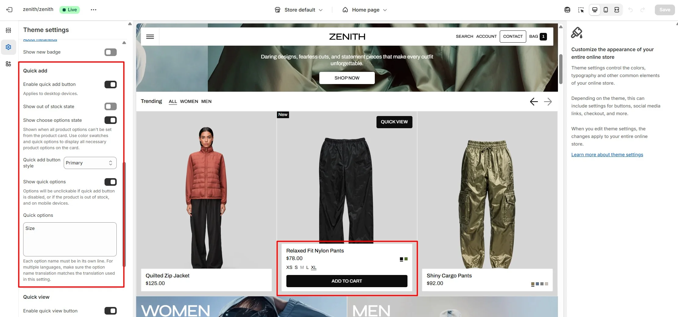
Quick view
The theme allows customers to view products without opening the product page using Quick view settings in the product card. To display the Quick view button, enable it in the global settings. Sections using product cards can override this and disable the button locally.
Quick add
The theme also supports quick add to cart. For quick add to work, products must have no variants, or all variants must be selectable directly from the product card. Use Color swatches and Quick options to display the necessary product choices.
This functionality is not available on mobile. On mobile devices, quick add is only possible through Quick view to ensure a better shopping experience.
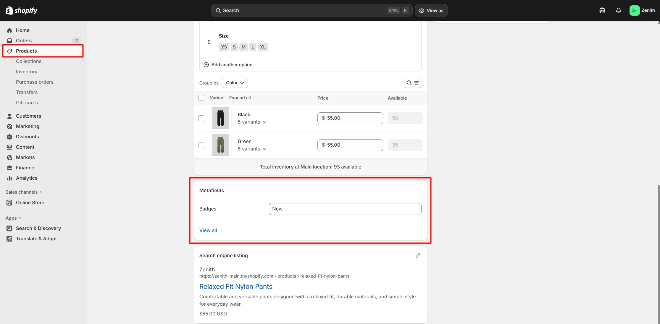
Custom product badges
To enable and edit Custom badges, navigate to Theme settings > Product card.
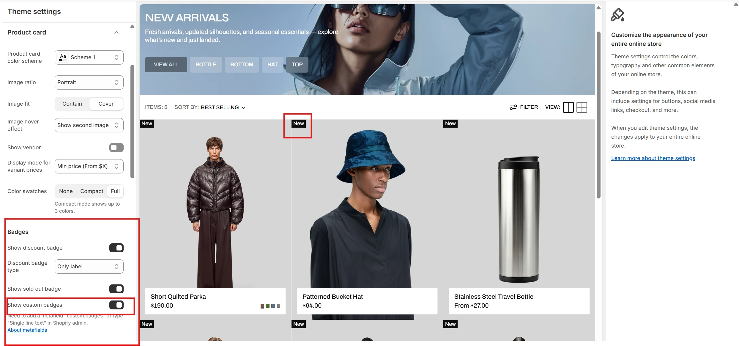
The next step is to add metafields to the products.
To add and edit metafields, follow these steps:
-
Navigate to Settings > Metafields and metaobjects in the Admin panel.
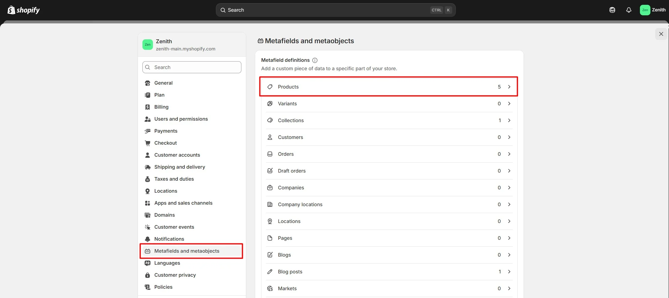
- Select Products.
-
Click the button "Add definition" and fill the fields. In the Name field enter "Badges" so
that "custom.badges" appears in the Namespace and Key field. In the Select type field
select "Single line text" and "List of values."
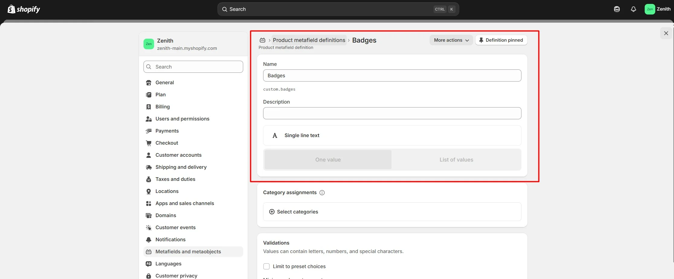
-
Navigate to the product and add information below.
Header group
Sections that are used on all pages by default.
Announcement bar
The announcement bar appears at the top of every page and includes custom messages with optional links. It's good to use for promoting sales or need-to-know updates.
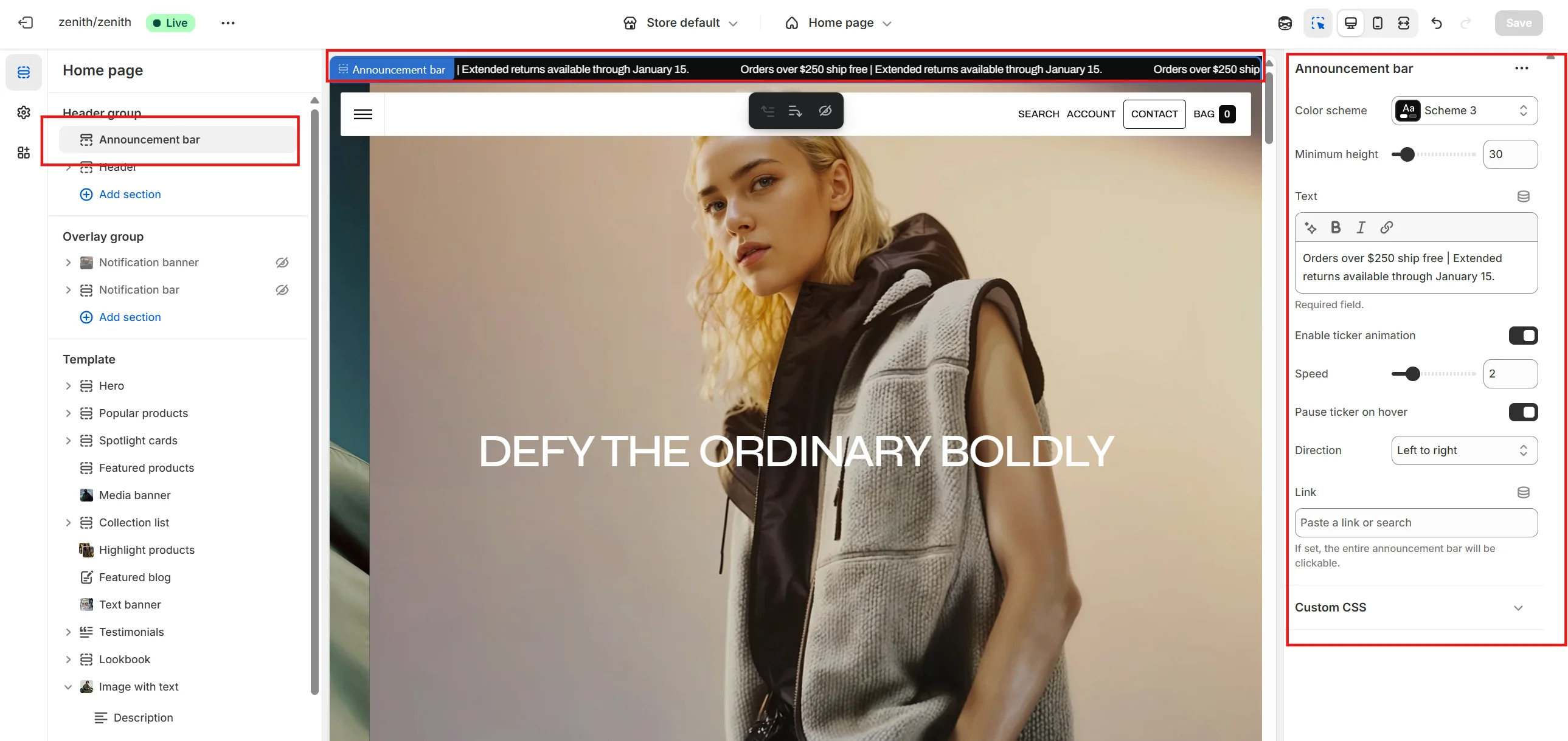
- Minimum height slider allows you to change the announcement height only on desktop devices.
- Minimum height on mobile devices slider allows you to change the announcement height only on mobile devices.
- Color scheme selector allows you to change the color scheme. You can change the colors in the Theme settings.
- Text field allows you to add and edit text.
Header
You can customize the header.
- Use the Logo image file selector allows you to select or upload your logo file.
- Use the Dark mode logo image file selector to select or upload your logo, which can be seen in Dark mode and when header is overlay.
- Logo position selector allows you to place the logo either on the left or in the center.
- (Optional.) If you add a logo, you can use the Logo width slider to change the logo size.
- Choose a Main menu to be displayed in the header.
- Use the Sticky header field to select a variant of the header when user scrolls in page.
- Enable country/region selector field enables the display of country/region.
- Enable language selector field enables the display of language.
- Enable search allows you to add Search modal and customize it.
- Choose a Popular searches menu to be displayed its items below the search interface.
- Enable bottom border field allows you to connect the lines under the header.
Desktop burger menu
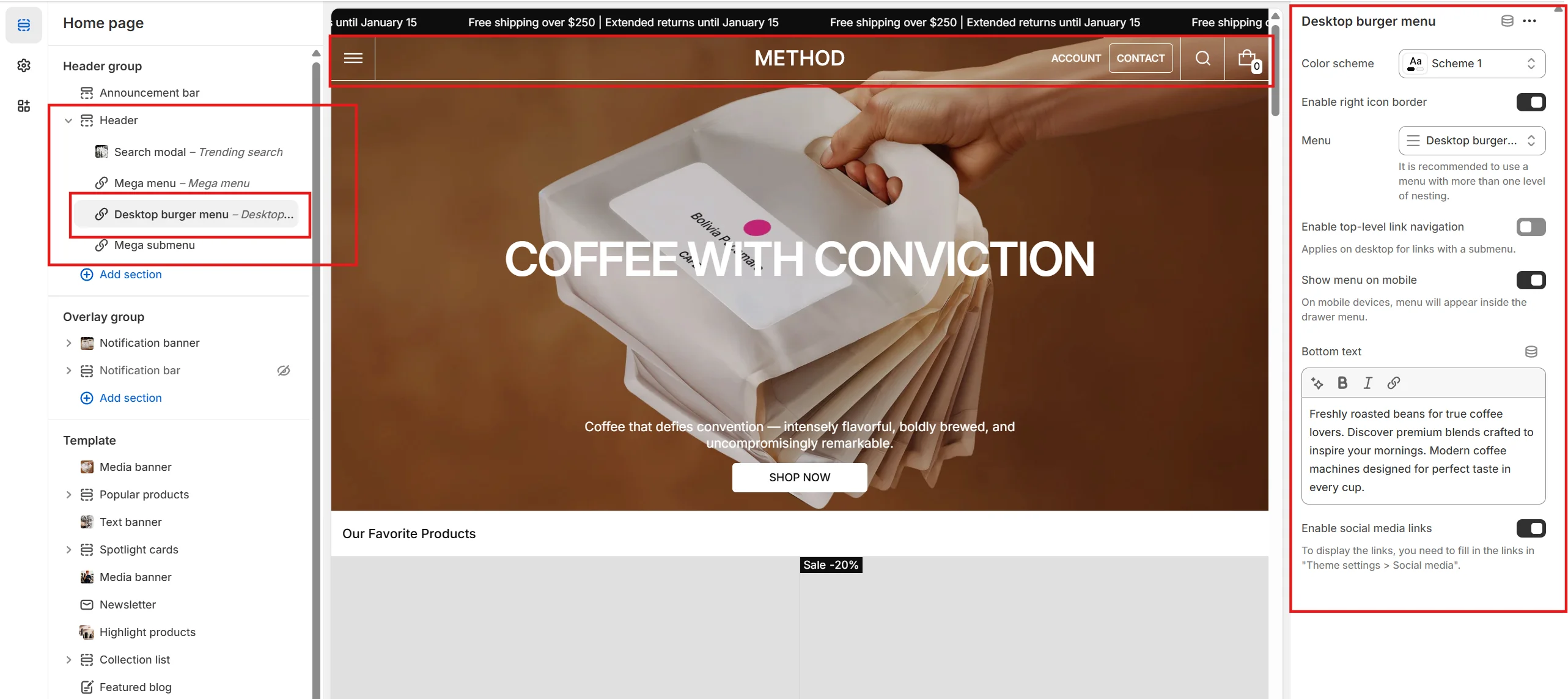
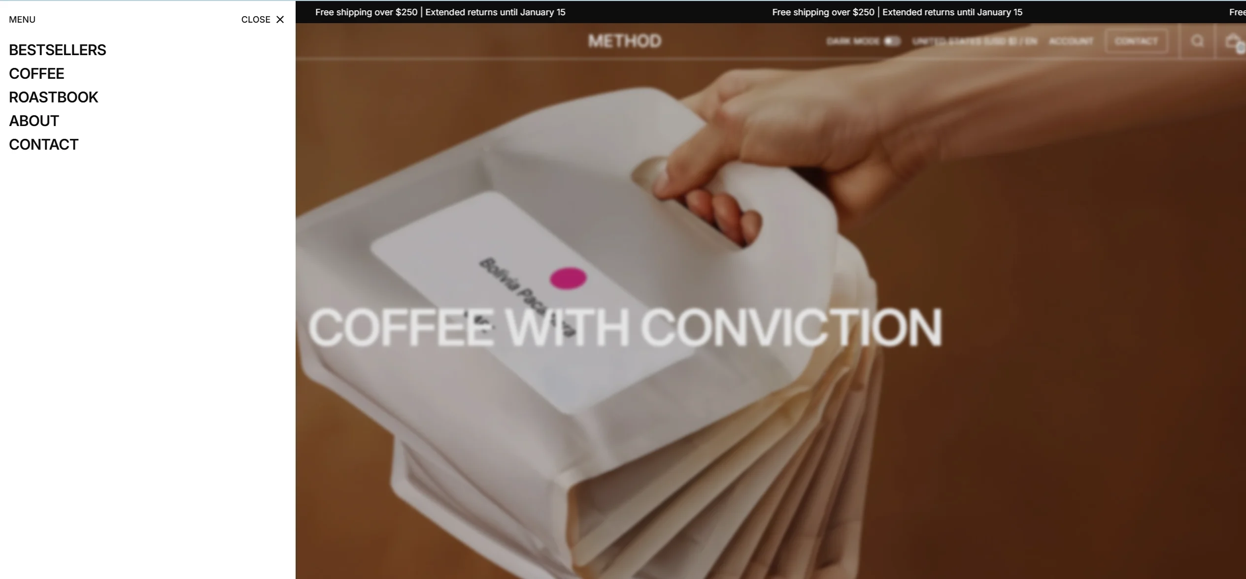
This burger menu is only available for display on desktop devices (screen width greater than 1200px).
You can display social media links, additional links, and add up to 4 promo cards to the burger menu.
- Add the Desktop burger menu block to the Header.
- Enable social media links to display them at the bottom of the burger menu.
- Choose a Additional links to display them at the bottom of the burger menu.
- Choose a Card type. The Link type will be a large link card with an arrow icon. The Media type allows you to upload a image, add a promotional button.
- Heading, description and link customizations are available in each card.
Mega menu
Mega menu allows you to display lists of products categorized into categories, as well as additional links.
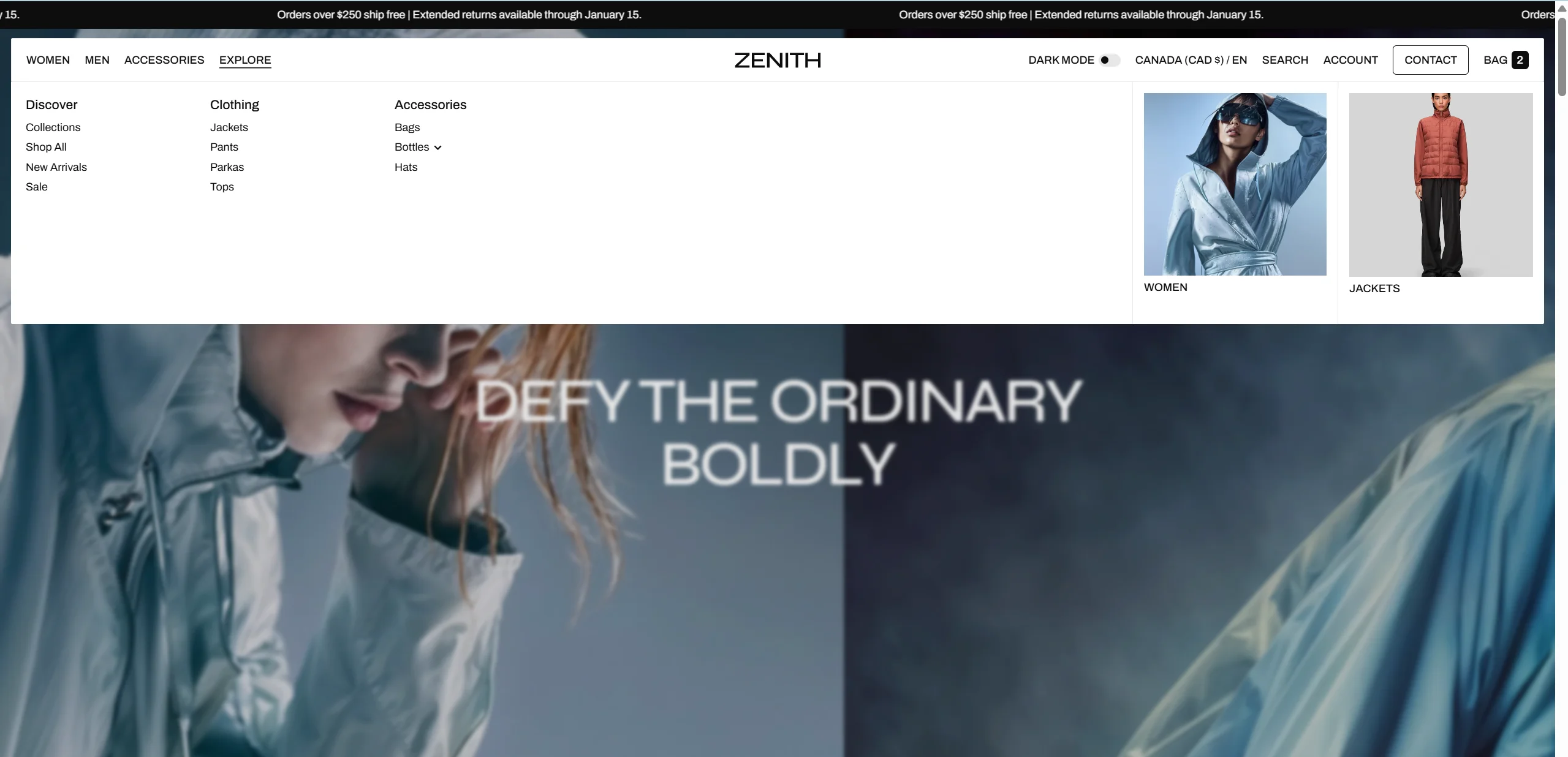
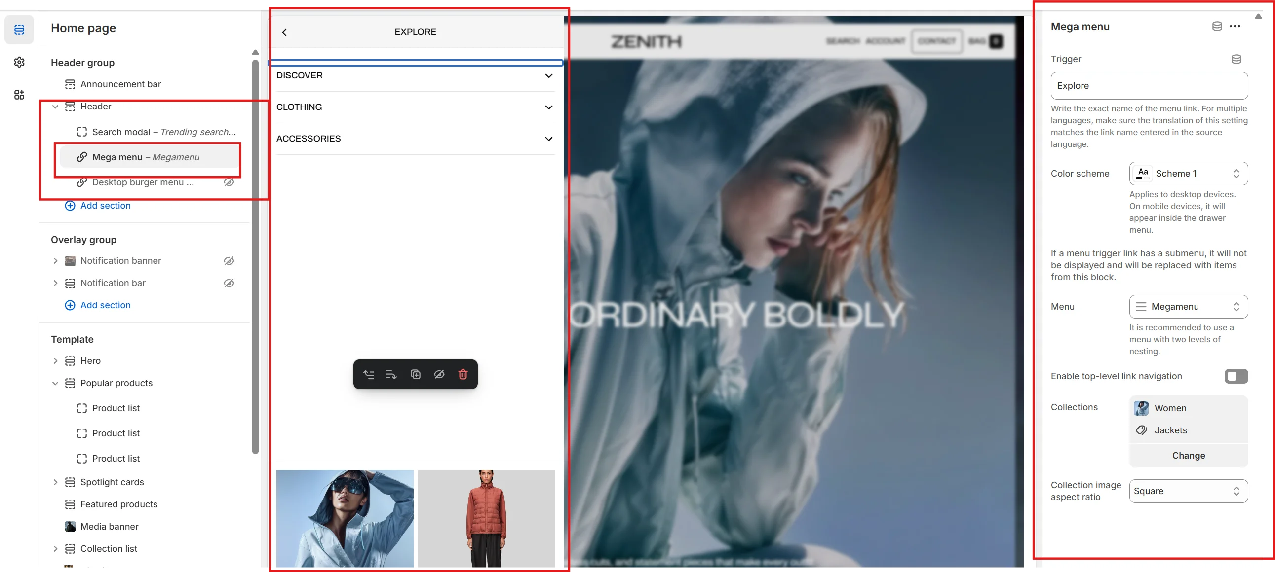
- Add the Mega menu block to the Header.
- Type the exact name of the link in the Trigger field.
- Fill in the categories, for each category you can customize Type, Heading, Link, Products list for Products type, Image for Image type and an Additional label that is displayed on the right side above the product list or above the image.
- Choose a Additional links to display them at the bottom of the mega menu.
Multilanguage Mega menu trigger
In this section, we will show how to create multilingual mega menu trigger using the Shopify Translate & Adapt app as an example.
After translating the store with the Translate & Adapt app, the value of the Trigger field in Theme > Header group > Header > Mega menu block will also be translated.
For the mega menu to work correctly in all languages, you need to ensure that the value in the Mega Menu Trigger field under Translate & Adapt > Theme > Section groups > Header group matches the Source value in the default language for each translated language.
Search
You can add an additional menu for quick customer access to your selected pages. The menu items will be displayed below the search interface.
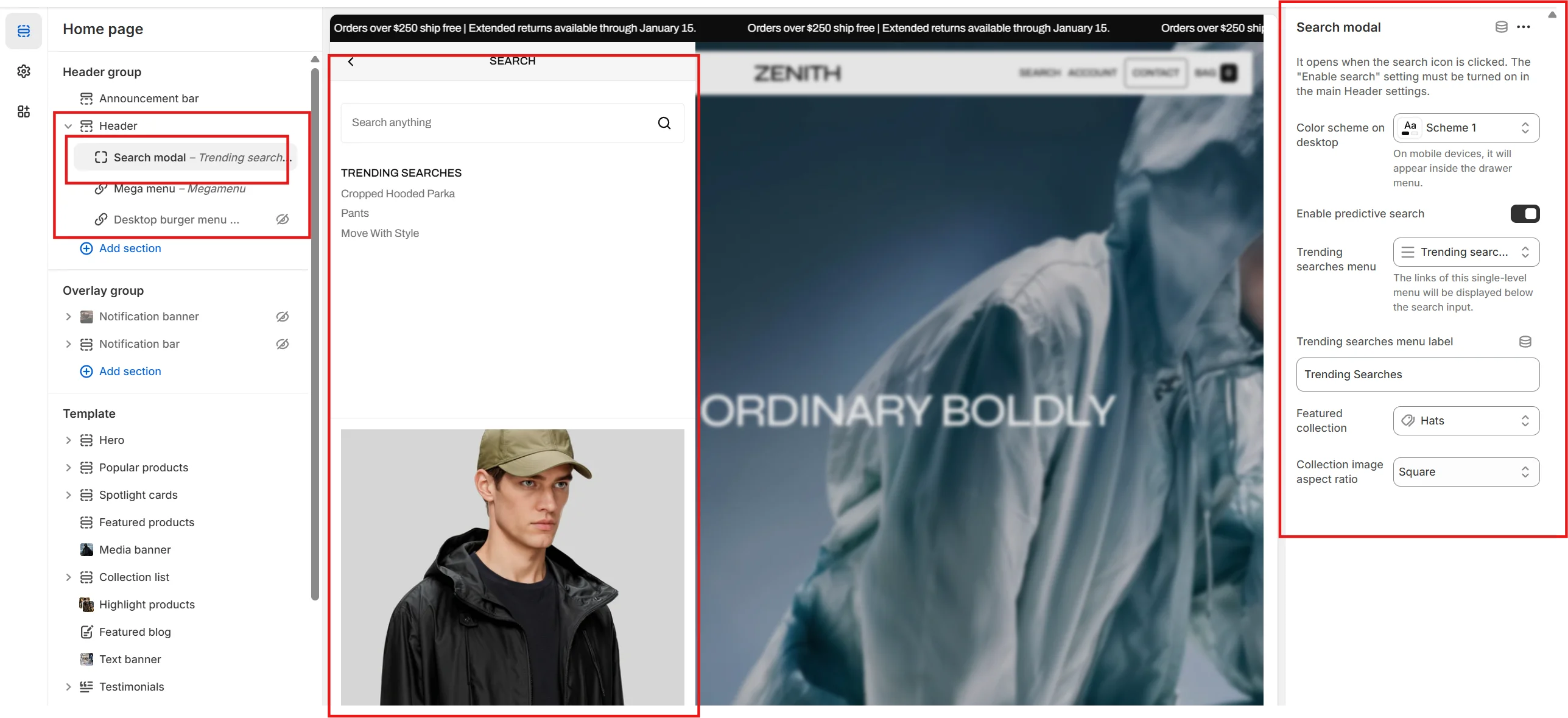
In this theme, you can use a predictive search. It is enabled by default for header, but you can disable it in the Theme settings > Predictive search.
Overlay group
Sections that are used on all pages by default.
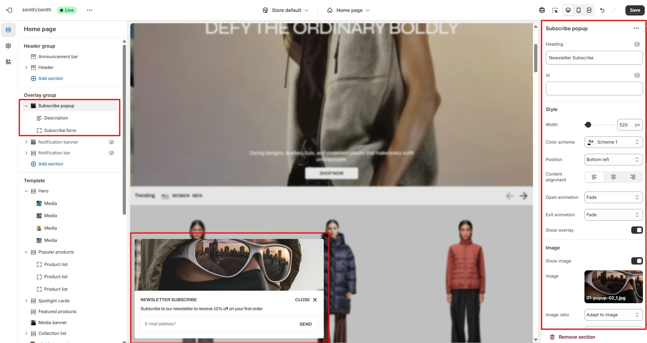
Subscribe popup
In the Subscribe popup settings, you can change layout, add image, subscribe form, customize position, open and exit animations and other options.
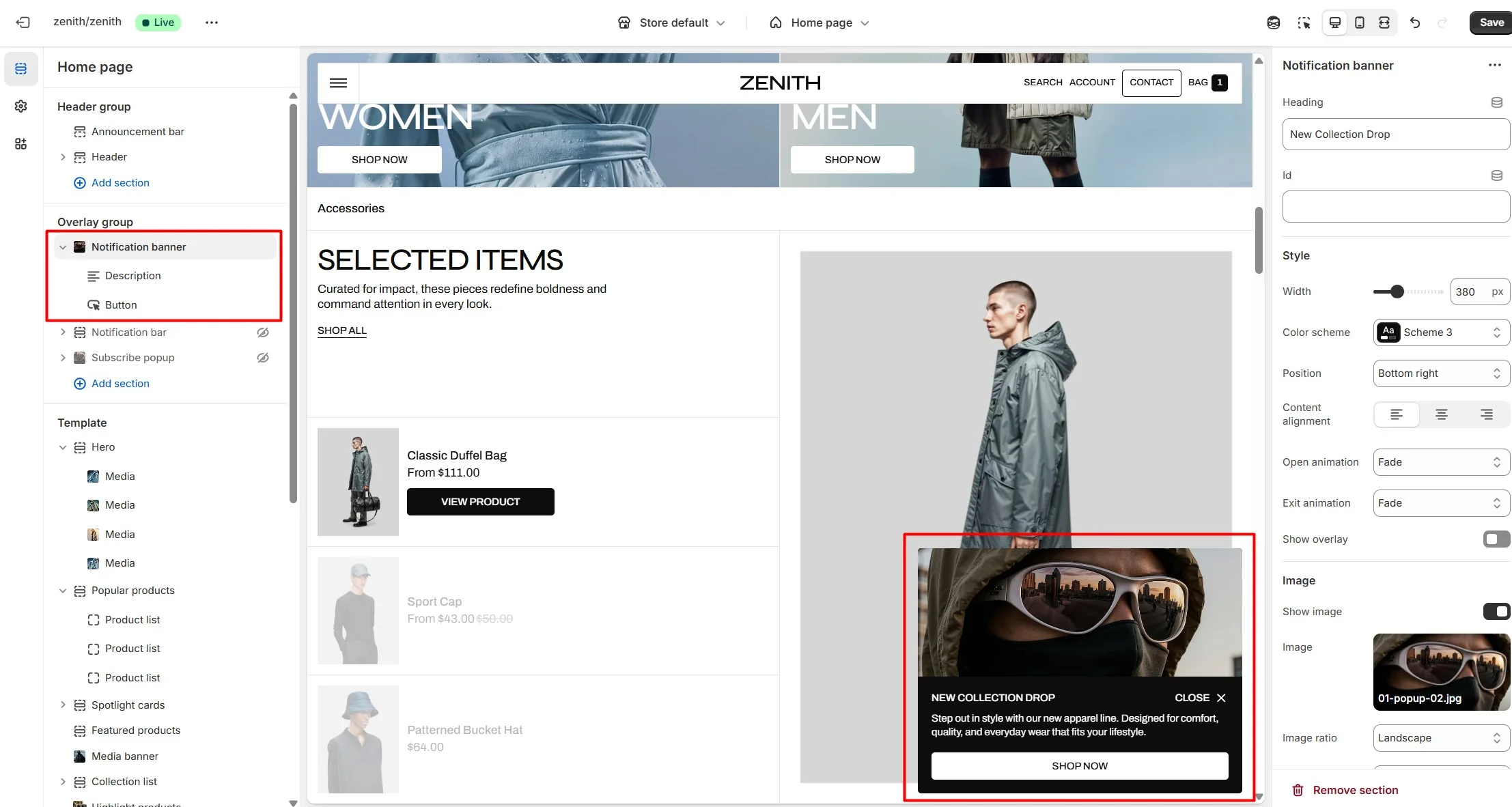
Notification banner
In the Notification banner settings, you can change layout, add image, texts, customize banner position, change open and exit animations and other options.
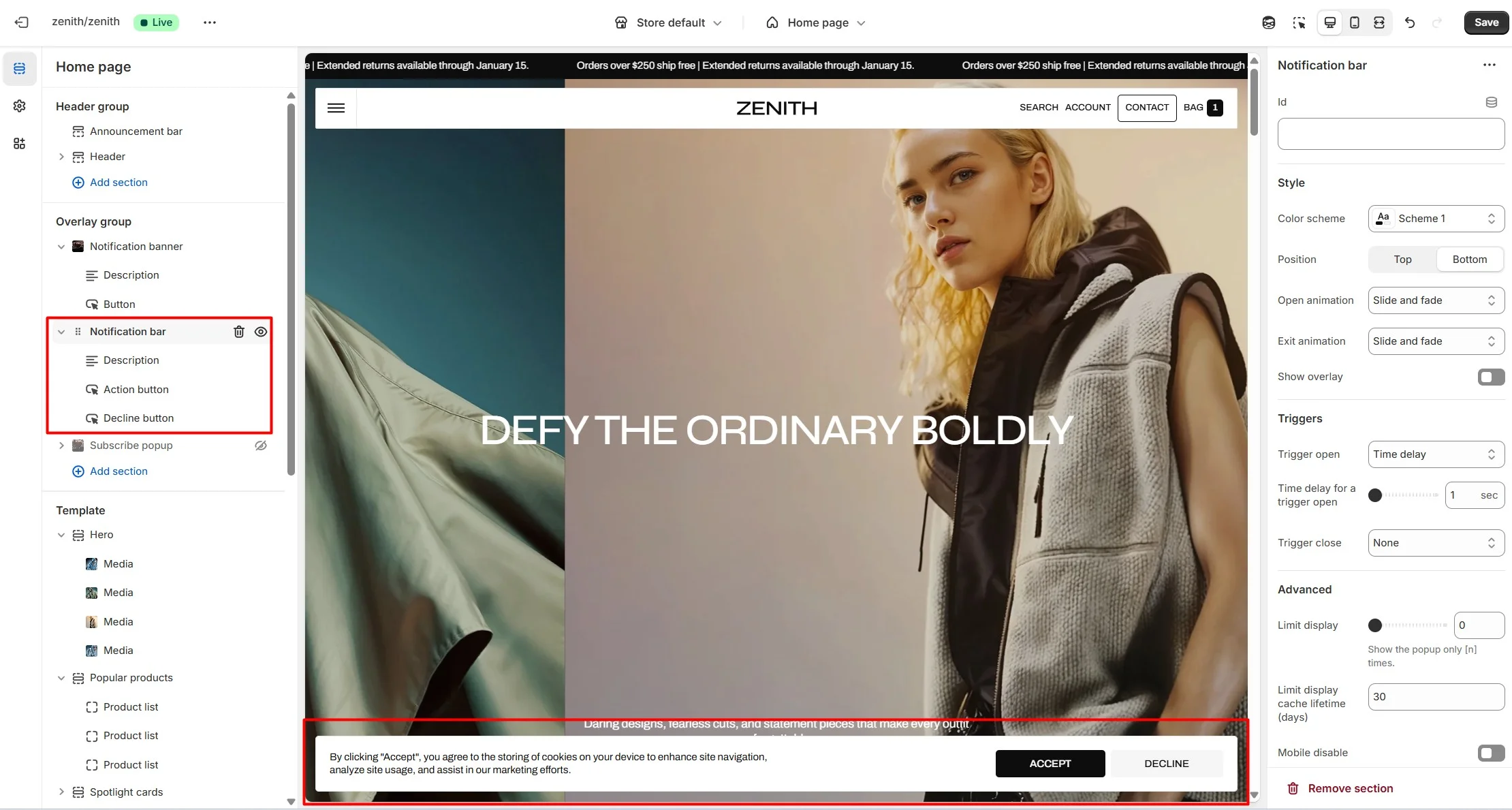
Notification bar
In the Notification bar settings, you can change texts, customize bar position, change open and exit animations and other options.
Manual trigger
You can also use subscribe popup, notification banner, notification bar as a button-trigger for opening another popup or notification bar by following these steps:
- Add the id of the popup/notification bar you chose to open to the Id field (e.g. "popup").
- Navigate to the popup/notification bar settigns and add the Id with "#" in the beginning to the "CSS selector for manual trigger" field.
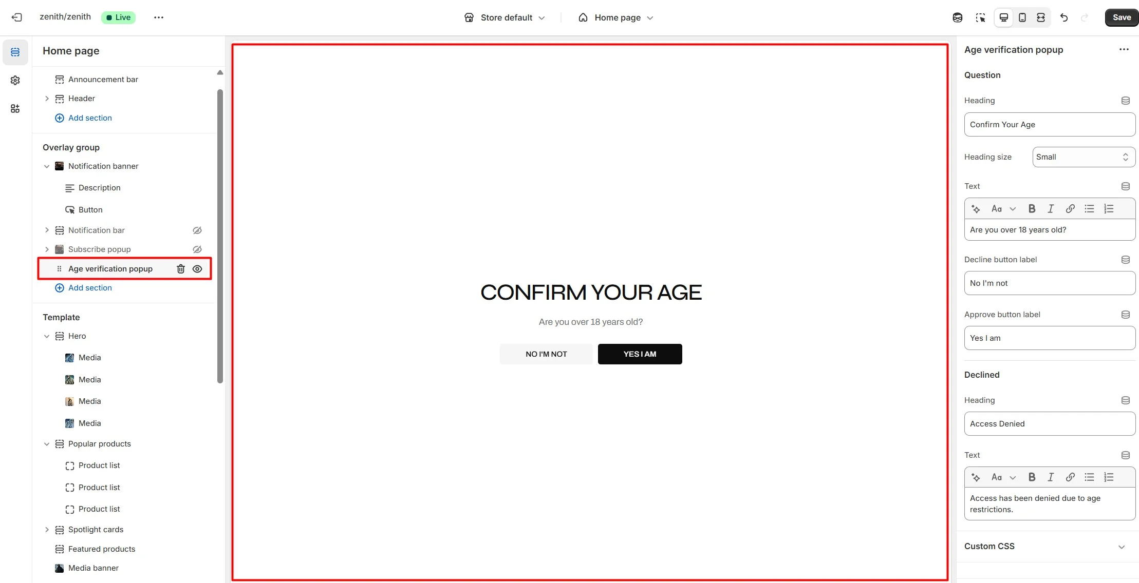
Age verification popup
An Age verification popup is a prompt that appears on a website to confirm the user's age before accessing restricted content. In the Age verification popup settings, you can change customize text and buttons.
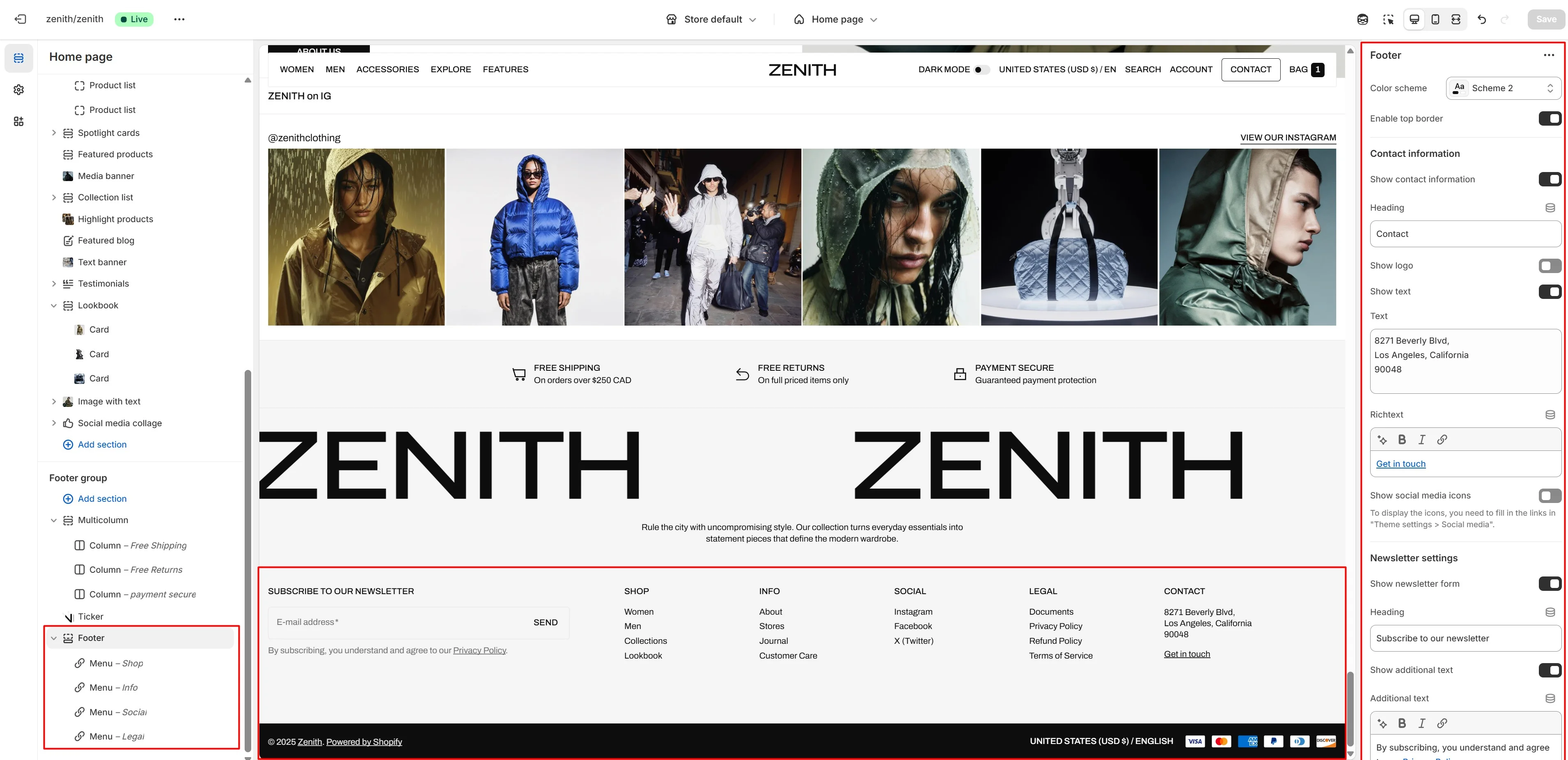
Footer group
Sections is used on all pages by default.
Footer
Footer appears at the bottom of every page. You can customize it to fit your brand and product offerings.
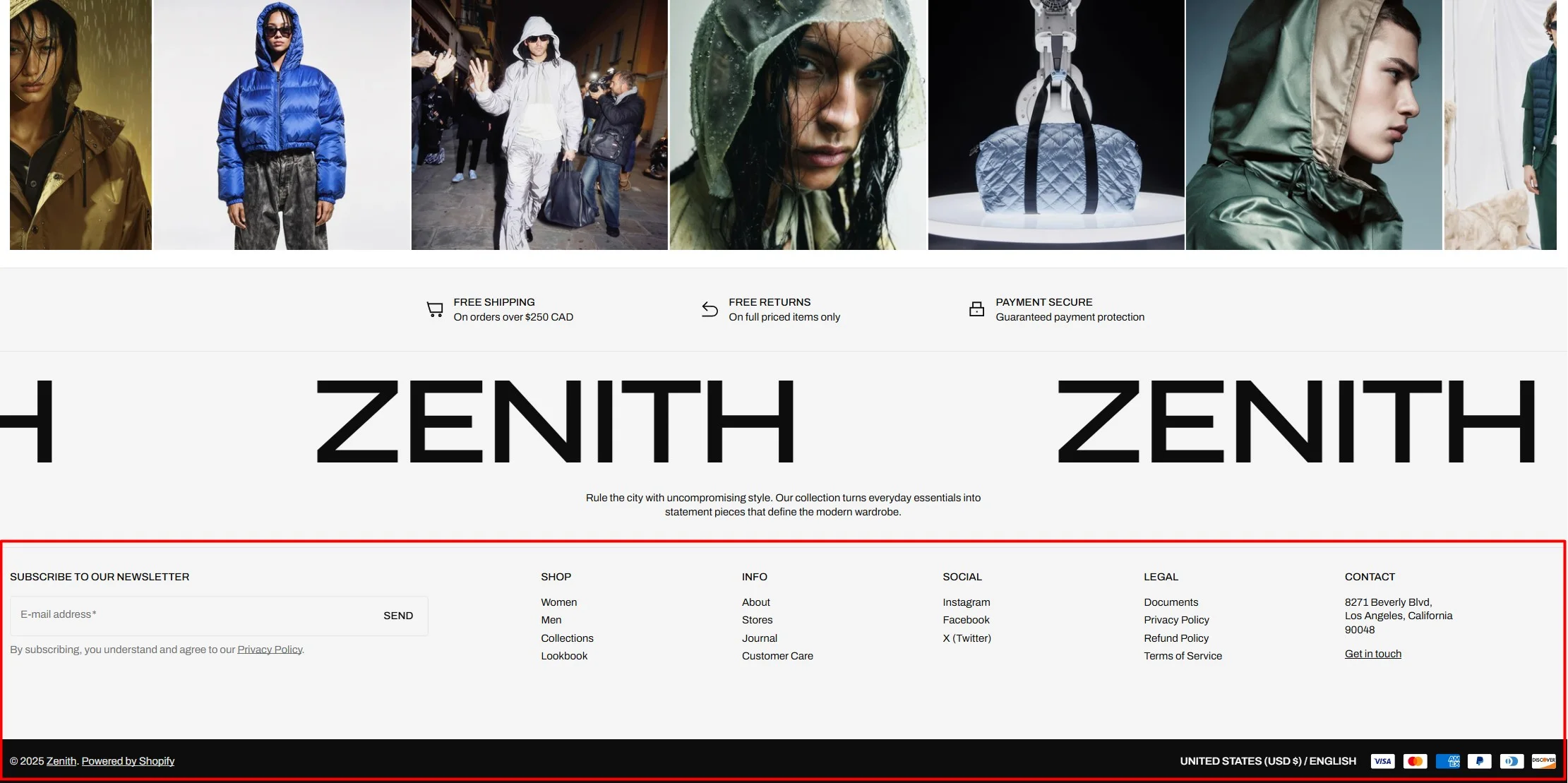
- Use Color scheme selector to change the color scheme.
- Enable border top field enables a line above the section.
- Use the Logo image file selector allows you to select or upload your logo file.
- Use the Dark mode logo image file selector to select or upload your logo, which can be seen in Dark mode.
- If you add a logo, you can use the Custom logo width slider to change the logo size.
- Text allows you to add additional description under the logo.
- Social media icons field enables the display of the social media links in the footer.
- Newsletter settings allows you to add and customize subscribe form.
- Country/region selector field enables the display of the region selector in the footer.
- Language selector field enables the display of the language selector in the footer.
- Payment icons field enables the display of payment methods in the bottom line of the footer.
- Copyright allow to show info about copyright.
- Policy links field enables the display of the policies links in the footer.
- Follow on shop allow customers to follow your store on the Shop app from your storefront, Shop Pay must be enabled.
- Block Menu allows you to select menus, which will be displayed on the top line of the footer.
All sections
The theme contains several customizable sections that you can add to your page in any order.
Heading group
This is a common group of settings that allows you to customize the heading in most sections..
The Heading group allows you:
- Set the section heading.
- Choose the heading size.
- Define the heading tag for SEO purposes.
- Configure a section button.
- Add a border to separate the heading group from the main section content.
Slideshow
The section allows you to add slides with an image, heading, and text.
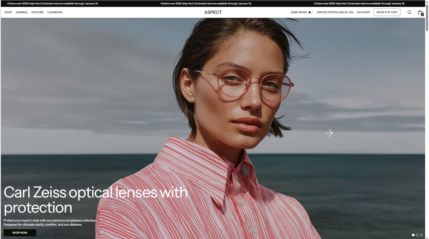
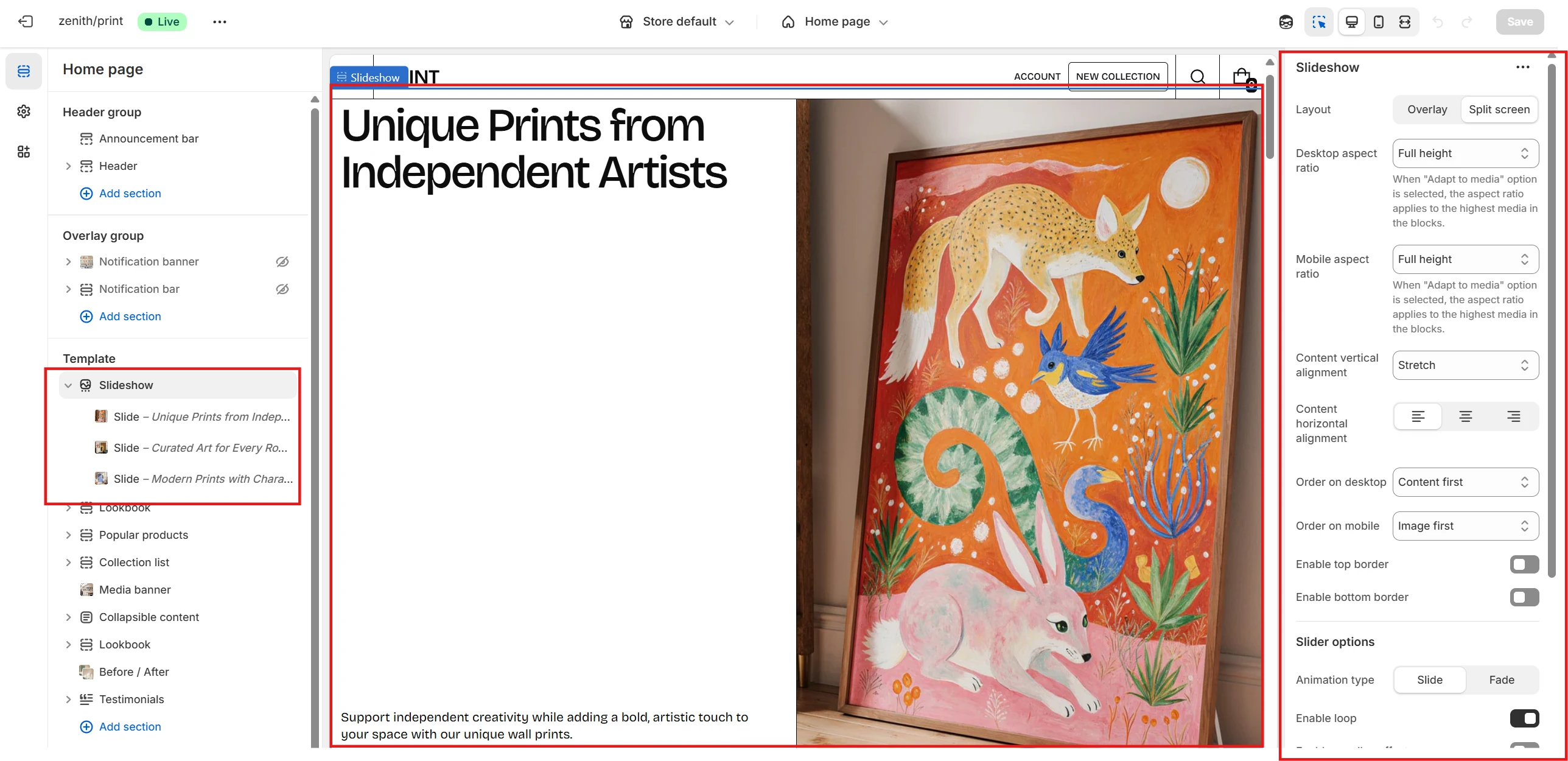
- Use the Layout selector to switch between Overlay or Split screen (text + image) layouts.
- With Desktop aspect ratio and Mobile aspect ratio you can set ratios for the entire section on desktop and mobile devices.
- You can also set text alignment using the available options.
- If the Split screen layout is selected, you can define the content order separately for desktop and mobile.
- In the Slider options you can configure effects such as looping, parallax, autoplay with duration, and pagination.
- You can also set a custom cursor for the section.
Slide options
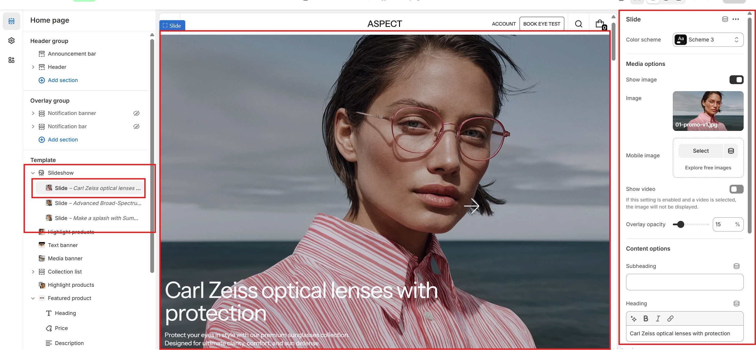
- You can set both Color scheme and Media color scheme for the Split screen layout. This allows you to define separate color palettes for text and media areas.
- In the Media options section you can choose the media type for the slide: Image or Video. If Image is selected, you can also specify a dedicated Mobile image.
- In the Content options section you can add and customize the Subheading, Heading, Description, and Button.
Text banner
This section allows you to add text content highlighted with an image, which can also be used as a custom cursor.

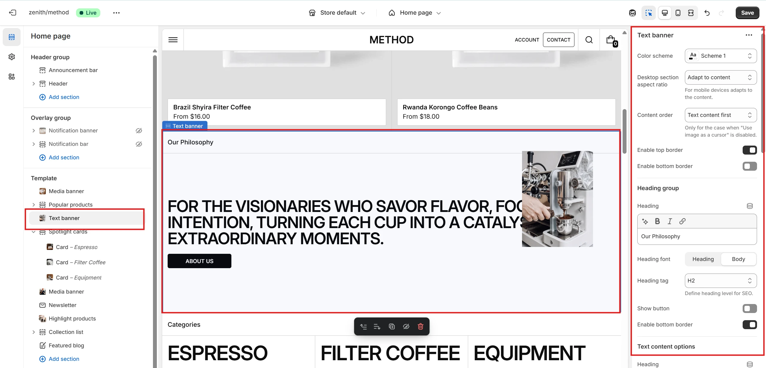
- Color scheme selector changes the color palette of the section.
- By adjusting the Desktop section aspect ratio you can set the ratio for the entire section on desktop devices.
- Text content options allow you to configure the text elements: Heading, Description, and Button with several customization settings.
- Image options allow you to configure the Image itself and set it as a cursor by enabling the Use image as a cursor option.
- You can also set the image ratio for both desktop and mobile devices, define its Width, and choose the Image fit.
- Content alignment options let you control the positioning of the text content.
Rich text
This section allows you to add Rich text content block.
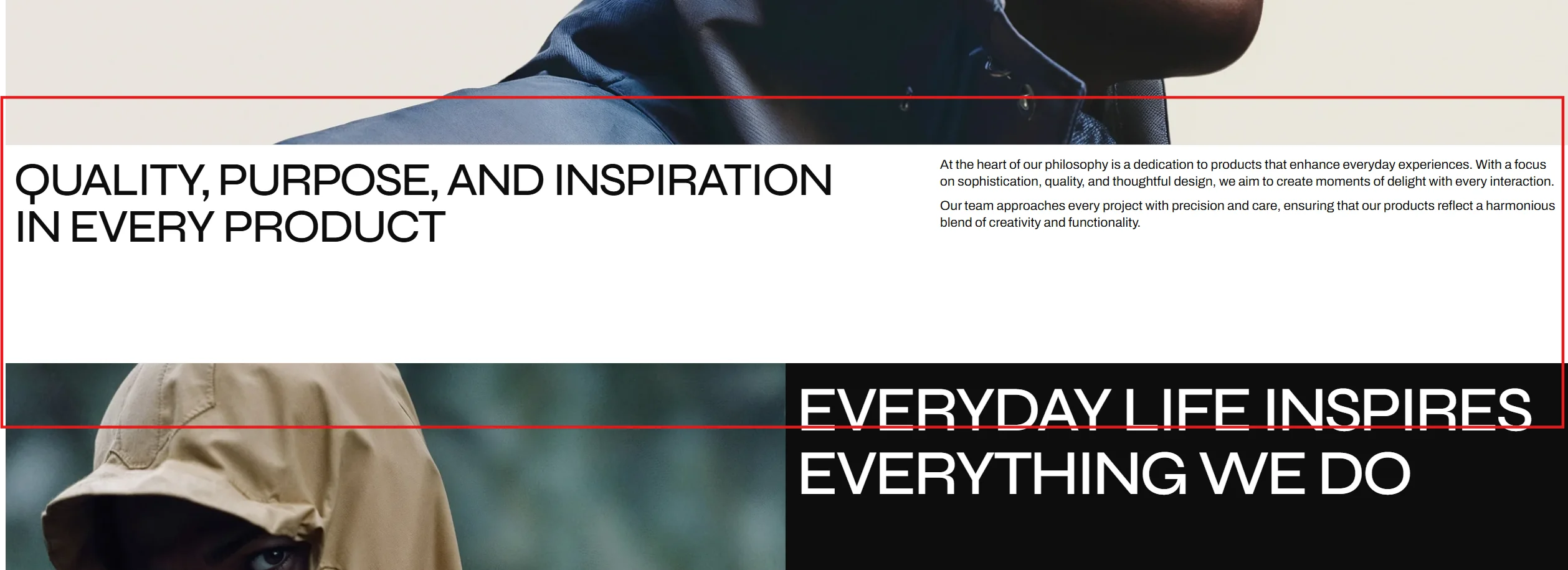
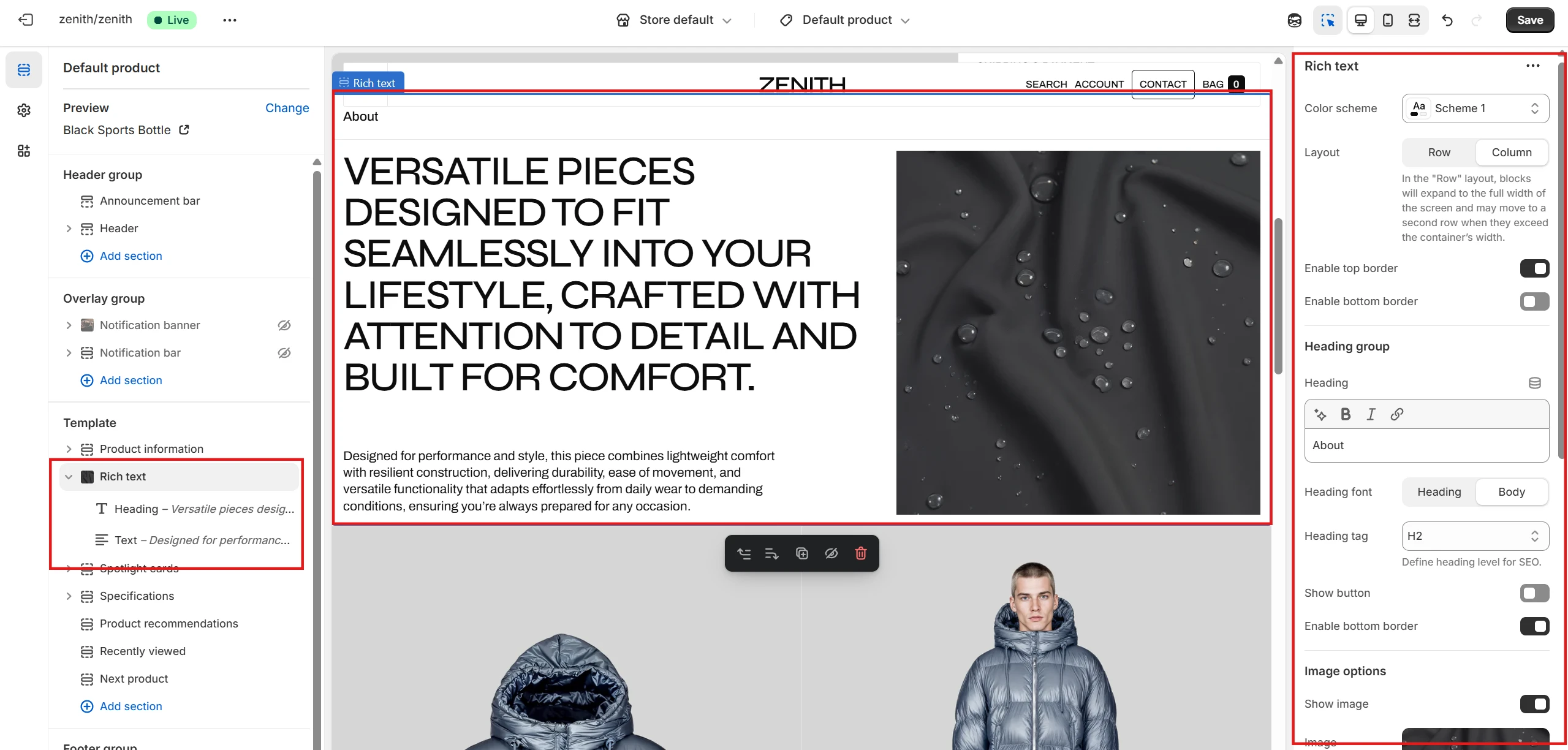
- Color scheme selector changes the color scheme of the section.
- Layout type allows you to set the layout for the section: Row (without image) or Column (with image).
- With Image settings you can set an image for the section itself, specify the ratio for desktop and mobile devices, and define the image fit.
- Alignment and placement options allow you to change the content position and order.
-
This section contains 3 block types. You can add up to 4 blocks (one of each type),
including:
- Heading – allows you to add a heading and customize its size.
- Description – allows you to add a description (rich text content).
- Button – allows you to add a button and customize it.
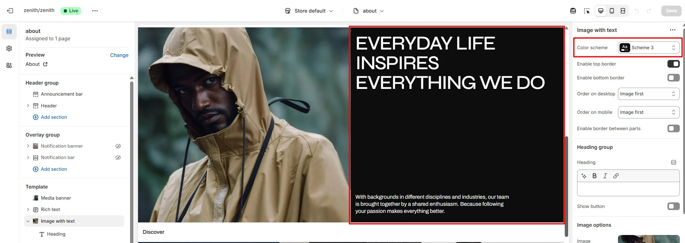
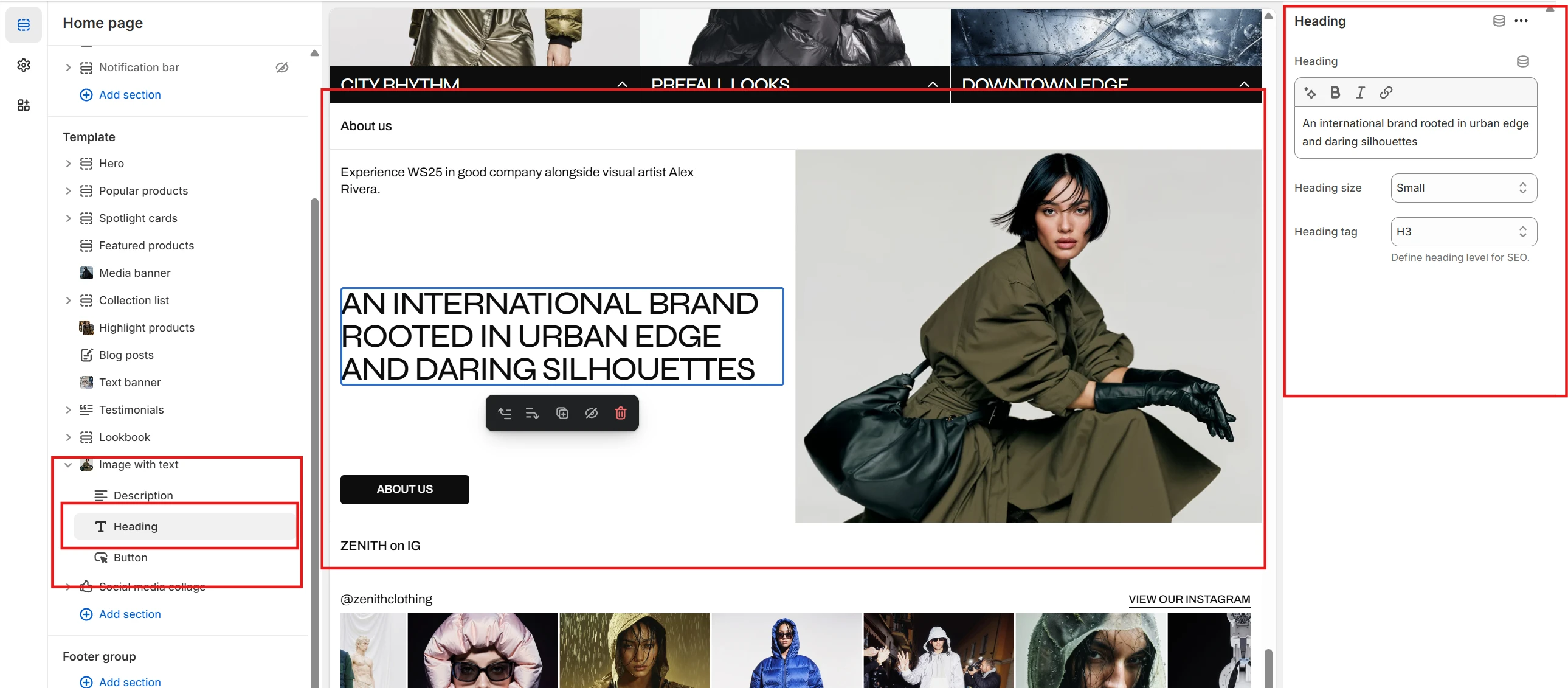
Image with text
This section allows you to add an image with a text (content) block.

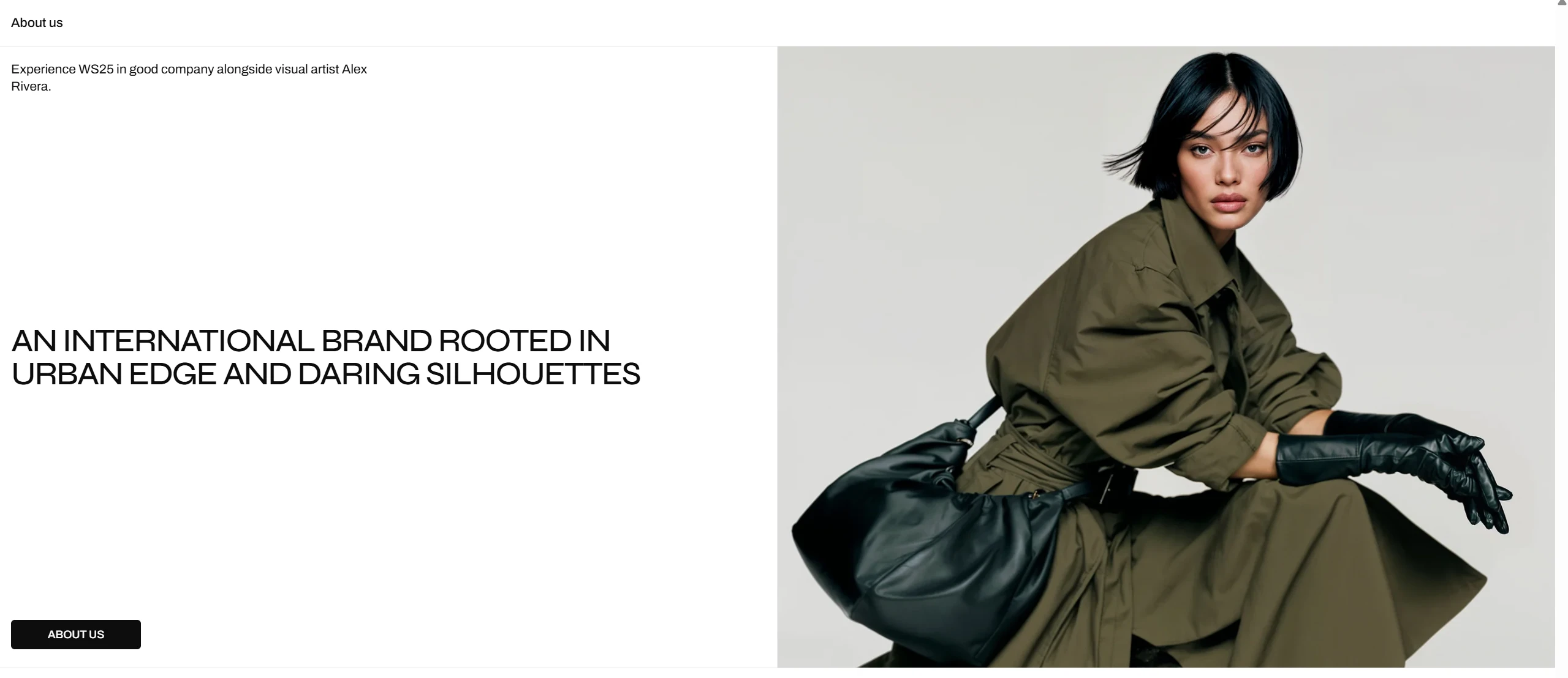
- The Color scheme selector changes the color scheme for the section.
- You can add borders to the top and bottom of the section.
- You can also set the order for the content and image for desktop and mobile.
- Heading group options: Use Heading, Heading font, Heading size, and Heading tag to set a heading for the whole section. Through these options you can also show a Button, set the Button label, Button link, and Button style (Primary, Secondary, Tertiary). Finally, you can enable a bottom border for the group.
- Image options (Image, Desktop image ratio, Mobile image ratio, Image fit. You can also enable an overlay and set an overlay link) allow you to set an image for the section and customize it.
Blocks settings
- Heading: Use Heading, Heading size, and Heading tag to configure the heading settings.
- Description: allows you to set a description.
- Button: allows you to set and customize a button.
Popular products
This section allows you to display a set of products and organize them into tabs using special filters.
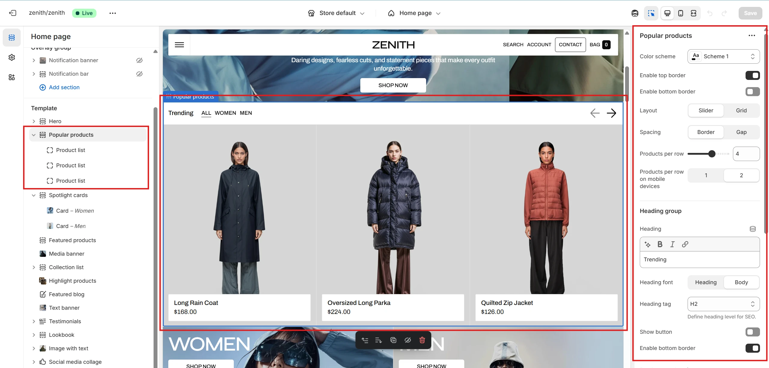
Popular products block
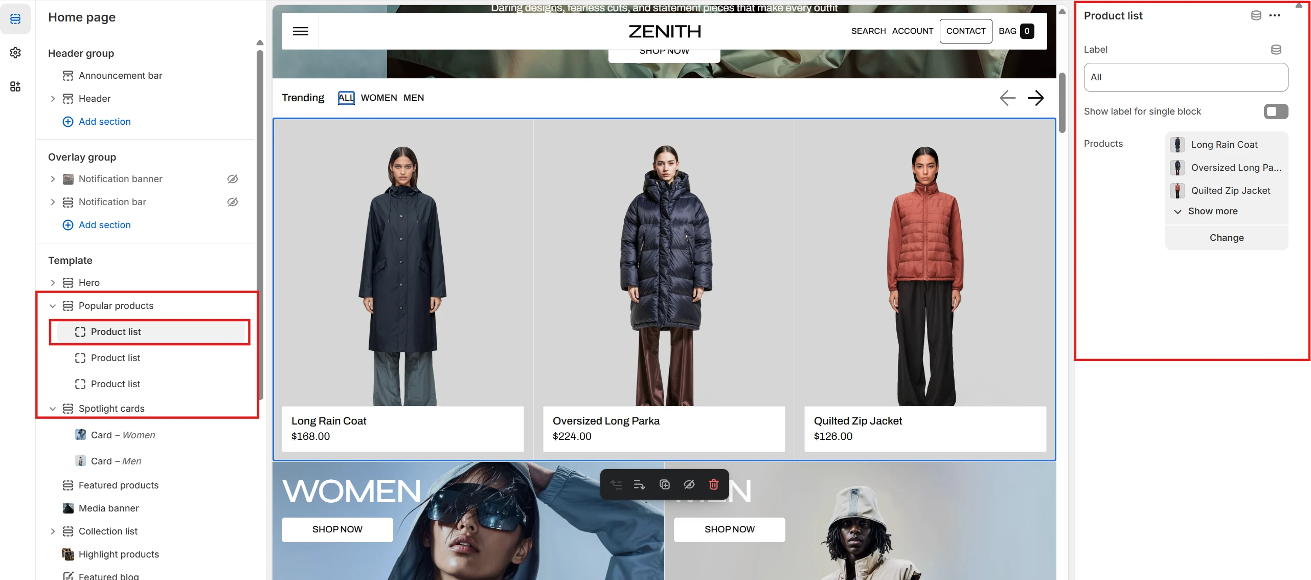
- Within each Tab block, you can specify the tab's name and choose the products to display in that tab.
Testimonials
This section allows you to add and customize testimonials (user reviews).
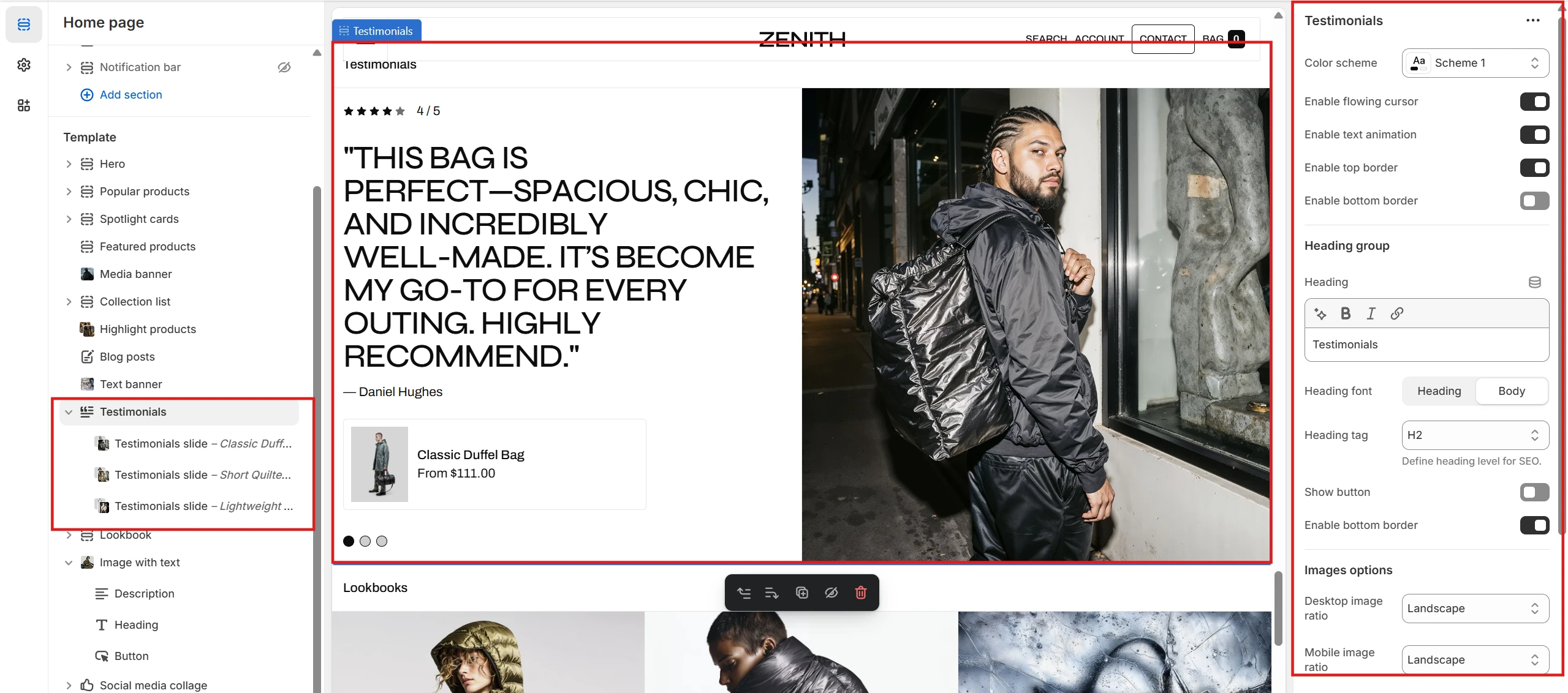
- The Color scheme option allows you to change the color scheme of the section.
- The Enable flowing cursor option allows you to set a custom cursor for the section.
- The Enable text animation option enables text animation for the slides.
- You can also set top and bottom borders for the section.
-
The Images options section allows you to customize testimonial image styles. It
includes the following options:
- Desktop image ratio allows you to set the image aspect ratio for desktop devices.
- Mobile image ratio allows you to set the aspect ratio for mobile devices.
Slide settings
The Testimonials slide block allows you to add and customize testimonials (user reviews). Each block has the following options: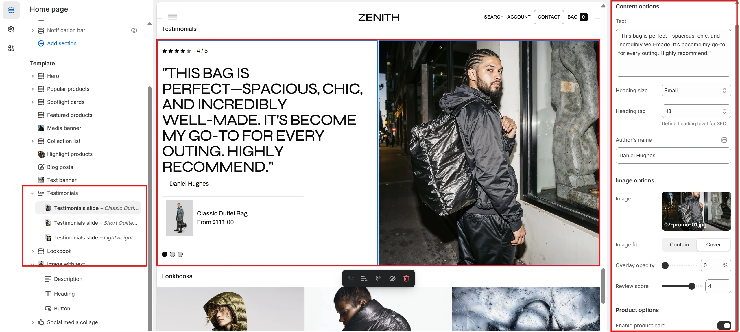
- Text allows you to set the review text. You can also set the size and tag for the text.
- Author's name allows you to set the name of the review author.
- Image allows you to set an image for the testimonial slide.
- Review score allows you to set a review score.
- Product allows you to set a product related to the review.
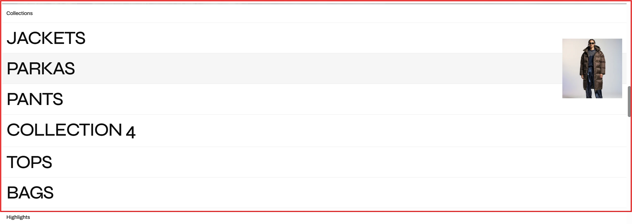
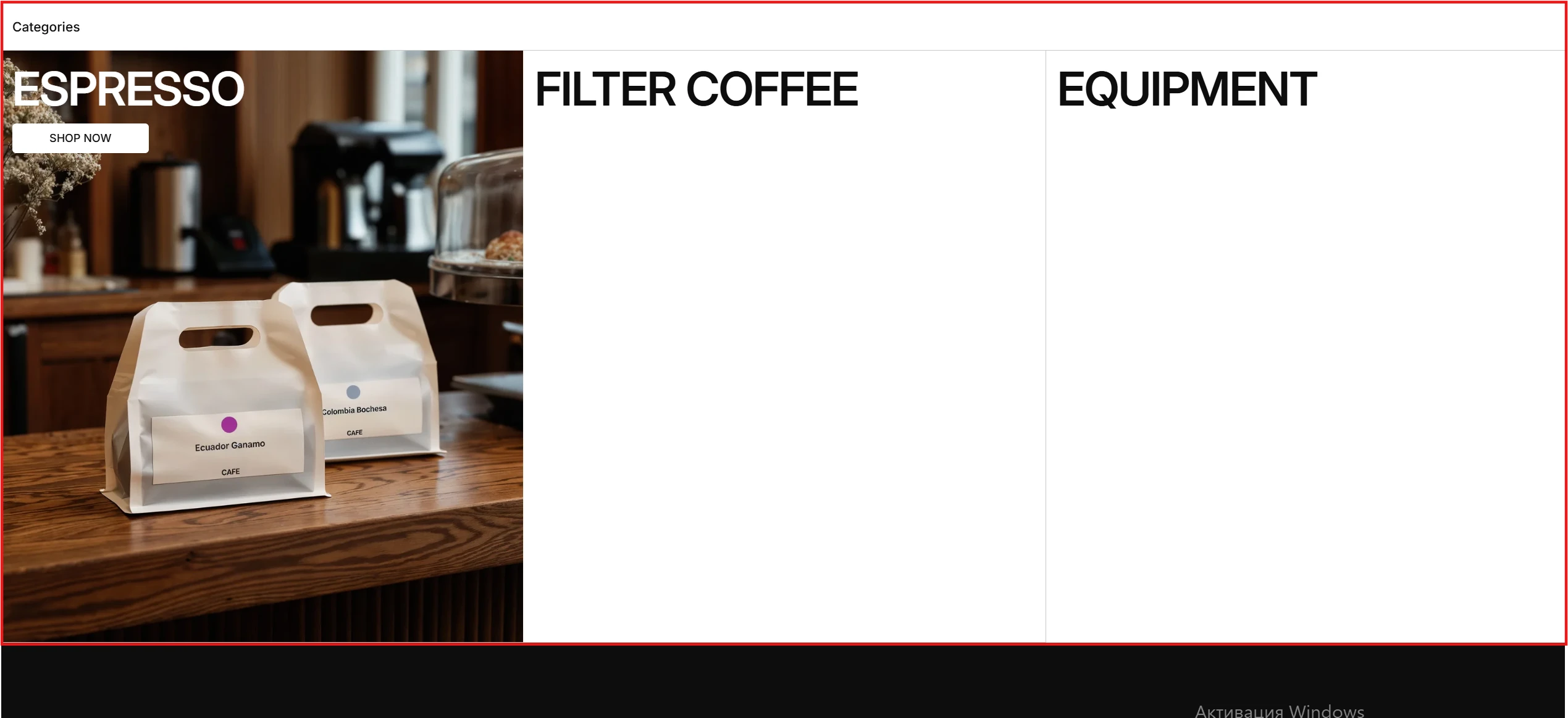
Collection list
Displays a list of selected collections.
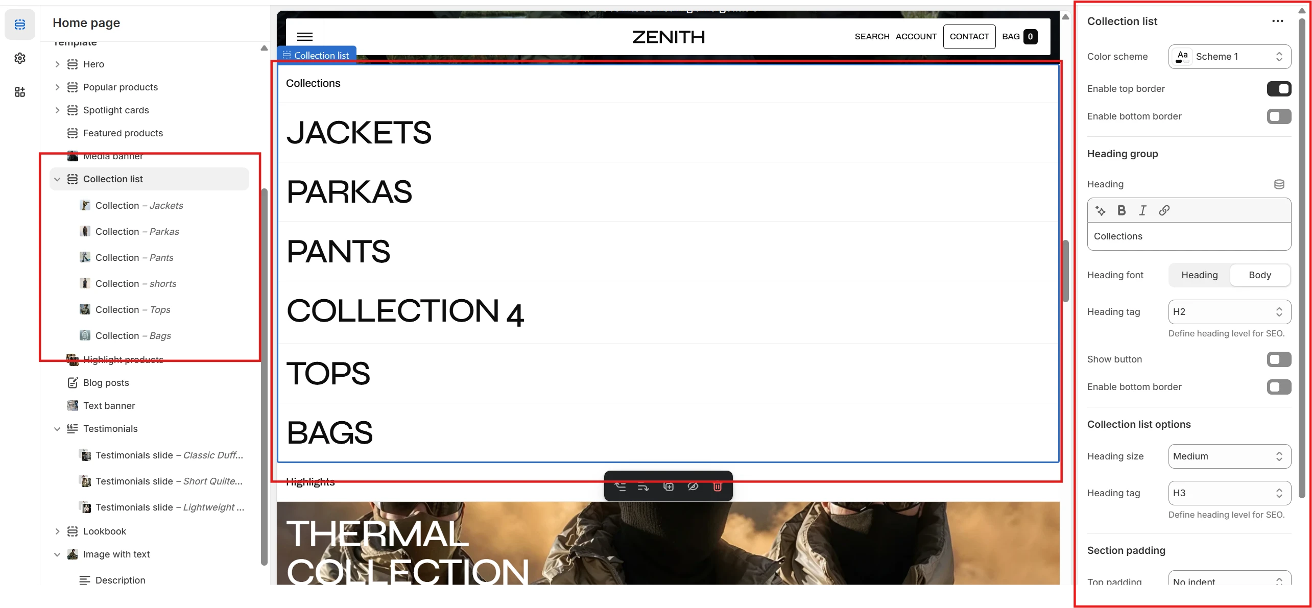
- Color scheme allows you to change the color scheme of the section. You can also set top and bottom borders.
-
Collections list options allow you to customize the typography of collection names.
This includes the following options:
- Heading size – allows you to change the size of the collections' headings.
- Heading tag – allows you to change the tag of the collections' headings.
Collection list block
Collection block allows you to select a collection and customize it. This includes the following options:
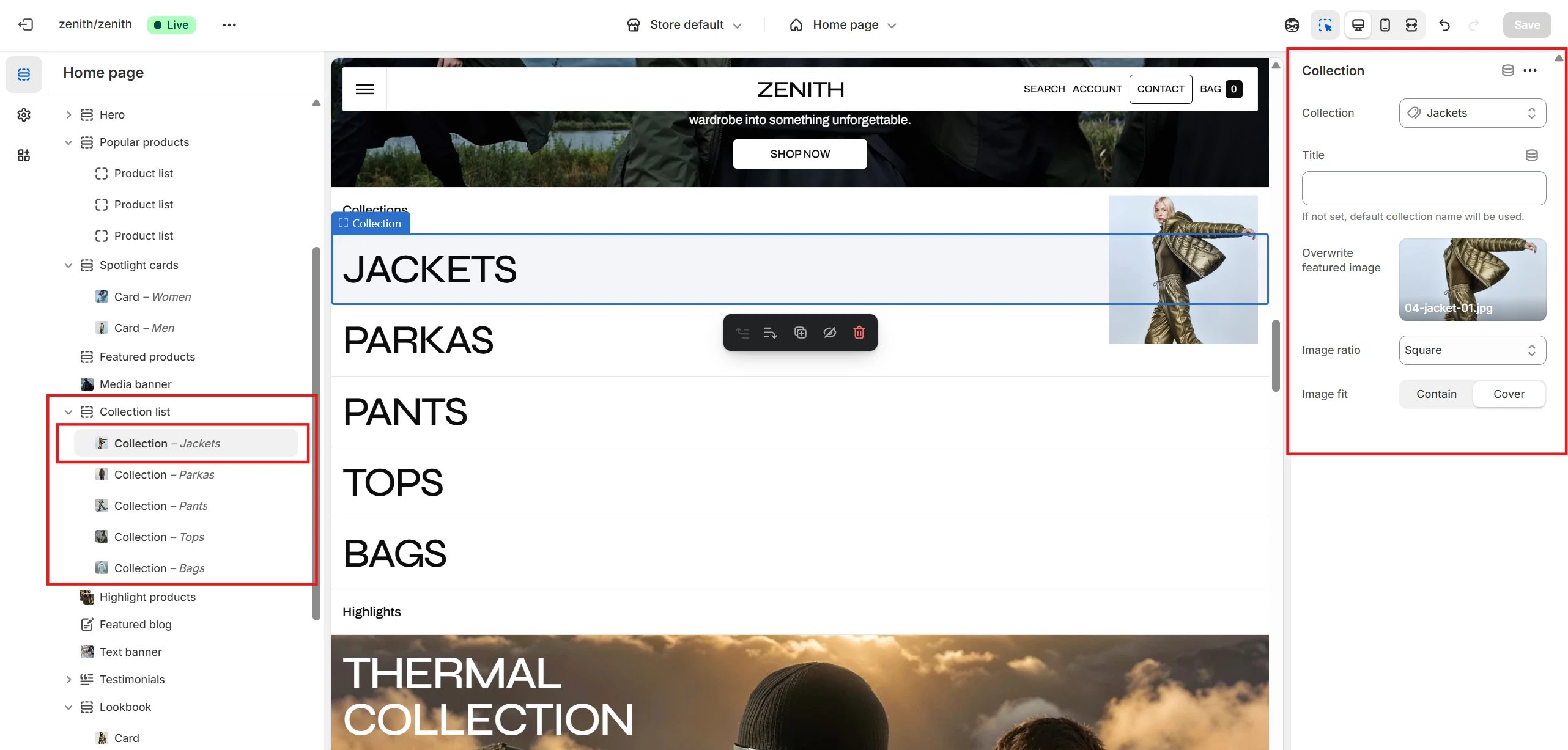
- Collection – allows you to select a collection.
- Title – allows you to set a custom title for the collection line. If not set, the default one will be used.
- Overwrite featured image – allows you to replace the collection's featured image. Additionally, you can specify an image ratio and fit for the collection's image.
Before / After
The section allows you to add images to demonstrate positive improvements achieved by the product.
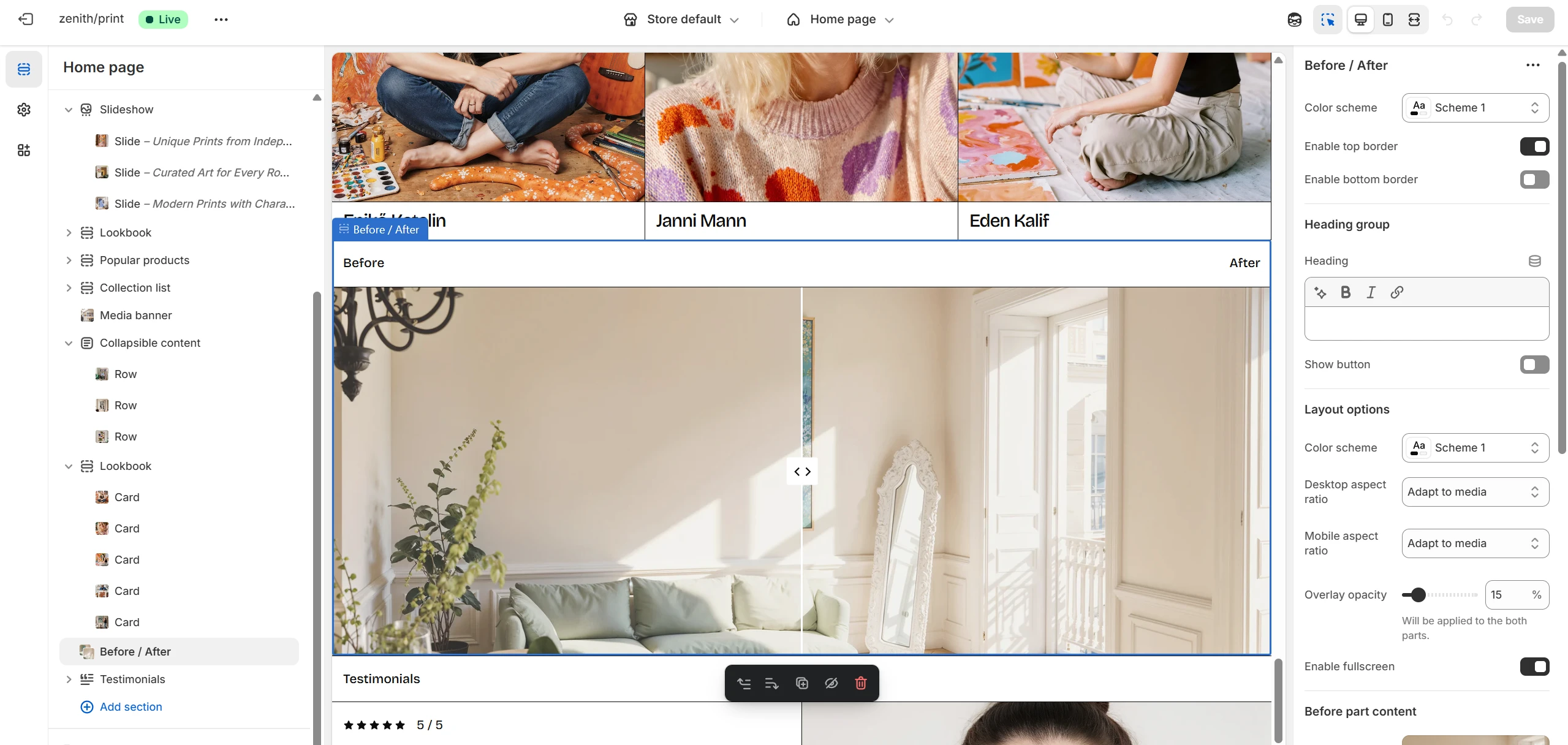

- Color scheme – allows you to change the color scheme of the section. You can also set top and bottom borders.
- Layout options – allow you to set a color scheme for the image field itself, select image ratios for mobile and desktop devices, and adjust the overlay if needed.
- Before/After content settings – allow you to set images for each part and define labels for them.
Collapsible content
You can add and configure a collapsible content section, commonly used for FAQs or expandable details.
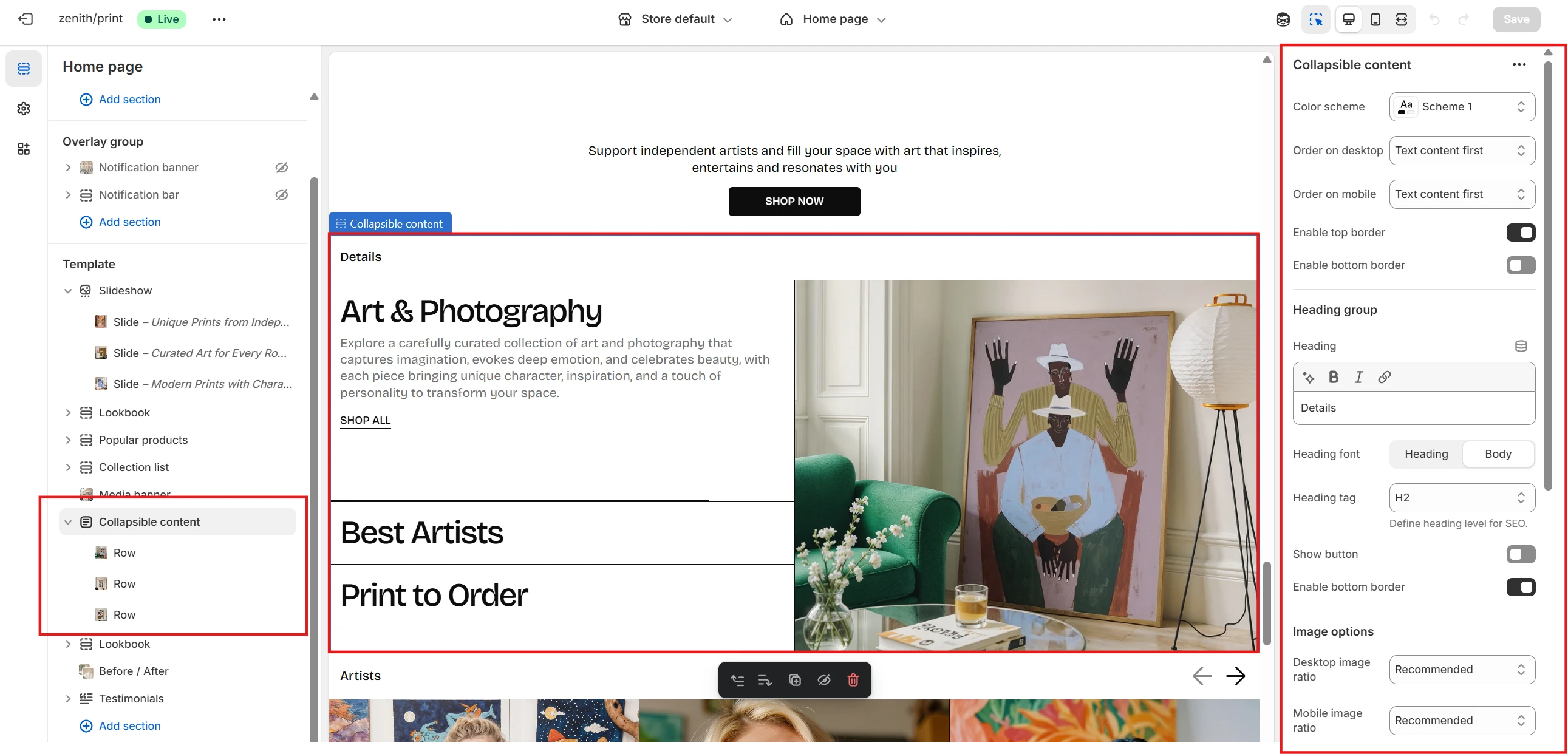
- Color scheme – allows you to adjust the overall color scheme of the section.
- Content order – defines the sequence of text and images on desktop and mobile devices: Text first or Image first.
- Also you can set top and bottom borders for the section.
- Image ratio – select the appropriate ratio for both desktop and mobile views using the Desktop image ratio and Mobile image ratio dropdowns.
- Autoplay settings – control automated playback for this section. You can set duration, enable or disable looping, and pause on hover.
Collapsible content block
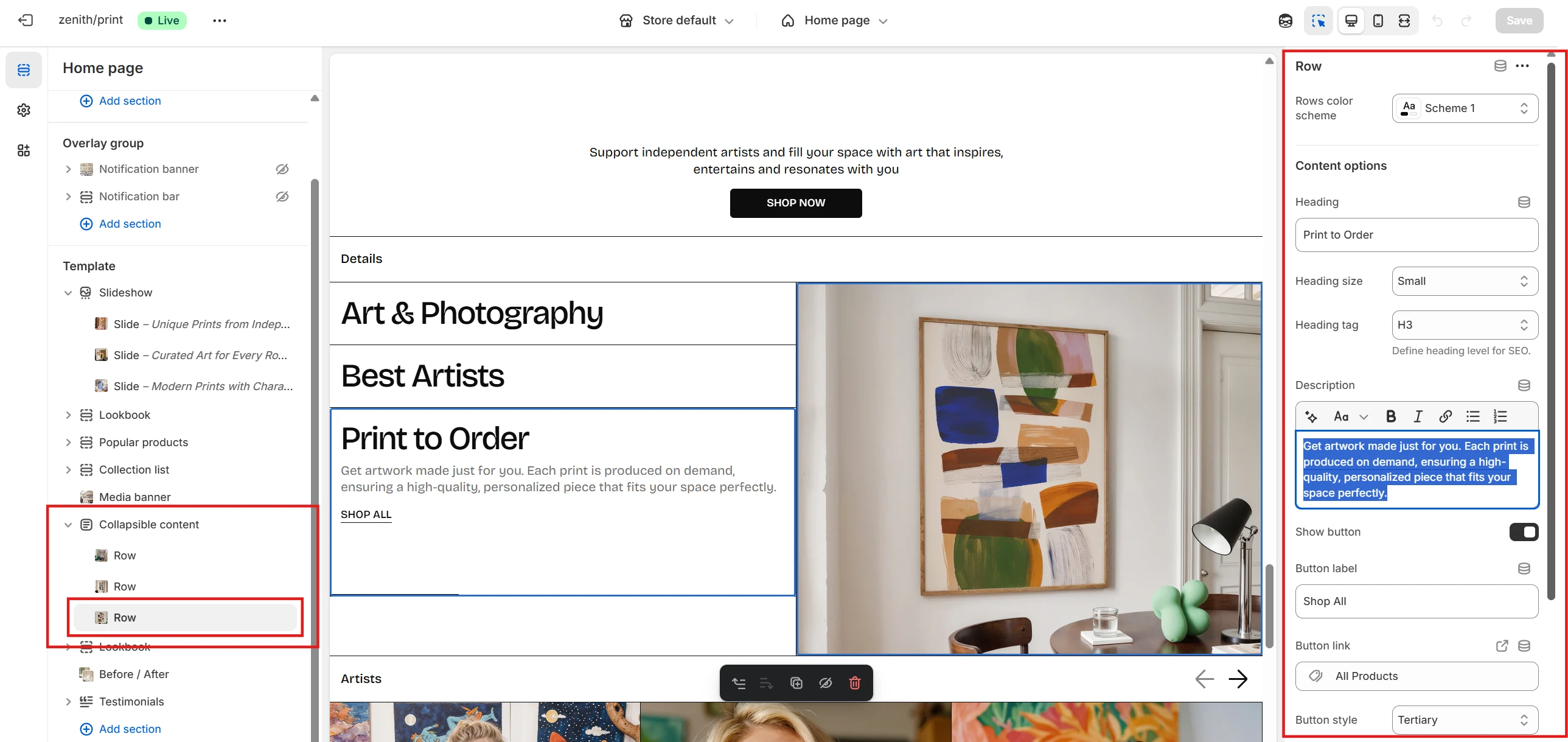
- Row color scheme – set a unique color scheme for an individual row.
- Content settings – for each collapsible row, you can configure a Heading (size and tag), Description, and Button with its options. You can also define horizontal alignment for the row.
- Image options – upload an image, set its ratio and fit, add an overlay, and optionally assign a link triggered on click.
Spotlight cards
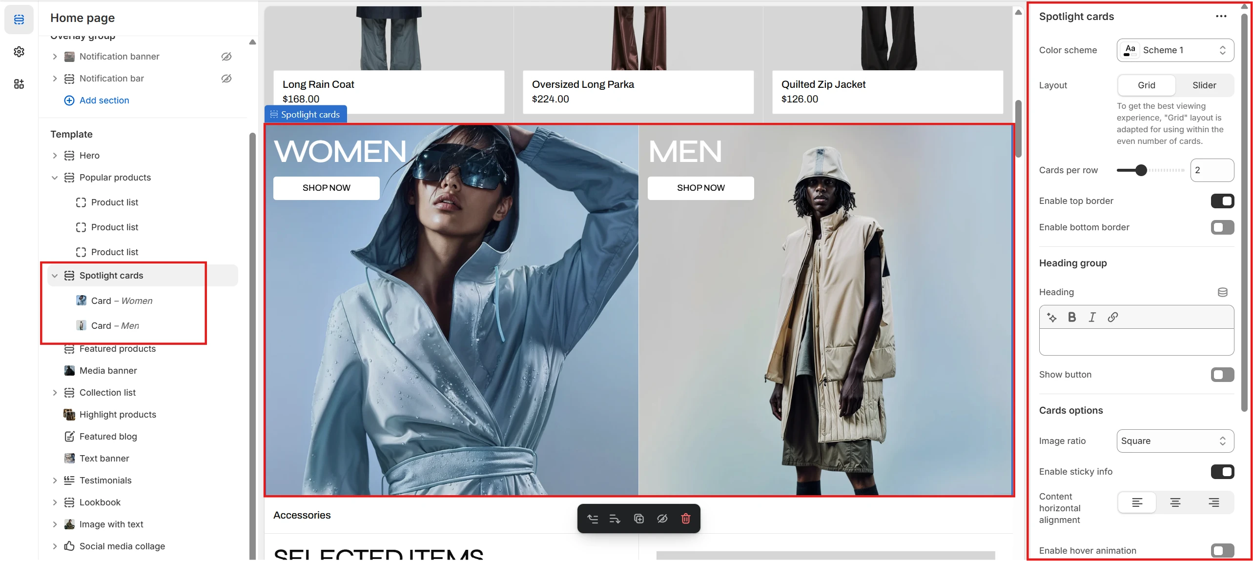
- Color scheme selector allows you to change the color scheme of the section.
- By changing the Layout selector, you can set the section view to either Grid or Slider. You can also specify the number of columns per row using the Cards per row option.
- You can also set top and bottom borders for the section.
- Cards options allow you to define the card ratio, set inner content alignment, and enable hover animation.
Spotlight cards block
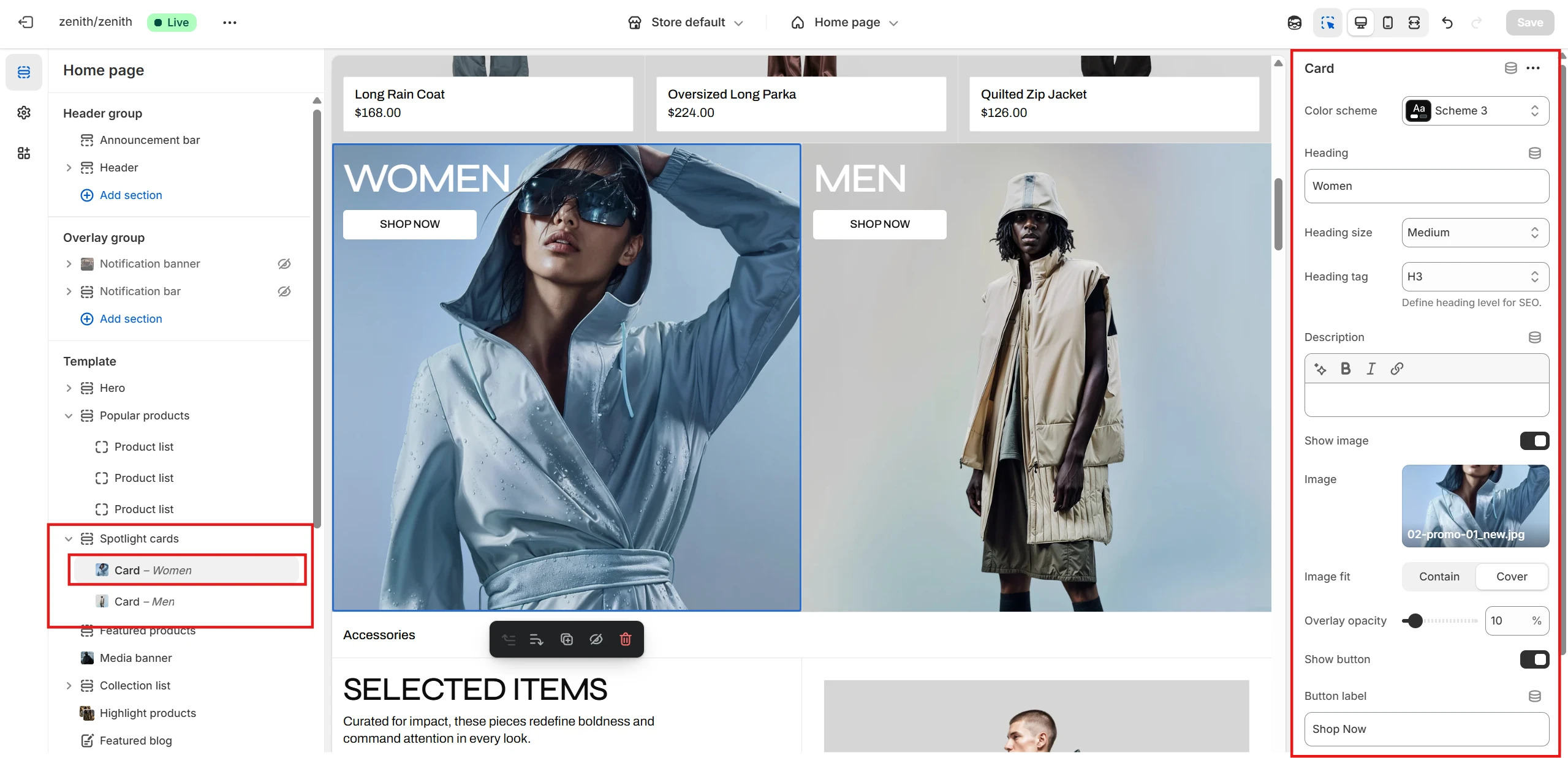
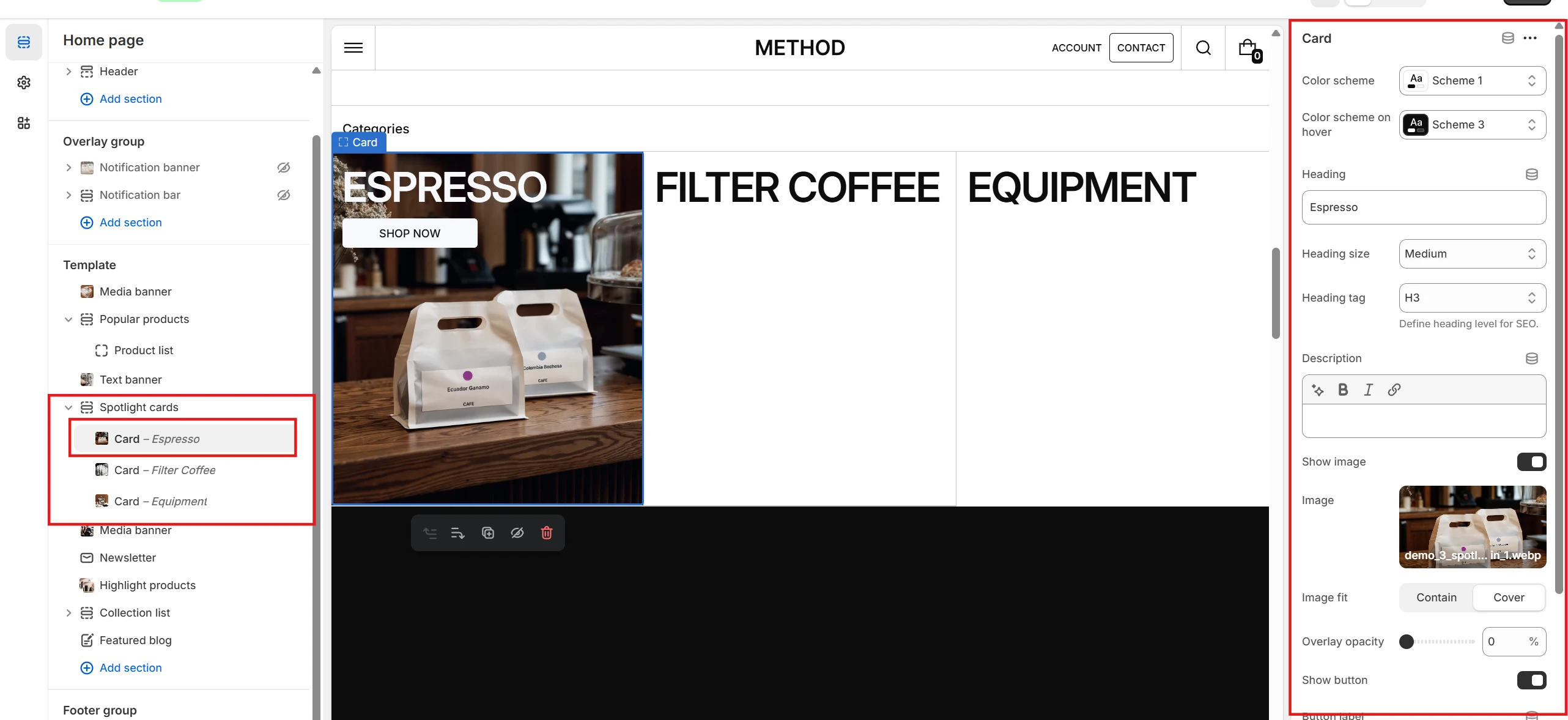
- Color scheme allows you to set the color palette for the card.
- If Hover animation is enabled, you can also define the hover color palette using the Color scheme on hover option.
- You can define and customize the card’s Heading, Description, and Button if needed.
- You can upload an image, customize its fit and overlay, and optionally set a link triggered by clicking on the image.
Highlight products
- Color scheme allows you to set the color palette for the card.
- You can specify products to highlight using either the Collection or Products selector. If you select Collection, you can also set the number of products to display with the Products to show option (maximum 4).
- As before, you can set top and bottom borders for the section.
- Through Product card options you can configure specialized settings related to Product card behavior.
-
Promo banner content allows you to customize the following options:
- Heading: content, size, tag, and width.
- Description content.
- Button and related options.
- Additionally, you can make the banner content sticky using Enable sticky banner info.
- You can also align the content using the Horizontal alignment selector.
-
Promo banner media allows you to specify media for the banner and customize it
using the following options:
- Choose the type of content to display: Image or Video.
- If Image is selected, you can specify separate images for devices ranging from laptops to mobile screens.
- Define the Promo banner ratio for these devices.
- Set the Overlay opacity.
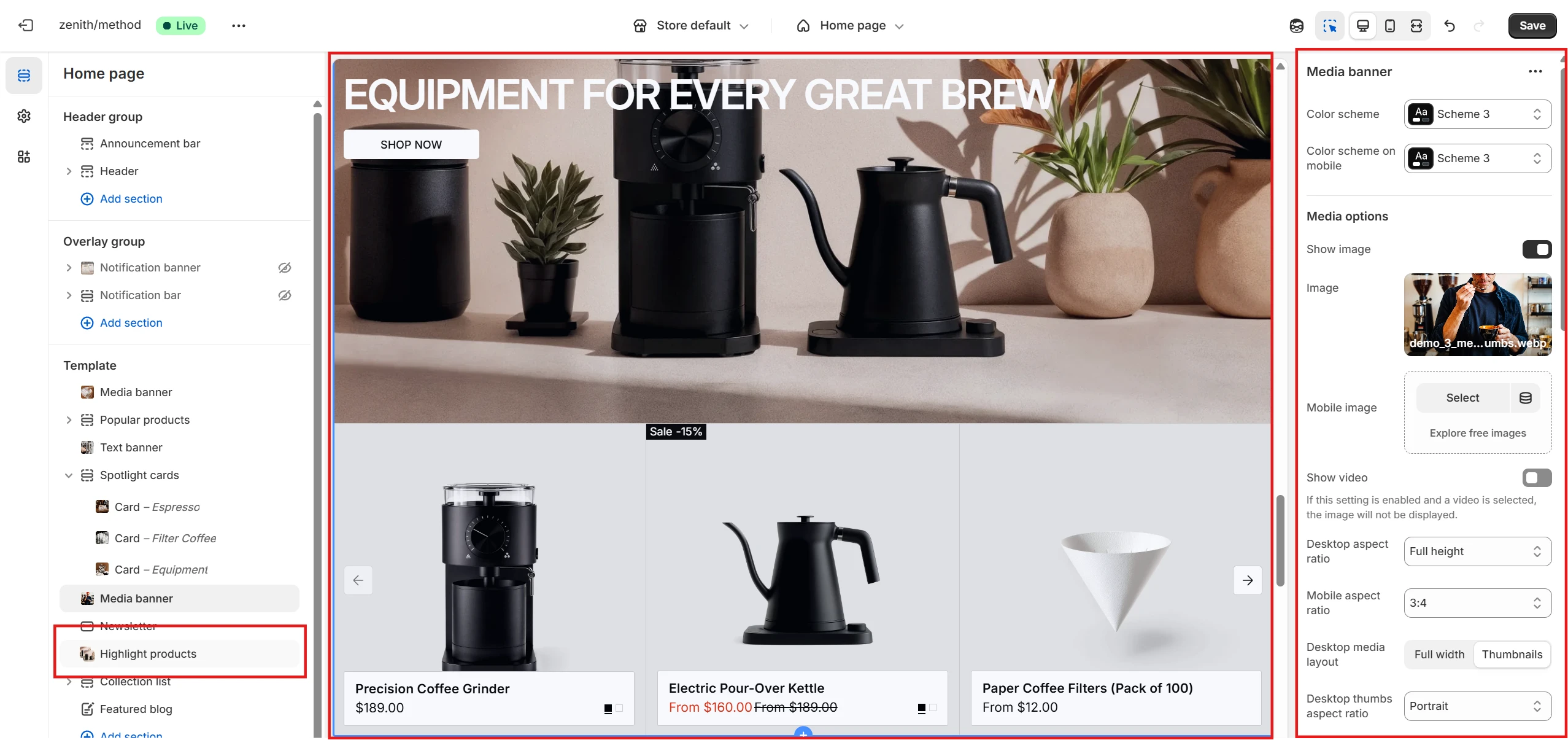
Media banner
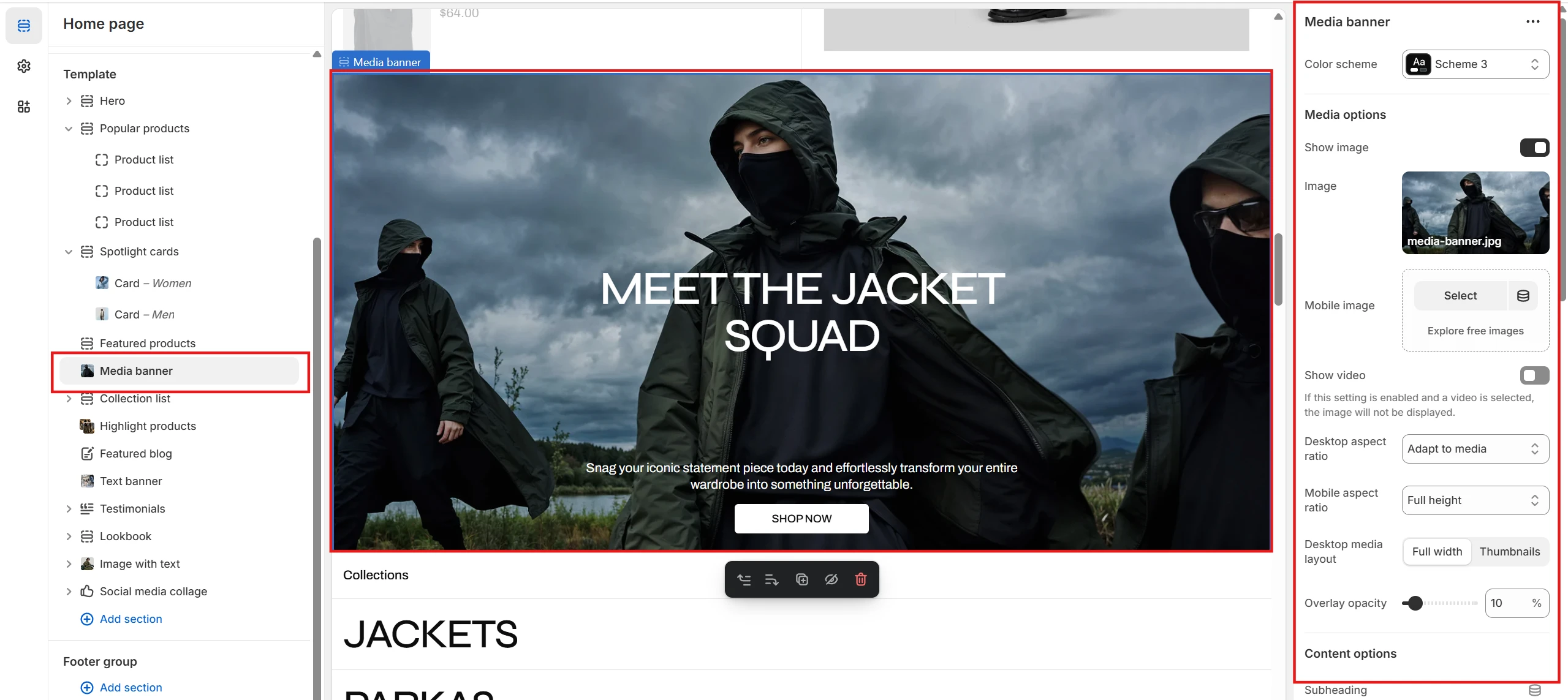
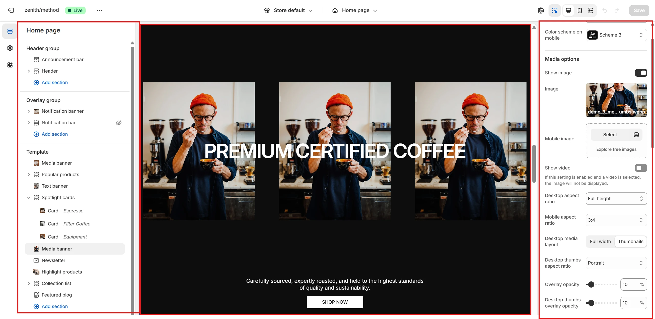
- Color scheme allows you to set the color palette for the card.
-
Media options allow you to specify media for the banner and customize it using the
following settings:
- Select the type of content to display: Image or Video.
- If Image is selected, you can specify a Mobile image.
- Define the banner’s Desktop aspect ratio and Mobile aspect ratio.
- Specify the Desktop media layout, which can be Full width or Thumbnails (three separate images placed in a row).
- Set the Overlay opacity.
-
Content options allow you to customize the following:
- Heading: content, size, tag, and width.
- Description content.
- Button and related options.
- Adjust content alignment using the Horizontal alignment and Vertical alignment selectors.
Social media collage
This section allows you to display a carousel of images from a related social media account and add a link to it.
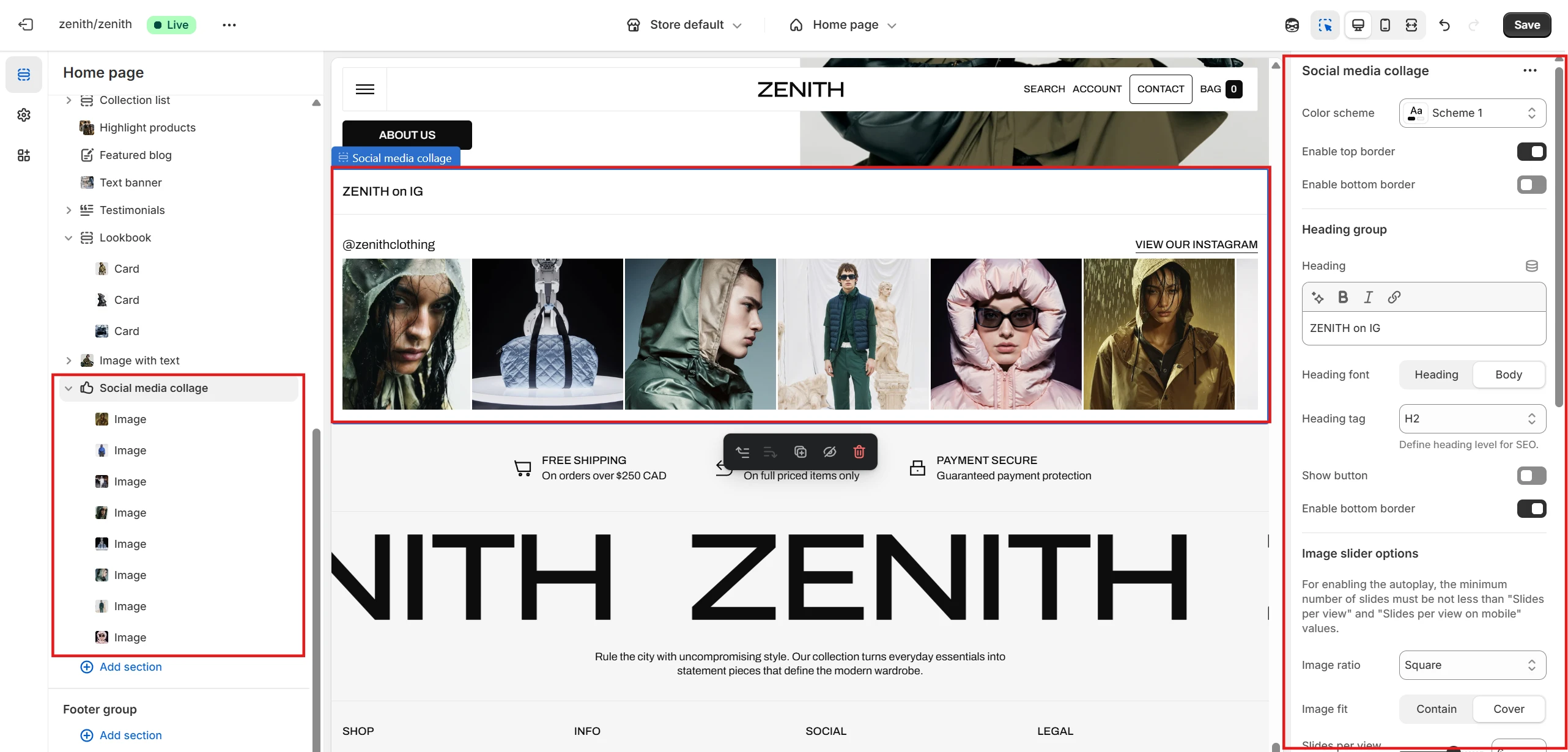
- Color scheme selector allows you to change the section’s color palette.
- You can also set top and bottom borders for the section.
-
Image slider options let you customize the following settings:
- Uploaded Images, along with their Ratio and Fit.
- Slides per view for desktop and mobile devices.
- Slider speed to control the transition duration between slides.
- Option to Pause on hover or Enable fullscreen.
-
Content options allow you to configure the section’s text:
- Specify the social media Account name.
- Add a dedicated Button linking to the account.
- Each block in this section includes a slot for attaching an Image.
Lookbook
This section’s blocks can either display hidden content revealed on hover or simply contain images with accompanying text.
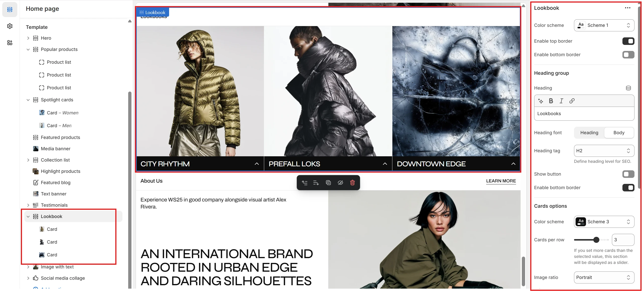
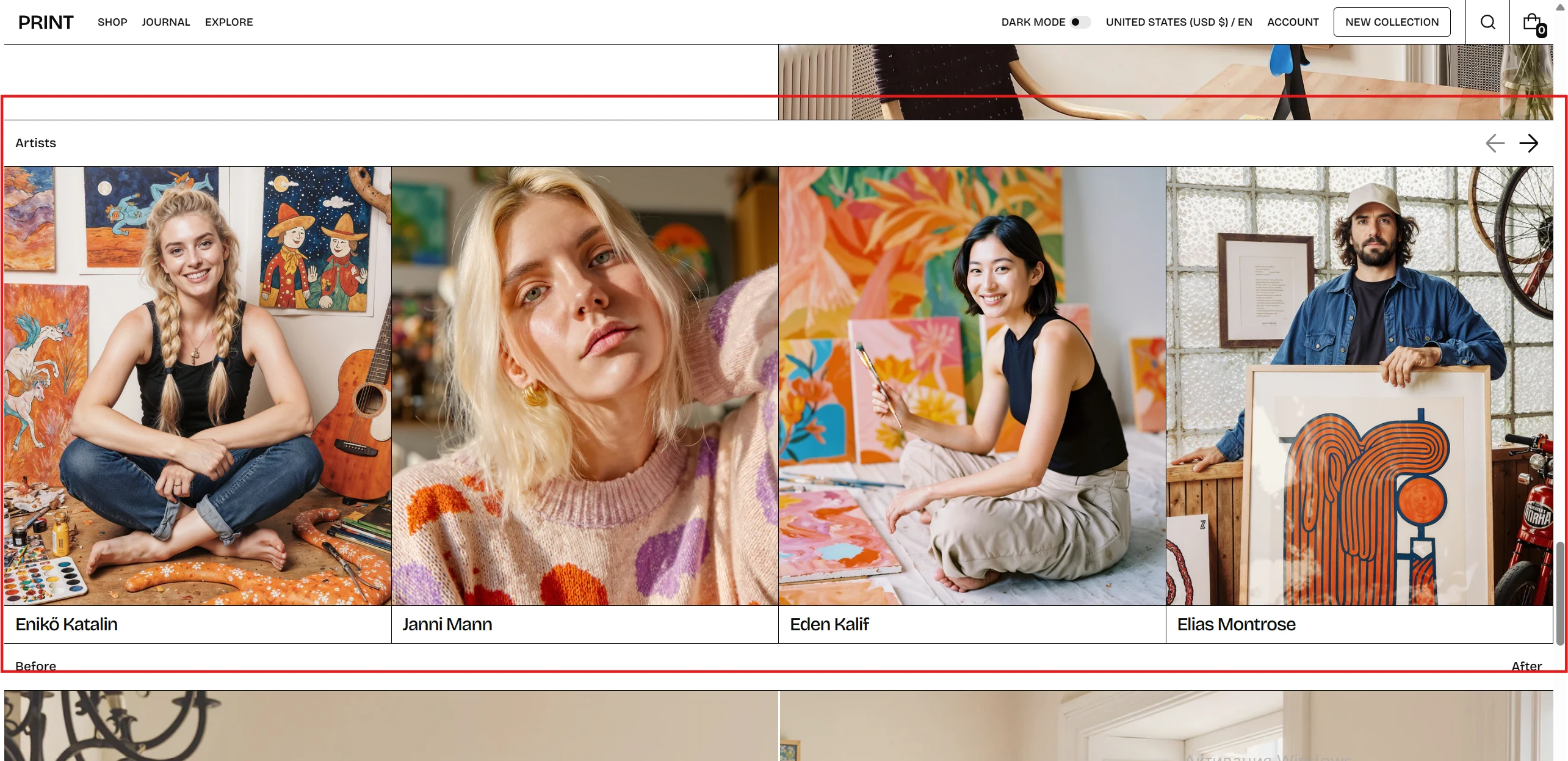
- Color scheme selector allows you to change the section’s color palette.
- You can also set top and bottom borders for the section.
- Use Cards per row to define how many cards are displayed in a row. If the number of blocks exceeds this value, the section automatically turns into a slider.
- You can configure each card’s Image ratio and Image fit.
-
A key setting is the Info panel type:
- With Dropdown, only the card Heading is visible, and the remaining content appears on hover.
- Static displays the entire card content at once.
Lookbook block
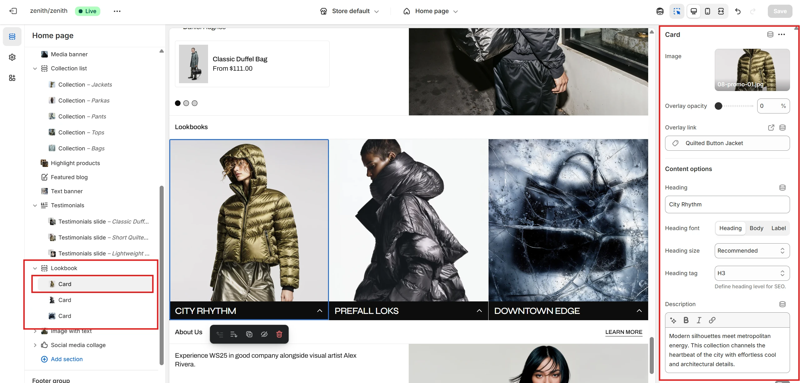
- You can set the Image, apply an Overlay, and define an Overlay link triggered on click.
- You can also add and customize the Heading, Description, and Button.
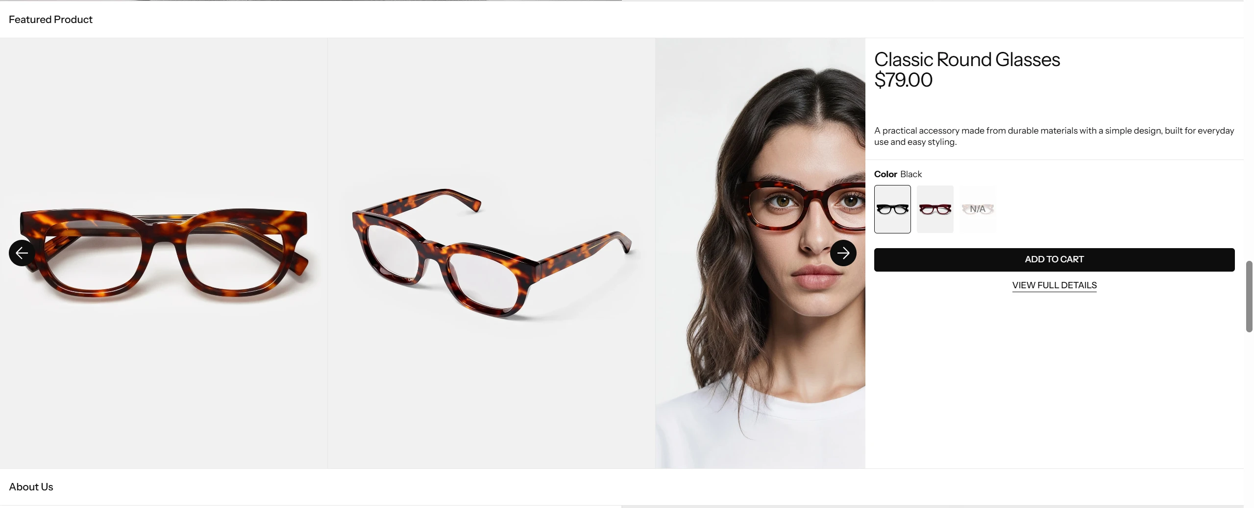
Featured products
This section allows you to feature selected products and give customers the opportunity to view their media in detail.
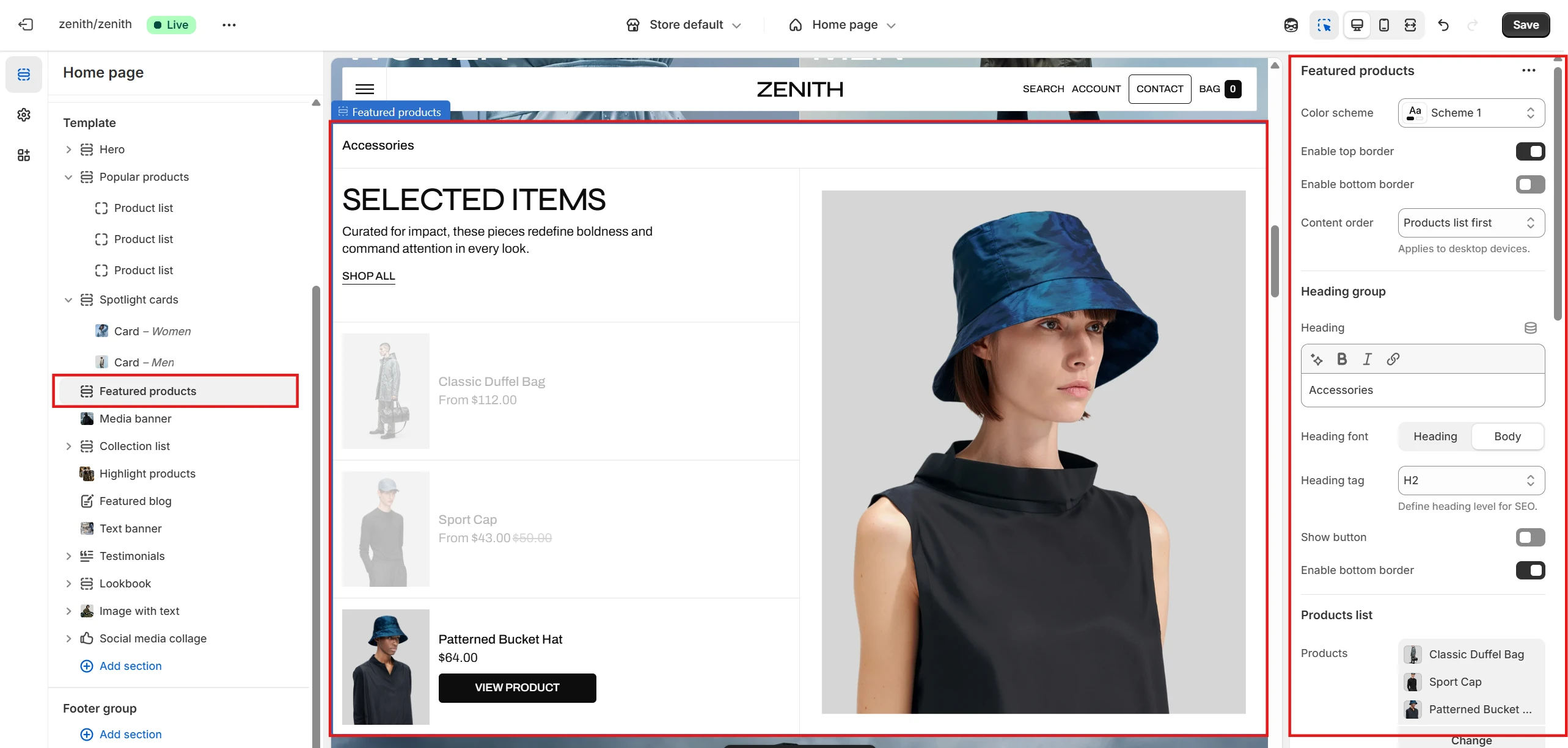
- Color scheme selector allows you to change the section’s color palette.
- Using the Content order, you can define the sequence of product and images on desktop devices: Product line first or Detailed images first.
- You can also set top and bottom borders for the section.
- Product list allows you to select and display up to 8 products.
- You can set and customize the Heading, Description, and Button to provide text content and navigation for the section.
- You can specify settings for the mini Product card.
-
Settings in the Detailed block allow you to:
- Set Image ratio and Image fit for the secondary product image.
- Add and customize a Button linking to the product page.
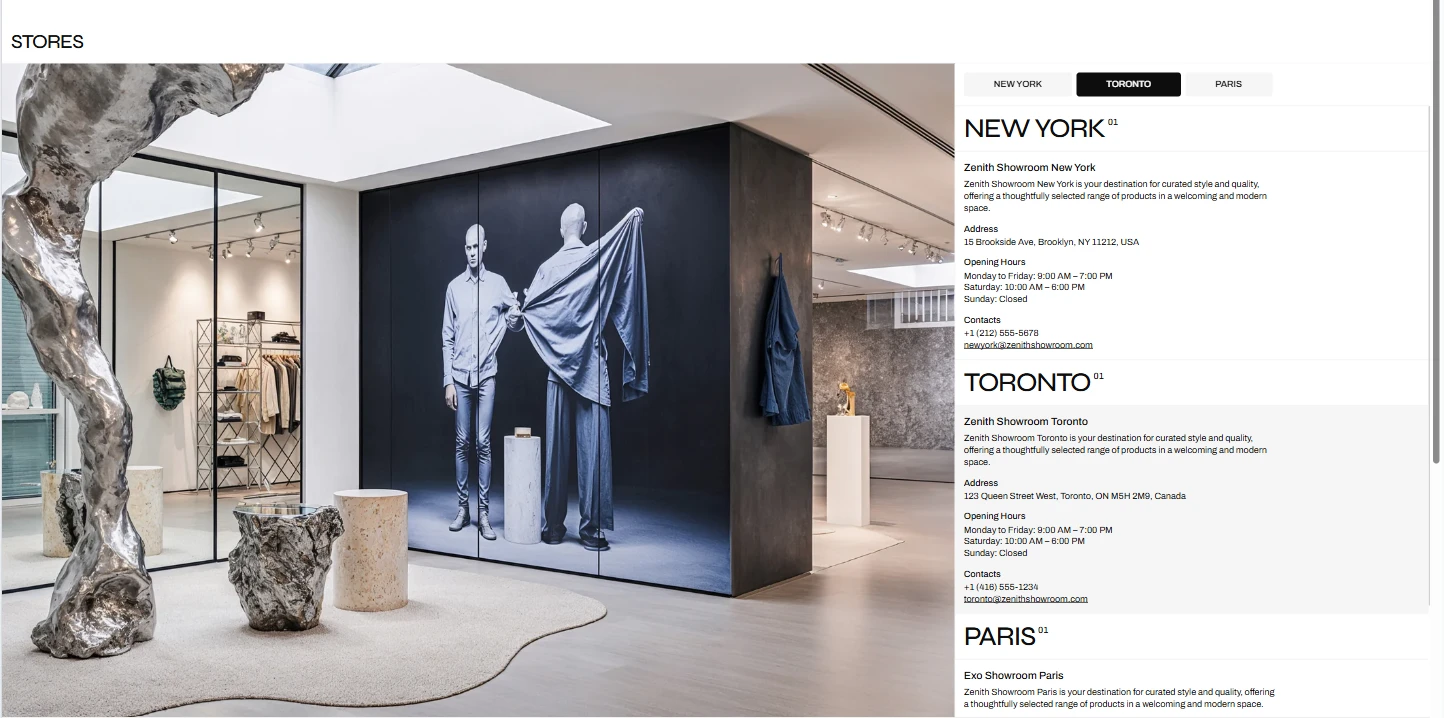
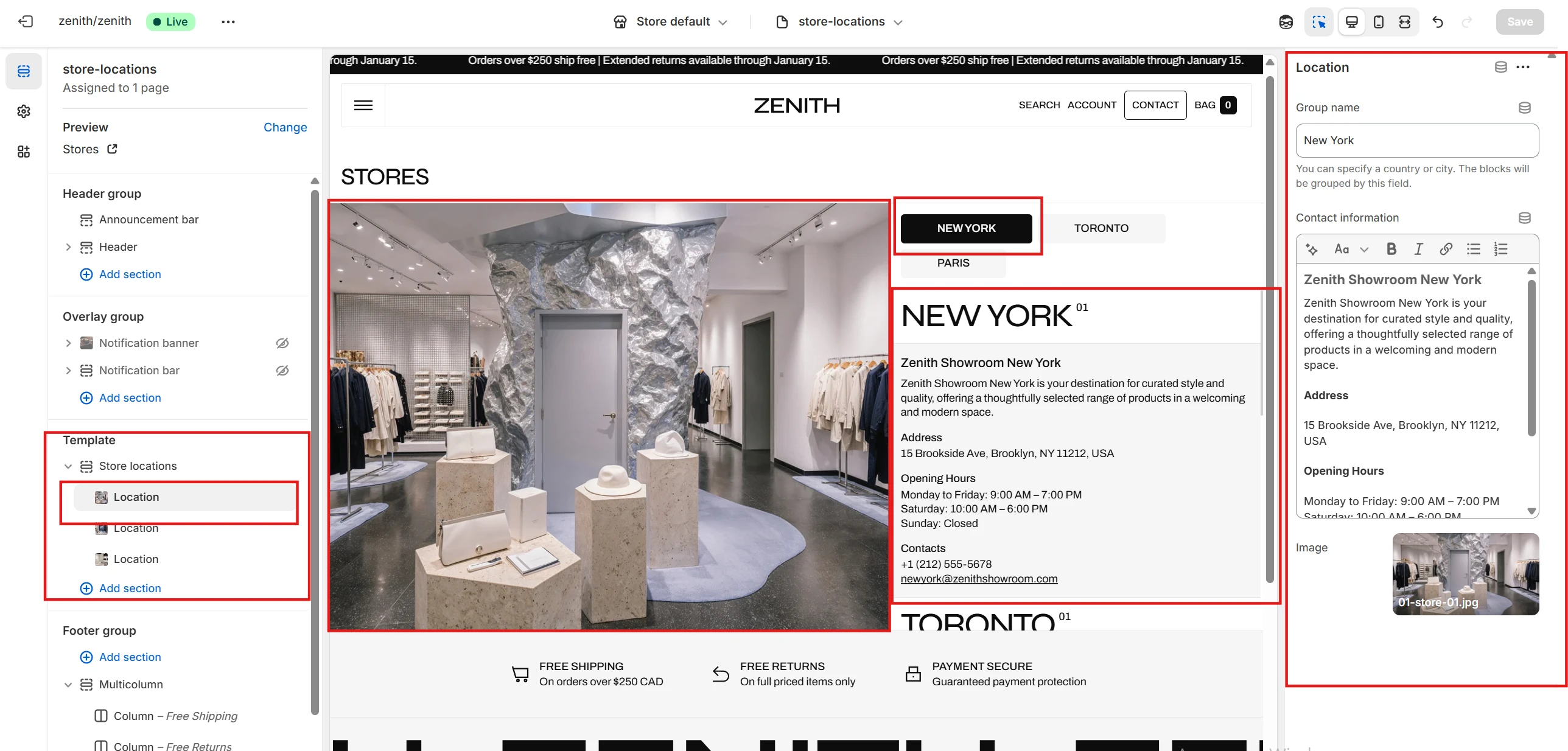
Store locations
This section allows you to specify the locations of your stores, grouped by country or city name, with options to configure addresses and store photos.
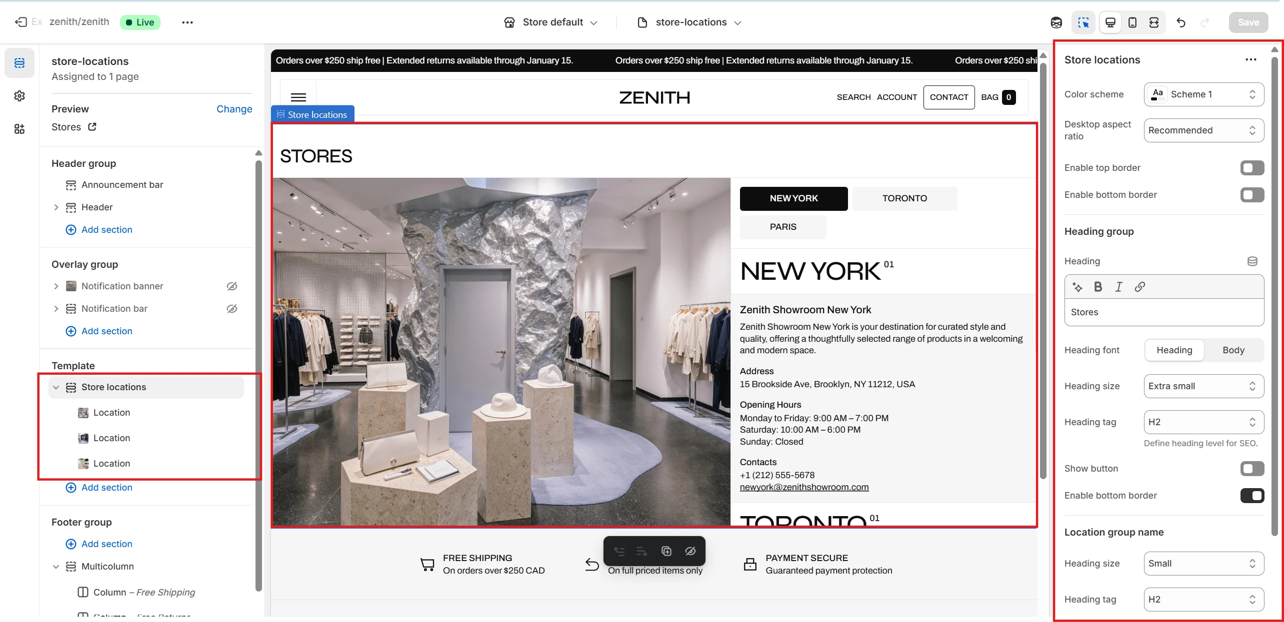
- As before, you can set a Color scheme for the section, enable top and bottom borders, and define the overall section ratio.
- In the Location group name settings you can specify the size and tag of the group label, which applies to every Location block.
Store locations block
- Group name specifies a country, city, or any other category. Location blocks are grouped by this value. It is displayed both at the top of the section (as a navigation tag) and at the top of the group (as a heading).
- Contact information is a rich text field for providing details related to the location.
- Image allows you to upload an image for the location.
Multicolumn
This section allows you to add multiple columns of content.
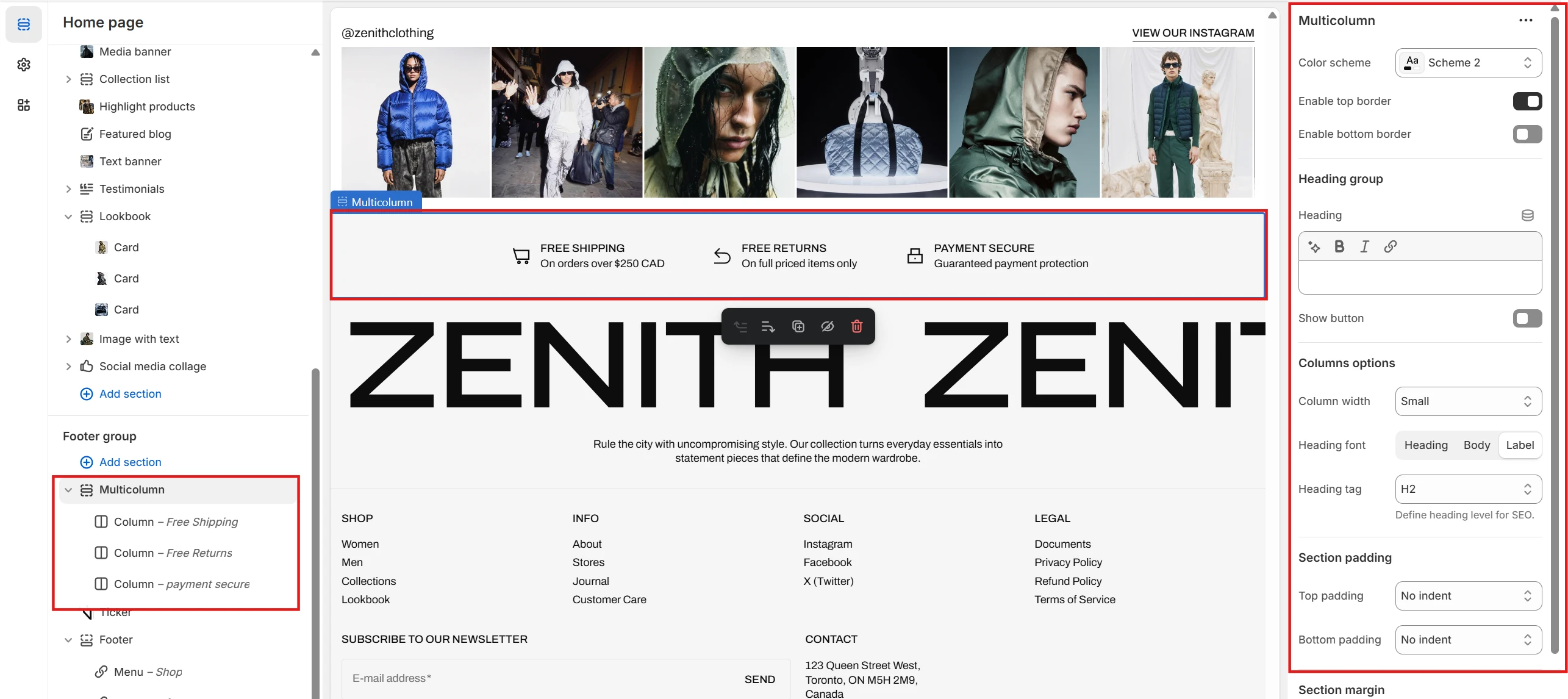
- Color scheme selector allows you to change the color scheme of the section.
- Subheading Heading, Heading size, Description and Text alignment options allows you to set a subheading, heading and description for the whole section.
- Columns layout options allows you to customize columns layout. Includes following options:
- Columns per row – allows you to select the number of columns in one row.
- Columns spacing – allows you to set the spacing between columns.
- Row spacing – allows you to set the spacing between rows.
- Enable slider on mobile – allows you to display this section as slider on mobile.
- Enable slider on desktop – allows you to display this section as slider on desktop.
- Column options allows you to customize each column. Includes following options:
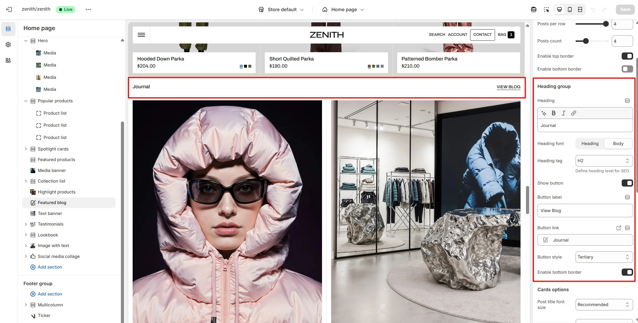
Blog posts
The section allows you to select a blog and display its blog posts.

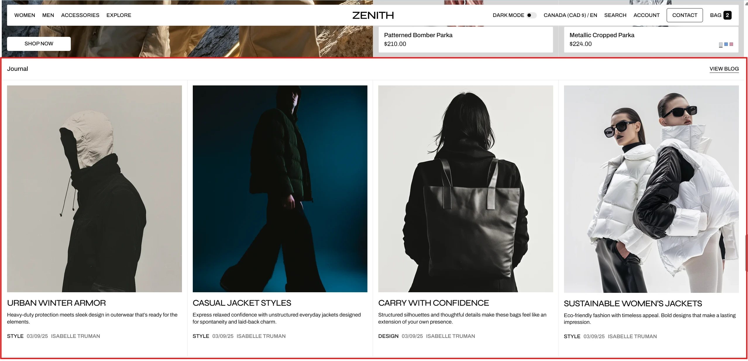
- Blog field allows you to choose a blog which posts will be displayed.
- Color scheme selector allows you to change the color scheme of the section.
-
Header options allows you to set a subheading and heading for the section. Header
options includes the following:
- Section header text allows you to set a text for the section header.
- Section header size allows you to change the size of the section header text.
- Show "Read all" button allows you to show or hide "Read all" button.
- "Read all" button label allows you to set the label of "Read all" button.
- Button style allows you to change the style of "Read all" button.
- Show arrow allows you to show or hide arrow in "Read all" button.
-
Posts layout options allows you to customize posts layout. Includes following
options:
- Display as slider on mobile allows you to display this section as slider on mobile.
- Mobile slider layout allows you to select the layout of the slider on mobile devices.
- Posts per row slider allows you to select the number of posts in one row.
- Posts count slider allows you to change the number of displayed posts.
-
Post image options allows you to customize post's image.
Post image options includes:
- Show post image allows you to show or hide post's image.
- Image ratio allows you to choose the orientation of pictures for cards.
- Image fit allows you to choose the fit of pictures for cards.
-
Post title options allows you to customize post's title.
Post title options includes:
- Font family allows you to select the font of the post's title.
- Font size allows you to select the size of the post's title.
-
Post content options allows you to customize post card's content.
Post content options includes:
- Show post date allows you to show or hide post's date of publication in post card.
- Show post tags allows you to show or hide post's tags in post card.
- Show post author allows you to show or hide post's author in post card.
- Show post excerpt allows you to show or hide post's excerpt in post card.
- Show "Read article" button allows you to show or hide "Read article" button in post card.
- "Read article" button label allows you to set the label of "Read article" button.
- Show comments count allows you to show or hide comments count in post card.
Featured product
In this section, you can display a single product and provide information about it. This section is similar to Product information, but with limited functionality.
Pages
Product
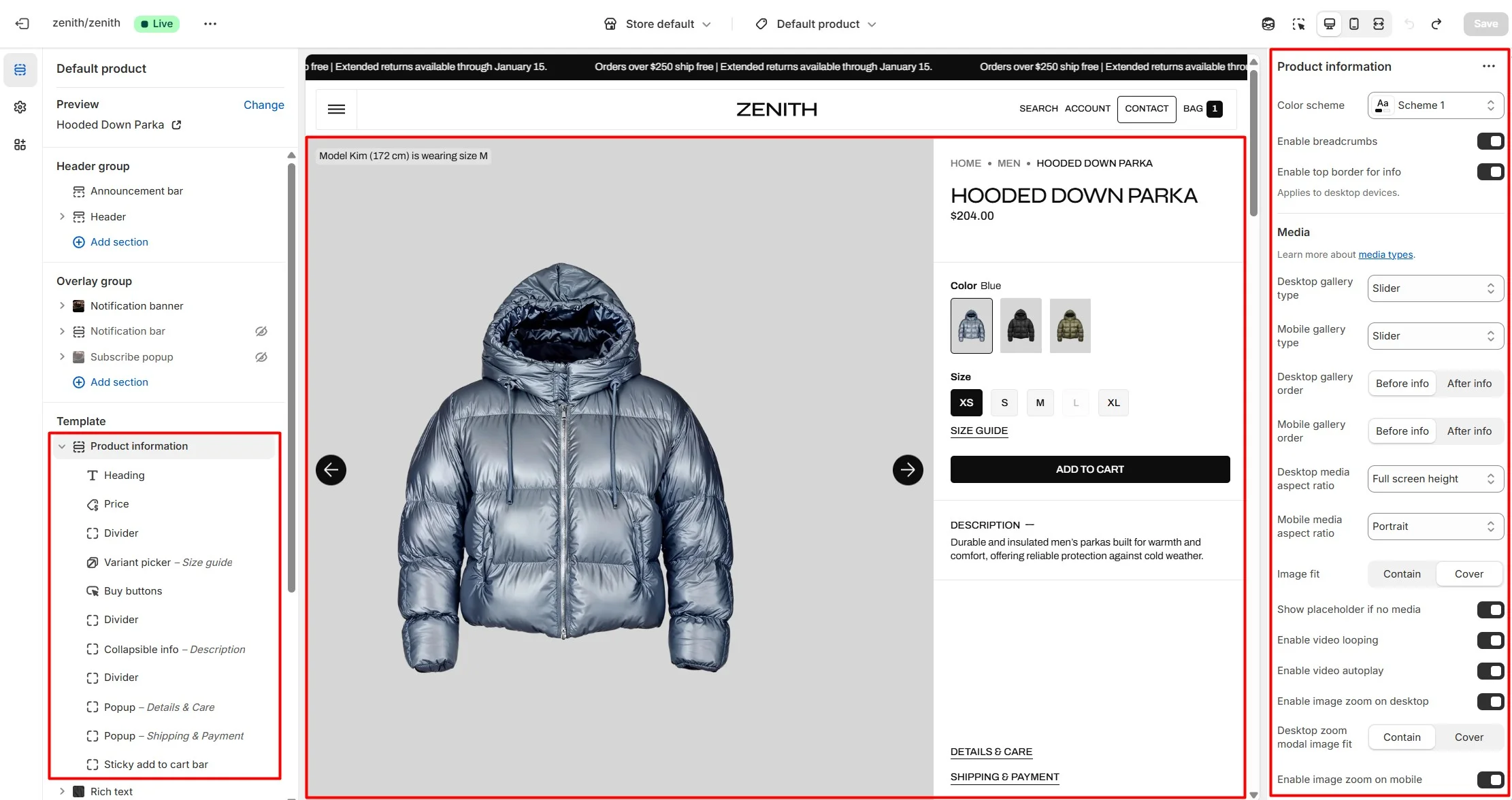
Product information
The Product information section allows users to view all relevant information about the product.
This section allows you to configure:
- Gallery type allows 4 options for desktop (Slider, Slider with previews, Stacked, Stacked with previews) and 3 options for mobile (Slider, Slider with previews, Stacked).
- Aspect ratio and image fit allows controlling the aspect ratio of images and adapting their height to the screen.
- You can adjust the image gallery placement for both desktop and mobile layouts using Desktop gallery order and Mobile gallery order.
- Zoom modal allows setting up an enlarged product image modal. For double zoom, customers can open the modal and double-click the image.
-
Buy buttons block allows enabling availability notifications for sold-out products. After form submission, customer details and selected options are sent to your email.
Note: The theme does not send automatic back-in-stock emails — sellers must contact customers manually or via third-party tools.
- Sticky add to cart block allows customers to add the selected variant to their cart from anywhere on the page while scrolling.
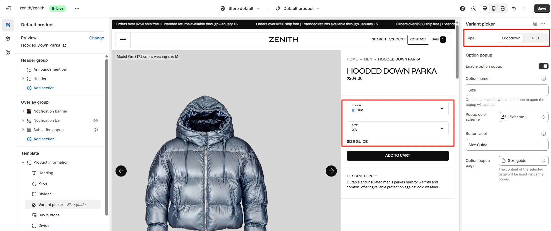
Variant picker block
Variant picker block allows customizing how product options are displayed. For the Pills type, swatches can be shown as plain colors or variant images. You can also assign an option to open a custom modal (e.g., Size guide) and display inventory information.
Pills
Pills display options as buttons. In this type, the color option can be shown as Color swatches.
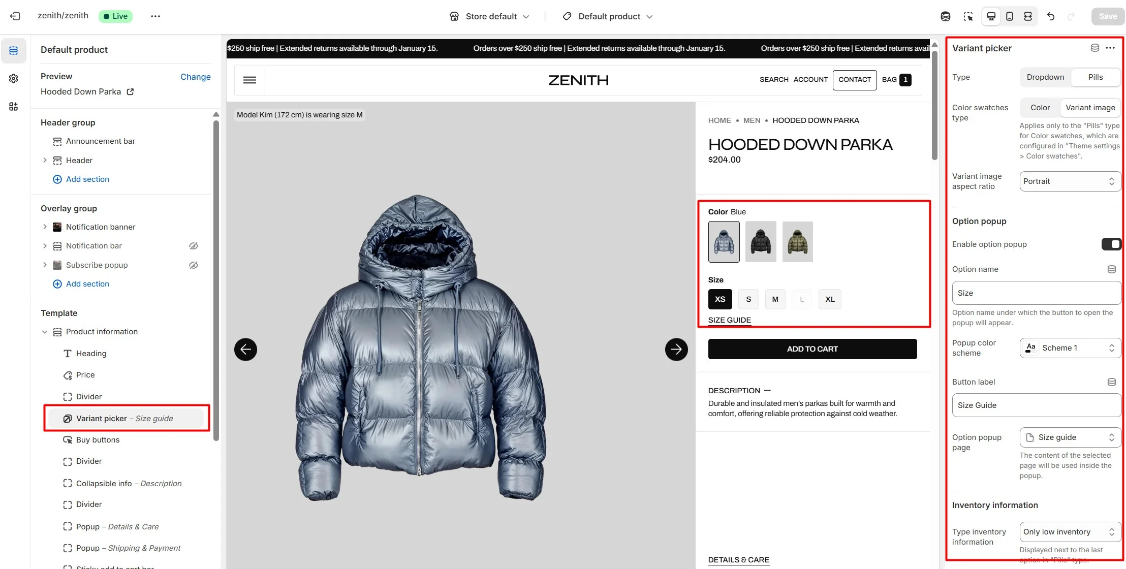
Dropdown
Dropdown allows variant selection through dropdown options.
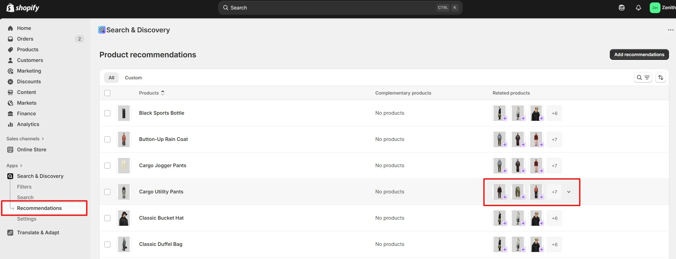
Product recommendations
Dynamic recommendations use order and product information to change and improve over time.
To add and edit product recommendations, install the Search & Discovery app by Shopify from the Apps page in the Admin panel. Once installed, open the app and follow the "Recommendations" link in the Feature overview section to add recommendations to your products.
Settings for this section look like below:
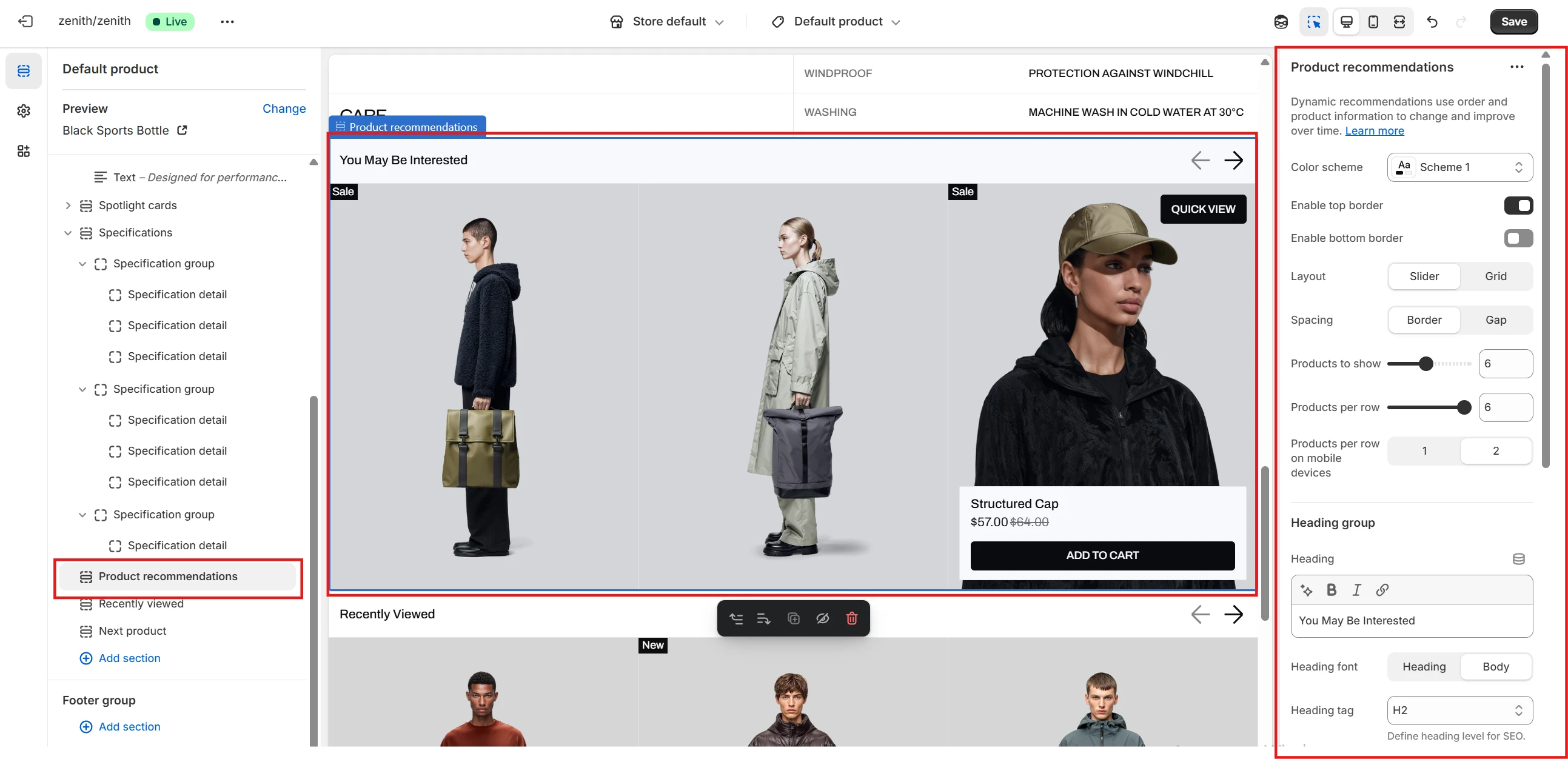
- Heading allows you to set a heading for the section.
- Heading size selector field allows you to change the size of the section header.
- Product card options allow you to customize product cards in the section.
Collection
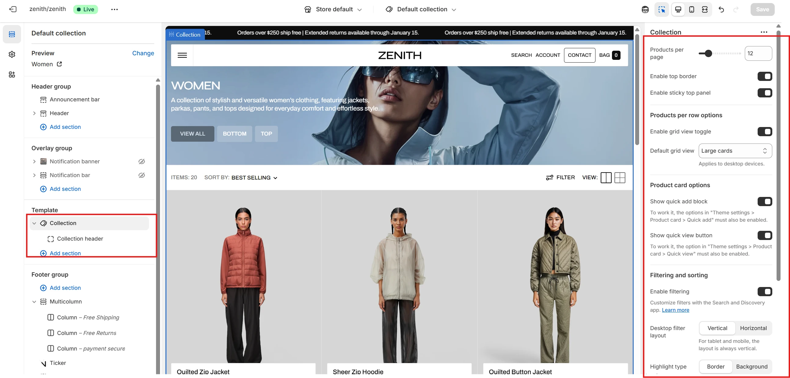
- Products per page field sets the number of displayed cards.
- Grid view toggle setting lets customers choose the size of product cards in the catalog on desktop devices.
- If the Grid view toggle is disabled, the seller can set the number of cards per row manually with Number of columns.
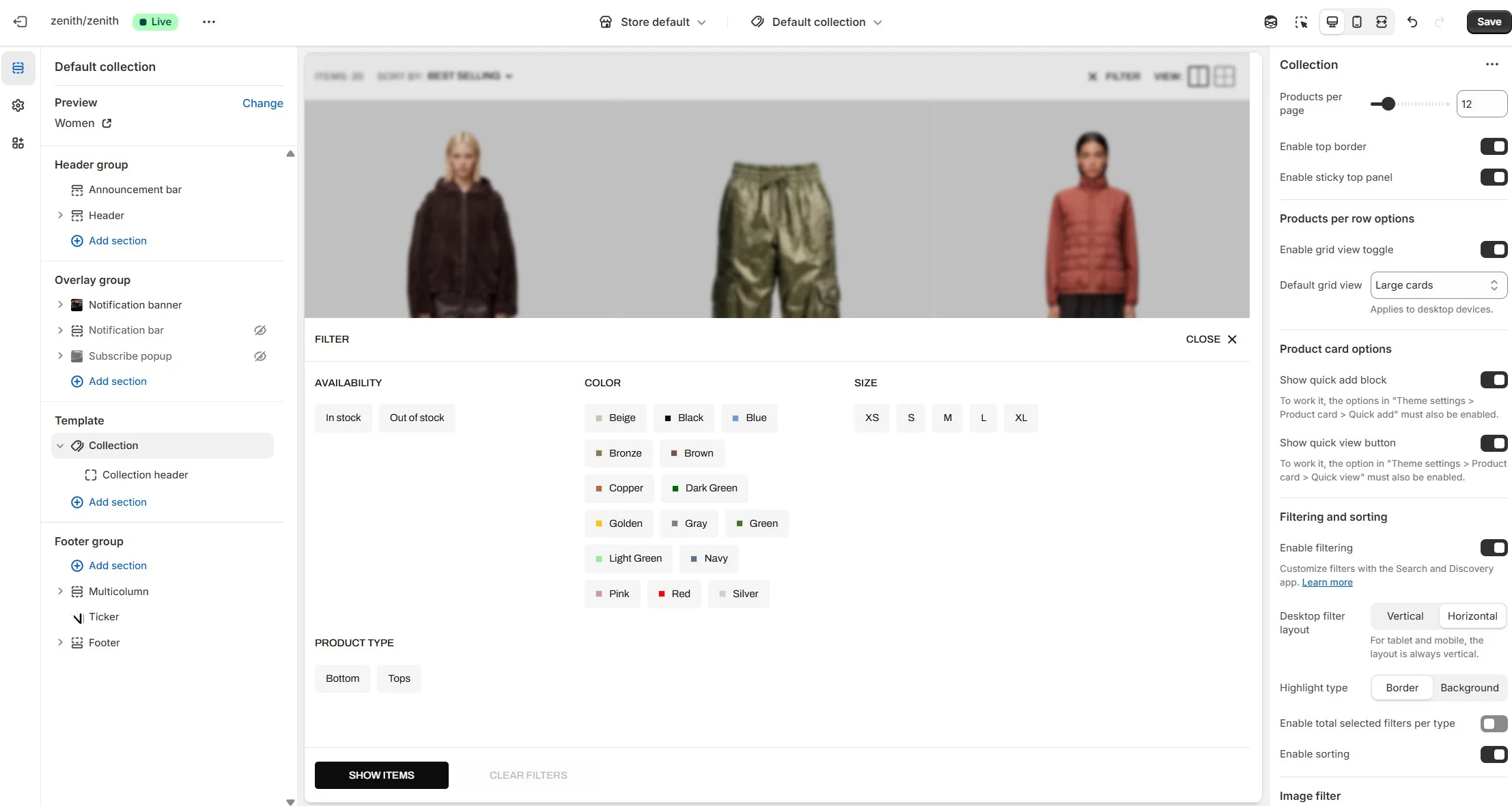
- Enable filtering field turn filtering.
- Enable sorting field turn sorting.
- Product card options allow you to customize product cards in the section.
- Desktop filter layout selector field allows you to select one of two desktop filter types.
Collection header

- Show collection image field turn on image display.
- Image for "Products" page Image for automatically generated page with all products.
- Featured collection list allows you to highlight some collections.
Vertical filter layout
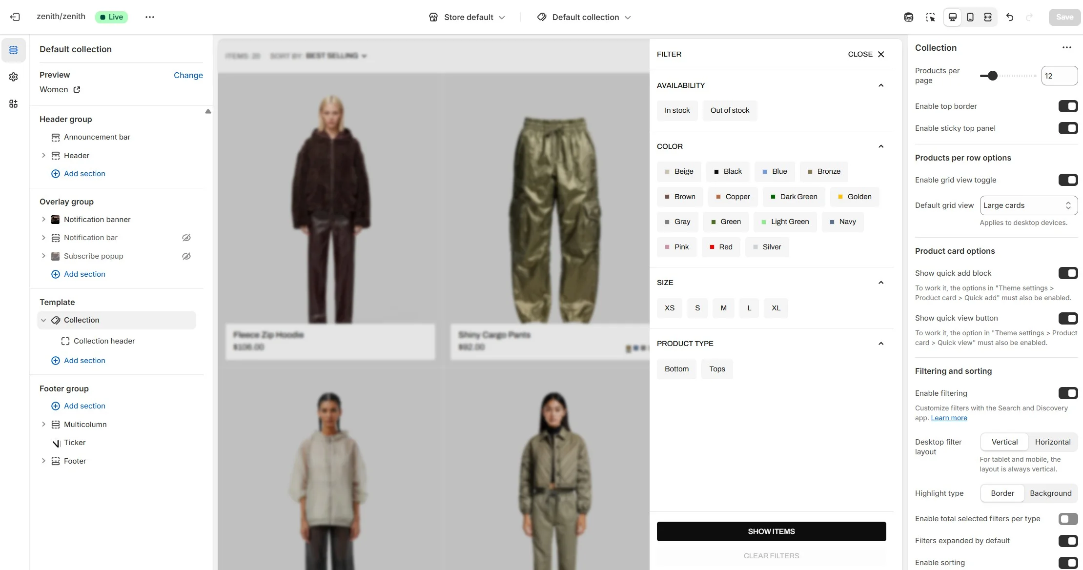
Horizontal filter layout
Collections list
Displays a list of all collections
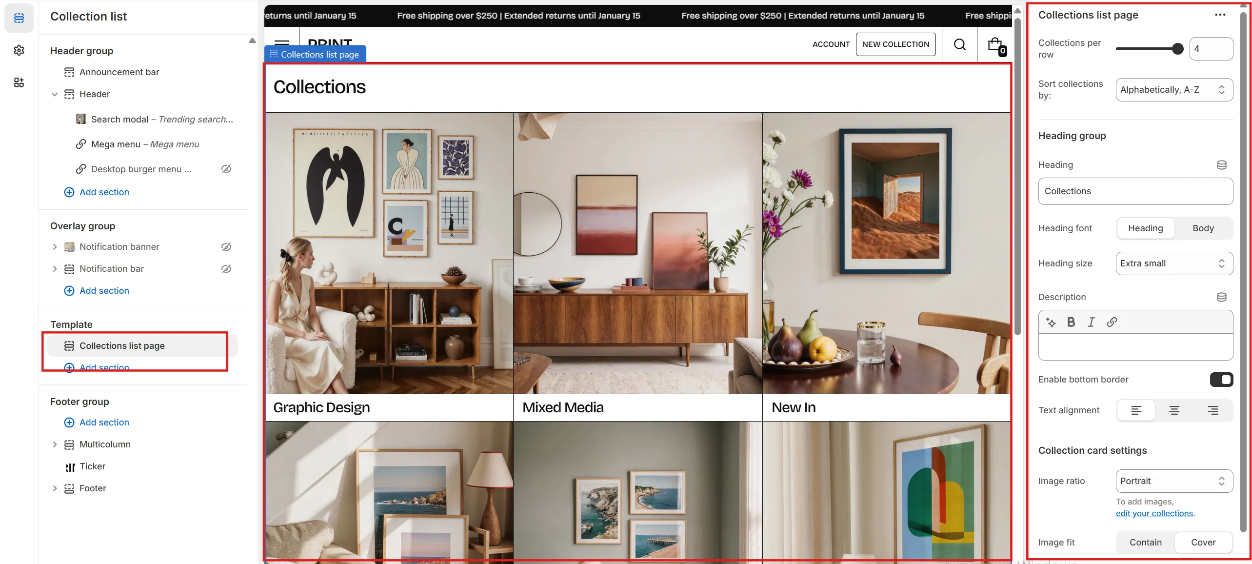
- Collections per row slider allows you to change the number of collections per line only on desktop devices.
- Sort collections by field filters the collection by the specified parameters
- Image ratio field allows you to choose the orientation of images for cards.
- Image fit field allows you to choose the fit of pictures for cards.
- Show description enables the display of the collection description.
Cart
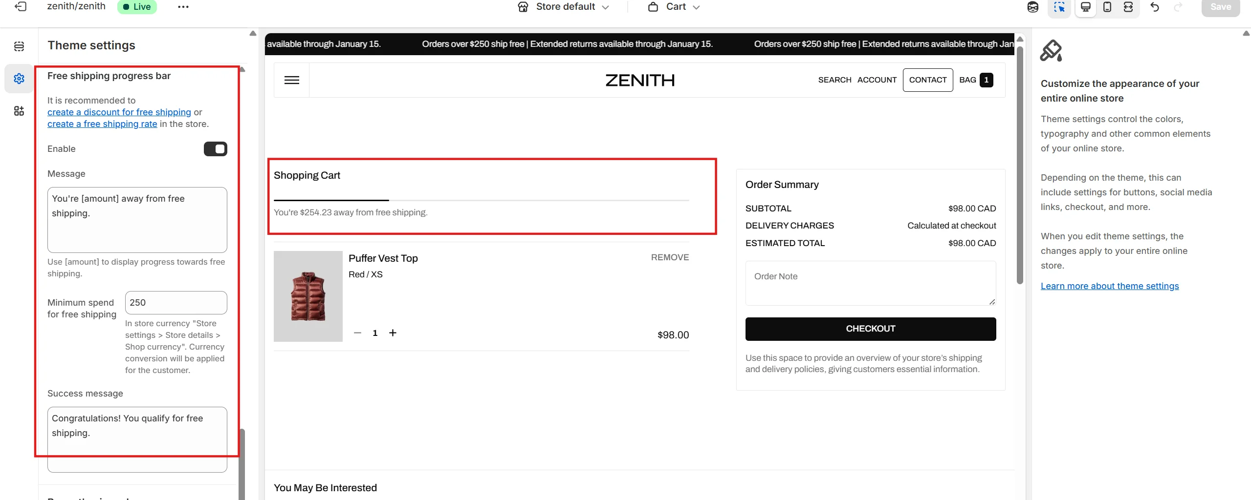
Cart free shipping progress bar
To add and edit cart free shipping progress bar, follow these steps:
- Enable the Theme settings - Cart - Free shipping progress bar option.
- Set the value required to qualify for free shipping. This value should be specified in the store's default currency. For customers using other currencies, conversion will be applied.
- Create a free shipping discount in the store and set the same amount, or configure a shipping rate.
- To create and edit a shipping rate, go to the store settings under the Shipping and delivery tab.
Blog
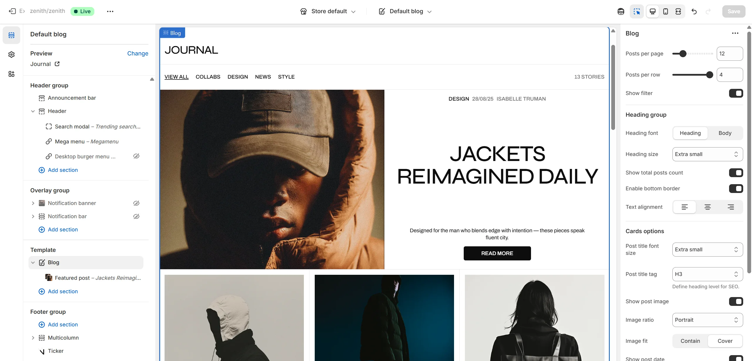
- Posts per page slider allows you to change the number of posts per page.
- Posts per row slider allows you to select the number of posts in one row.
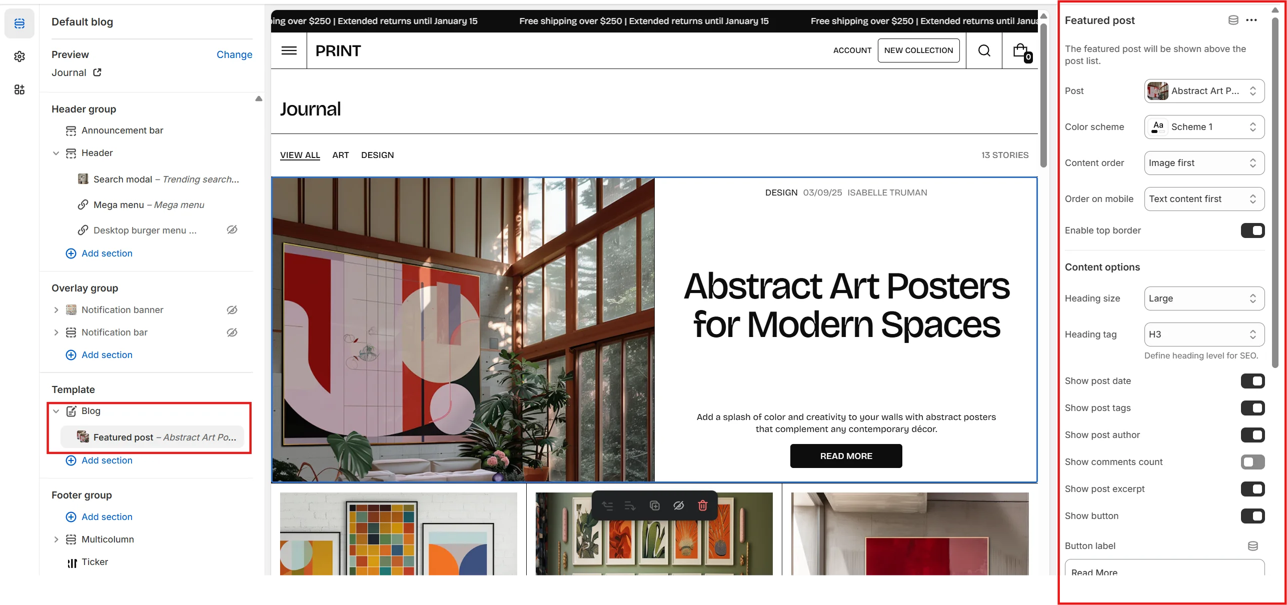
-
Featured posts options allows you to customize featured post(s). To add a featured
post(s), add at least one Featured post block. Featured posts options
includes:
- Dekstop aspect ratio allows you to set the aspect ratio of the Featured posts slider on desktop devices.
- Mobile aspect ratio allows you to set the aspect ratio of the Featured posts slider on mobile devices.
- Show post date allows you to show or hide post's date of publication in featured post.
- Show post tags allows you to show or hide post's tags in featured post.
- Show post author allows you to show or hide post's author in featured post.
- Show post excerpt allows you to show or hide post's excerpt in featured post.
- Content position allows you to select the alignment of the featured post's content.
-
Post image options allows you to customize post's image.
Post image options includes:
- Show post image allows you to show or hide post's image.
- Image ratio allows you to choose the orientation of pictures for cards.
- Image fit allows you to choose the fit of pictures for cards.
-
Post title options allows you to customize post's title.
Post title options includes:
- Font family allows you to select the font of the post's title.
- Font size allows you to select the size of the post's title.
-
Post content options allows you to customize post card's content.
Post content options includes:
- Show post date allows you to show or hide post's date of publication in post card.
- Show post tags allows you to show or hide post's tags in post card.
- Show post author allows you to show or hide post's author in post card.
- Show post excerpt allows you to show or hide post's excerpt in post card.
- Show "Read article" button allows you to show or hide "Read article" button in post card.
- "Read article" button label allows you to set the label of "Read article" button.
- Show comments count allows you to show or hide comments count in post card.
Featured post block
- Post allows you to select a post.
- Color scheme allows you to select the color scheme for the block.
- Overwrite image allows you to overwrite post's image.
- Overlay opacity allows you to change the opacity of the image overlay.
Blog post
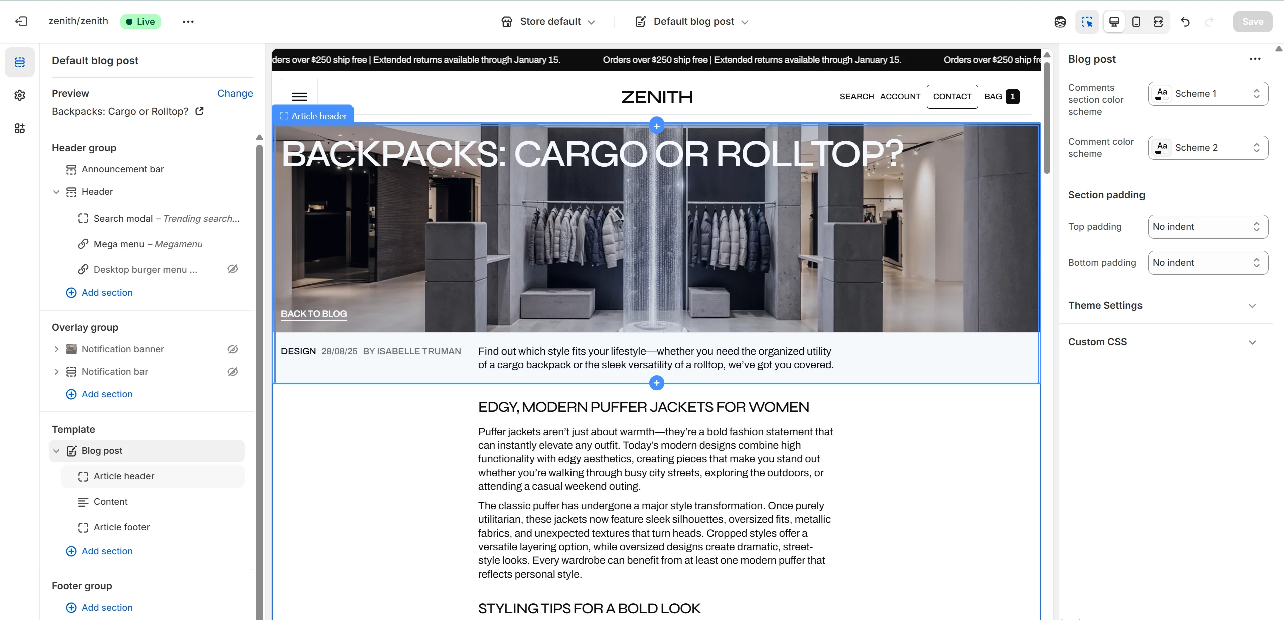
- Comments section color scheme allows you to select the color scheme for the comments section.
- Comment color scheme allows you to select the color scheme for comments.
-
This section contains 3 block types. You can add up to 3 blocks (one of each type),
including:
- Article header
- Content
- Article footer
-
Article header block has following options:
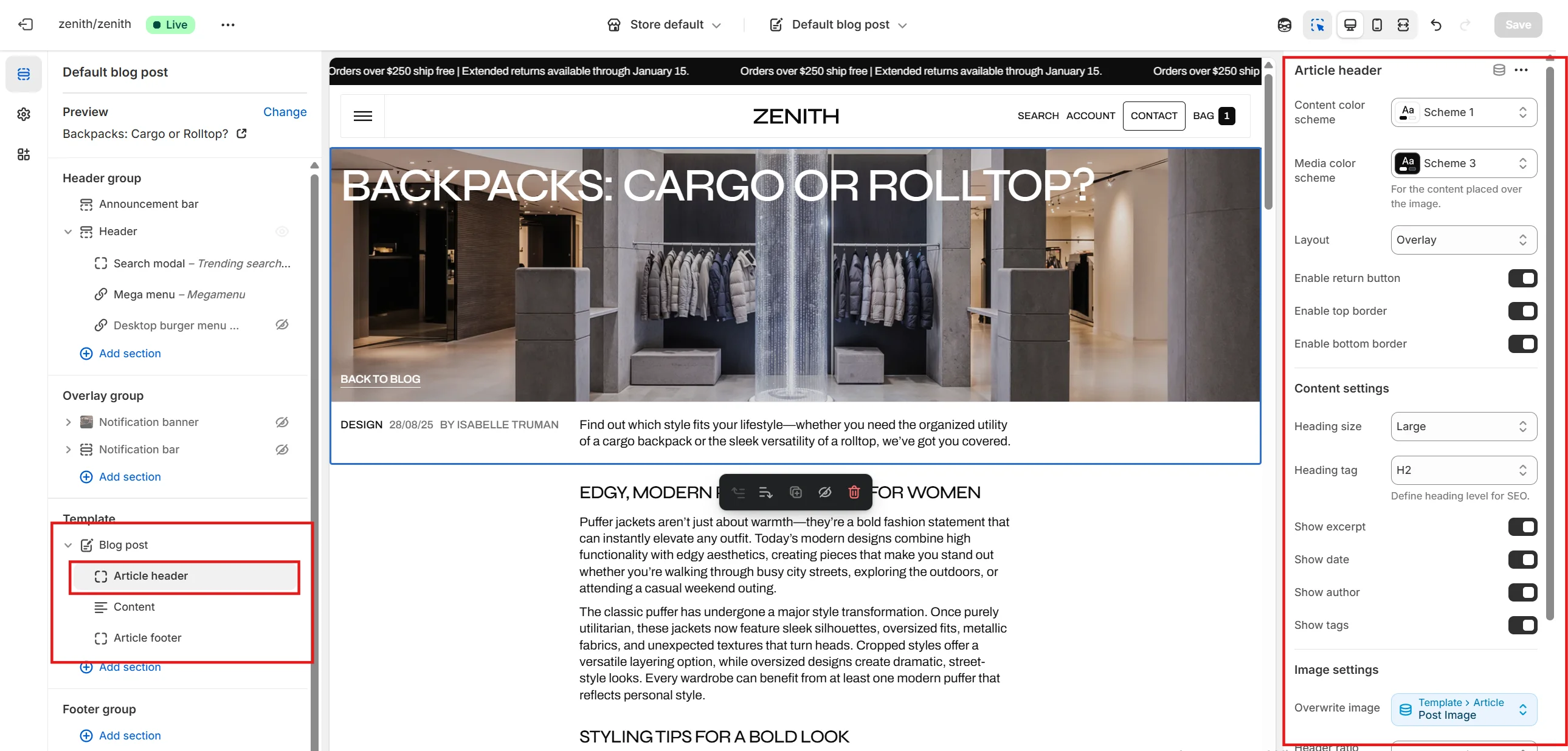
- Color scheme allows you to select the color scheme for article header's text block.
- Image ratio selector allows you to choose the aspect ratio of the post's feature image.
- Show excerpt allows you to show or hide post's excerpt in article header.
- Show date allows you to show or hide post's date of publication in article's header.
- Show author allows you to show or hide post's author in article's header.
- Show tags allows you to show or hide post's tags in article's header.
-
Content block has following options:
- Content alignment selector allows you to choose the alignment of the post's content.
-
Article footer block has following options:
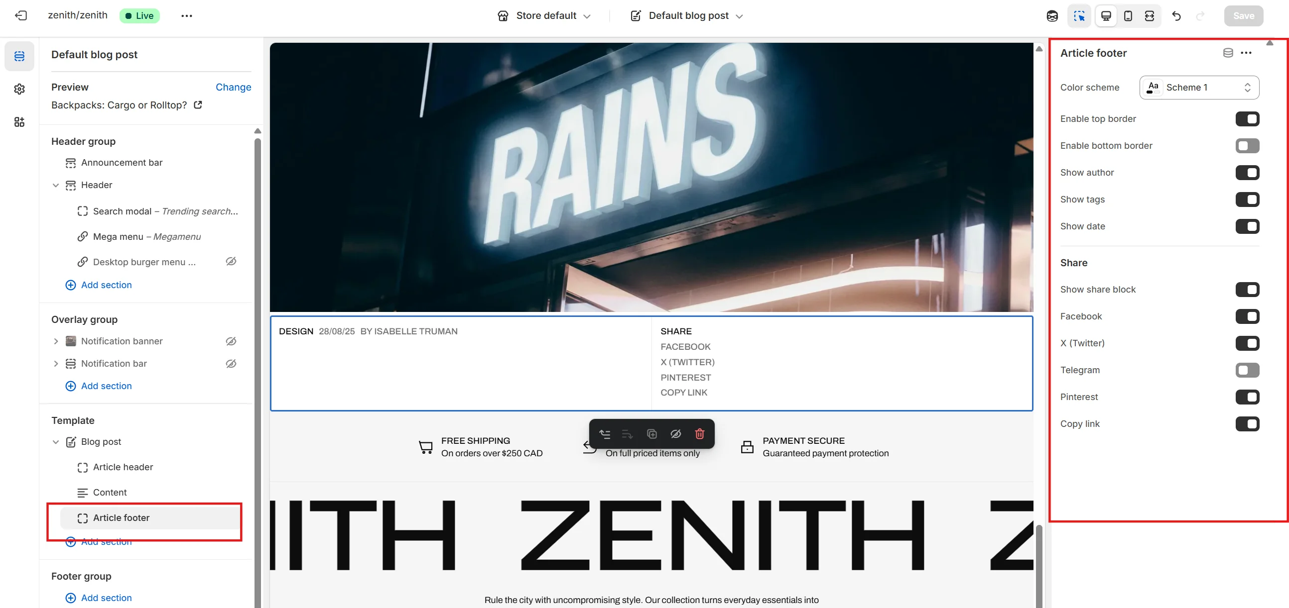
- Show author allows you to show or hide post's author in article's footer.
- Show tags allows you to show or hide post's tags in article's footer.
- Show date allows you to show or hide post's date of publication in article's footer.
- Share options allows you to enable share block and each share link from the list.
Custom
About page
The theme includes an About page template featuring the following sections: Media Banner, Rich Text, Image with Text, Spotlight Cards, and Social Media Collage.
Other pages
Templates are also available for Contact, Lookbook list, Lookbook detail, Customer care, and Documents pages. You can see examples of these templates in our demo stores.
Support
You can ask any questions about the theme and our support agent will help you within 24 hours on business days.
Visit Help Center View Terms & Conditions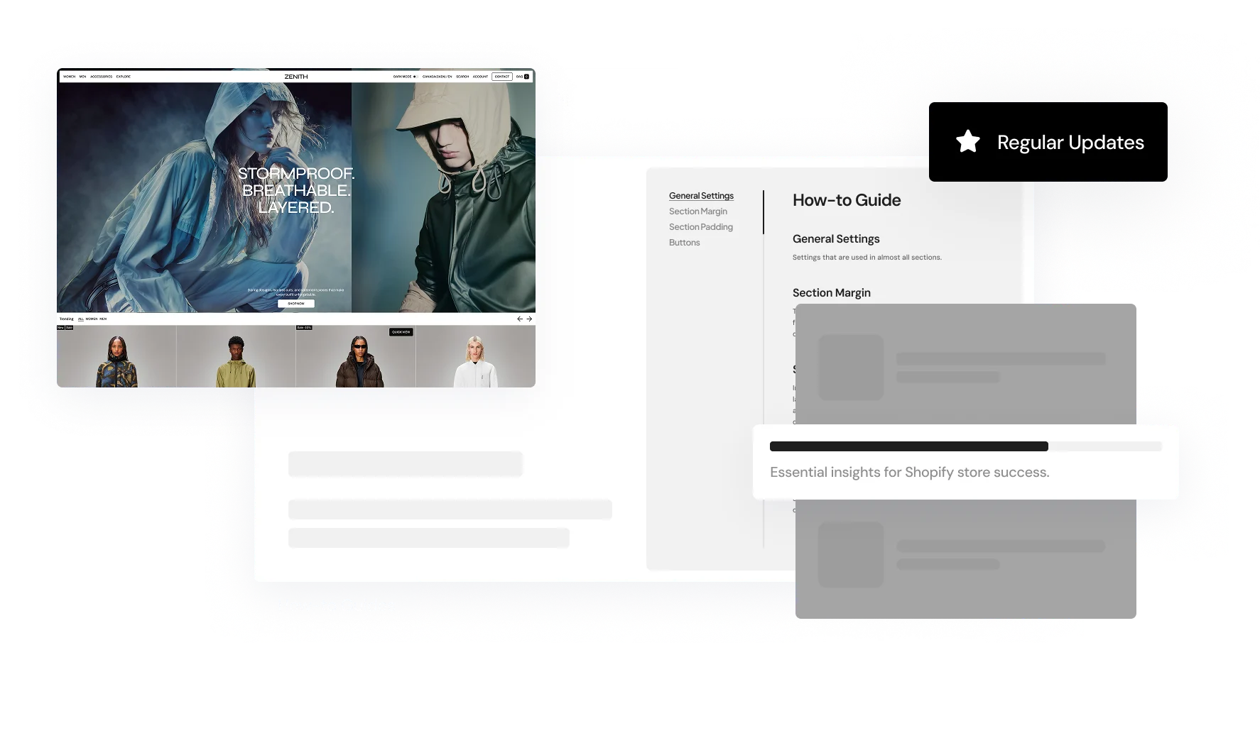
