Find Your Perfect Shopify Theme - Designed for Sales and Functionality Explore

Metropolitan

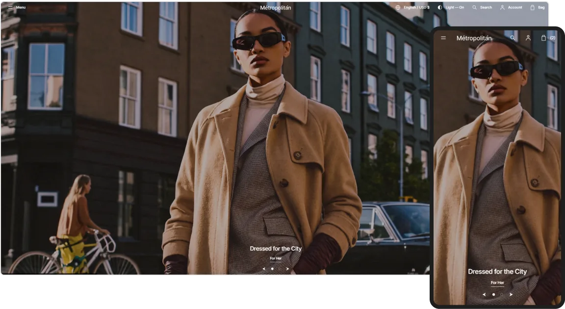
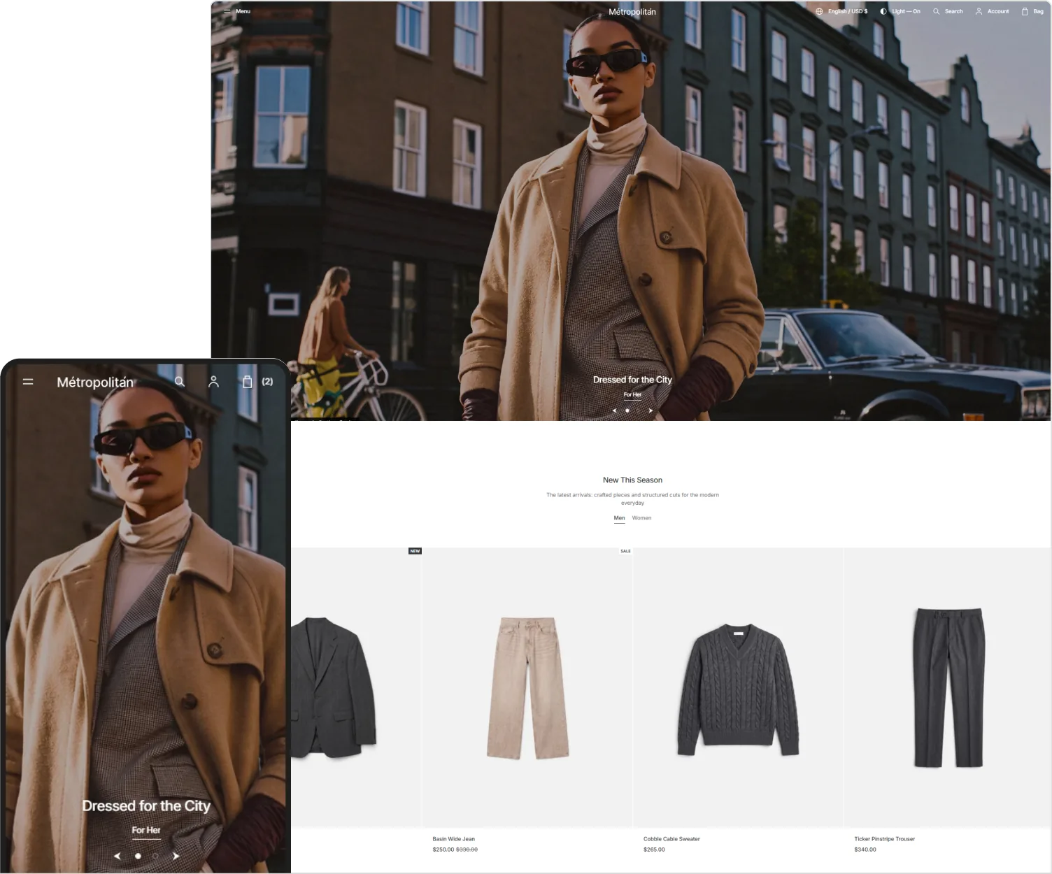
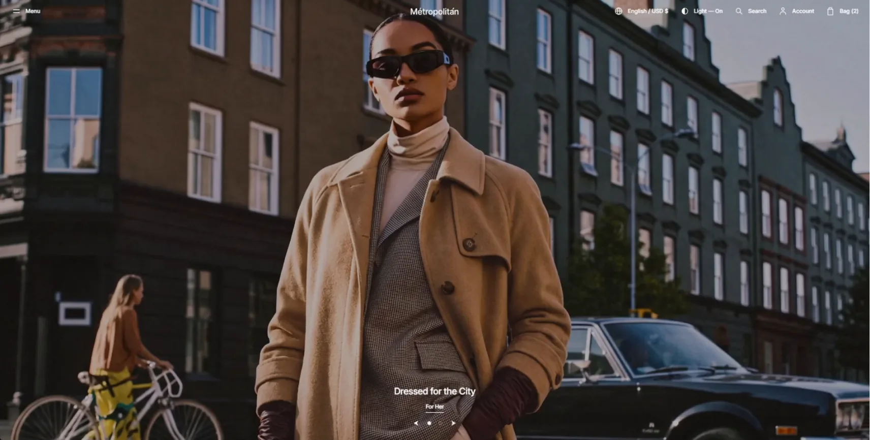
Sell more than product. Metropolitan gives premium brands an editorial storefront that turns everyday browsing into something elevated.
hero-image
about metropolitan

Metropolitan treats your storefront like a brand statement, not just a shop. Editorial layouts, measured spacing, and full-width visuals put the focus squarely on your products, so every visit reads as considered, premium, and unmistakably yours, from first glance onward.

  • Ideal Catalog-Size Small / Medium
  • Ideal Merchant New Merchants
about-image

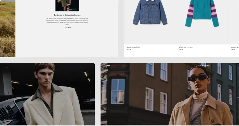
Extensive Collection of Thematic Sections
about-image

Customer and Brand-Centric Features

about-image

Simple
& Quick Setup

Starter Sites

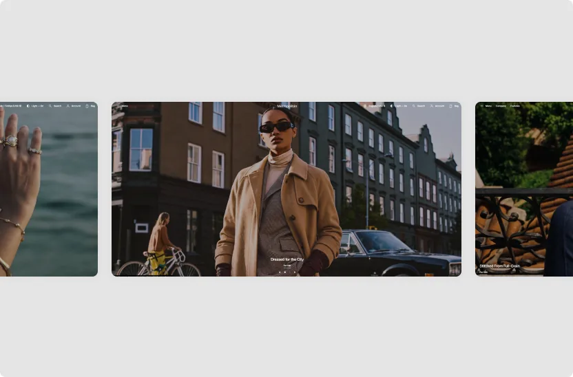
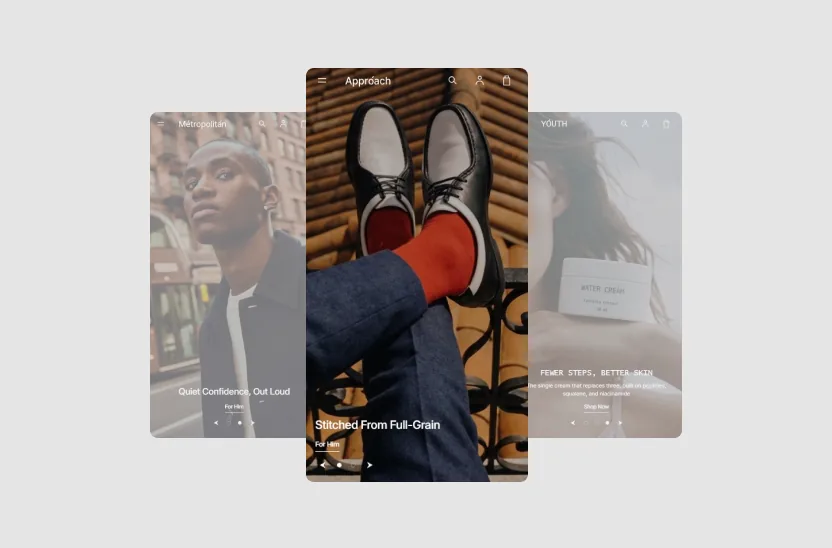
5 Pre-Made Templates

Five templates, each tuned to a different premium niche and ready to make your own.
demos-image
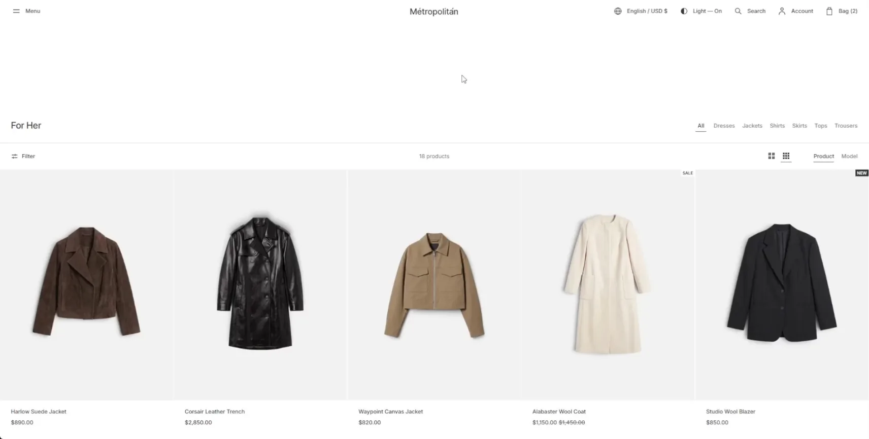
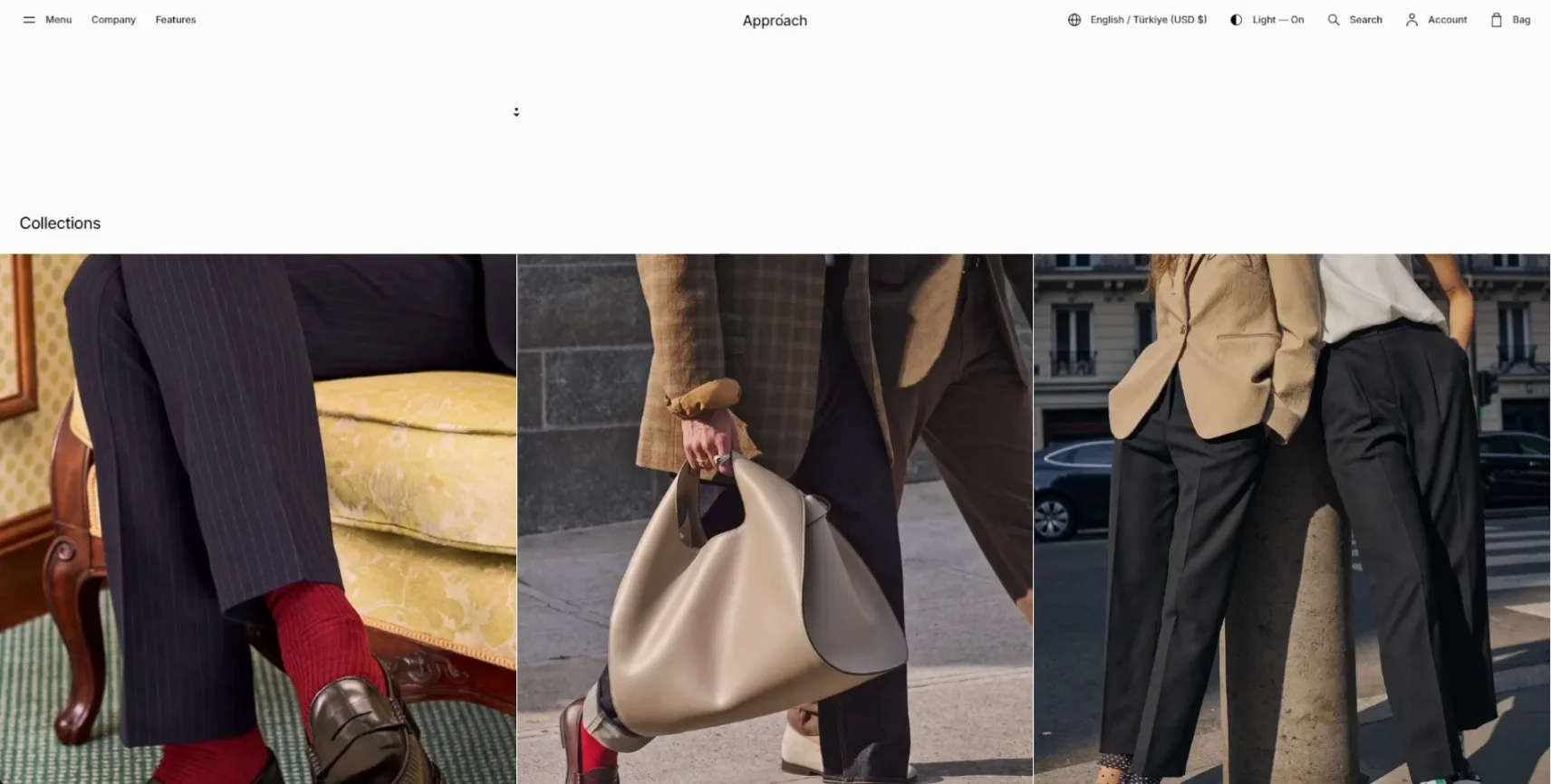
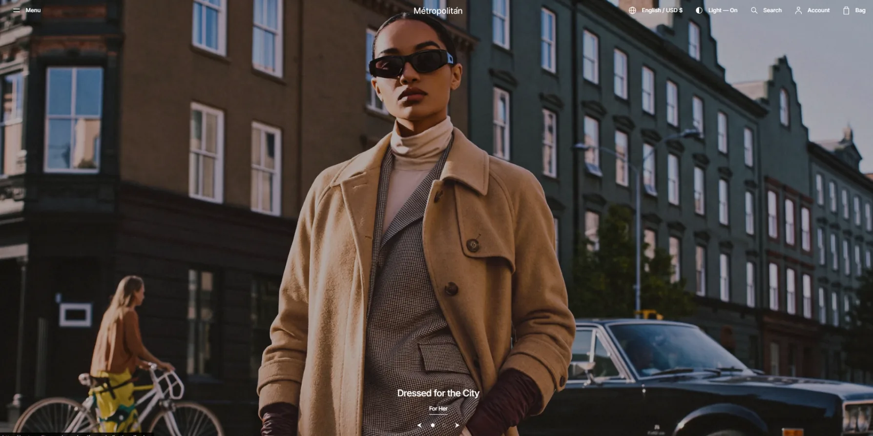
Clothing

Modern apparel through an editorial lens, with full-width visuals and measured type that let each garment lead.
demos-image
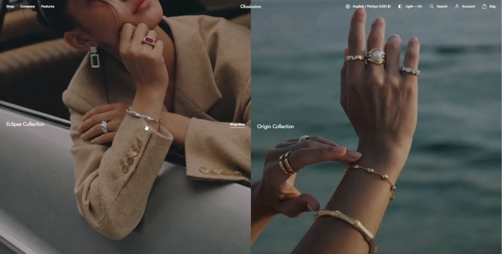
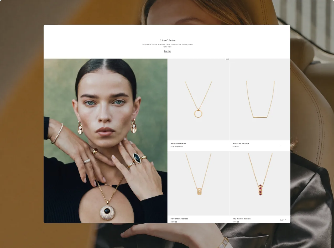
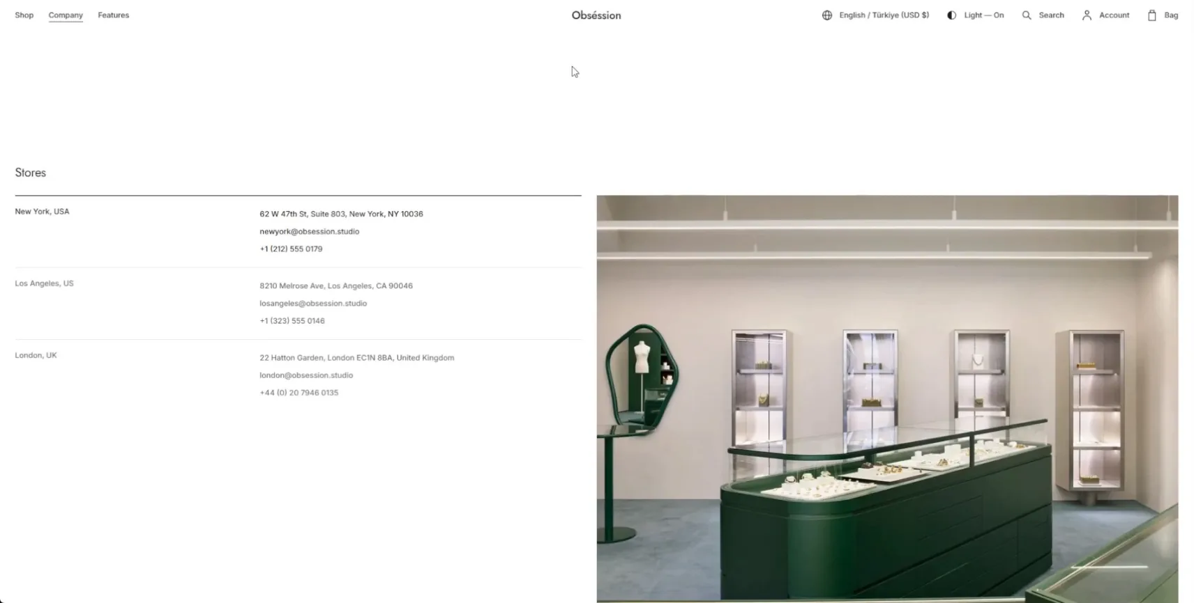
Jewelry

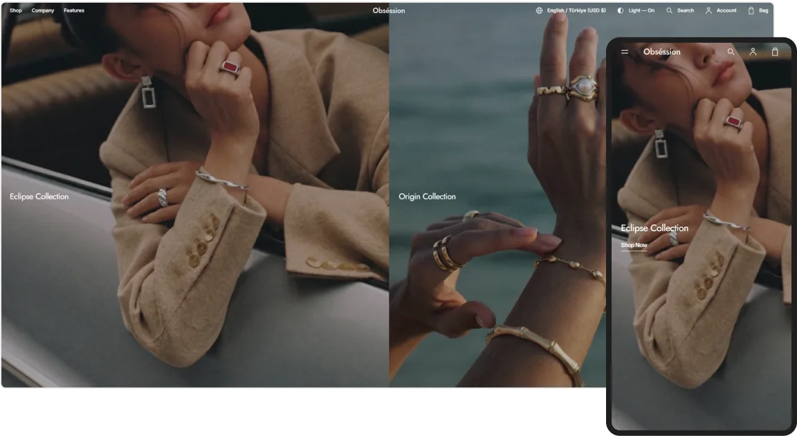
Fine jewelry shown up close, where minimal spacing and quiet type draw the eye to every facet and finish.
demos-image
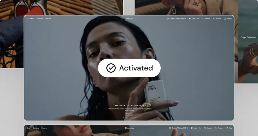
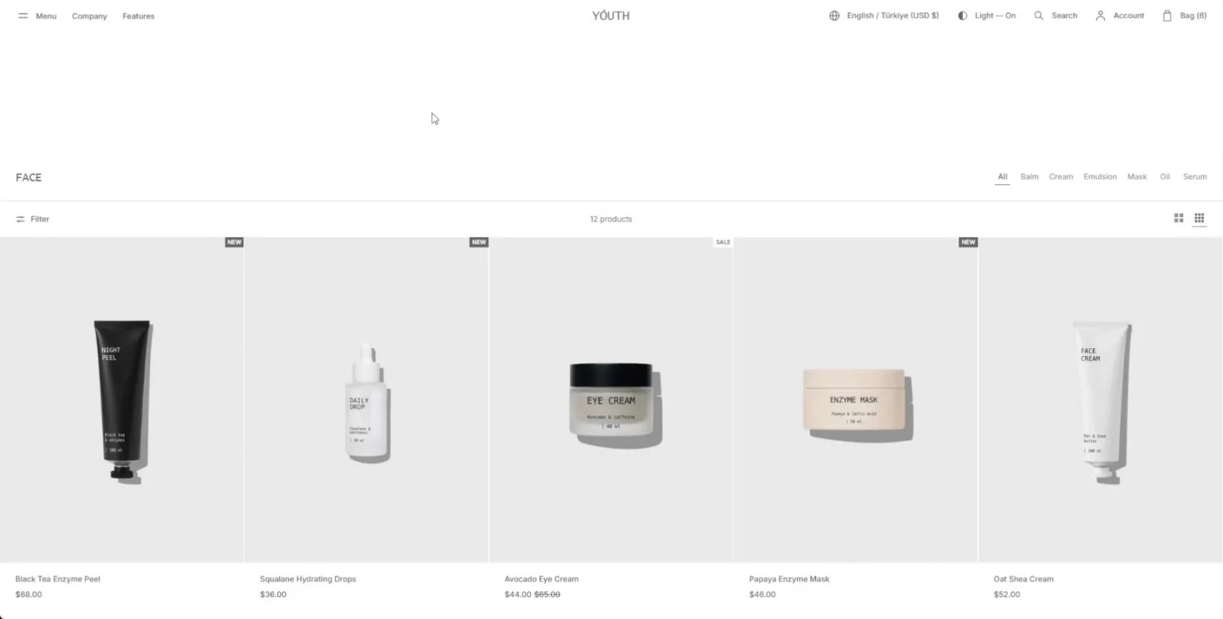
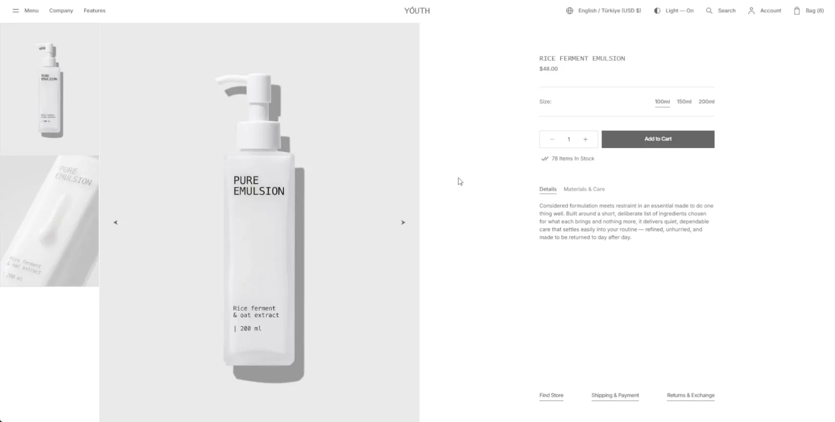
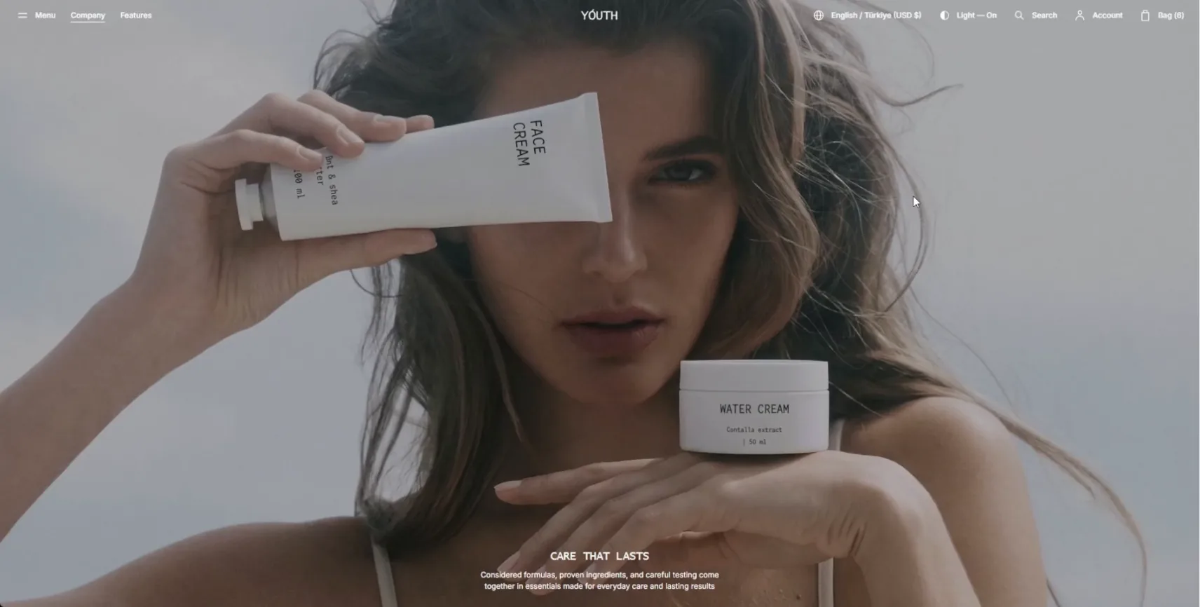
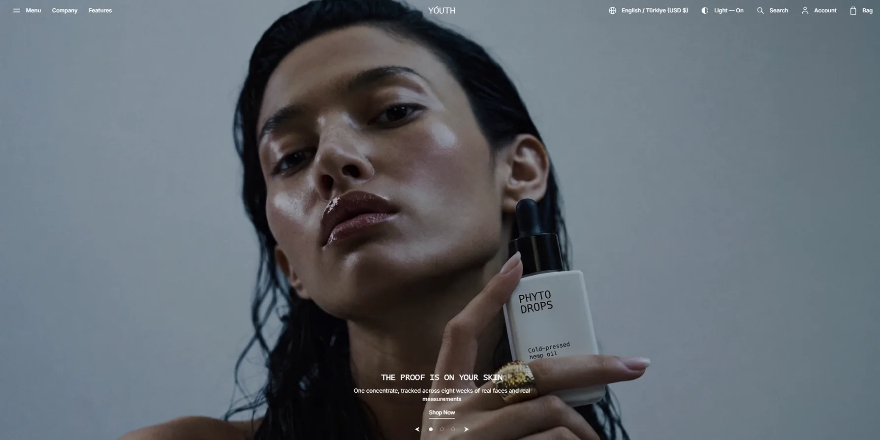
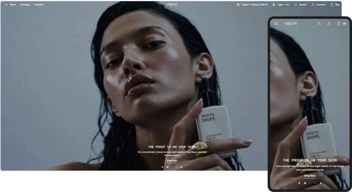
Beauty

A tonal, unhurried direction for beauty, with calm layouts that make each product feel refined and intentional.
demos-image
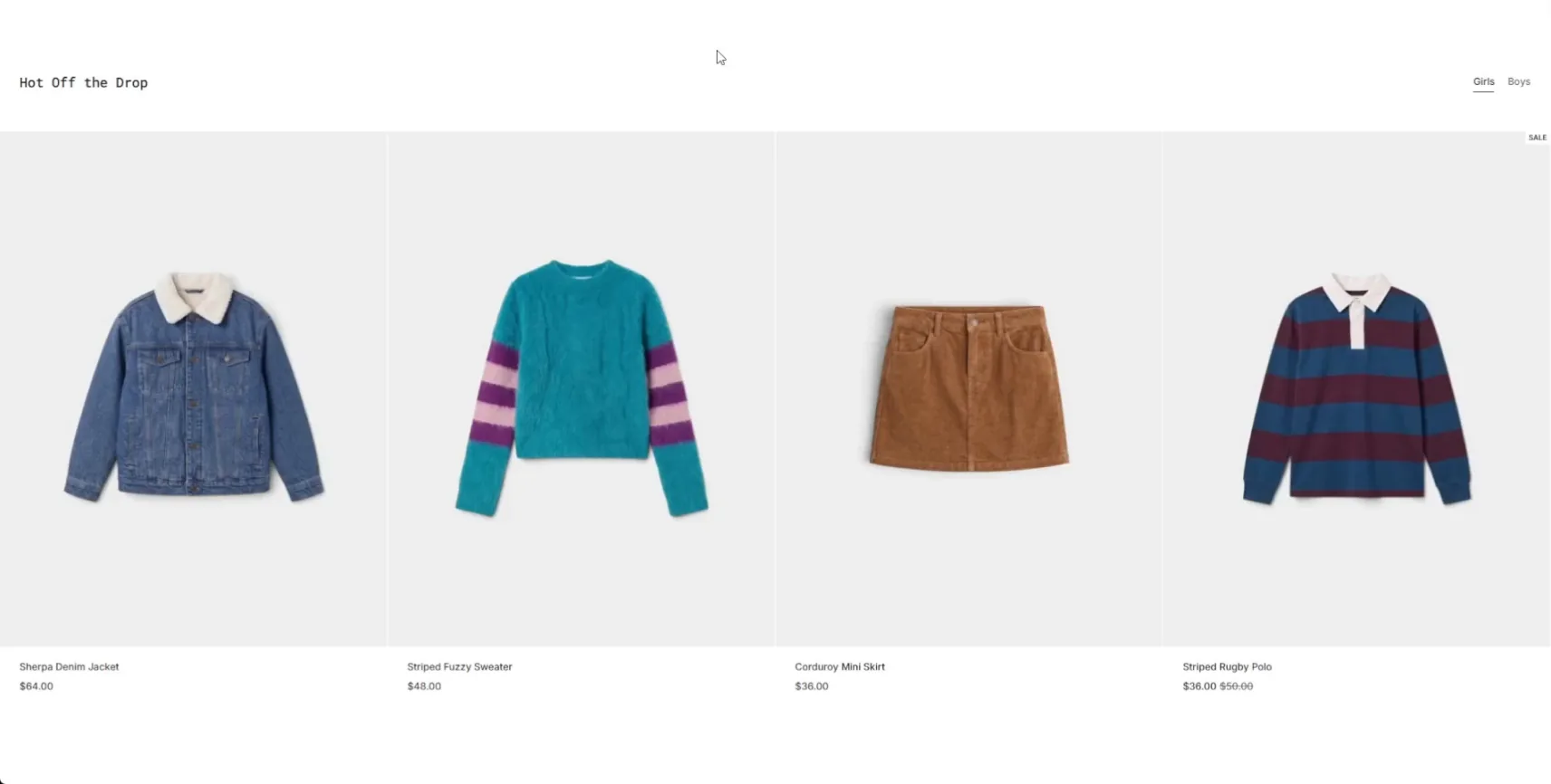
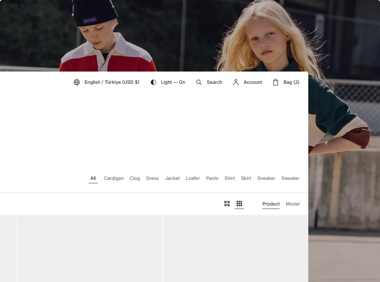
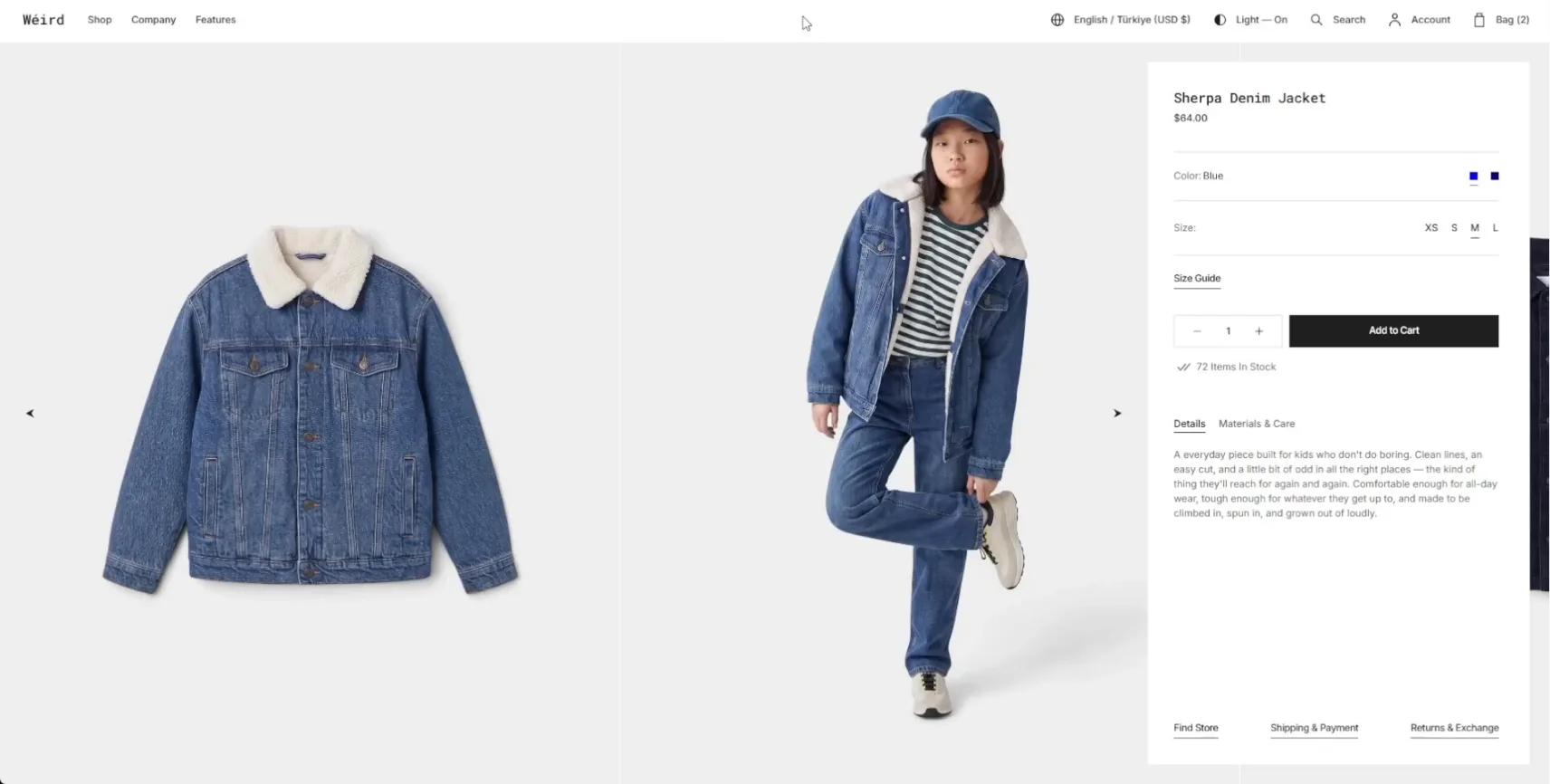
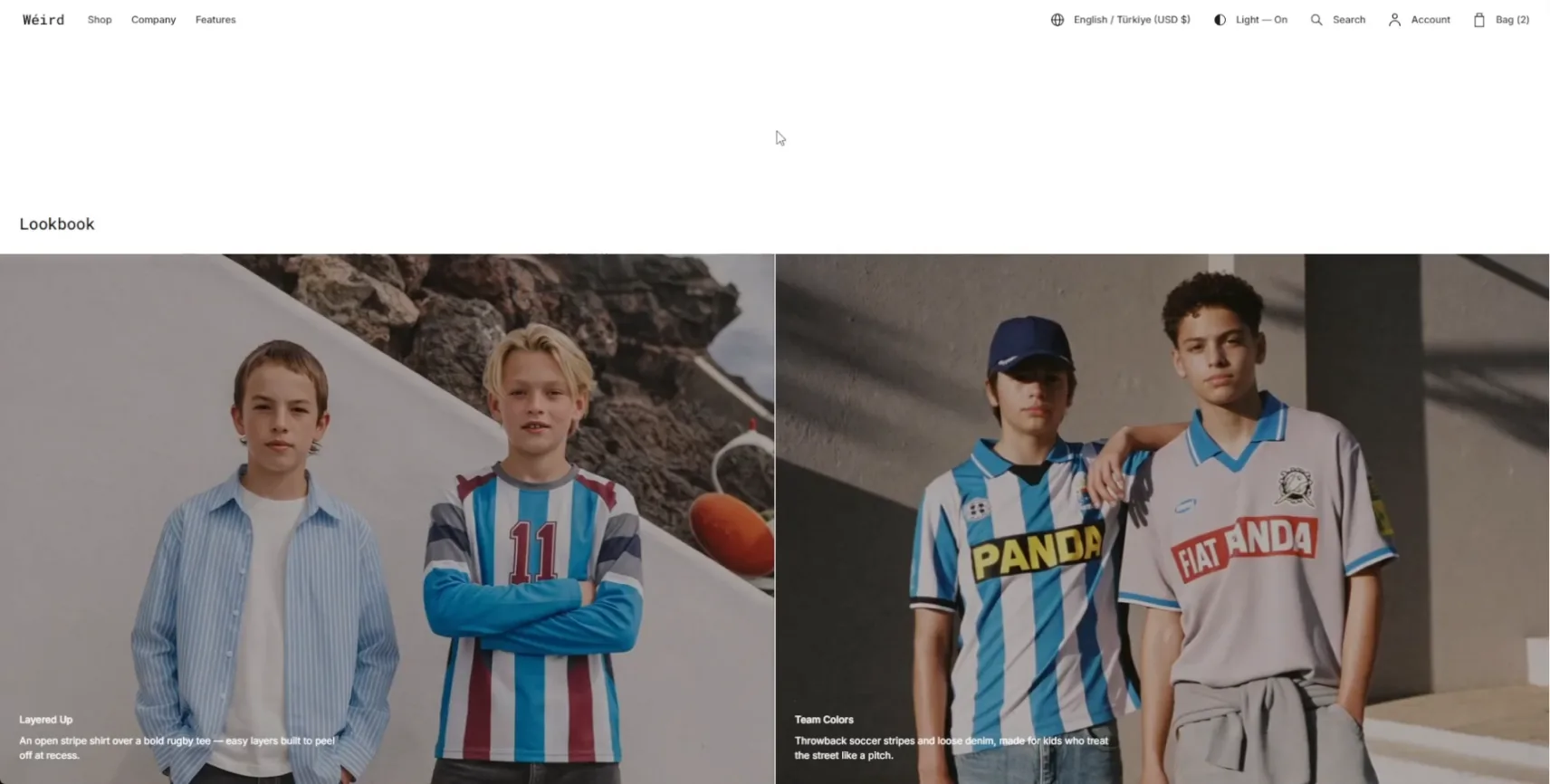
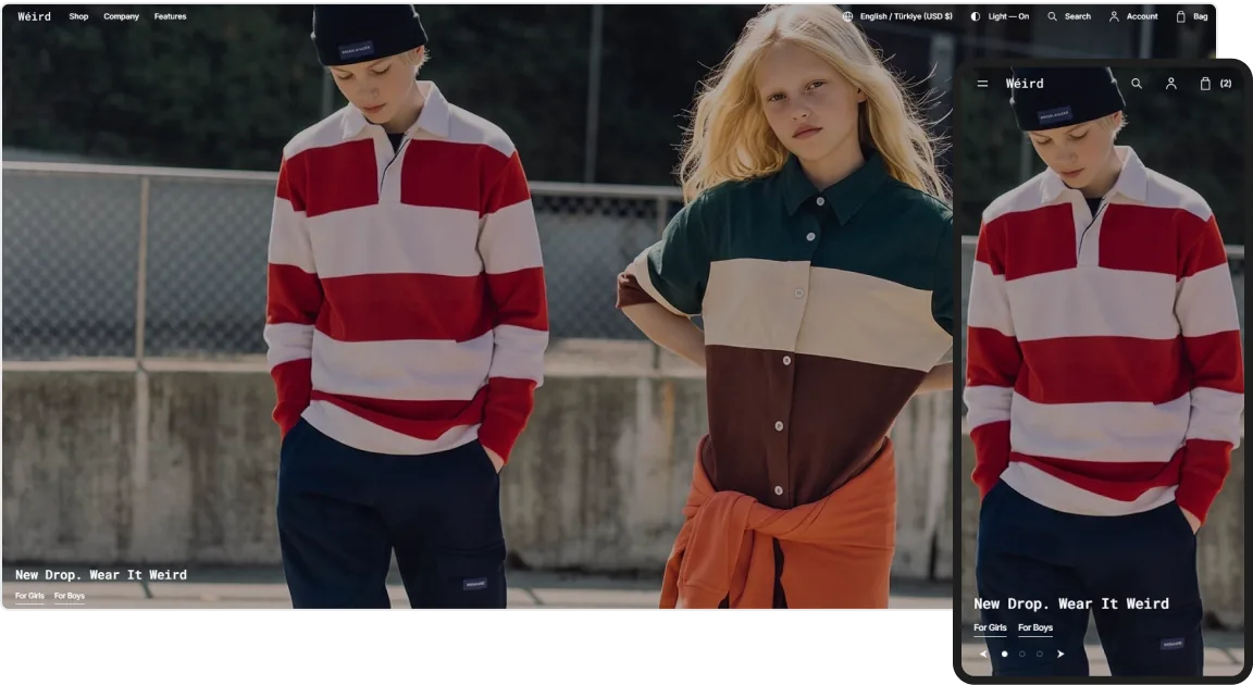
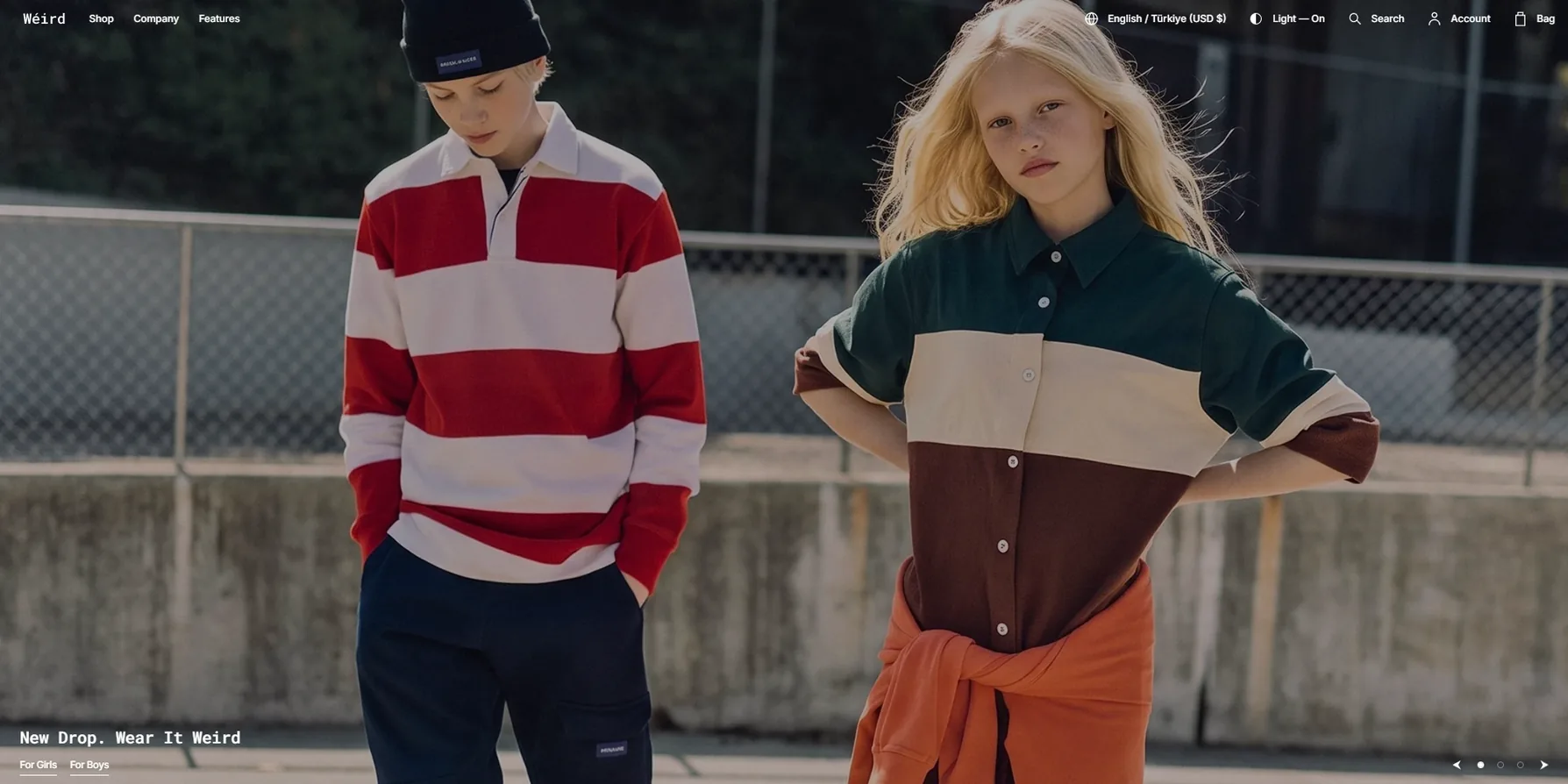
Kids

Childrenswear with a composed, playful spirit, pairing bright imagery and clean type with a grown-up eye for taste.
demos-image
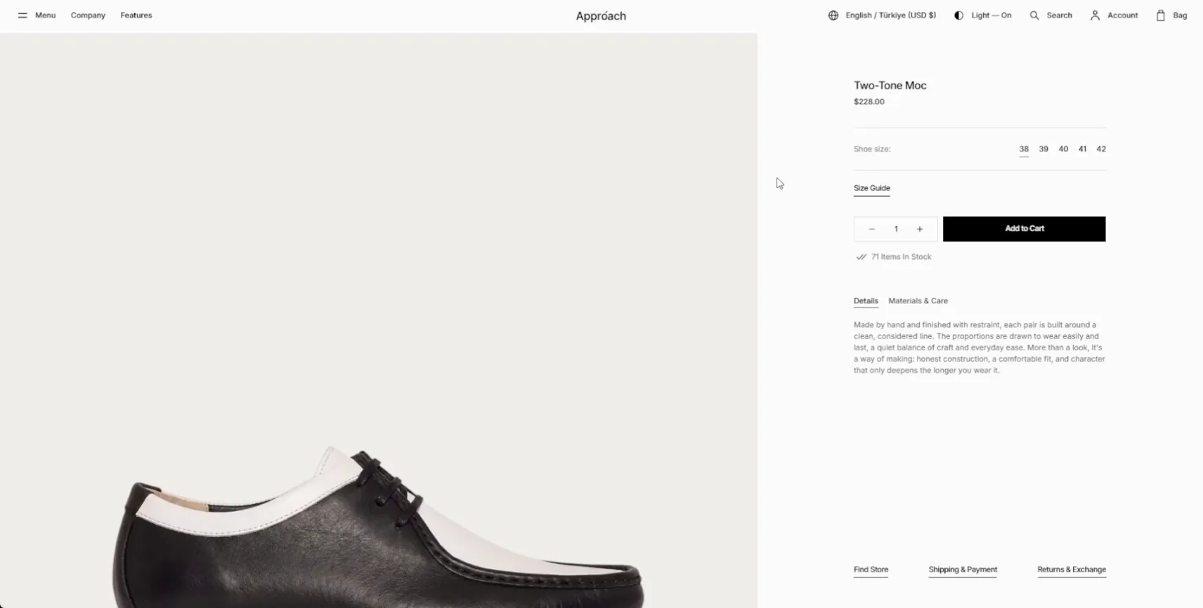
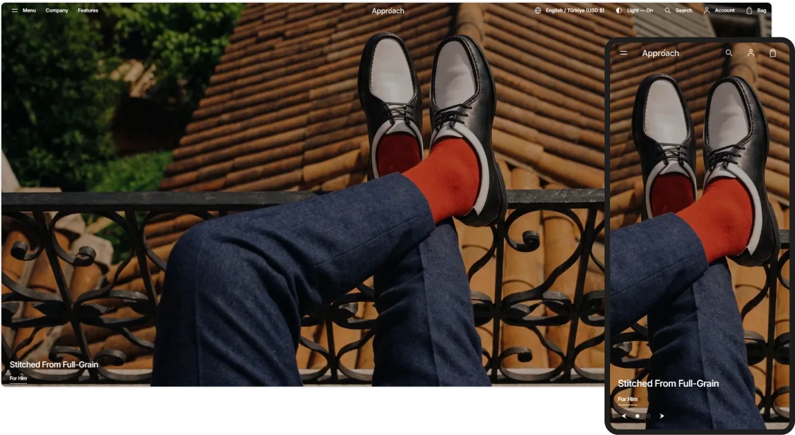
Shoes

An image-led direction for footwear, with edge-to-edge shots that bring shape, material, and finish forward.

Single Payment.
Unlimited Access

Acquire 5 pre-made templates in one single purchase of Metropolitan. No monthly fees. Guaranteed lifetime customer support and free feature updates.
WHAT YOU GET

A Foundation That Bends to Your Brand

A flexible base with carefully considered features that help you shape your store, fit it to any screen, and find support the moment you need a hand.

5 Ready-to-Use Demos

Launch from a ready storefront made for its own style and industry, then reshape every detail to fit your brand.

Looks Right Anywhere

A responsive build that holds its shape and clarity across desktop, tablet, and phone, right down to the last detail.

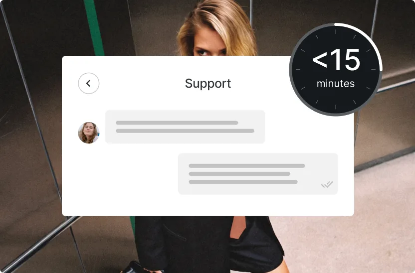
Support Within 15 Minutes

Have a question or need a hand? Our support team is ready to help you get the most out of your store.
animations

Motion That Brings Every Section to Life
Deliberate animation and interactive detail bring depth, personality, and a more immersive feel to each scroll and tap.

Masked Hero Transitions

Each new hero image is unveiled through a masked transition, giving the top of your store a polished, film-like opening.

Sticky Promo Layers

Scroll on and every promo panel settles over the one before it, holding a steady, uninterrupted flow down the page.

Cursor-Following Text

Glide across the section and the words move with you, turning a simple pass of the cursor into a playful bit of interaction.
global features

More Ways to Set Your Store Apart

Move past ordinary layouts with striking sections, interactive touches, and flexible content blocks that give each page a personality of its own.

Tell a Story in One Display

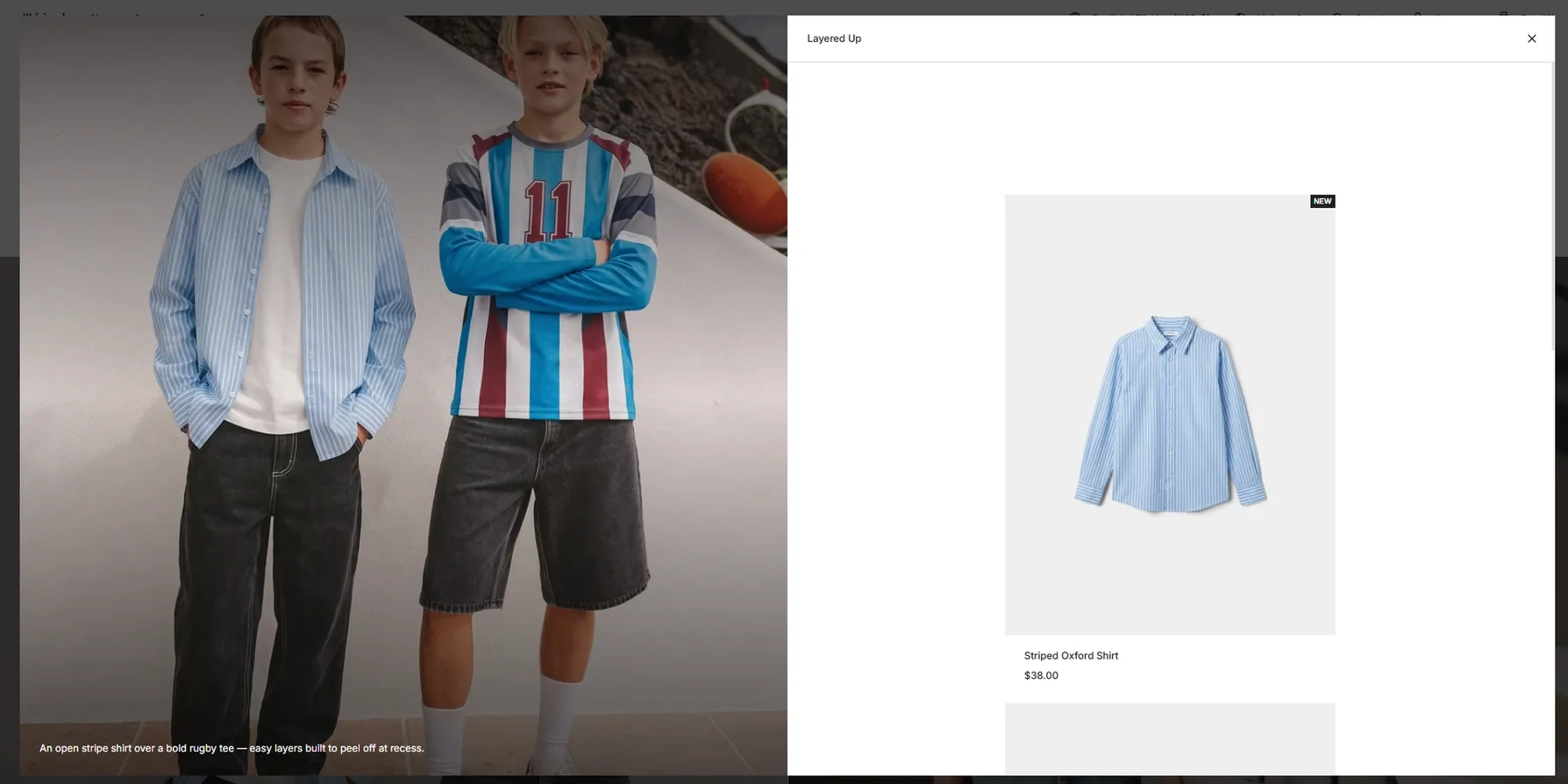
Bring several pieces together in one thoughtful arrangement, so related products read as a single, styled scene.

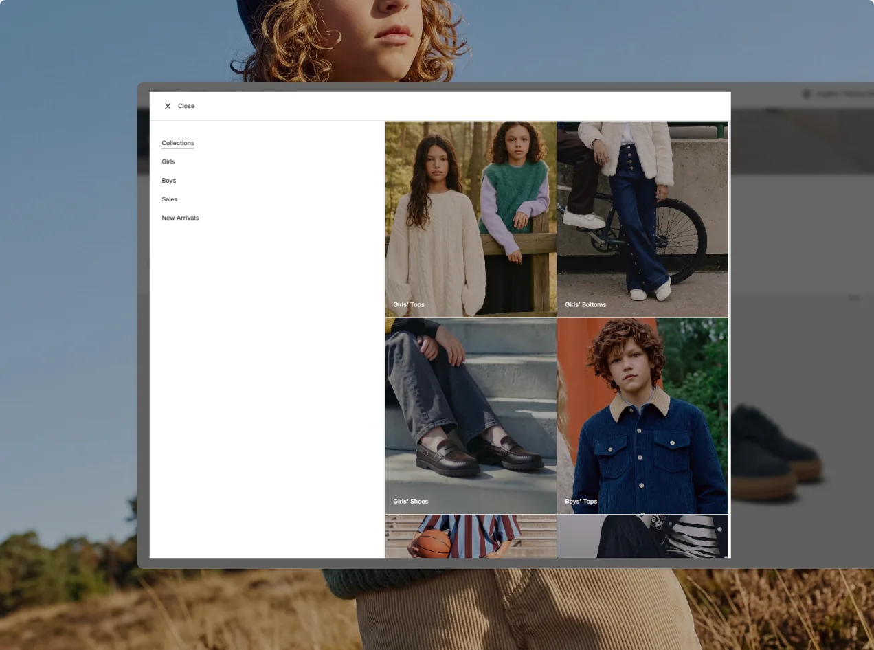
Featured Mega Menu

Make your menu a destination in itself, surfacing standout products, collections, and editorial picks as shoppers browse.

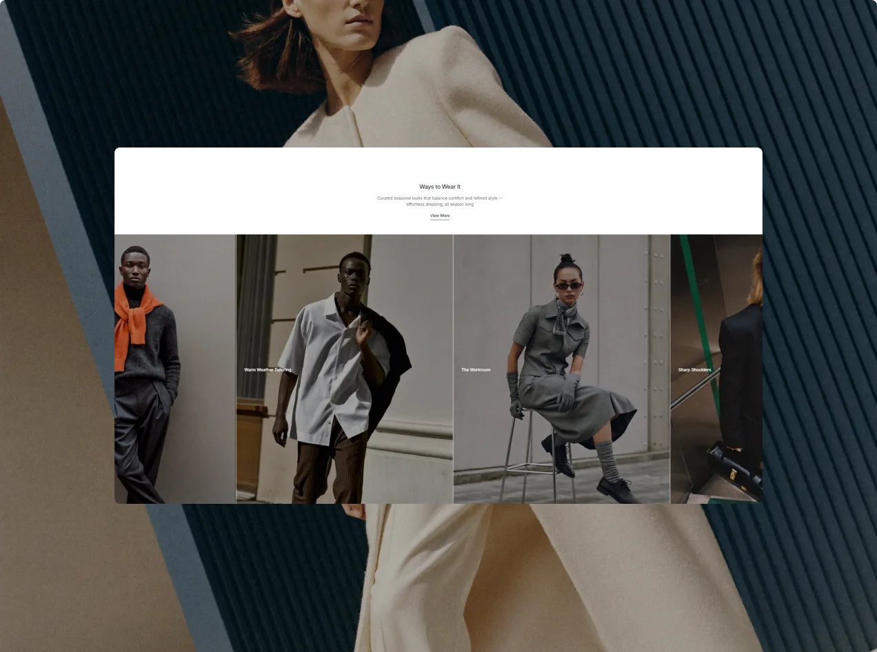
Lookbook Section

Compose editorial looks that show how pieces pair up, giving shoppers the inspiration to complete the whole ensemble.

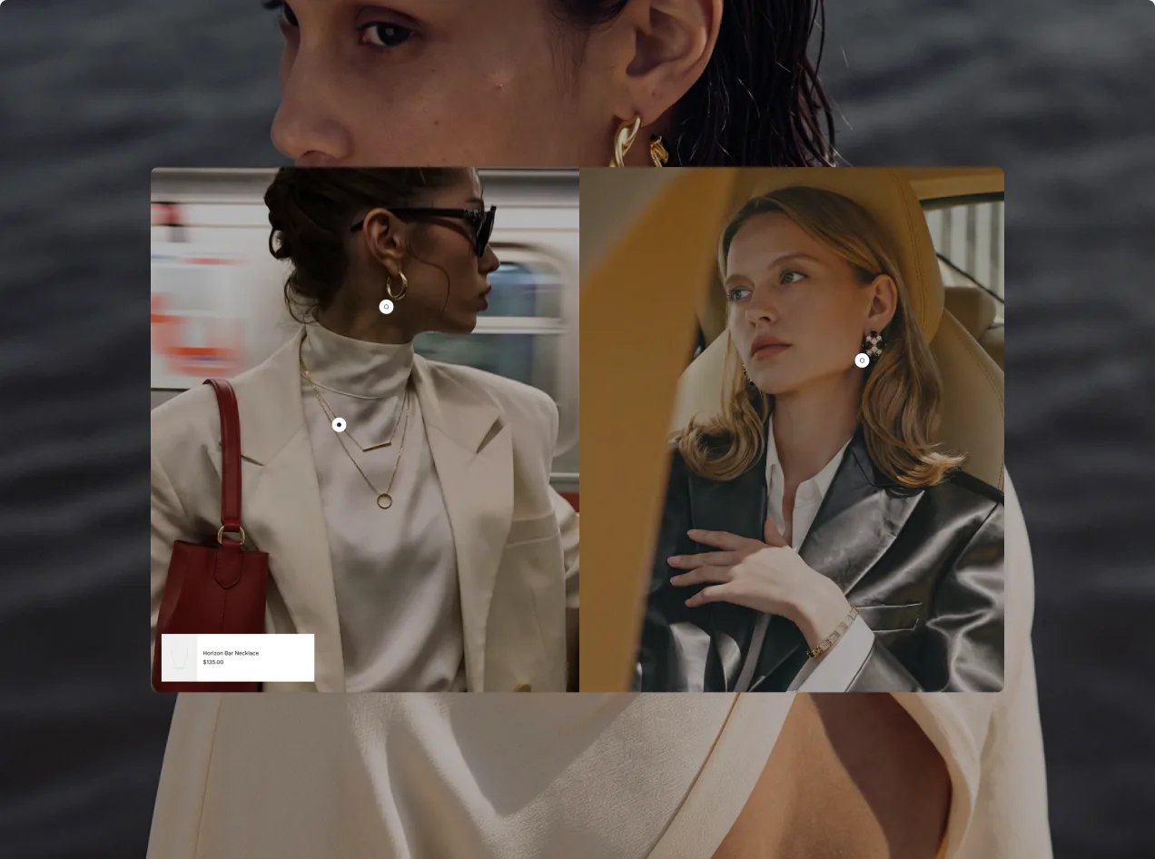
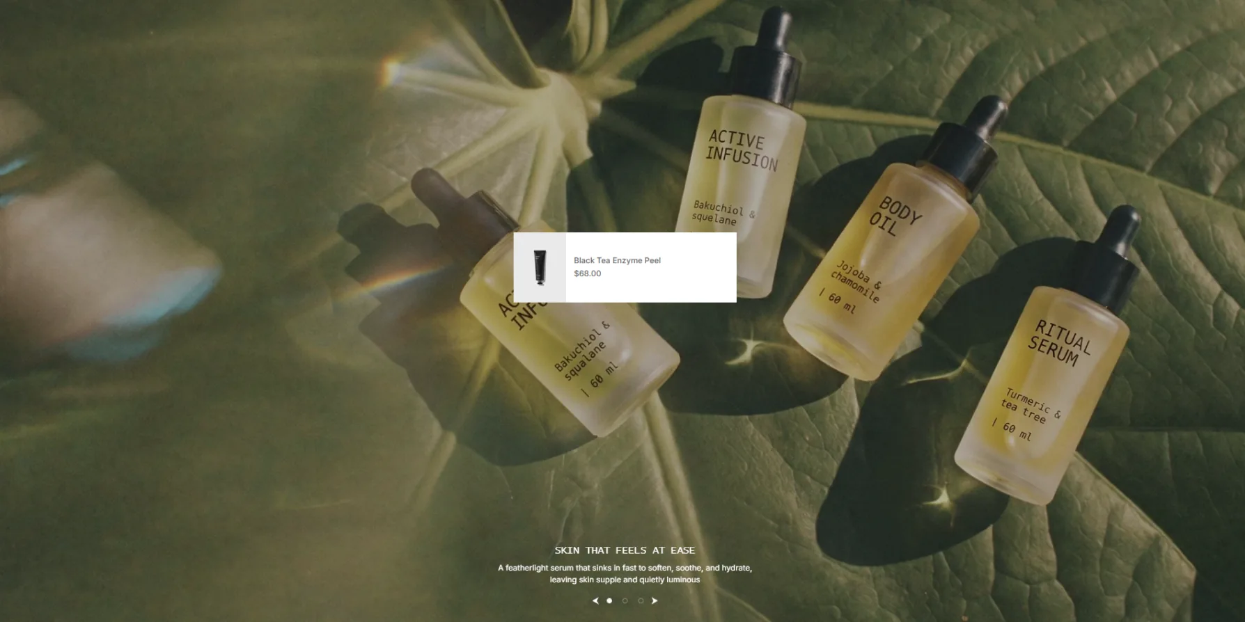
Tap the Image, Find the Piece

Pin interactive hotspots to any photo so customers can uncover featured products without leaving the scene.
catalog

Catalog Tools That Deliver

Everything a buyer needs — images, options, specs, reviews — pulled into one clear page that's easy to navigate.

Flexible Filters

Help shoppers get to the right product fast, with intuitive filters that trim the catalog to just what they're after.

Complete Product Cards

Preview color and size right on the grid, so customers know what they're looking at before they ever click through.

A Layout on Your Terms

Set 4 or 5 products per row and swap between product-only or model shots to lay your catalog out exactly how you like.
The Details

Beyond the Basic Grid

Go further than the basic grid with added features designed to make every visit more engaging, more intuitive, and truly yours.

Collection Tabs

Give shoppers a quick way to flip between product groups, so they can move across your whole catalog without a pause.

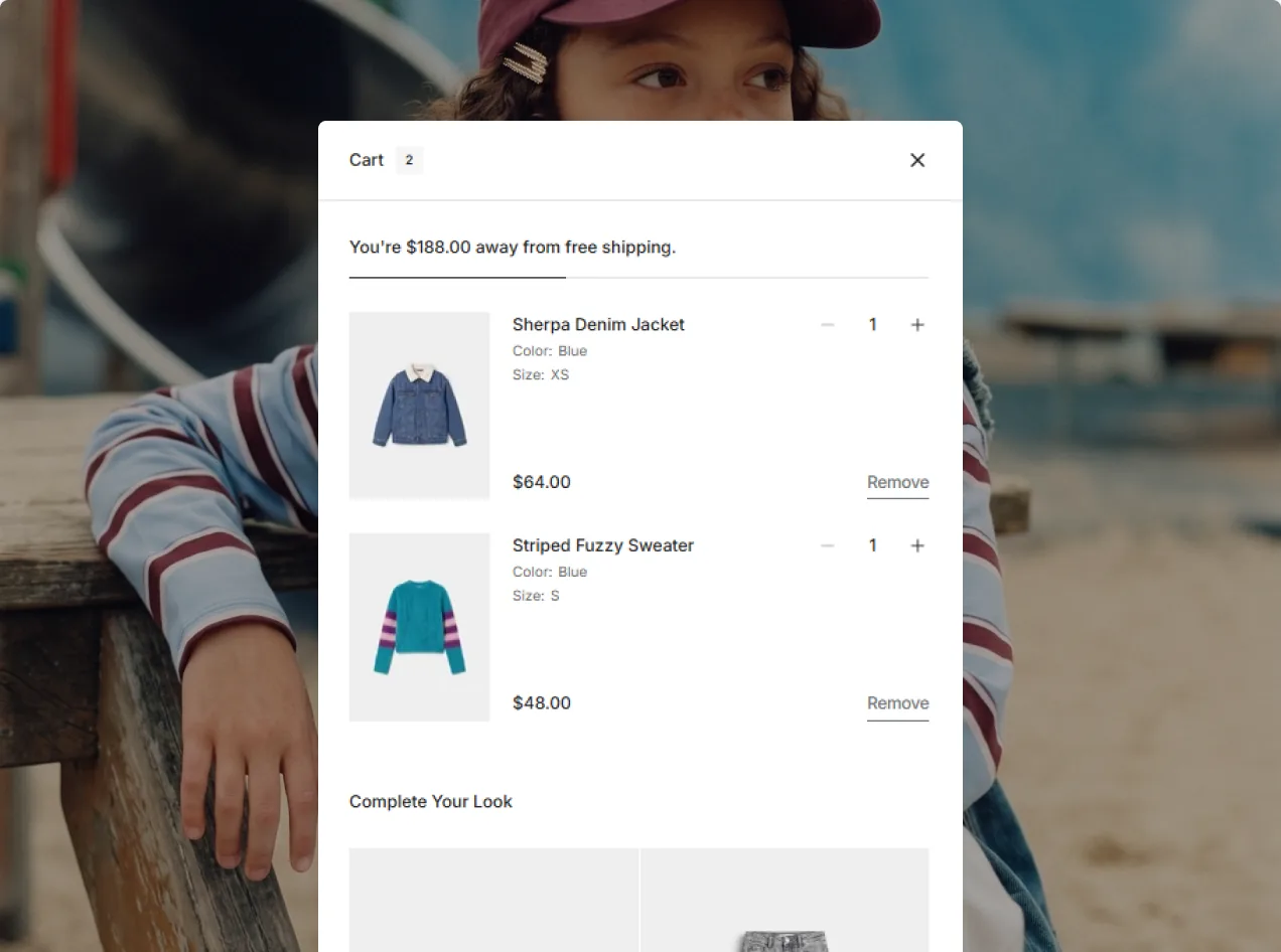
Cart Drawer

Pull up the cart from anywhere on the page, with every item, quantity, and order detail kept close at hand.

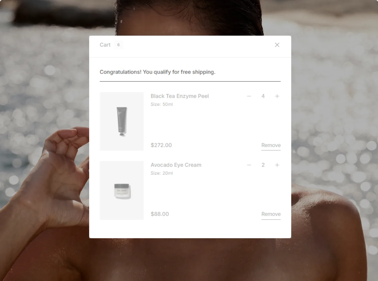
Shipping Goal Indicator

Let customers see what they've unlocked through a live bar tracking free shipping, gifts, and other perks.

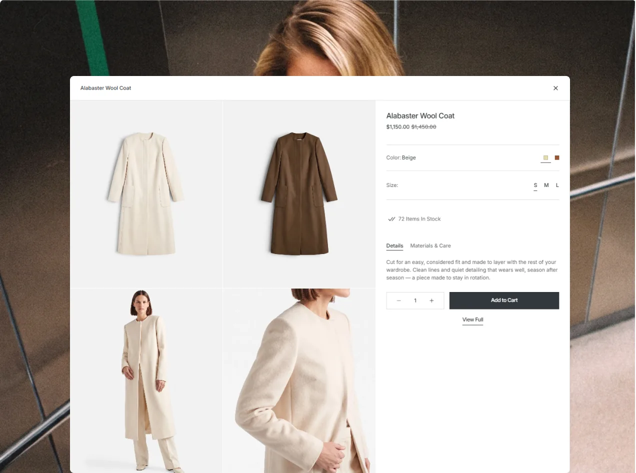
Quick View

Open any product straight from the grid with two quick-view options — a compact one for pace, a fuller one for detail.

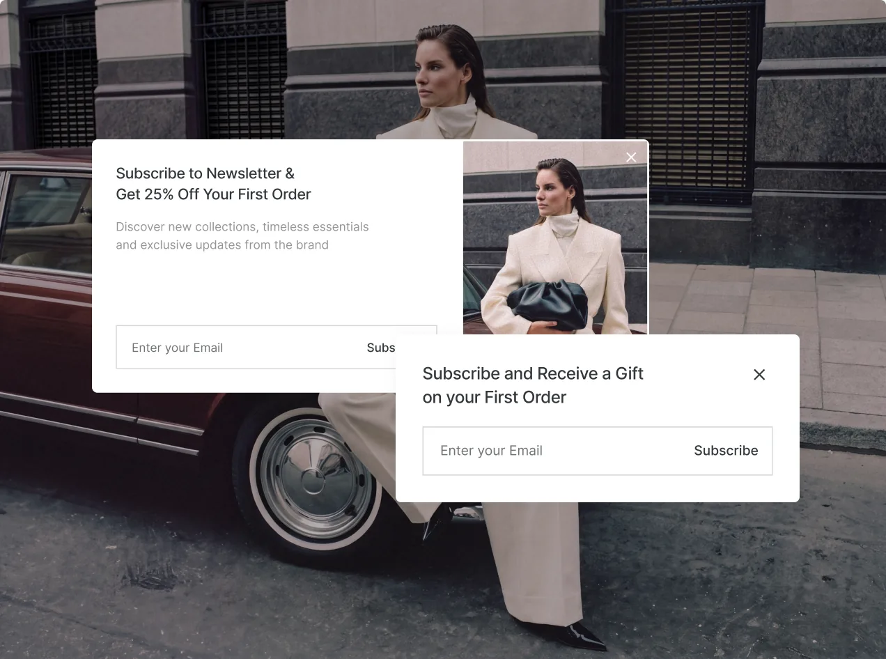
Promotional Modals

Catch attention with neatly presented pop-ups built for offers, newsletter sign-ups, and exclusive deals.

Smart Search

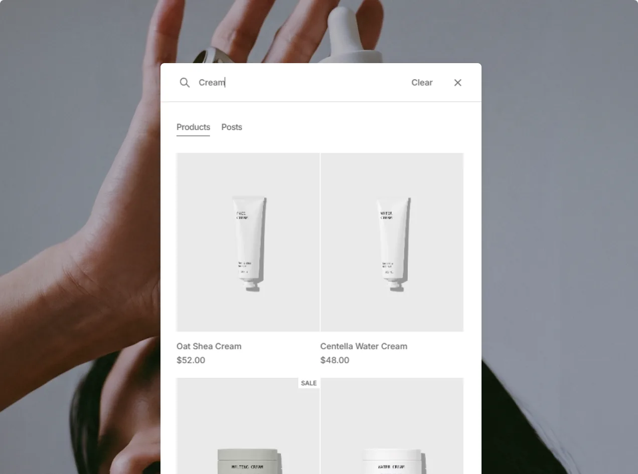
Guide customers to the right piece faster, with a search panel serving live results and product previews as they type.
product page

Pick How Your Products Show

Show your products through three separate gallery layouts, each shaped to deliver its own visual feel and hold attention on every detail.

Immersive Split Gallery

Big, bold imagery takes the lead while product info holds steady beside it, giving shoppers a calm, immersive read.

Classic Product Gallery

Thumbnails, a generous main image, and easy slider controls come together to keep product browsing clear and familiar.

Full-Screen Showcase

Make your product shots the whole show, with full-screen scenes and a horizontal gallery that keeps moving on its own.
product page features

Give Shoppers the Full Picture

Hand customers everything they need to browse, understand, and commit to your products with assurance, backed by flexible options and detail.

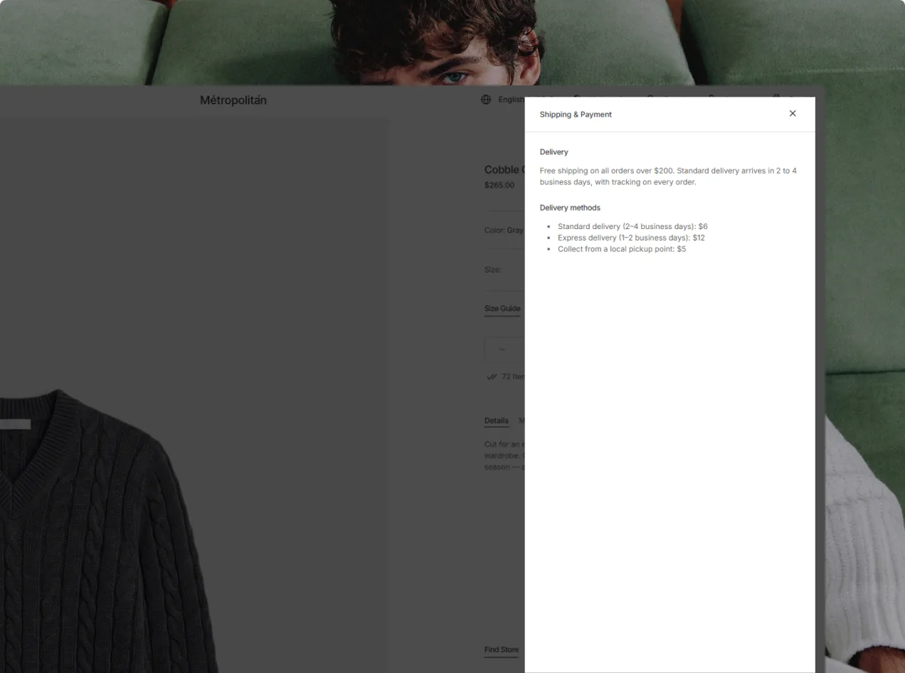
Popup Details

Keep the product page tidy while serving richer detail the moment a customer wants it, through clean pop-ups.

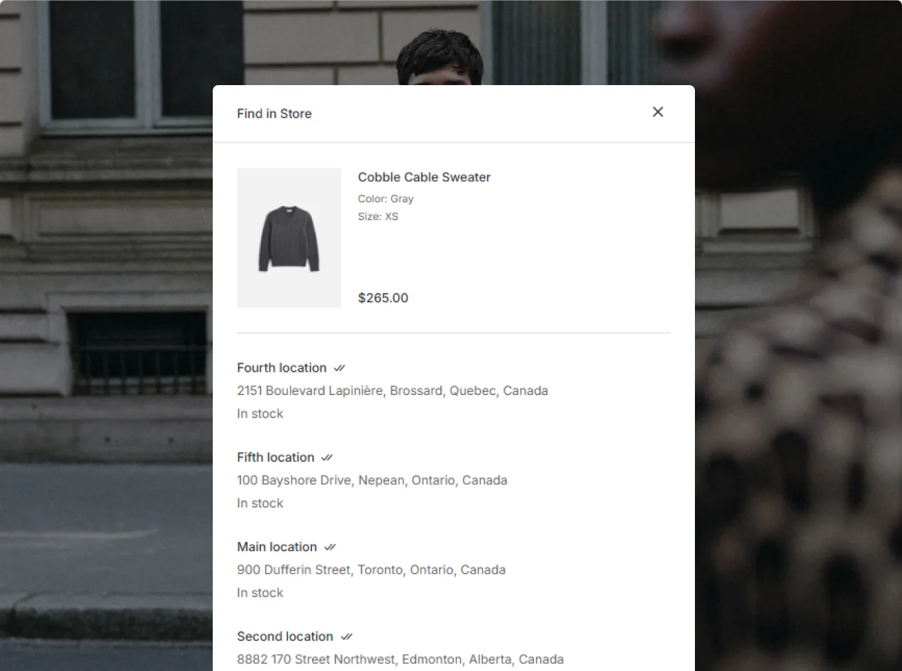
Find in Store

Let shoppers confirm availability at nearby locations through a built-in store lookup, right from the page.

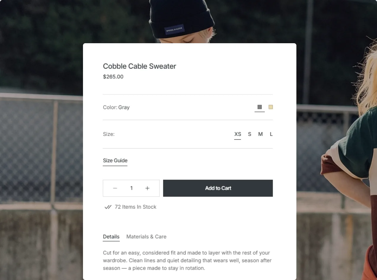
Product Options

Take the guesswork out of selection with clear, intuitive controls for size, color, and any other variant.

Space for the Full Story

Go further than the usual product page with added sections that layer in context, information, and detail.
other pages

More Pages. More Possibilities.

Put together a complete store with a wide set of ready-made pages, giving you fresh ways to present your brand, content, and range.

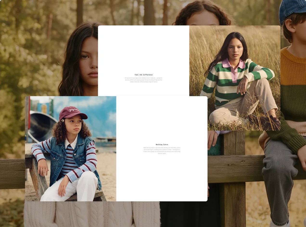
About Page

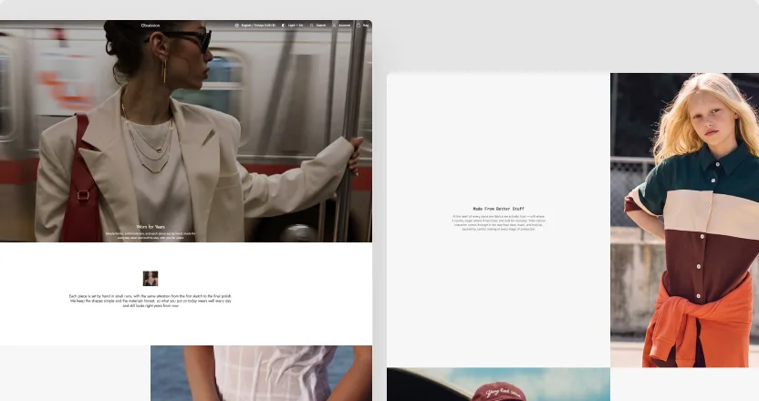
Tell the story behind your label with a refined, editorial-style layout that conveys who you are and what drives you.

Lookbook

Craft visual narratives and inspiring looks with an immersive layout made for editorial-style storytelling.

Collections

Lay out your collections with adaptable layouts that keep browsing visual, easygoing, and full of interest.

Stores

Spotlight your physical spaces with clear location details, hours, and everything a shopper needs to visit.

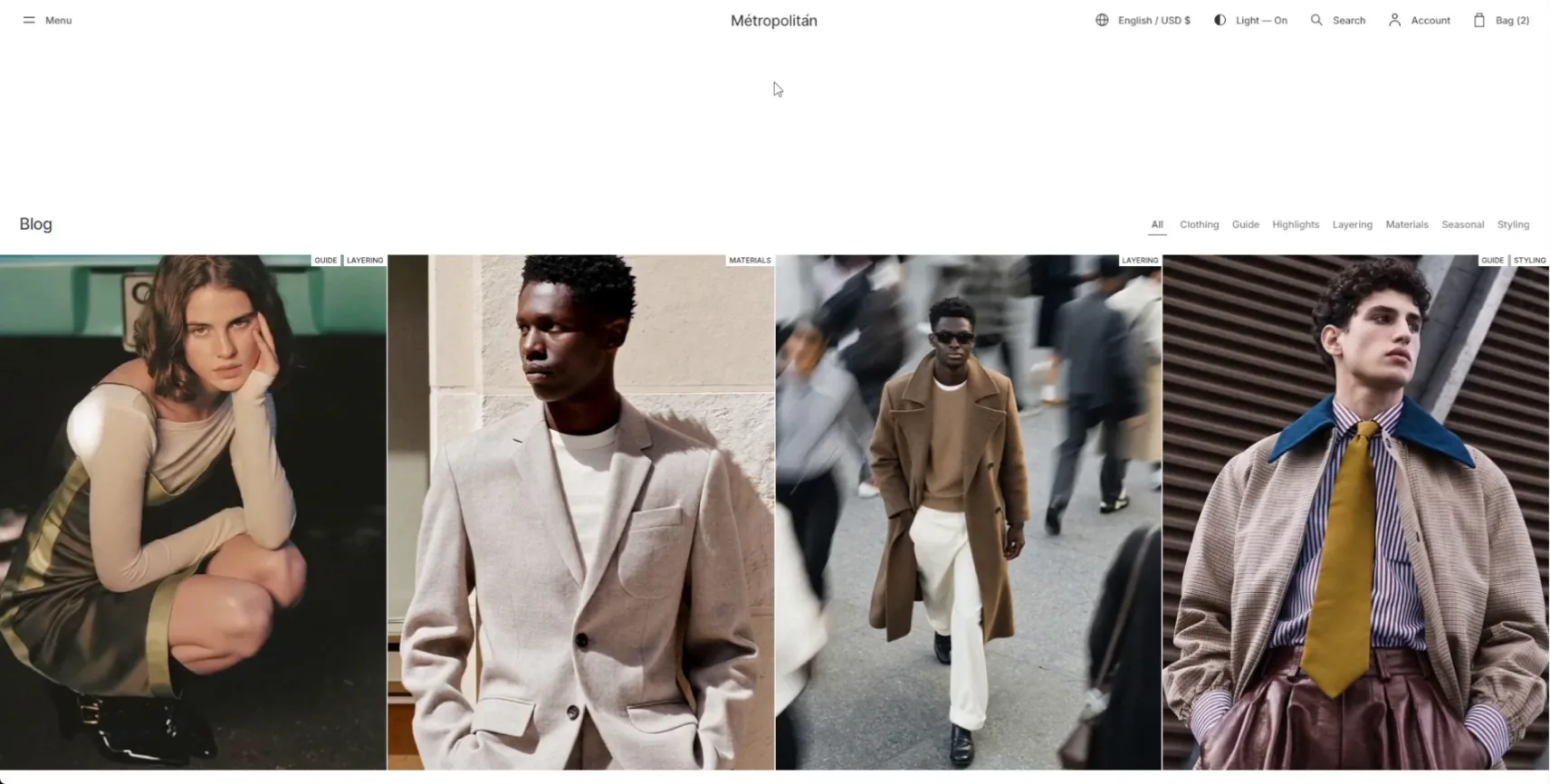
Blog

Post stories, updates, guides, and ideas in a clean editorial space shaped around whatever you publish.
One-of-a-Kind Support
You Can Rely On
Our team is here to help on business days, with typical response times of 15 minutes during support hours, even during your trial. Choose the option that works best for you.
Real-time help from our Support team
Request a Fix or Customization
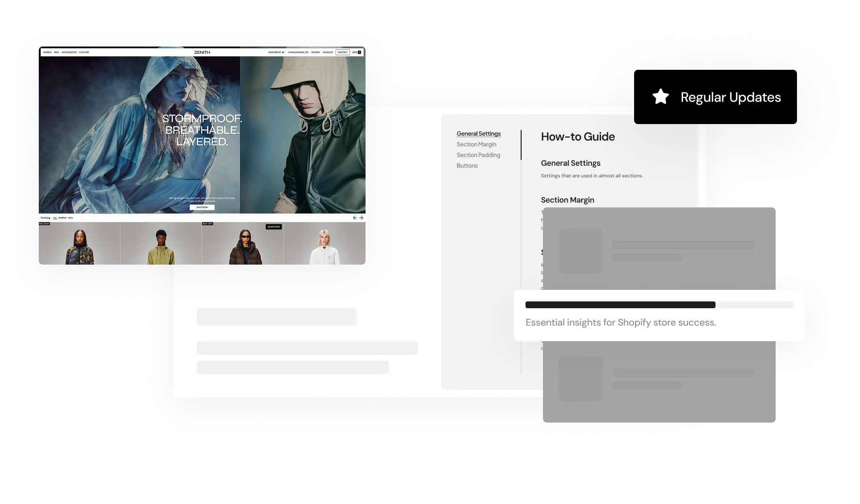
How-to guidance for theme setup and use

You Are One Click Away From Your Perfect Store
Discover the perfect theme that tells your brand's story. Customize and tailor your shop to meet the unique needs of your customers using our wide array of features.